Tag Archives: design

bristolmuseums.org.uk – phase two, milestone three

m_shed_venue_hireWe haven’t done an update on website phase two in a while, mainly because we’ve been busy bees behind the scenes with testing and implementing lots of new stuff.

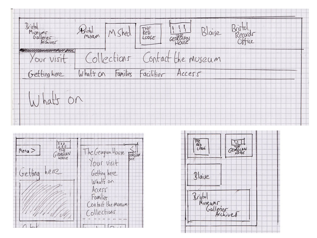
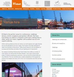
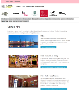
We’re now in the midst of milestone three, having done some work on improvements in milestone one and having held our milestone two workshops a little while back. We recently went live with some fresh new venue hire sections: http://www.bristolmuseums.org.uk/venue-hire/

After workshops and testing we decided to go down the route of event types for venue hire – we have lots of interesting conferences at M Shed, really exciting evening events at Bristol Museum & Art Gallery and lovely weddings at Blaise Castle House Museum so can adapt these depending on what people need and what our offer is. People can find information on room spaces such as capacities, download our menus and contact us to book really easily.

Know anyone who wants to hire a pretty special venue in Bristol? Send ‘em our way!

event_espresso_whats_on_190615
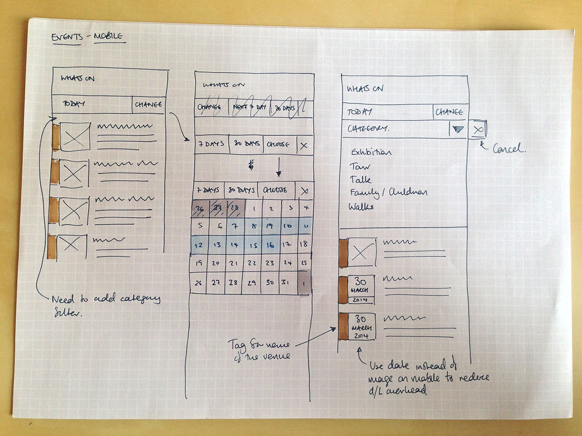
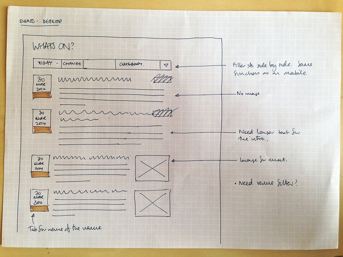
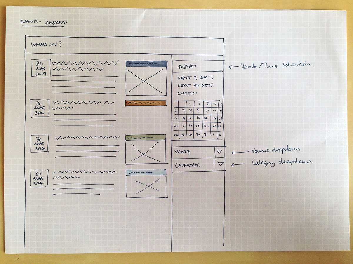
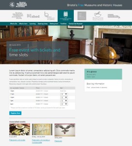
Right now we’re in the middle of developing our ticketing functionality, which we’ll be using for our what’s on events (to replace third party sites such as eventbrite) and eventually for learning workshops. For this we’re using WordPress plugin Event Espresso; we’ve been really impressed with how this works and we’re pretty confident it’ll make the user experience so much nicer for people wanting to book with us. There’s a lot of work for us to do on fulfilment (we need to decide what to put on confirmation emails and tickets), setting up a new database and making sure people can navigate through registration easily.

Next up is user testing with teachers and learning people which will be at the beginning of July. We need to cover a number of things for learning: showing our offer (school workshops, gallery visits, teacher training etc), giving users the right information to be able to plan their visit (such as risk assessments) and then being able to book and take payments, so we’ll be testing all of this.

learning workshopsWe’re aiming for learning sections to be in place before the new school year and what’s on updates to be in place before our next What’s On guide comes out in September.

bristolmuseums.org.uk – phase two, milestone two

Well it seems it’s March already. This means we’re now two milestones into project website phase two.

We’ve done a chunk of work on events filtering, which you can try out here: http://www.bristolmuseums.org.uk/whats-on/ Hopefully you’ll agree it’s pretty simple and useful. Of course we did a spot of user testing for it and got lots of positive noises from people – let us know what you think of it.

bro
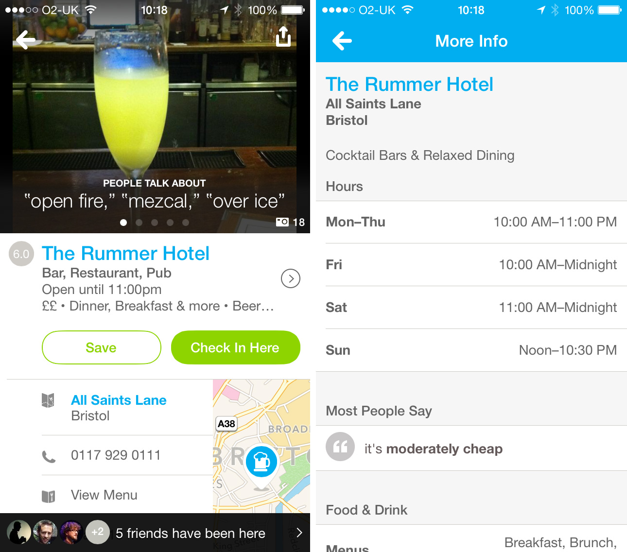
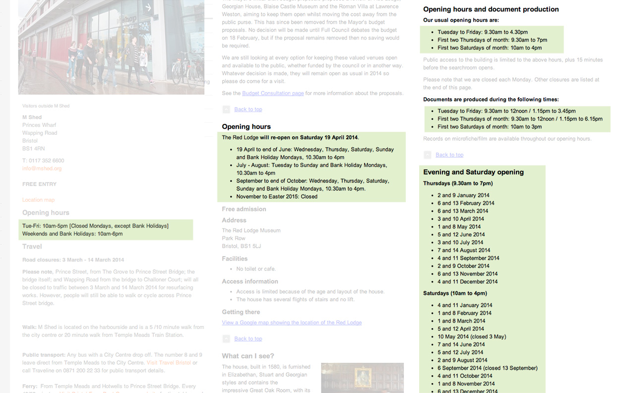
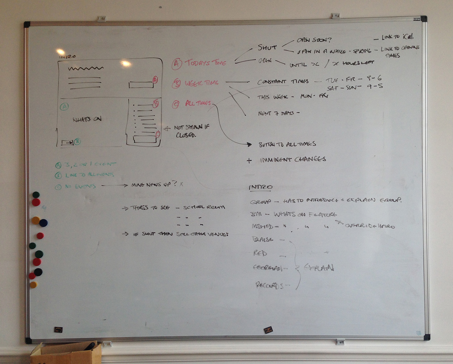
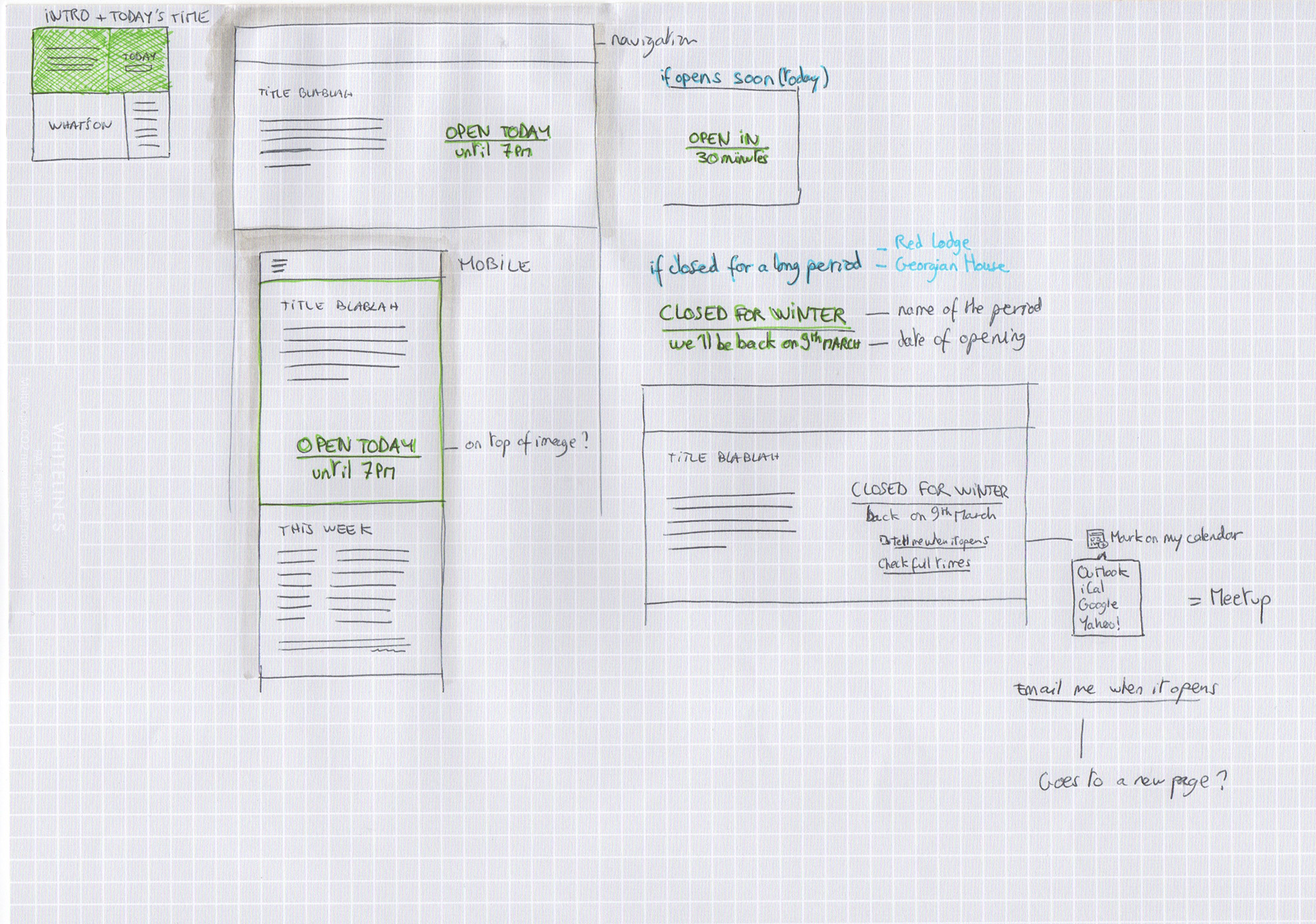
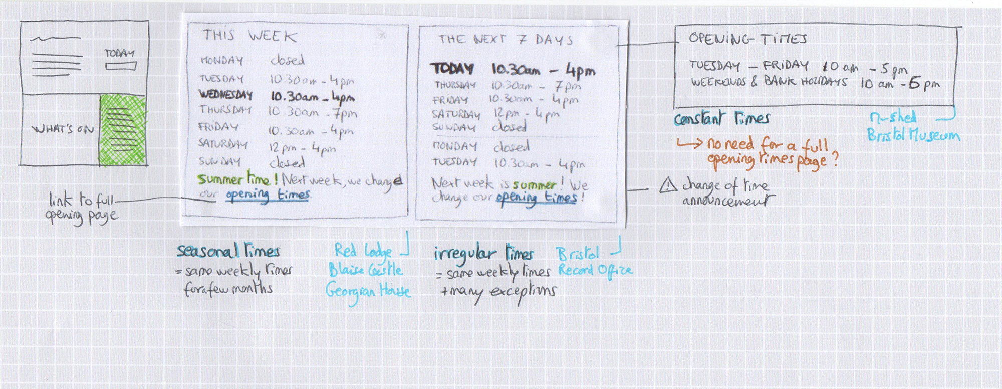
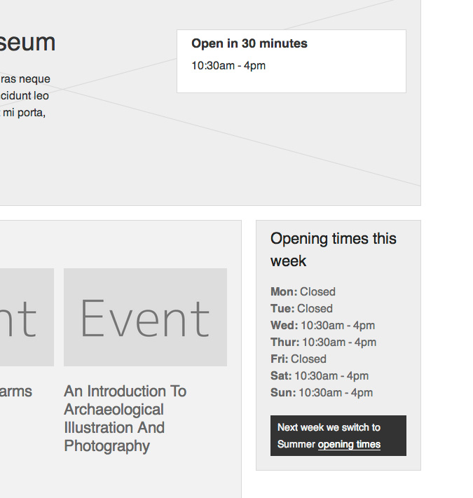
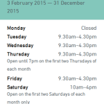
We also worked a bit on improving how our opening times are displayed. We added the option to add ‘notes’ to particular days, which is mainly for
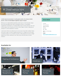
 Bristol Record Office who have a range of opening times across any given week or month. We’re really trying to make it as clear as possible when our sites are open (and of course each of the six sites have different opening times across different seasons over any given year).

Other stuff for milestone one included nicer 404 pages, WordPress upgrade and some other bits and bobs from phase one.

So, onto milestone two. During February we held three workshops – for venue hire, what’s on and learning. In these we got a load of people from all over the service together to map out who our users are and what they need from us for each. Ben over at fffunction is going to talk more about how we get from the workshops to the prototypes in a future post, but for now I’ll leave you with a couple of images to show where we are with our venue hire section. At the moment we’re testing the prototype and putting together some visual designs for it. I’m sure it won’t be long until it’s live, and in the meantime we’re starting to think about how we show our learning offer and enabling users to book workshops online.

visual
Visual designs for venue hire
prototype
Venue hire prototype


Creating characters for our Hidden Museum app

We’ve been beavering away creating characters for our app. Creating a style for this exercised our grey matter somewhat!

We needed to create a look which complimented the very clean visual style that our lead designer for the project, Sarah Matthews created for the app. However, from our years of experience in creating characters for apps and games we know that younger children react much better to characters with an element of realism to them.

In user testing we trialed 3 potential styles:

A photographic style, using photographs of artifacts from around the museum:

Photographic character

A silhouetted style, which fits very well with the UI design, but is much less realistic in style:

Silhouette character

A geometric style, which is stylised like our UI design, but has much more realism:

Geometric character style

The overwhelming vote was for the geometric style, which thankfully our production team all liked too – so we decided to go down this route.

Next we had to decide what our characters should be – we had some ideas and Gail was great at helping us to hone these down. We wanted them to really represent the diversity of the exhibits at the museum, and also be appealing to all age groups and both males and females. So we settled on the ubiquitous dinosaur, George Peppard the boxkite pilot who flies the plane in the main hall, a chinese dragon head as represented in the chinese dragons over the stairs int he main hall, a roman goddess to represent the museum’s wealth of roman artifacts, a female Egyptian Mummy with gorgeous coloured paint and… Alfred the Gorilla (obviously!)

Here are the results!

All characters

Still a bit of work to do on the Mummy to make her a little more female, but more or less there.

Building the Pattern Library

Something we’ve started in the last week or so is building out the BMAG pattern library.

guide-cut-ins

Eventually this will contain all the elements that will make up the website. We’ve already got some visual design going on, some core elements such as colour and typography and also wireframes in the form of screenshots from the prototyping work we’ve completed and tested.

We’ve broken the site into modules to work with to help with the BEMs orientated approach we’ll be building the site with. We’ve found it helps to start thinking in terms of modules rather than pages as early as possible in the design process in preparation for building using using BEMs.

For each of the modules we often have several variants, or different states that we have a clear definition for. We use different images for each state, and provide an explanation as to what can happen with each module.

So you can see in the left column of the pattern library that we’ve got the following groups:

Full Comps

Show full page visual designs, currently there’s a design for the homepage that is very much a work in progress.

Guide To

Shows core brand elements that are defined from the various venue brands and over-arching service brand. This includes: Buttons, Colour, Links & Typography. You can see an example of the colour page below:

guide-colour

Visuals

As visual designs come together we’re adding them here. Again, not too much to see aside from some initial thinking on some core elements.

Wireframes

As we’ve been moving our thinking into the prototype and testing on users we’ve edited to improve the design. Once we’re happy with each module or group of elements we’re moving it into this pattern library for reference. You can see an example of the Whats On modules below:

guide-whats-on

Sketching museum home layout opening times

Let’s talk about the big little details that offered up some challenges. Basic information such as opening times are extremely valuable for visitors, despite being sometimes overlooked during the design process.

For our project, a common user journey would involve looking for something to do today, as the previous user research suggested. Visitors would like to know right away if the museum is open today and what activities or events are available.

Foursquare venue opening times
Foursquare displays a time for the current day. A simple click links to a page with the full opening times.

A simple click or tap links to a page with the full opening times. This task gets more complicated when all our venues have a different system of timetables. They would all be displayed on the homepage of each venue but vary wildly in their arrangement. Who would have thought it could be such a challenge?

Venue times screenshot
Opening times for three of the museums involved in the project.

After some experimentation with the layout, we defined all of the user scenarios to solve. Some of the scenarios we found were, how do we show today’s time left before closing?  How do all the modules connect together if the venue is closed for a few months? How do we deal with irregular times without displaying a list full of exceptions and difficult to digest information on the homepage?


Venue homepage content
The tree of possibilities we have to think about to develop a flexible solution.

Looking at all the scenarios started sketching out different layouts to solve each.

Today time on hero
A few ideas to display today’s opening time for each case.
Weekly opening times
Sketches about displaying a weekly opening timetable: some venues have very regular times throughout the year, other requires flexibility.

And once we’d sketched out and refined all the options we could display we moved all the ideas into a prototype.

Prototype implementation
One of the cases implemented in the prototype.

Check out the rest by clicking on each venue on http://bmga-prototype.fffixture.co. We’ll be testing this with users next week to validate our thinking and see which ideas perform best.


Developing the UI with Sketching

Something we’re massively keen on is sketching. Its the quickest way to get ideas out of my head and onto a page, and whilst I’m doing it I’m debating and justifying the decisions I make along the way. Its an incredibly good exercise for honing ideas quickly.

So today I began sketching UI ideas for the various sections of the site, having first digested the IA and User Research work we’ve completed.

The images below show the sketching I’ve been doing  whilst looking at the different display options for handling events. We need to give the user an initial snapshot of the day’s events, whilst enabling them to look at a week, a month or a custom time period. We also want to offer them the option to filter by type of event, or the venue.

So in this first image  I’m looking at a mobile view, and how users can interact to view the events as they wish. There’s ideas coming out such as colour coding events by venue. I also started with thumbnail images for each event, and then thought about download overhead, and so made a note that we could use a date card device there instead.

Events---Mobile

The next step was to take the ideas to the desktop view, and see how we could configure and add to them there. So there’s two ideas on how to treat the elements from the mobile view. You can see I’m exploring the options for displaying the filter – whether in a horizontal configuration that closely resembles the mobile UI, or in a sidebar so its very visible for the user. I’ve considered whether there will be images for each event, and what to do if there is not one. And lastly, how to use the colour coded tabs to indicate the venue for each event.

Events---Desktop-1

Events---Desktop-2

All a work in progress, but worth sharing so you can see how I quickly generate, discard and progress ideas. The next step for us is to test these ideas with users, and see how they respond.

Building a prototype and user testing

Since our initial review of user research, I’ve been busy developing information architecture and navigation ideas. We’ve worked up an initial information architecture and navigation which is geared towards getting museum visitors the information that they need but which will allow the site to expand to accommodate content for other users in later phases of the project.

Sketches for navigation for mobile and desktop views of the Bristol Museums website

We’re committed to testing our work with users throughout the project and for these early stages we’ll be using an interactive prototype built with HTML and CSS for this. Building and testing with a prototype in this way allows us to

  • work quickly and iteratively
  • experiment, keeping what works and throwing away what doesn’t
  • design and test across devices: everything we build must be fully responsive
  • quickly, easily and continuously share our designs with members of the team, stakeholders and everyone else who is interested (see the URL below)

More details of how we build our prototypes will come in a later post or, in case we forget(!), on request.

We’re working on setting up a development site to publish the prototype on Bristol Museum’s hosting but until that’s sorted, you can access it here:

http://bmga-prototype.fffixture.co

Last week we ran the first tests with members of the public. We set ourselves up with a laptop and an iPad in the cafe at Bristol Museum and Art Gallery and invited users to test the IA and navigation. Volunteers who could spare us 10 – 15 minutes were asked to complete a theoretical task by navigating the prototype whilst talking through what they were thinking and doing.

User testing at Bristol Museum with a laptop and an iPad
User testing at Bristol Museum with a laptop an iPad and a pot of tea

We tested with a number of individuals or couples and gained some really helpful insights into our early stage designs. We’re incorporating changes to the navigation as a response to these insights at the same time as starting to populate the prototype with features and content for further user testing.