By University of Bristol Computer Science student team: Sonny, Sergi, Thomas, Daniel and Milosz
Back in September five of us gathered round a table thinking about the prompt given to us by Bristol Museum: develop an interactive exhibit where visitors touch replicas of artefacts and related information appears, creating an interesting and fun way to learn about these objects.
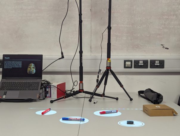
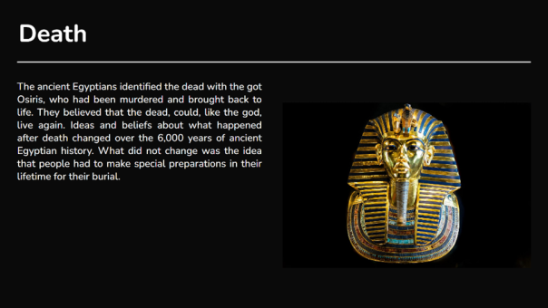
After many months and iterations, we finally came to the design you see above, an exhibit consisting hotspots over the replicas on a table. When the hotspots are touched, information about each artifact is displayed.
But how did we get here? With little idea on how to tackle such a task we split it into the three logical sections: how do people interact with the replicas? How do we display the information? How do we make it easy for museum staff to use in future exhibitions?
How do people interact with the replicas?
This was tough as we didn’t have any examples to work off – we couldn’t find anyone who’d done something similar.
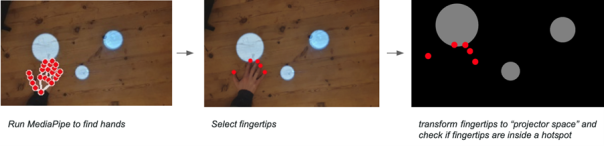
We explored many possible solutions; looking at methods such as computer vision, lasers and detecting decreases in light. Through our exploration we ultimately settled on MediaPipe; an AI-powered hand tracking model which allowed us to see how users touched the replicas.
We created hotspots in which the replicas could be placed and animations to prompt visitors to interact.
While two of us worked on this, the rest of the team was busy creating a user interface, so users could engage with the exhibition.
How do we display the information?
This was a simpler task; the museum had informed us that they wanted to use projectors to show this information, so we created a dynamic display with a black background and white text to make it less blocky and more appealing to the eye. After a few iterations with museum staff and user feedback we came to the structure shown. Videos, image slideshows and text can all be included.
How do we make it easy for museum staff to use in future exhibitions?
We wanted to create a easy-to-use system with equipment most museums would already have.
A projector displays hotspots and a camera detects when people touch them. The camera and projector can be calibrated with the click of a button. A second projector displays information, which changes according to how the users interact with the hotspots.
We also designed an editor allowing staff to add, remove and position the hotspots, and attach relevant information to them. We added import and export features so the design can be used on different machines.
Conclusion
Overall this was a fun project to work on. We learnt a lot about computer vision, hardware, frontend development and working as a team on a larger project. We are grateful for Bristol Museum for coming to us with such an interesting task and are looking forward to seeing this software in action.
In July 2022 at M Shed, we launched our exhibition ‘Think Global: Act Bristol’. It’s an exhibition that informs the public on Climate Change as a global issue, whilst showing how Bristol can and how Bristol is acting to fight climate change. An important topic that reaches through various aspects of society, including nature.
This Interactive was thought up to be displayed in the ‘Nature’ section of this exhibition. Its purpose? To allow the public to accession our collection of Lepidoptera. This is done by entering the data shown in the photographs of our Lepidoptera, these Lepidoptera are photographed with their original handwritten accession data in shot. This data input is done through a web form on a computer setup in gallery, which is accompanied by an interactive projection wall.
The interactive wall element is to give people a fun interactive experience in gallery by moving the Lepidoptera with their movement in front of the wall. As well as this, the wall plays animations after an accession entry has been submitted and the animation is based on the data entered by a member of the public. There are 3 animations that can be displayed, one for each classification of our Lepidoptera: butterflies, moths and extinct species.
How it Works
The interactive has a keyboard, mouse, screen, projector and camera. These are used to carry out the two functions of the interactive, accession data entry and the interactive wall. The form function is there to enable people to transcribe accession data from photos of our Lepidoptera with their paper accession data. An example of one of these images is shown below.
an image of an ‘Celastrina argiolus’ with it’s accession data.
The form has the necessary fields with validation measures where necessary to ensure that the data entered is of use. The fields are as follows:
ID Letters
ID Number
Species Name
Collectors Name
Sighting Day
Sighting Month
Sighting Year
Location
Other Number
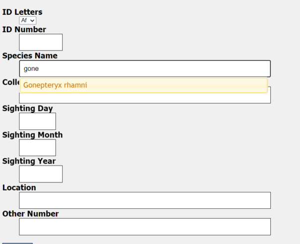
Data entry page with data entry points listed and a photo for transcription
All of these fields have validation that restricts what data can be entered and some of them (Species Name, Collectors Name, Location) have an autocorrect feature. This kicks in after 4 correct characters in a row that correspond exactly to one of the possible entries for that field. This helps the public get the spelling correct and speeds up the process of entering in data. Having the autocorrect come up after 4 correct characters also deters spam data entries, at the member of the public can only submit an entry if it passes all 4 required validation points.
Screenshot of a data entry point showing an autofill suggestion for a species that could be entered.
Once the data is entered correctly and submit is pressed a loading screen will appear, this loading screen will stay on until an animation corresponding with the type of Lepidoptera is shown on the interactive wall.
This interactive wall uses an ultra short throw projector to front project Lepidoptera onto a wall in gallery. The nature of this projector means that it is hard for people to cast shadows on the wall as the projector is mounted very close to the wall. As we were not able to rear project, this is the next best setup for this projection that also achieves an image over 3 and a half metres wide, which gives a good area for interaction.
There is a Kinect Azure mounted away from the wall which gets a depth image of everything in shot. This depth image is used to detect motion in front of the wall which in turn is used to affect butterflies in the area around where the motion is made. More Lepidoptera build up on the projection every time an entry is made in a day.
How it Works: The Nerd Version
The interactive runs on two systems with one system referencing the other. The data entry system is a Python Flask Server, which runs on Apache and can be run on a Windows PC or a Linux server. Though the server version I am yet to run in gallery due to some compatibility improvements and an inability to sort terms and conditions for this exhibition as of typing.
The server serves the client the data entry form with a randomly chosen image for transcription alongside it, the data inputed for each entry is saved to a timestamped json file. This file contains all the data fields as well as the filename for the image, meaning that all the data can be linked and sorted through afterwards in order to upload to our database. The server also updates a file that shows the latest species that has been entered, this is used by the Interactive Wall’s system to trigger animations.
The interactive wall runs on a Touchdesigner project that I created that uses a Kinect Azure to see people and know where to apply movement to the Lepidoptera in the projection. Touchdesigner is a real time visual development platform that allows you to create interactive installations, it’s a node based programming environment that allows interactives like this to be created in good time. Touchdesigner uses a particle system(particleGPU) that uses 3 videos, one for butterflies, moths and extinct species. These videos are then put on 2d planes that move and rotate in 3d space, these are the ‘particles’. These particles are affected by optical flow, which is generated by Touchdesigner analysing motion in the depth image, areas in which it believes there are motion are then used on the particleGPU video to move the particles in the affected areas.
2d Planes without Lepidoptera2d planes with Lepidoptera
For the entry animations that play when an entry is made by the public there are 3 videos that play, again one for butterflies, moths and extinct species. Touchdesigner overlays these videos onto the particleGPU output when the Flask Server signals it’s had a new entry, Touchdesigner will then check which animation should be played to make sure it corresponds with the relevant Lepidoptera. This process works however it is not instantaneous and It’s one of the elements of this interactive I wish to improve for future use.
What’s next?
As of typing, the exhibition is yet to finish, I am hoping to add some improvements to the interactive before it’s derigged as having it in gallery would be a good test bench to make solid changes. These changes include:
Reworked css to improve compatibility on smartphones
Have the linux version up and running on our server so the public can enter data on their devices
Decrease the latency between both systems by taking a different approach for their communication
Add analytics to the Touchdesigner project so we can gather data
As of typing we have over 1500 entries from the public, which should enable us to have hundreds of these Lepidoptera catalogued, which is fantastic news for us! I think this interactive has big potential for other museums and I’m hoping that I can provide versions of this to other sites in future.
Currently it’s planned that this interactive will be returning in a permanent installation, so I plan to add these additional changes for this. I will post a second blog on labs once I’ve done some upgrades and analysed the data we have gathered from this exhibition.
Special thanks to Bristol Museums Development Trust and the ‘Think Global: Act Bristol’ exhibition for making this all possible.
My name is Caroline
James and I am currently in my fourth week of my Digital Marketing
Apprenticeship with Bristol Museums.
I am originally from Luton and moved to the South West in 2013 when I was 18 years old to do my degree in Diagnostic Radiography, at the University of Exeter. I loved the South West so much I didn’t want to leave! So once I finished my degree and became a qualified radiographer, I moved to Bristol in 2016 and worked at Southmead Hospital. Although I absolutely loved going to university and had an interesting experience working for the NHS, after being a healthcare worker for three years, I realised it was no longer for me and wanted to have a career change. I wanted to do something more creative and have been interested in digital marketing for a long time.
I thought an
apprenticeship was a good route for me as I wanted to learn new skills and use
them in a real life setting. So I went on the government website and found this
apprenticeship at the museum, and thought it looked great!
I feel extremely privileged to have got this apprenticeship and I am already learning so much. I loved visiting Bristol Museum and Art Gallery and M Shed even before I moved to Bristol, so it is incredibly fulfilling to be doing digital marketing for institutions I really care about.
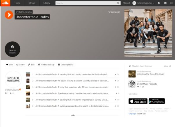
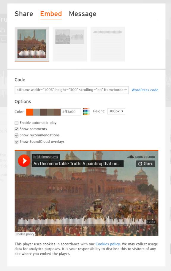
So far I have helped with the launch of a project entitled “Uncomfortable Truths”. This is where a group of BAME students and alumni came together to create podcasts where they discussed their interpretation of certain objects within the museum that have an uncomfortable and controversial side to them – this includes how they were collected and what they represent.
I helped with creating a webpage presenting the project, the podcasts and its creators using WordPress. I helped upload the podcasts onto Soundcloud, and then took the WordPress code generated for each podcast and uploaded it to the webpage. I also assisted with the design of an information leaflet for the launch using a website called Canva.
The launch itself
went incredibly well and it was very interesting. I hope more podcasts
discussing the complex cultural and colonial histories behind objects within
the museum are created.
Additionally, I’ve
been helping with the social media campaigns for the museum shop products using
Hootsuite. I look forward to updating the blogs on the museum website and
producing email newsletters in the near future.
Furthermore, I get to help with the creation and the promotion of the “Stories” on the Bristol Museums website, which go in depth about black history in Bristol.
I expect there will be many more projects and assignments that I will get to be a part of as a member of the Digital Team that will assist with my understanding of digital marketing. Furthermore, I am incredibly excited about the qualification I will be gaining from this apprenticeship and look forward to learning about the fundamentals of digital marketing such as Google Analytics and SEO. It has only been a few weeks but I am already realising what an amazing place it is to work with many teams of incredibly skilled people working together. There are so many opportunities to learn and I cannot wait to gain more skills over the next two years.
This post is about my recent week of reducing screen time to a minimum after seeking a fresh approach, having lost the plot deep in some troublesome code, overloaded with an email avalanche and pestered by projects going stale. In other words…have you tried turning it off? (and not on again!)
STEP 1: TURN OFF PC
Guys this is what a computer looks like when it is off
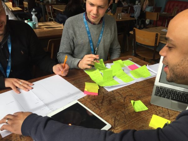
Kinda feels better already. No more spinning cogs, no more broken code, brain starting to think in more creative ways, generally mind feeling lighter. Trip to the stationary cupboard to stock up on Post-its and sticky things, on way speak to a colleague whom I wouldn’t usually encounter and gain an insight into the user facing end of a project I am currently working on (I try to make a mental note of that).
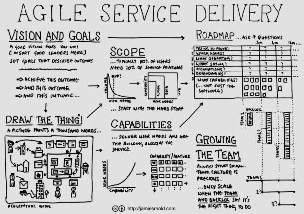
STEP 2: RECAP ON AGILE METHODS
a great diagram about agile processes by Jamie Arnold
(admittedly you do need to turn the computer back on from here onwards, but you get the idea!)
The team here have just completed SCRUM training and we are tasked with scratching our heads over how to translate this to our own working practices. I was particularly inspired by this diagram and blog by Jamie Arnold from G.D.S. explaining how to run projects in an agile way. I am especially prone to wanting to see things in diagrams, and this tends to be suppressed by too much screen time 🙁
“a picture paints a thousand words.”
Also for projects that are stalled or for whatever reason on the backburner – a recap (or even retrospective creation) on the vision and goals can help you remember why they were once on the agenda in the first place, or if they still should be.
STEP 3: FOCUS ON USER NEEDS
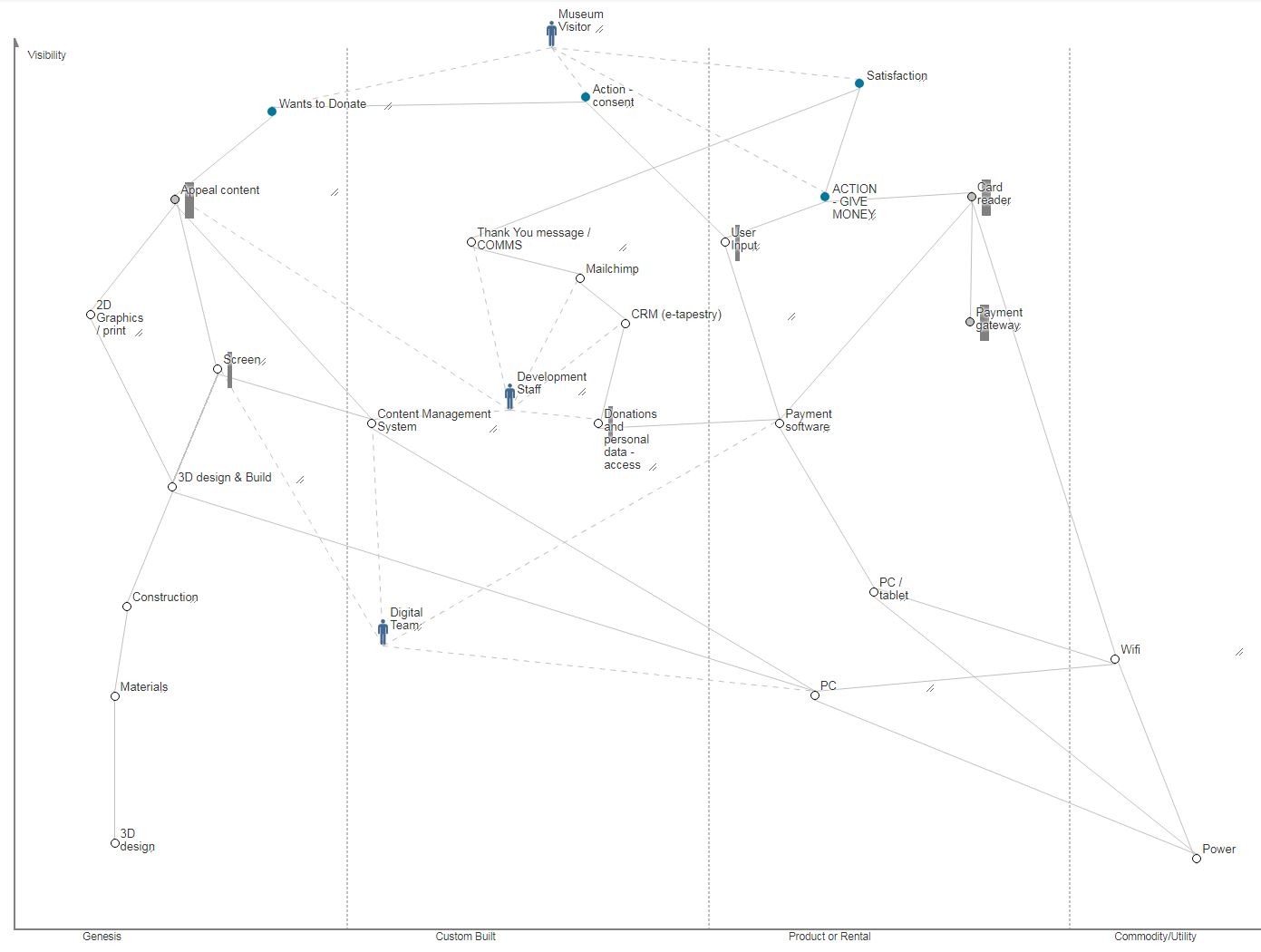
It is actually much easier to concentrate on user needs with the computers switched off. Particularly in the museum where immediately outside the office are a tonne of visitors getting on with their lives, interacting with our products and services, for better or worse. Since several of our projects involve large scale transformation of museum technology, mapping out how the user need is acheived from the range of possible technologies is useful. This post on mapping out the value chain explaines one method.
Mapping the value chain for donation technology
Whilst the resulting spider-web can be intimidating, it certainly helped identify some key dependencies like power and wifi (often overlooked in musuem projects but then causing serious headaches down the line) as well as where extra resource would be needed in developing new services and designs that don’t yet come ‘off the shelf’.
STEP 4: DISCOVERING PRODUCT DISCOVERY
There is almost always one, or more like three of our projects in the discovery phase at any one time, and this video form Teresa Torres on product discovery explains how to take the focus away from features and think more about outcomes, but also how to join the two in a methodical way – testing many solutions at once to analyse different ways of doing things.
We are a small multidisciplinary team, and in that I mean we each need to take on several disciplines at once, from user research, data analysis, coding, system admin, content editing, online shop order fulfilment (yes you heard that right) etc. However, it is always interesting to hear from those who can concentrate on a single line of work. With resources stretched we can waste time going down the wrong route, but we can and do collaborate with others to experiment on new solutions. Our ongoing “student as producer” projects with the University of Bristol have been a great way for us to get insights in this way at low risk whilst helping to upskill a new generation.
STEP 5: GAMIFY THE PROBLEM
Some of the hardest problems are those involving potential conflict between internal teams. These are easier to ignore than fix and therefore won’t get fixed by business as usual, they just linger and manifest, continuing to cause frustration.
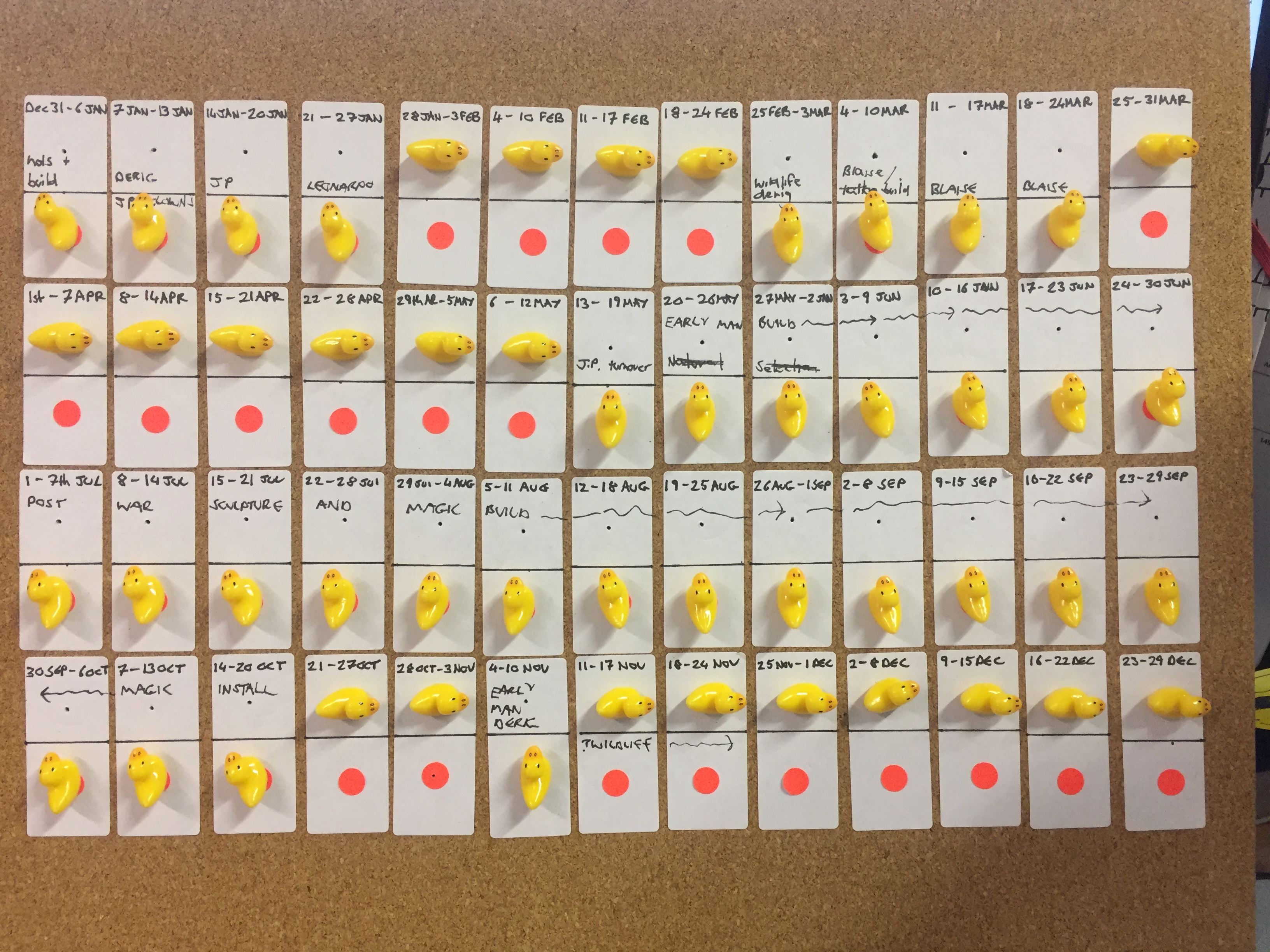
Matt Locke explained it elegantly in MCG’s Museums+Tech 2018: the collaborative museum. And this got me thinking about how to attempt to align project teams that run on totally different rhythms and technologies. Last week I probably would have tried to build something in Excel or web-based tech that visualised resources over time, but no, not this week….this week I decided to use ducks!
Shooting ducks on a pinboard turned out to be a much easier way to negotiate resources and was quicker to prototype than any amount of coffee and coding (its also much easier to support 😉 ). It was also clear that Google sheets or project charts weren’t going to cut it for this particular combination of teams because each had its own way of doing things.
“Shoot the duck”: Blocking out 52 weeks in a year to barter with resources across teams
The challenge was to see how many weeks in a year would be available after a team had been booked for known projects. The gap analysis can be done at a glance – we can now discuss the blocks of free time for potential projects and barter for ducks, which is more fun than email crossfire. The problem has now become a physical puzzle where the negative space (illustrated by red dots) is much more apparent than it was by cross-referencing data squares vs calendars. Its also taken out the underlying agendas across departments and helped us all focus on the problem by playing the same game – helping to synchronise our internal rhythms.
REMARKS
It may have come as a surprise for colleagues to see their digital people switch off and reach for analogue tools, kick back with a pen and paper and start sketching or shooting ducks, but to be honest its been one of the most productive weeks in recent times, and we have new ideas about old problems.
Yes, many bugs still linger in the code, but rather than hunting every last one to extinction, with the benefit of a wider awareness of the needs of our users and teams, maybe we just switch things off and concentrate on building what people actually want?
Hi! My name is Cameron Hill and I am currently working as a Digital Apprentice as part of
Cameron Hill
the Bristol City Council Culture Team, where I’ll mainly be based at Bristol Museum and helping out with all things digital.
Previously to joining Bristol City Council, I studied Creative Media at SGS College for two years as well as at school for GCSE. A huge interest of mine is social media. Whilst at college I worked with a friend who was a fashion student who sold her creations to create more of a brand for herself. After she came up with the name, I created an Instagram page for the brand and started creating various types of content. Using Instagram stories was a great way to interact with followers. Using different features such as Q&A and polls, it was easy to see what the customers like. Something else we did with stories was showing the ‘behind the scenes’. For example: from picking the fabric, making the item itself and packing the item to be shipped.
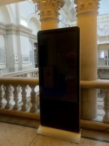
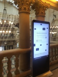
As I am writing this it is my first day and so far it has been a lot to take in. One of my first tasks was to upload an image to a folder linked to the various screens around the museum.
Digital signage not working
Although technology can be temperamental, the first issue we came across was unexpected….
Using my iPhone, I was asked to take an image to upload into the folder but without me realising the phone camera had ‘live photos’ turned on meaning all pictures taken would create small video clips. After waiting for five minutes or so and the image not appearing we realised that the image was taken in High-Efficiency Image File Format (HEIC). Not knowing what HEIC was I did what anyone in the twenty-first century would do and took to Google.
After a little research, I came across an article in a technology magazine, The Verge stating that this format that Apple has added to iOS 11 would be a problem for PC users. From reading various articles online it is clear that a lot of people have struggled
when trying to upload their files to PCs and not being able to view and edit it. I am really looking forward to my future working here as part of the Digital Team.
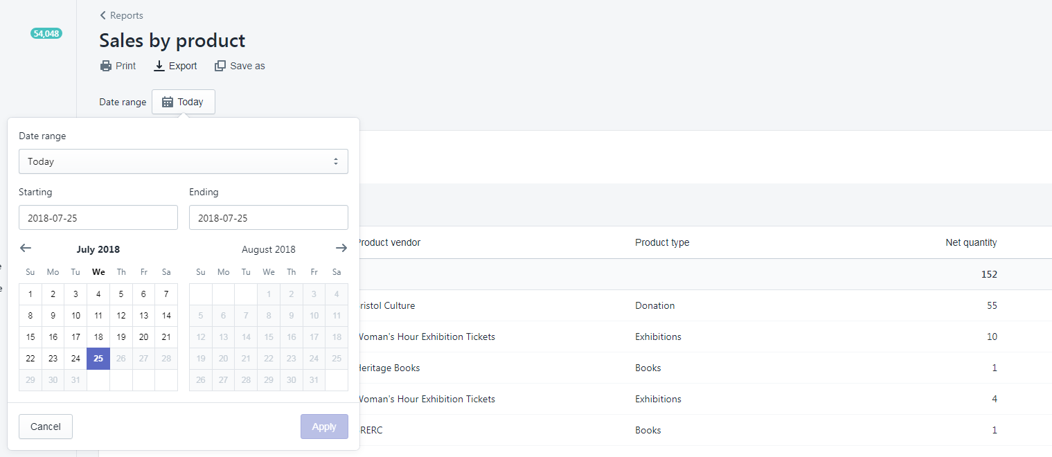
In team digital we like to make things look easy, and in doing so we hope to make life easier for people. A recent challenge has been how to recreate the Top sales by product analysis from the Shopify web application in Google Docs to see how the top 10 selling products compare month by month. The task of creating a monthly breakdown of product sales had up until now been a manual task of choosing from a date picker, exporting data, copying to google sheets, etc.
Having already had some success pushing and pulling data to google sheets using google apps script and our Culture Data platform, we decided to automate the process. The goal was to simplify the procedure of getting the sales analysis into Google docs to make it as easy as possible for the user – all they should need to do would be to select the month they wish to import.
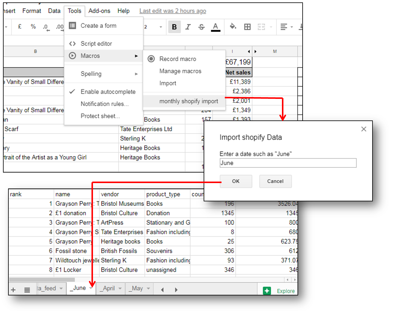
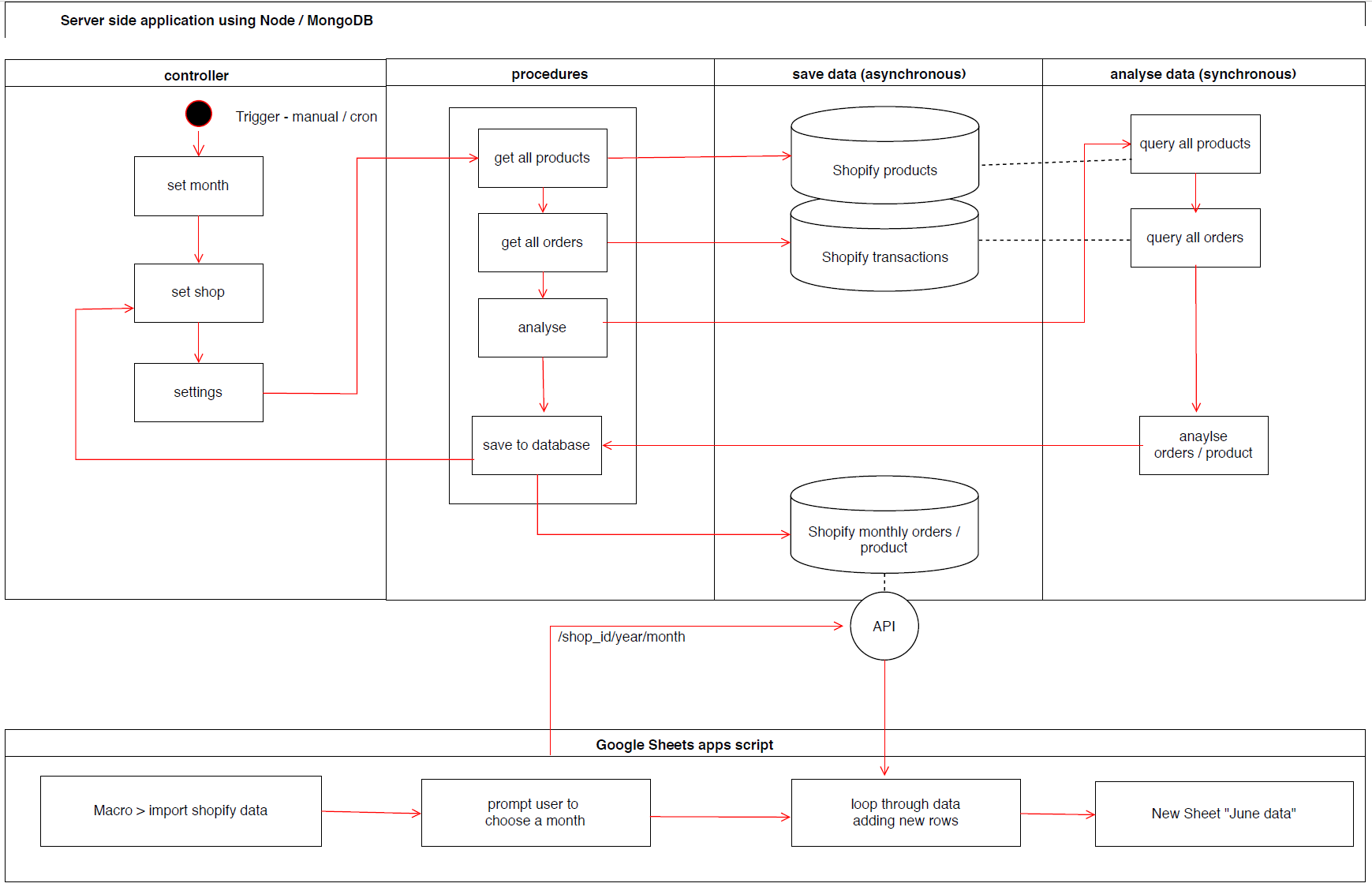
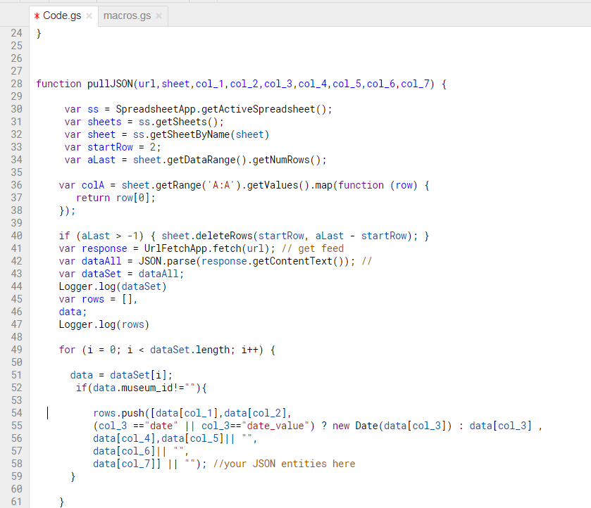
We have developed a set of scripts for extracting data using the Shopify API, but needed to decide how to get the data into Google Sheets. Whilst there is a library for pushing data from a node application into a worksheet, our trials found it to be slow and prone to issues where the sheet did not have enough rows or other unforeseen circumstances. Instead, we performed our monthly analysis on the node server and saved this to a local database. we then built an api for that database that could be queried by shop and by month.
The next step, using google script was to query the api and pull in a month’s worth of data, then save this to a new sheet by month name. This could then be set added as a macro so that it was accessible in the toolbar for the user in a familiar place for them, at their command.
As the data is required on a monthly basis, we need to schedule the server side analysis to save a new batch of data after each month – something we can easily achieve with a cron job. The diagram below shows roughly how the prototype works from the server side and google sheets side. Interestingly, the figures don’t completely match up to the in-application analysis by Shopify, so we have some error checking to do, however we now have the power to enhance the default analysis with our own calculations, for example incorporating the cost of goods into the equation to work out the overall profitability of each product line.
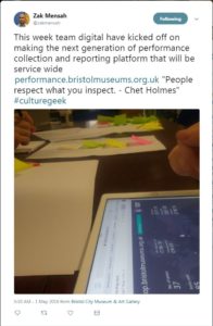
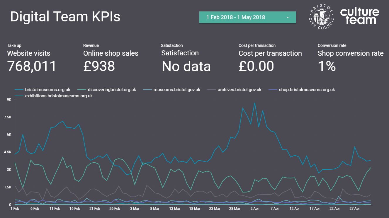
There are various versions of a common saying that ‘if you don’t measure it you can’t manage it’. See Zak Mensah’s (Head of Transformation at Bristol Culture) tweet below. As we’ll explain below we’re doing a good job of collecting a significant amount of Key Performance Indicator data; however, there remain areas of our service that don’t have KPIs and are not being ‘inspected’ (which usually means they’re not being celebrated). This blog is about our recent sprint to improve how we do KPI data collection and reporting.
The most public face of Bristol Culture is the five museums we run (including Bristol Museum & Art Gallery and M Shed), but the service is much more than its museums. Our teams include, among others; the arts and events team (who are responsible the annual Harbour Festival as well as the Cultural Investment Programme which funds over 100 local arts and cultural organisations in Bristol); Bristol Archives; the Modern Records Office; Bristol Film Office and the Bristol Regional Environmental Recording Centre who are responsible for wildlife and geological data for the region.
Like most organisations we have KPIs and other performance data that we need to collect every year in order to meet funding requirements e.g. the ACE NPO Annual Return. We also collect lots of performance data which goes beyond this, but we don’t necessarily have a joined up picture of how each team is performing and how we are performing as a whole service.
Why KPIs?
The first thing to say is that they’re not a cynical tool to catch out teams for poor performance. The operative word in KPI is ‘indicator’; the data should be a litmus test of overall performance. The second thing is that KPIs should not be viewed in a vacuum. They make sense only in a given context; typically comparing KPIs month by month, quarter by quarter, etc. to track growth or to look for patterns over time such as busy periods.
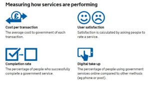
A great resource we’ve been using for a few years is the Service Manual produced by the Government Digital Service (GDS) https://www.gov.uk/service-manual. They provide really focused advice on performance data. Under the heading ‘what to measure’, the service manual specifies four mandatory metrics to understand how a service is performing:
cost per transaction– how much it costs … each time someone completes the task your service provides
user satisfaction– what percentage of users are satisfied with their experience of using your service
completion rate– what percentage of transactions users successfully complete
digital take-up– what percentage of users choose … digital services to complete their task
Added to this, the service manual advises that:
You must collect data for the 4 mandatory key performance indicators (KPIs), but you’ll also need your own KPIs to fully understand whether your service is working for users and communicate its performance to your organisation.
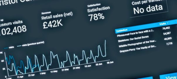
Up until this week we were collecting the data for the mandatory KPIs but they have been somewhat buried in very large excel spreadsheets or in different locations. For example our satisfaction data lives on a surveymonkey dashboard. Of course, spreadsheets have their place, but to get more of our colleagues in the service taking an interest in our KPI data we need to present it in a way they can understand more intuitively. Again, not wanting to reinvent the wheel, we turned to the GDS to see what they were doing. The service dashboard they publish online has two headline KPI figures followed below with a list of the departments which you can click into to see KPIs at a department level.
Achieving a new KPI dashboard
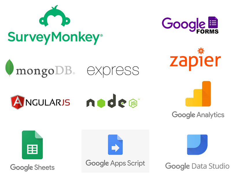
As a general rule, we prefer to use open source and openly available tools to do our work, and this means not being locked into any single product. This also allows us to be more modular in our approach to data, giving us the ability to switch tools or upgrade various elements without affecting the whole system. When it comes to analysing data across platforms, the challenge is how to get the data from the point of data capture to the analysis and presentation tech – and when to automate vs doing manual data manipulations. Having spent the last year shifting away from using Excel as a data store and moving our main KPIs to an online database, we now have a system which can integrate with Google Sheets in various ways to extract and aggregate the raw data into meaningful metrics. Here’s a quick summary of the various integrations involved:
Data capture from staff using online forms: Staff across the service are required to log performance data, at their desks, and on the move via tablets over wifi. Our online performance data system provides customised data entry forms for specific figures such as exhibition visits. These forms also capture metadata around the figures such as who logged the figure and any comments about it – this is useful when we come to test and inspect any anomalies. We’ve also overcome the risk of saving raw data in spreadsheets, and the bottleneck often caused when two people need to log data at the same time on the same spreadsheet.
Data capture directly from visitors: A while back we moved to online, self-completed visitor surveys using SurveyMonkey and these prompt visitors to rate their satisfaction. We wanted the daily % of satisfied feedback entries to make its way to our dashboard, and to be aggregated (both combined with data across sites and then condensed into a single representative figure). This proved subtly challenging and had the whole team scratching our heads at various points thinking about whether an average of averages actually meant something, and furthermore how this could be filtered by a date range, if at all.
Google Analytics: Quietly ticking away in the background of all our websites.
Google sheets as a place to join and validate data: It is a piece of cake to suck up data from Google Sheets into Data Studio, provided it’s in the right format. We needed to use a few tricks to bring data into Google Sheets, however, including Zapier, Google Apps Script, and sheets Add-ons.
Zapier: gives us the power to integrate visitor satisfaction from SurveyMonkey into Google Sheets.
Google apps script: We use this to query the API on our data platform and then perform some extra calculations such as working out conversion rates of exhibition visits vs museum visits. We also really like the record macro feature which we can use to automate any calculations after bringing in the data. Technically it is possible to push or pull data into Google Sheets – we opted for a pull because this gives us control via Google Sheets rather than waiting for a scheduled push from the data server.
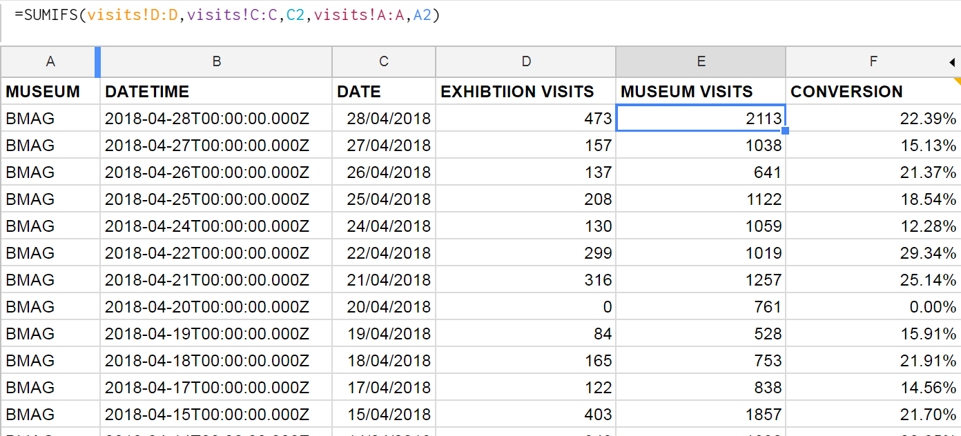
Google Sheets formulae: We can join museum visits and exhibition visits in one sheet by using the SUMIFS function, and then use this to work out a daily conversion rate. This can then be aggregated in Data Studio to get an overall conversion rate, filtered by date.
Sheets Add-Ons: We found a nifty add-on for integrating sheets with Google Analytics. Whilst it’s fairly simple to connect Analytics to Data Studio, we wanted to combine the stats across our various websites, and so we needed a preliminary data ‘munging’ stage first.
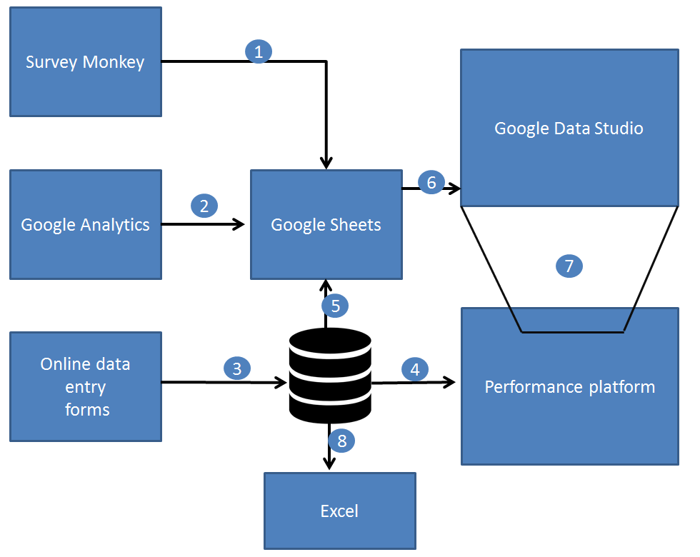
Joining the dots…
1.) Zapier pushes the satisfaction score from SurveyMonkey to Sheets.
2.) A Google Sheets Add On pulls in Google Analytics data into Sheets, combining figures across many websites in one place.
3.) Online data forms save data directly to a web database (MongoDB).
4.) The performance platform displays raw and aggregated data to staff using ChartJS.
5.) Google Apps Script pulls in performance data to Google Sheets.
6.) Gooogle Data Studio brings in data from Google Sheets, and provides both aggregation and calculated fields.
7.) The dashboard can be embedded back into other websites including our performance platform via an iframe.
8.) Good old Excel and some VBA programming can harness data from the performance platform.
Technologies involved in gathering and analysing performance data across museums.
Data Studio
We’ve been testing out Google Data Studio over the last few months to get a feel for how it might work for us. It’s definitely the cleanest way to visualise our KPIs, even if what’s going on behind the scenes isn’t quite as simple as it looks on the outside.
There are a number of integrations for Data Studio, including lots of third party ones, but so far we’ve found Google’s own Sheets and Analytics integrations cover us for everything we need. Within Data Studio you’re somewhat limited to what you can do in terms of manipulating or ‘munging’ the data (there’s been a lot of munging talk this week), and we’re finding the balance between how much we want Sheets to do and how much we want Data Studio to do.
At the beginning of the sprint we set about looking at Bristol Culture’s structure and listing five KPIs each for 1.) the service as a whole; 2.) the 3 ‘departments’ (Collections, Engagement and Transformation) and 3.) each team underneath them. We then listed what the data for each of the KPIs for each team would be. Our five KPIs are:
Take up
Revenue
Satisfaction
Cost per transaction
Conversion rate
Each team won’t necessarily have all five KPIs but actually the data we already collect covers most of these for all teams.
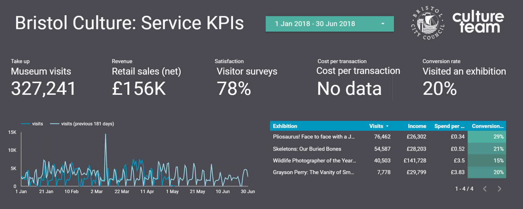
Using this structure we can then create a Data Studio report for each team, department and the service as a whole. So far we’ve cracked the service-wide dashboard and have made a start on department and team-level dashboards, which *should* mean we can roll out in a more seamless way. Although those could be famous last words, couldn’t they?
Any questions, let us know.
Darren Roberts (User Researcher), Mark Pajak (Head of Digital) & Fay Curtis (User Researcher)
Here at the M Shed in Bristol, we have amazing views of the harbor from our lovely events suit. Here we hold all sorts of events from large annual AGMs for corporations’, to weddings and some really great community events.
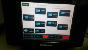
We have a fully automated integrated audio visual system. With AMX and Creston control systems, you can walk around the function rooms holding a smart, touch screen control panel and control just about everything! You can power up the projectors, lower the screens, open and shut the blinds, control volumes, select what to display from Sky TV, Blu-ray players and laptops, you can even change the lighting to any colour scheme you want.
It’s all pretty smart. Pretty smart apart from the dreaded Video Graphics Array as the main interface, more commonly referred to as the VGA connector! For all this advanced technology, presenters still have to connect their devices with a cable.
The VGA standard was invented in 1987 by IBM, and its dreaded 15 pin D Sub connector still to this day refuses to go away.
Until now…
There’s something amiss when a presenter asks to use their nice, brand new iPad to run their presentation and you then have to use a lighting port to VGA adapter connected to 10 meter VGA cable. These VGA connectors were designed for permanent installation and so when they are swapped between laptop and other devices several times a day, the 15 tiny pins take a battering and it only takes one bent pin for the screen to go pink, blue or stop all together.
Here comes the ingenious solution to take advantage of the wireless / Wi-Fi capabilities that are now standard for all devices.
The idea and solution comes in the form of finding a combination of ready available, off the shelf technology combined in such a way it allows the transmission of a device’s screen to appear on our projection system, without any wires. We needed this to be augmented into our current system without affecting its current capabilities. It is already a great intergraded AV system, it’s just needs to be brought into the future without losing its ability to use the old VGA system. It may be old but it works so well as a last resort and backup.
Apple products long ago ditched the VGA system in favour of min-display ports or “lighting ports”. A quick trip to any Apple store and an assistant will enthusiastically show how with a flick of the devices, a display can be “thrown” to another screen. It’s called Air Play and is Apple’s secure version of Wi-Fi streaming.
Google, with their ever innovative developments, have developed a technology called Chrome Cast to the same effect, which is also based on Wi-Fi streaming.
With delegates at our events bringing Apple products, PCs and android devices, we needed an all in one system; so purchased these products to enable this streaming. I ordered an Apple TV and a Chrome Cast device which both work by connecting to a Wi-Fi network and looking for compatible devices. Both of these provide a solution for all devices. Chrome Cast is much cheaper than Apple TV and can support Apple products too, but the ease of use and reliability of Apple on Apple products seemed worth the extra investment. I calculated the cost of replacement VGA cables and at the current rate we replace them, these new items would pay for themselves in just three years!
The main issue I faced in integrating these was how to patch them into a fully automated, closed AV system without affecting its capabilities. In essence, how to “retrofit” an Apple TV and Chrome Cast and get the systems to talk over M Shed’s Wi-Fi – a public network, effectively part of the councils IT network and heavily locked down.
To solve the first issue, I had to literally climb into the AV racking system to find a suitable part that interfaced with an HDMI connector (both Chrome Cast and Apple TV use HDMI). I chose our SKY TV box and unplugged its HDMI cable. Onto this cable I place a HDMI switcher, which allows 4 inputs to connect as one. The switcher is the sort of device you would buy if your TV at home only has one HDMI port and you had multiple devices you wanted to connect: a DVD player, games console and a Freeview box. I then connected the Sky box to the switcher along with the Apple TV and Chrome Cast unit. Then after finding power outlets, whilst still inside the AV systems rack, I carefully slid the switcher unit so its control switch faced out the front of the rack. A few cables ties and some Velcro later and the hardware was installed, all that was left to do was to climb out and check it all worked.
Going back to the Creston AV touch panel, I selected Sky TV and sure enough it appeared on the projections screen as it should. Then by using the controls on the switcher unit I was able to toggle between Sky, Apple TV and Chrome Cast.
It then occurred to me that both the Apple and Chrome devices use the HDMI to output their audio too. However the HDMI feeds to the projector which only projects the image, so audio would be lost. Climbing back into the AV rack, I noticed that the Sky box was using analog RCA connectors to output its audio to integrated ceiling speaker system. Fortunately the switcher also had 3.5mm TRS output (headphone socket), so by setting the Sky box to output audio through its HMDI it meant that all three devices were now feeding the audio and visual signal to the switcher. Then by using the RCA connector from the Sky box with the TRS adapter, all three devices were now feeding to the ceiling speaker system. I climbed back out of the rack and started to create a new, independent Wi-Fi network for devices to communicate.
The new Wi-Fi network was actually the simpler part.
I purchased an ASUS RT-AC3200 Tri-Band Giga-Bit Wi-Fi router. This router is enormous with six aerials and looks like the Batmobile. I figured that it would have to be reliable and be able to cope with large amount of data traffic, so I got the most powerful but cost effective router I could find.
The idea behind the router was to have all the devices (Apple TV, Chrome Cast and whichever device is streaming) all on the same network, a network I could manage. Once on the same network, it was a matter of connecting. The Apple system was really straight forward- you join the same Wi-Fi network as the Apple TV (I named the network “presentations”) then chose the Airplay option on the device and as easy as that the screen is mirrored on the projector. The Chrome set up was a little more involved. With an android device, you have to install an app called Chrome Cast. Once installed it’s quite straight forward to pair with the Chrome Cast receiver and then the screen can be mirrored on the projector. With a Windows PC laptop, I had to install the latest version of Chrome. This then comes with the option to cast either just the browser tab you’re using or the whole desktop -this works well but compared to the Apple TV there is a slight lag. In some instances you would have to install the Chrome Cast extension for Chrome.
I also connected the Wi-Fi router to our open Wi-Fi system with a RJ45 cable. This then allowed people on the Presentation Wi-Fi to still be able to access the net.
We are still trialing the system before we start to officially offer it as part of a package, but so far so good. It has been received very positively from users. We’ve had people walking around with iPads – controlling their presentation and not being tied to the lectern with an old pc. We’ve even had the best man at a wedding wirelessly control the music playlist from his iPhone at the top table! PCs are still being used at the lectern as normal but without the need to trail VGA cable everywhere. The only thing left to work out is wireless power… I suppose batteries will have to do for now.
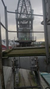
Here at M Shed Bristol, we have some great working exhibits from the bygone era of Bristol Harbour’s industrial past: steam engines, steam boats, steam cranes and more. But the most recognisable and iconic are the four great towering electric cranes standing over 120 feet above the old docks.
As the Industrial Museum was being transformed into the present day M Shed Museum two of the cranes would strike up conversations with each other, entertaining and informing passers-by of what they could look forward to seeing inside the new museum. However due to renovations and movement of the
cranes they fell silent again…
A few years later, due to popular demand I was tasked with bringing the cranes back to life!
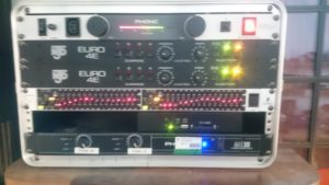
To get these cranes talking was going to require rebuilding the whole audio and lighting system and recording new scripts. We were fortunate enough to have Alex Rankin, from our M Shed team, lend his penning abilities for the new scripts and Jacqui and Heather to voice the new crane characters.
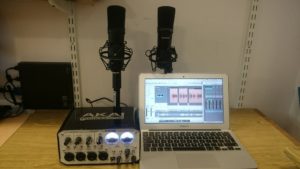
To record the dialogue, we arranged to meet in a nice quite corner of the L Shed store room. It’s a vast store, full of so many objects that there isn’t enough space to have them on permanent display. With both Jacqui and Heather sat at opposite ends of a table, I set up a pair of good quality condenser microphones. Each plugged into their own separate channel on my external sound card, an Akai EIE 4 channel usb sound card with great preamps and phantom powered for the mics. This in turn was hooked up to my MacBook and copy of Logic Pro. I recorded through each script a few times and was able to compile a seamless recording from the various takes. Once finished, I hard panned each channel left and right so that when each voice played back each would have its own speaker, left or right – crane 1 or crane 2.
To start building the new AV system, I searched around the vast L-Shed stores and work rooms to find what was left of the old system. I then decided what could be re used and what new equipment would be needed. I had been informed, by our volunteer team for the working exhibits, that everything had been removed from the cranes themselves; this meant starting from scratch.
The cranes themselves would need a loud speaker system for the voices and the crane cabs would need different coloured lights to flash in time with the talking as this helps to animate the cranes. That part was relatively easy. It meant scaling the cranes and bolting speakers to their underside and mounting lamps inside the cabs. I’ll be honest, I was helped by the Volunteer team and a huge mobile diesel powered cherry picker!
The hard part was how to feed the power and audio cables to the cranes. After some investigation it turned out that below the surface of the dockside was a network of underground pipes which lead to the base of each crane to feed their power. The great volunteer team once again worked miracles and fed over 600 combined meters of audio and lighting cables for me. This all led back to the clean room in their ground floor workshop. With all the cabling done I just needed to build a lighting control and audio playback system.
My design solution, using what kit I could find and a few new bits, was to use a solid state compact flash media player, graphic equaliser, audio mixing desk and power amplifier for the audio. To have the light flash in time with the dialogue, I used a two light controller with a light to sound module, similar to what a DJ might use to have their disco lights flash to the music!
By having the audio go through the mixing desk, I was able to take an audio feed for each channel and direct them to lighting controllers. By recording the two voices in stereo, with each voice on its own left or right channel, it meant i only needed one media player and could easily control each channel on the sound desk. The graphic equaliser allowed me to tweak the speakers to acoustically fit their environment.
I looked at randomising the audio or having it triggered by people walking past, but with the amount of people who pass outside M Shed the cranes would be chatting away, non-stop all day! I decided to create a long audio file of about 3 hours with the different recorded scripts and random intervals of silence. These ranged from 5 minutes to 20 minutes, so it always comes as a surprise when they start talking to each other.
The results are really effective. It is always fun to see people being caught by surprise as the cranes light up and start a conversation and to see them stop and listen in on what they have to say.
*explicit content warning* this post makes reference to APIs.
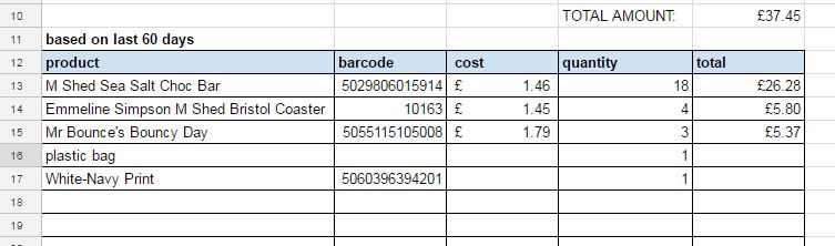
THE PROBLEM: Having set ourselves the challenge of improving the buying process , our task in Team Digital was to figure out where we can do things more efficiently and smartly. Thanks to our implementation of Shopify, we have no shortage of data on sales to help with this, however the process of gathering the required information to place an order of more stock is time consuming – retail staff need to manually copy and paste machine-like product codes, look up supplier details and compile fresh order forms each time, all the while attention is taken away from what really matters, i.e. which products are currently selling, and which are not.
In a nutshell, the problem can be addressed by creating a specific view of our shop data – one that combines the cost of goods, with the inventory quantity (amount of stock left) in a way that factors in a specific period of time and which can be combined with supplier information so we know who to order each top selling product from, without having to look anything up. We were keen to get in to the world of Shopify development and thanks to the handy Shopify developer programme documentation & API help it was fairly painless to get a prototype up and running.
SETTING UP: We first had to understand the difference between public and private apps with Shopify. A private app lets you hard code it to speak to a specific shop, whereas the public apps need to be able to authenticate on the fly to any shop. With this we felt a private app was the way to go, at least until we know it works!
Following this and armed with the various passwords and keys needed to programmatically interact with our store, the next step was to find a way to develop a query to give us the data we need, and then to automate the process and present it in a meaningful way. By default Shopify provides its data as JSON, which is nice, if you are a computer.
TECHNICAL DETAILS: We set up a cron job on an AWS virtual machine running Node and MongoDB. Using the MEAN stack framework and some open source libraries to integrate with Google Sheets, and notably to handle asynchronous processes in a tidy way. If you’d like to explore the code – that’s all here. In addition to scheduled tasks we also built an AngularJS web client which allows staff to run reports manually and to change some settings.
Which translates as:In order to process the data automatically, we needed a database and computer setup that would allow us to talk to Shopify and Google Docs, and to run at a set time each day without human intervention.
The way that Shopify works means we couldn’t develop a single query to do the job in one go as you might in SQL (traditional database language). Also, there are limitations in how many times you can query the store. What emerged from our testing was a series of steps, and an algorithm which did multiple data extractions and recombination’s, which I’ll attempt to describe here. P.S. do shout if there is an easier way to do this ;).
STEP 1: Get a list of all products in the store. We’ll need these to know which supplier each product comes from, and the product types might help in further analysis.
STEP 2: Combine results of step one with the cost of goods. This information lives in a separate app and needs to be imported from a csv file. We’ll need this when we come to build our supplier order form.
STEP 3: Get a list of all orders within a certain period. This bit is the crucial factor in understanding what is currently selling. Whilst we do this, we’ll add in the data from the steps above so we can generate a table with all the information we need to make an order.
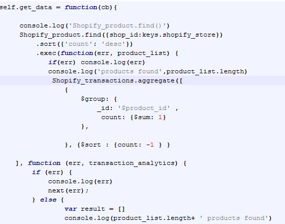
STEP 4: Count how many sales of each product type have taken place. This converts our list of individual transactions into a list of products with a count of sales. This uses the MongoDB aggregation pipeline and is what turns our raw data into something more meaningful. It looks a bit like this, (just so you know):
STEP 5: Add the data to a Google Sheet. What luck there is some open source code which we can use to hook our Shopify data up to Google. There are a few steps needed in order for the Google sheet to talk to our data – we basically have our server act as a Google user and share editing access with him, or her?. And while we are beginning to personify this system, we are calling it ‘Stockify’, the latest member of Team Digital, however Zak prefers the lofty moniker Dave.
The result is a table of top selling products in the last x number of days, with x being a variable we can control. The whole process takes quite a few minutes, especially if x >60, and this is due to limitations with each integration – you can only add a new line to a Google sheet once / second, and there are over 500 lines. The great thing about our app is that he/she doesn’t mind working at night or early in the morning, and on weekends or at other times when retail managers probably shouldn’t be looking at sales stats, but probably are. With Stockify/Dave scheduled for 7am each morning we know that when staff look at the data to do the ordering it will be an up to date assessment of the last 60 days’ worth of sales.
We now have the following columns in our Google Sheet, some have come directly from their corresponding Shopify table, whereas some have been calculated on the fly to give us a unique view of our data and on we can gain new insights from.
product_type: (from the product table)
variant_i:d (one product can have many variants)
price: (from the product table)
cost_of_goods: (imported from a csv)
order_cost: (cost_of_goods * amount sold)
sales_value: (price * amount sold)
name: (from the product table)
amount sold: (transaction table compared to product table / time)
inventory_quantity: (from the product table)
order_status: (if inventory_quantity < amount sold /time)
barcode: (from the product table)
sku: (from the product table)
vendor: (from the product table)
date_report_ru:n (so we know if the scheduled task failed)
TEST, ITERATE, REFINE: For the first few iterations we failed it on some basic sense checking – not enough data was coming through. This turned out to be because we were running queries faster than the Shopify API would supply the data and transactions were missing. We fixed this with some loopy code, and now we are in the process of tweaking the period of time we wish to analyse – too short and we miss some important items, for example if a popular book hasn’t sold in the last x days, this might not be picked up in the sales report. Also – we need to factor in things like half term, Christmas and other festivals such as Chinese New Year, which Stockify/Dave can’t predict. Yet.
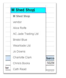
AUTOMATIC ORDER FORMS: To help staff compile the order form we used our latest Google-sheet-fu using a combination of pick lists, named ranges and the query function to lookup all products tagged with a status of “Re-order”
A list of suppliers appears on the order form template:
and then this formula looks up the products for the chosen supplier and populates the order table:
“=QUERY(indirect(“last_60_days”&”!”&”11:685″),”select G where M='”&$B2&”‘ and J=’re-order'”)”
The trick is for our app to check if the quantity sold in the last x days is less than the inventory quantity, in which case it goes on the order form.
NEXT STEPS: Oh we’re not done yet! with each step into automation we take, another possibility appears on the horizon…here’s some questions we’ll be asking our system in the coming weeks..
-How many products have not sold in the last x days?
-If the product type is books, can we order more if the inventory quantity goes below a certain threshold?
Even if a particular product has not sold in the last 60 days, can we flag this product type anyway so it gets added to our automatic order form?
While we are at it, do we need to look up supplier email addresses each time – cant we just have them appear by magic.
…furthermore we need to integrate this data with our CRM…..looks like we will be busy for a while longer.


 Added to this, the service manual advises that:
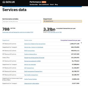

 It’s all pretty smart. Pretty smart apart from the dreaded Video Graphics Array as the main interface, more commonly referred to as the VGA connector! For all this advanced technology, presenters still have to connect their devices with a cable.
 Apple products long ago ditched the VGA system in favour of min-display ports or “lighting ports”. A quick trip to any Apple store and an assistant will enthusiastically show how with a flick of the devices, a display can be “thrown” to another screen. It’s called Air Play and is Apple’s secure version of Wi-Fi streaming.


 purchased an ASUS RT-AC3200 Tri-Band Giga-Bit Wi-Fi router. This router is enormous with six aerials and looks like the Batmobile. I figured that it would have to be reliable and be able to cope with large amount of data traffic, so I got the most powerful but cost effective router I could find.
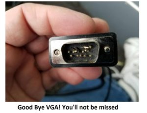

 e, we arranged to meet in a nice quite corner of the L Shed store room. It’s a vast store, full of so many objects that there isn’t enough space to have them on permanent display. With both Jacqui and Heather sat at opposite ends of a table, I set up a pair of good quality condenser microphones. Each plugged into their own separate channel on my external sound card, an Akai EIE 4 channel usb sound card with great preamps and phantom powered for the mics. This in turn was hooked up to my MacBook and copy of Logic Pro. I recorded through each script a few times and was able to compile a seamless recording from the various takes. Once finished, I hard panned each channel left and right so that when each voice played back each would have its own speaker, left or right – crane 1 or crane 2.