Category Archives: Digital services

Google Arts & Culture: an overview…also, what is it?

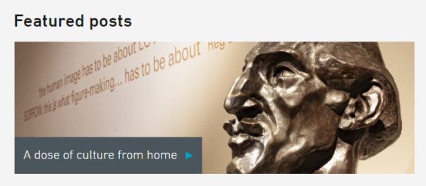
I have been working on the development of the Bristol Museums partner page with Google Arts & Culture for close to two years, and in October it finally went live!

Screenshot of the Bristol Museums Google Arts & Culture partner page. Header image is a painting of the Clifton Suspension Bridge and highlighted are the Online Exhibits.

Some background info about my involvement

I started working on this as a trainee on the Museum Futures programme in January 2020, this was actually one of the first projects that I participated on. Originally designed as a partnership with South West Museum Development , the idea behind it was that we would develop a page for Bristol Museums and then bring this (and the process guides) to smaller museums as a way to support getting their collections online. However, it was mutually decided that this process was more convoluted than anyone first assumed, and that didn’t end up happening.

As of April 2021, I have continued to work on this in my current role as Digital Collections Content Coordinator – a position funded by the Art Fund – as part of a larger project to make our collections accessible online. Thanks Art Fund!

This project has not necessarily gone to plan. We originally aimed to launch at some point in summer 2020. We were then offered to be a part of the Google Arts & Culture Black History Month 2020 campaign if we were ready to launch by that October. While we first worked towards meeting the deadline, we ultimately decided against going ahead with this plan as we had to rush, and we felt that these stories deserved a much longer preparation time than we could give them at that stage. Also, we felt that we didn’t need to be a part of the campaign in order to tell these stories. 

What is Google Arts & Culture?

Google Arts & Culture is still fairly new and unknown territory, and there seem to be a number of (understandable) misconceptions about what its purpose is. Is it social media? Is it an alternative to Collections Online? Is it a blog? Can we signpost to events and the shop?

No, sort of but not really, no and no. 

This doesn’t really sound appealing, does it?

The best comparison we can make is to a Collections Online service, but less extensive. And it’s shared by lots of other organisations. And also other organisations can use our images. (Yikes! But bear with me.)

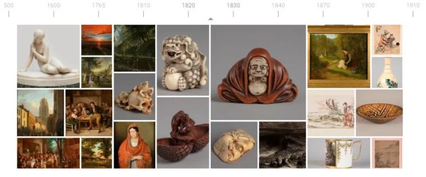
It is described as an online platform through which the public can view high resolution images of objects in museums and galleries. This is accurate, does what it says on the tin. 

You might know Google Arts & Culture from the Art Selfies trend (which I would recommend checking out if you’re not easily offended, as the comparisons are usually NOT KIND) or the chance to zoom in reeeeeally close to Rembrandt’s The Night Watch. These are two of the platform’s jazzy features that haven’t really been seen anywhere before, at least not in the same way. 

Why do we want to use it?

They use incredibly sophisticated software to automatically attach these functions to uploaded content, which is good for us because it means we don’t have to do anything special to get them to work for our objects. By using the highest quality TIFFs that we have for the objects we’ve selected, we can zoom in to brushstroke level on these works and use attention grabbing features like an interactive timeline. 

Image of the interactive timeline on the Bristol Museums Google Arts & Culture page. Date range starting at 500 AD and ending at 1910

I mentioned before that other people can use our images. This sounds like a big no-no, but bear with me (again). 

When creating an exhibition or a story you can use content that you’ve previously uploaded, but you also have the opportunity to use images shared by other organisations. This is often used if an org is creating a story about a specific subject and they don’t have enough content/images to contextualise, they can use images that have been uploaded to the platform previously. As all images already have clear rights acknowledgements and redirect to the partner page they belong to, this does not breach anything nasty. 

The benefit of this is that the reach one image could potentially have is boundless, and thus, the reach of our page also has the potential to be boundless.

What do we do if they kill it?

Well, it wouldn’t be ideal. We wouldn’t lose much content, and we won’t lose any data as this all came from our CMS anyway. We don’t rely on this to attract the bulk of our audiences and we’ve approached it as a bit of an experiment. It would be a shame to lose it, but it’s so new that I honestly can’t say how much of an impact that it would have, so I suppose we’ll just have to wait and see.

What has the process been to make it a thing here?

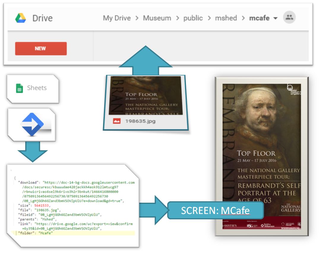
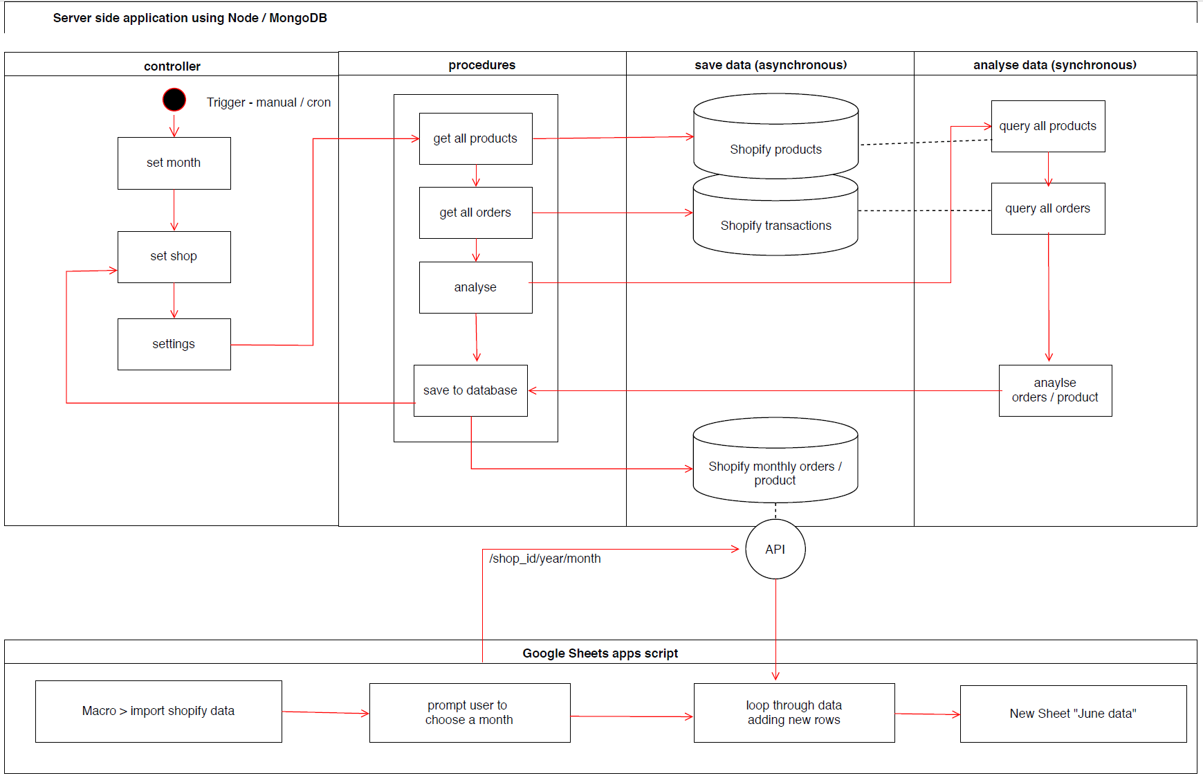
LONG. This process has been full of learning curves and a lot of troubleshooting. There is much to be said for data consistency and quality at internal database level when working on projects such as this. Arguably, one of the longest processes is assessing groups of content to ensure that what you’re including meets data requirements. But it has been fun to experiment and uncover a process that is now…somewhat…streamlined – which looks a bit like this:

  1. Find cool things on the database
  1. Export cool things using a self-formatting report that you’ve spent weeks developing in Visual Basic (groan)
  1. Find images of cool things and group those
  1. Export images of cool things using another self-formatting report that you’ve spent weeks developing in Visual Basic (more groaning)
  1. Stitch together image metadata and object metadata
  1. Add in descriptions and dimensions data manually because of data quality issues and duplicates that you have to assess on a case by case basis
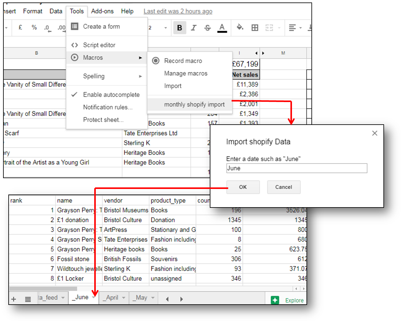
  1. Upload fully formatted and cleaned dataset to a Google Drive as a Google Sheet
  1. Add in rows from new dataset into the Google Sheet that you’ve been provided with, because instead of uploading individual CSVs (which it says you can do but this option does not work) you have to use one spreadsheet and refresh it every time you make additions from the Cultural Institute (Google A&C back end)
  1. Upload images to Google Bucket 
  1. Refresh spreadsheet from the Cultural Institute  
  1. Fix all of the errors that it comes up with because it’s a buggy system 
  1. Refresh again
  1. Repeat steps 11 and 12 as needed

So…not exactly streamlined but in fairness, I have ironed out all of the kinks that I am capable of ironing out. The systems designed by Google are more archaic in practice than I was anticipating (sorry Google, no shade) and the small yet very irritating tech issues were real roadblocks at times. And yet, we persevere.

There will always be a level of manual work involved in this process, as there should be when it comes to choosing images and reviewing content, but I think that this does highlight areas where we could do with giving our database some TLC – as if that’s an easy and quick solution that doesn’t require time, money and other resources…

We aren’t sure what the future of the Bristol Museums partner page looks like just yet, especially with a few projects in the works that might help us bridge some of the gap that Google Arts & Culture is helping to fill. At the very least, I’ve learned a fair bit about data movement and adaptability.

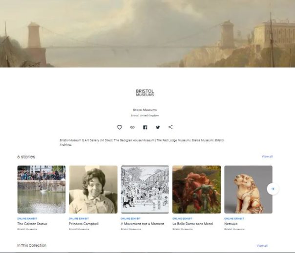
Do have a look! This was a labour of love and stubbornness. Maybe let us know what you think?

This work was made possible by a Respond and Reimagine grant from The Art Fund

CV19 – Digital Battle Plans

Background

Bristol Culture receives an average of 2.5 million yearly visits to its websites (not including social media). Additionally, we have different demographics specific to each social media channel, which reflect the nature of the content and how users interact with the platform features offered.

Since March 13th visits to the bristolmuseums.org.uk have fallen off sharply from a baseline of 4000/day to under 1000/day as of 6th April. This unprecedented change in website visitors is a reflection of a large scale change in user behaviour which we need to understand, presumably – due to people no longer searching to find out about visiting the museum in person, due to enforced social distancing measures. It remains to be seen how patterns of online behaviour will change in the coming weeks, however, it appears we have a new baseline which more closely matches our other websites that are more about museum objects and subject matter than physical exhibitions and events.

You can explore this graph interactively using the following link:

https://datastudio.google.com/reporting/196MwOHX1WOhtwDQbx62qP0ntT7sLO9mb

Before CV struck

The top 10 most visited pages in January on bristolmuseums.org.uk feature our venue homepages, specific exhibitions and our events listings

online stats January 2020

During Lockdown

From March-April we are seeing visits to our blog pages, our online stories and our collections pages feature in the top 10 most visited.

online stats March 16th-April 9th

Digital Content Strategy

Internally, we have been developing a digital content strategy to help us develop and publish content in a more systematic way. The effect of CV-19 has meant we have had to fast track this process to deal with a large demand for publishing new online content. The challenge we are faced with is how to remain true to our longer-term digital aims, whilst tackling the expectations to do more digitally. In practice, we have had to rapidly transform to a new way of working with colleagues, collaborating remotely, and develop a new fast track system of developing and signing off digital content. This has required the team to work in different ways both internally, distributing tasks between us, but also externally across departments so that our content development workflow is more transparent.

Pre-quarantine online audiences

Online we follow our social media principles: https://www.labs.bristolmuseums.org.uk/social-media-principles/

A key principle of our audience development plan is to understand and improve relationships with our audiences (physical and digital). This involves avoiding the idea that everything is for ‘everyone’. Instead of recognising that different activities suit different audiences. We seek to use data from a range of sources (rather than assumptions) to underpin decisions about how to meet the needs and wants of our audiences. 

Quarantine online audiences

Since the implementation of strict quarantine measures by the Government on Tuesday 24th March – audiences’ needs have changed.  

  • Families at home with school-age children (4 – 18) who are now home-schooling during term-time.
  • Retired people with access to computers/smart-phones who may be isolated and exploring online content for the first time.
  • People of all ages in high-risk groups advised not to leave their homes for at least the next 12 weeks.
  • People quarantining who may be lonely/anxious/angry/bored/curious or looking for opportunities to self-educate. 
  • Possible new international audiences under quarantine restrictions.

See this list created anonymously by digital/museum folk: https://docs.google.com/document/d/1MwE3OsljV8noouDopXJ2B3MFXZZvrVSZR8jSrDomf5M/edit

What should our online offer provide?

https://www.bristolmuseums.org.uk/blog/a-dose-of-culture-from-home/

Whilst our plummeting online visitors overall tells us one story – we now have data to tell us there is a baseline of people who are visiting our web pages regularly and this audience needs consideration. Potentially a new audience with new needs but also a core group of digitally engaged visitors who are seeking content in one form or another.

Some things we need to be thinking about when it comes to our digital content:

  • What audiences are we trying to reach and what platforms are they using? 
  • What reach are we aiming for and what are other museums doing – we don’t necessarily want to publish content that is already out there. What’s our USP? 
  • What can we realistically do, and do well with limited resources?
  • What format will any resources take and where will they ‘live’? 
  • What’s our content schedule – will we be able to keep producing this stuff if we’ve grown an audience for it once we’re open again? When will we review this content and retire if/when it’s out of date?
  • We need to be thinking about doing things well (or not doing them at all – social media platforms have ways of working out what good content is, and will penalise us if we keep posting things that get low engagement. A vicious cycle)
  • We want to engage with a relevant conversation, rather than simply broadcast or repurpose what we have (though in practice we may only have resource to repurpose content)

Submitting ideas/requests for digital content during Quarantine period

We are already familiar with using trello to manage business processes so we quickly created a new board for content suggestions. This trello-ised what had been developing organically for some time, but mainly in the minds of digital and marketing teams.

Content development Process in trello

STEP 1: An idea for a new piece of digital output is suggested, written up and emailed to the digital team, and then added to the Digital Content Requests Trello.

STEP2: The suggestion is then broken down / augmented with the following information (detailed below), and added as fields to the trello card

STEP 3: This list of suggestions is circulated amongst staff on the sign off panel, for comments.

STEP 4: The card is either progressed into the To Do List, or moved back to “more info needed / see comments” list.

The following information is required in order to move a digital content suggestion forward:

Description: Top level description about what the proposal is

Content: What form does the content take? Do we already have the digital assets required or do we need to develop or repurpose and create new content? What guidelines are available around the formats needed?

Resource: What staff are required to develop the content, who has access to upload and publish it?

Audiences: Which online audiences is this for and what is their user need?

Primary platform: Where will the content live, and for how long? 

Amplification: How will it be shared?

Success: What is the desired impact / behaviour / outcome?

Opportunities 

Experimentation

New and emerging content types: The lockdown period could be an opportunity to try a range of different approaches without worrying too much about their place in the long term strategy.

Online events programme

Now we can only do digital-or-nothing, we need to look at opportunities for live streaming events. Where there is no audience – how do we build enough digital audiences to know and be interested in this if we did go down that route. Related to above – online family/ adult workshops, a lot of this is happening now, are they working, how long will people be interested?

Collaborating with Bristol Cultural organisations

With other cultural organisations in Bristol facing similar situations, we’ll be looking to collaborate on exploring:

  • What is the online cultural landscape of Bristol?
  • Collaborative cultural response to Corona
  • A curated, city wide approach
  • Working with digital producers on user research questions
  • Similar to the Culture ‘Flash Sale’
  • Scheduled content in May

Arts Council England business plan

Those projects are at risk of not being able to be delivered –  can digital offer a way to do these in a different way?

Service / Museum topical issues

How can we create an online audience to move forward our decolonisation and climate change discussions?

Family digital engagement  

We’ll be working with the public programming team to develop content for a family audience

Examples of museum services with online content responding well to quarantine situation

a) they have a clear message about the Corona virus situation

b) they have adjusted their landing pages to point visitors to online content.

Examples of museums with good online content generally

Recent Guardian article by Adrian Searle lists museums for digital visits https://www.theguardian.com/artanddesign/2020/mar/25/the-best-online-art-galleries-adrian-searle

Fundraising

The Development Team typically manages around £12,800 in donations per month through ‘individual giving’ which goes to our charity, Bristol Museums Development Trust. This is from a variety of income streams including donation boxes, contactless kiosks, Welcome Desks and donations on exhibition tickets. Closure of our venues means this valuable income stream is lost. To mitigate this, we need to integrate fundraising ‘asks’ into our online offers. For example, when we promote our online exhibitions, ask for a donation and link back to our online donation page. 

The Development Team will work with the Digital and Marketing teams to understand plans and opportunities for digital content and scope out where and how to place fundraising messages across our platforms. We will work together to weave fundraising messages into the promotion of our online offers, across social media, as well as embed ‘asks’ within our website. 

Next Steps:

Clearly, there will be long-lasting effects from the pandemic and they’ll sweep through our statistics and data dashboards for some time. However – working collaboratively across teams, responding to change and using data to improve online services are our digital raison d’etre – we’ll
use the opportunity as a new channel for 2020 onwards instead of just a temporary fix .

snapshopt of digital stats before the pandemic

How to nail it in Team Digital by turning it off.

This post is about my recent week of reducing screen time to a minimum after seeking a fresh approach, having lost the plot deep in some troublesome code, overloaded with an email avalanche and pestered by projects going stale. In other words…have you tried turning it off? (and not on again!)

STEP 1: TURN OFF PC

Guys this is what a computer looks like when it is off

Kinda feels better already. No more spinning cogs, no more broken code, brain starting to think in more creative ways, generally mind feeling lighter.  Trip to the stationary cupboard to stock up on Post-its and sticky things, on way speak to a colleague whom I wouldn’t usually encounter and gain an insight into the user facing end of a project I am currently working on (I try to make a mental note of that).

STEP 2: RECAP ON AGILE METHODS

Agile Service Delivery concept
a great diagram about agile processes by Jamie Arnold

(admittedly you do need to turn the computer back on from here onwards, but you get the idea!)

The team here have just completed SCRUM training and we are tasked with scratching our heads over how to translate this to our own working practices. I was particularly inspired by this diagram and blog by Jamie Arnold from G.D.S.  explaining how to run projects in an agile way. I am especially prone to wanting to see things in diagrams, and this tends to be suppressed by too much screen time 🙁

“a picture paints a thousand words.”

Also for projects that are stalled or for whatever reason on the backburner – a recap (or even retrospective creation) on the vision and goals can help you remember why they were once on the agenda in the first place, or if they still should be.

STEP 3: FOCUS ON USER NEEDS

It is actually much easier to concentrate on user needs with the computers switched off. Particularly in the museum where immediately outside the office are a tonne of visitors getting on with their lives, interacting with our products and services, for better or worse.  Since several of our projects involve large scale transformation of museum technology, mapping out how the user need is acheived from the range of possible technologies is useful. This post on mapping out the value chain explaines one method.

Mapping the value chain for donation technology

Whilst the resulting spider-web can be intimidating, it certainly helped identify some key dependencies like power and wifi (often overlooked in musuem projects but then causing serious headaches down the line) as well as where extra resource would be needed in developing new services and designs that don’t yet come ‘off the shelf’.

STEP 4: DISCOVERING PRODUCT DISCOVERY

There is almost always one, or more like three of our projects in the discovery phase at any one time, and this video form Teresa Torres on product discovery explains how to take the focus away from features and think more about outcomes, but also how to join the two in a methodical way – testing many solutions at once to analyse different ways of doing things.

We are a small multidisciplinary team, and in that I mean we each need to take on several disciplines at once, from user research, data analysis, coding, system admin, content editing, online shop order fulfilment (yes you heard that right) etc. However, it is always interesting to hear from those who can concentrate on a single line of work. With resources stretched we can waste time going down the wrong route, but we can and do collaborate with others to experiment on new solutions. Our ongoing “student as producer” projects with the University of Bristol have been a great way for us to get insights in this way at low risk whilst helping to upskill a new generation.

STEP 5: GAMIFY THE PROBLEM

Some of the hardest problems are those involving potential conflict between internal teams. These are easier to ignore than fix and therefore won’t get fixed by business as usual, they just linger and manifest, continuing to cause frustration.

Matt Locke explained it elegantly in MCG’s Museums+Tech 2018: the collaborative museum. And this got me thinking about how to attempt to align project teams that run on totally different rhythms and technologies. Last week I probably would have tried to build something in Excel or web-based tech that visualised resources over time, but no, not this week….this week I decided to use ducks!

Shooting ducks on a pinboard turned out to be a much easier way to negotiate resources and was quicker to prototype than any amount of coffee and coding (its also much easier to support 😉 ). It was also clear that Google sheets or project charts weren’t going to cut it for this particular combination of teams because each had its own way of doing things.

The challenge was to see how many weeks in a year would be available after a team had been booked for known projects. The gap analysis can be done at a glance – we can now discuss the blocks of free time for potential projects and barter for ducks, which is more fun than email crossfire. The problem has now become a physical puzzle where the negative space (illustrated by red dots)  is much more apparent than it was by cross-referencing data squares vs calendars. Its also taken out the underlying agendas across departments and helped us all focus on the problem by playing the same game – helping to synchronise our internal rhythms.

REMARKS

It may have come as a surprise for colleagues to see their digital people switch off and reach for analogue tools, kick back with a pen and paper and start sketching or shooting ducks, but to be honest its been one of the most productive weeks in recent times, and we have new ideas about old problems.

Yes, many bugs still linger in the code, but rather than hunting every last one to extinction, with the benefit of a wider awareness of the needs of our users and teams, maybe we just switch things off and concentrate on building what people actually want?


Integrating Shopify with Google Sheets (magic tricks made to look easy)

In team digital we like to make things look easy, and in doing so we hope to make life easier for people. A recent challenge has been how to recreate the Top sales by product analysis from the Shopify web application in Google Docs to see how the top 10 selling products compare month by month. The task of creating a monthly breakdown of product sales had up until now been a manual task of choosing from a date picker, exporting data, copying to google sheets, etc.

Having already had some success pushing and pulling data to google sheets using google apps script and our Culture Data platform, we decided to automate the process. The goal was to simplify the procedure of getting the sales analysis into Google docs to make it as easy as possible for the user – all they should need to do would be to select the month they wish to import.

We have developed a set of scripts for extracting data using the Shopify API, but needed to decide how to get the data into Google Sheets. Whilst there is a library for pushing data from a node application into a worksheet, our trials found it to be slow and prone to issues where the sheet did not have enough rows or other unforeseen circumstances. Instead, we performed our monthly analysis on the node server and saved this to a local database. we then built an api for that database that could be queried by shop and by month.

The next step, using google script was to query the api and pull in a month’s worth of data, then save this to a new sheet by month name. This could then be set added as a macro so that it was accessible in the toolbar for the user in a familiar place for them, at their command.

As the data is required on a monthly basis, we need to schedule the server side analysis to save a new batch of data after each month – something we can easily achieve with a cron job. The diagram below shows roughly how the prototype works from the server side and google sheets side. Interestingly, the figures don’t completely match up to the in-application analysis by Shopify, so we have some error checking to do, however we now have the power to enhance the default analysis with our own calculations, for example incorporating the cost of goods into the equation to work out the overall profitability of each product line.


Preserving the digital

From physical to digital to…?

At Bristol Culture we aim to collect, preserve and create access to our
collections for use by present and future generations. We are increasingly dealing with digital assets amongst these collections – from photographs of our objects, to scans of the historical and unique maps and plans of Bristol, to born-digital creations such as 3D scans of our Pliosaurus fossil. We are also collecting new digital creations in the form of video artwork.

Photo credit Neil McCoubrey

One day we won’t be able to open these books because they are too fragile – digital will be the only way we can access this unique record of Bristol’s history, so digital helps us preserve the physical and provides access. Inside are original plans of Bristols most historic and well-known buildings including the Bristol Hippodrome, which require careful unfolding and digital stitching to reproduce the image of the full drawing inside.

Plans of the Hippodrome, 1912. © Bristol Culture

With new technology comes new opportunities to explore our specimens and this often means having to work with new file types and new applications to view them.  

This 3D scan of our Pliosaurus jaw allows us to gain new insights into the behavior and biology of this long-extinct marine reptile.

Horizon © Thompson & CraigheadThis digital collage by Thompson & Craghead features streaming images from webcams in the 25 time zones of the world. The work comes with a Mac mini and a USB drive in an archive box and can be projected or shown on a 42″ monitor. Bristol Museum is developing its artist film and video collection and now holds 22 videos by artists including Mariele Neudecker, Wood and Harrison, Ben Rivers, Walid Raad and Emily Jacir ranging from documentary to structural film, performance, web-based film and video and animation, in digital, video and analogue film formats, and accompanying installations.

What could go wrong?

So digital assets are helping us conserve our archives, explore our collections and experience new forms of art, but how do we look after those assets for future generations?

It might seem like we don’t need to worry about that now but as time goes by there is constant technological change; hardware becomes un-usable or non-existent, software changes and the very 1s and 0s that make up our digital assets can be prone to deteriorating by a process known as bitrot!.  Additionally, just as is the case for physical artifacts, the information we know about them including provenance and rights can become dissociated.  What’s more, the digital assets can and must multiply, move and adapt to new situations, new storage facilities and new methods of presentation. Digital preservation is the combination of procedures, technology and policy that we can use to help us prevent these risks from rendering our digital repository obsolete. We are currently in the process of upskilling staff and reviewing how we do things so that we can be sure our digital assets are safe and accessible.

Achieving standards

It is clear we need to develop and improve our strategy for dealing with these potential problems, and that this strategy should underline all digital activity where the result of that activity produces output which we wish to preserve and keep.  To rectify this, staff at the Bristol Archives, alongside Team Digital and Collections got together to write a digital preservation policy and roadmap to ensure that preserved digital content can be located, rendered (opened) and trusted well into the future.

Our approach to digital preservation is informed by guidance from national organisations and professional bodies including The National Archives, the Archives & Records Association, the Museums Association, the Collections Trust, the Digital Preservation Coalition, the Government Digital Service and the British Library. We will aim to conform to the Open Archival Information System (OAIS) reference model for digital preservation (ISO 14721:2012). We will also measure progress against the National Digital Stewardship Alliance (NSDA) levels of digital preservation.

A safe digital repository

We use EMu for our digital asset management and collections management systems. Any multimedia uploaded to EMu is automatically given a checksum, and this is stored in the database record for that asset. What this means is that if for any reason that file should change or deteriorate (which is unlikely, but the whole point of digital preservation is to have a mechanism to detect if this should happen) the new checksum won’t match the old one and so we can identify a changed file.

Due to the size of the repository, which is currently approaching 10Tb, it would not be practical to this manually, and so we use a scheduled script to pass through each record and generate a new checksum to compare with the original. The trick here is to make sure that the whole repo gets scanned in time for the next backup period because otherwise, any missing or degraded files would become the backup and therefore obscure the original. We also need a working relationship with our IT providers and an agreed procedure to rescue any lost files if this happens.

With all this in place, we know that what goes in can come back out in the same state -so far so good. But what we cant control is the constant change in technology for rendering files – how do we know that the files we are archiving now will be readable in the future? The answer is that we don’t unless we can migrate from out of date file types to new ones. A quick analysis of all records tagged as ‘video’ shows the following diversity of file types:

(See the stats for images and audio here).  The majority are mpeg or avi, but there is a tail end of various files which may be less common and we’ll need to consider if these should remain in this format or if we need to arrange for them to be converted to a new video format.

Our plan is to make gradual improvements in our documentation and systems in line with the NDSA to achieve level 2 by 2022:


The following dashboard gives an idea of where we are currently in terms of file types and the rate of growth:

Herding digital sheep

Its all very well having digital preservation systems in place, but the staff culture and working practices must also change and integrate with them.

The digitisation process can involve lots of stages and create many files

In theory, all digital assets should line up and enter the digital repository in an orderly and systematic manner. However, we all know that in practice things aren’t so straightforward.

Staff involved in digitisation and quality control need the freedom to be able to work with files in the applications and hardware they are used to without being hindered by rules and convoluted ingestion processes. They should to be allowed to work in a messy (to outsiders) environment, at least until the assets are finalised. Also there are many other environmental factors that affect working practices including rights issues, time pressures from exhibition development, and skills and tools available to get the job done. By layering new limitations based on digital preservation we are at risk of designing a system that wont be adopted, as illustrated in the following tweet by @steube:

So we’ll need to think carefully about how we implement any new procedures that may increase the workload of staff. Ideally, we’ll be able to reduce the time staff take in moving files around by using designated folders for multimedia ingestion – these would be visible to the digital repository and act as “dropbox” areas which automatically get scanned and any files automatically uploaded an then deleted. For this process to work, we’ll need to name files carefully so that once uploaded they can be digitally associated with the corresponding catalogue records that are created as part of any inventory project. Having a 24 hour ingestion routine would solve many of the complaints we hear from staff about waiting for files to upload to the system.


Automation can help but will need a human element to clean up and anomalies


Digital services

Providing user-friendly, online services is a principle we strive for at Bristol Culture – and access to our digital repository for researchers, commercial companies and the public is something we need to address.

We want to be able to recreate the experience of browsing an old photo album using gallery technology. This interactive uses the Turn JS open source software to simulate page turning on a touchscreen featuring in Empire Through the Lens at Bristol Museum.

Visitors to the search room at Bristol Archives have access to the online catalogue as well as knowledgeable staff to help them access the digital material. This system relies on having structured data in the catalogue and scripts which can extract the data and multiemdia and package them up for the page turning application.

But we receive enquiries and requests from people all over the world, in some cases from different time zones which makes communication difficult. We are planning to improve the online catalogue to allow better access to the digital repository, and to link this up to systems for requesting digital replicas. There are so many potential uses and users of the material that we’ll need to undertake user research into how we should best make it available and in what form.


Culture KPIs

There are various versions of a common saying that ‘if you don’t measure it you can’t manage it’. See Zak Mensah’s (Head of Transformation at Bristol Culture) tweet below. As we’ll explain below we’re doing a good job of collecting a significant amount of Key Performance Indicator data;  however, there remain areas of our service that don’t have KPIs and are not being ‘inspected’ (which usually means they’re not being celebrated). This blog is about our recent sprint to improve how we do KPI data collection and reporting.

The most public face of Bristol Culture is the five museums we run (including Bristol Museum & Art Gallery and M Shed), but the service is much more than its museums. Our teams include, among others; the arts and events team (who are responsible the annual Harbour Festival as well as the Cultural Investment Programme which funds over 100 local arts and cultural organisations in Bristol); Bristol Archives; the Modern Records Office; Bristol Film Office and the Bristol Regional Environmental Recording Centre who are responsible for wildlife and geological data for the region.

Like most organisations we have KPIs and other performance data that we need to collect every year in order to meet funding requirements e.g. the ACE NPO Annual Return. We also collect lots of performance data which goes beyond this, but we don’t necessarily have a joined up picture of how each team is performing and how we are performing as a whole service.

Why KPIs?

The first thing to say is that they’re not a cynical tool to catch out teams for poor performance. The operative word in KPI is ‘indicator’; the data should be a litmus test of overall performance. The second thing is that KPIs should not be viewed in a vacuum. They make sense only in a given context; typically comparing KPIs month by month, quarter by quarter, etc. to track growth or to look for patterns over time such as busy periods.

A great resource we’ve been using for a few years is the Service Manual produced by the Government Digital Service (GDS) https://www.gov.uk/service-manual. They provide really focused advice on performance data. Under the heading ‘what to measure’, the service manual specifies four mandatory metrics to understand how a service is performing:

  • cost per transaction– how much it costs … each time someone completes the task your service provides
  • user satisfaction– what percentage of users are satisfied with their experience of using your service
  • completion rate– what percentage of transactions users successfully complete
  • digital take-up– what percentage of users choose … digital services to complete their task

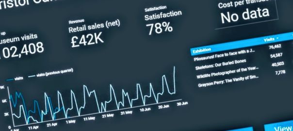
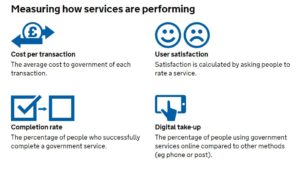
Added to this, the service manual advises that:

You must collect data for the 4 mandatory key performance indicators (KPIs), but you’ll also need your own KPIs to fully understand whether your service is working for users and communicate its performance to your organisation.

Up until this week we were collecting the data for the mandatory KPIs but they have been  somewhat buried in very large excel spreadsheets or in different locations.  For example our satisfaction data lives on a surveymonkey dashboard. Of course, spreadsheets have their place, but to get more of our colleagues in the service taking an interest in our KPI data we need to present it in a way they can understand more intuitively. Again, not wanting to reinvent the wheel, we turned to the GDS to see what they were doing. The service dashboard they publish online has two headline KPI figures followed below with a list of the departments which you can click into to see KPIs at a department level.

Achieving a new KPI dashboard

As a general rule, we prefer to use open source and openly available tools to do our work, and this means not being locked into any single product. This also allows us to be more modular in our approach to data, giving us the ability to switch tools or upgrade various elements without affecting the whole system. When it comes to analysing data across platforms, the challenge is how to get the data from the point of data capture to the analysis and presentation tech – and when to automate vs doing manual data manipulations. Having spent the last year shifting away from using Excel as a data store and moving our main KPIs to an online database, we now have a system which can integrate with Google Sheets in various ways to extract and aggregate the raw data into meaningful metrics. Here’s a quick summary of the various integrations involved:

Data capture from staff using online forms: Staff across the service are required to log performance data, at their desks, and on the move via tablets over wifi. Our online performance data system provides customised data entry forms for specific figures such as exhibition visits. These forms also capture metadata around the figures such as who logged the figure and any comments about it – this is useful when we come to test and inspect any anomalies. We’ve also overcome the risk of saving raw data in spreadsheets, and the bottleneck often caused when two people need to log data at the same time on the same spreadsheet.

Data capture directly from visitors: A while back we moved to online, self-completed visitor surveys using SurveyMonkey and these prompt visitors to rate their satisfaction. We wanted the daily % of satisfied feedback entries to make its way to our dashboard, and to be aggregated (both combined with data across sites and then condensed into a single representative figure). This proved subtly challenging and had the whole team scratching our heads at various points thinking about whether an average of averages actually meant something, and furthermore how this could be filtered by a date range, if at all.

Google Analytics:  Quietly ticking away in the background of all our websites.

Google sheets as a place to join and validate data: It is a piece of cake to suck up data from Google Sheets into Data Studio, provided it’s in the right format. We needed to use a few tricks to bring data into Google Sheets, however, including Zapier, Google Apps Script, and sheets Add-ons.

Zapier: gives us the power to integrate visitor satisfaction from SurveyMonkey into Google Sheets.

Google apps script: We use this to query the API on our data platform and then perform some extra calculations such as working out conversion rates of exhibition visits vs museum visits. We also really like the record macro feature which we can use to automate any calculations after bringing in the data. Technically it is possible to push or pull data into Google Sheets – we opted for a pull because this gives us control via Google Sheets rather than waiting for a scheduled push from the data server.

Google Sheets formulae: We can join museum visits and exhibition visits in one sheet by  using the SUMIFS function, and then use this to work out a daily conversion rate. This can then be aggregated in Data Studio to get an overall conversion rate, filtered by date.

Sheets Add-Ons: We found a nifty add-on for integrating sheets with Google Analytics. Whilst it’s fairly simple to connect Analytics to Data Studio, we wanted to combine the stats across our various websites, and so we needed a preliminary data ‘munging’ stage first.

Joining the dots…

1.) Zapier pushes the satisfaction score from SurveyMonkey to Sheets.

2.) A Google Sheets Add On pulls in Google Analytics data into Sheets, combining figures across many websites in one place.

3.) Online data forms save data directly to a web database (MongoDB).

4.) The performance platform displays raw and aggregated data to staff using ChartJS.

5.) Google Apps Script pulls in performance data to Google Sheets.

6.) Gooogle Data Studio brings in data from Google Sheets,  and provides both aggregation and calculated fields.

7.) The dashboard can be embedded back into other websites including our performance platform via an iframe.

8.) Good old Excel and some VBA programming can harness data from the performance platform.

logos
Technologies involved in gathering and analysing performance data across museums.

Data Studio

We’ve been testing out Google Data Studio over the last few months to get a feel for how it might work for us. It’s definitely the cleanest way to visualise our KPIs, even if what’s going on behind the scenes isn’t quite as simple as it looks on the outside.

There are a number of integrations for Data Studio, including lots of third party ones, but so far we’ve found Google’s own Sheets and Analytics integrations cover us for everything we need. Within Data Studio you’re somewhat limited to what you can do in terms of manipulating or ‘munging’ the data (there’s been a lot of munging talk this week), and we’re finding the balance between how much we want Sheets to do and how much we want Data Studio to do.

At the beginning of the sprint we set about looking at Bristol Culture’s structure and listing five KPIs each for 1.) the service as a whole; 2.) the 3 ‘departments’ (Collections, Engagement and Transformation) and 3.) each team underneath them. We then listed what the data for each of the KPIs for each team would be. Our five KPIs are:

  • Take up
  • Revenue
  • Satisfaction
  • Cost per transaction
  • Conversion rate

Each team won’t necessarily have all five KPIs but actually the data we already collect covers most of these for all teams.

Using this structure we can then create a Data Studio report for each team, department and the service as a whole. So far we’ve cracked the service-wide dashboard and have made a start on department and team-level dashboards, which *should* mean we can roll out in a more seamless way. Although those could be famous last words, couldn’t they?

Any questions, let us know.


Darren Roberts (User Researcher), Mark Pajak (Head of Digital) &  Fay Curtis (User Researcher)


Going digital with our Exhibition Scheduling Timeline


developing a digital timeline for scheduling exhibitions

BACKGROUND

Having a visual representation of upcoming exhibitions, works, and major events is important in the exhibition planning process. Rather than relying on spotting dates that clash using lists of data, having a horizontal timeline spread out visually allows for faster cross-checking and helps collaboratively decide on how to plan for exhibition installs and derigs.


Until recently we had a system that used excel to plan out this timeline, by merging cells and coloring horizontally it was possible to manually construct a timeline. Apart from the pure joy that comes from printing anything from Excel, there were a number of limitations of this method.

  • When dates changed the whole thing needed to be rejigged
  • Everyone who received a printed copy at meetings stuck that to the wall and so date changes were hard to communicate.
  • We need to see the timeline over different scales – short term and long term, so this means using 2 separate excel tabs for each, hence duplication of effort.
  • We were unable to apply any permissions
  • The data was not interoperable with other systems

TIMELINE SOFTWARE (vis.js)

Thanks to Almende B.V. there is an open source timeline code library available at visjs.org/docs/timeline so this offers a neat solution to the manual task of having to recast the timeline using some creative Excel skills each time. We already have a database of Exhibition dates following our digital signage project and so this was the perfect opportunity to reuse this data, which should be the most up to date version of planned events as it is what we display to the public internally in our venues.

IMPLEMENTATION

The digital timeline was implemented using MEAN stack technology and combines data feeds from a variety of sources. In addition to bringing in data for agreed exhibitions, we wanted a flexible way to add installations, derigs, and other notes and so a new database on the node server combines these dates with exhibitions data. We can assign permissions to different user groups using some open source authentication libraries and this means we can now release the timeline for staff not involved in exhibitions, but also let various teams add and edit their own specific timeline data.

The great thing about vis is the ease of manipulation of the timeline, users are able to zoom in and out, and backward and forwards in time using with mouse, arrow or touch/pinch gestures.


Zoomed out view for the bigger picture

Zoomed in for the detail…

EMU INTEGRATION

The management of information surrounding object conservation, loans and movements is fundamental to successful exhibition development and installation. As such we maintain a record of exhibition dates in EMu, our collections management software. The EMu events module is used to record when exhibitions take place and also the object list where curators select and deselect objects for exhibition. Using the EMU API we are able to extract a structured list of Exhibitions information for publishing to the digital timeline.

HOW OUR TIMELINE WORKS

Each gallery or public space has its own horizontal track where exhibitions are published as blocks. These are grouped into our 5 museums and archives buildings and can be selected/deselected from the timeline to cross reference each. Once logged in a user is able ot manually add new blocks to the timeline and these are pre-set to “install”, “derig” and “provisional date”. Once a block is added our exhibitions team are able to add notes that are accessible on clicking the block. It is also possible to reorder and adjust dates by clicking and dragging.

IMPACT

The timeline now means everyone has access to an up to date picture of upcoming exhibitons installations to no one is out of date. The timeline is on a public platform and is mobile accessible so staff can access it on the move, in galleries or at home. Less time is spent on creative Excel manipulation and more work on spotting errors. It has also made scheduling meetings more dynamic, allowing better cross referencing and moving to different positions in time. An unexpected effect is that we are spotting more uses for the solution and are currently investigating the use of it for booking rooms and resources. There are some really neat things we can do such as import a data feed from the timeline back into our MS Outlook calendars  (“oooooh!”). The addition of thumbnail pictures used to advertise exhibitions has been a favorite feature among staff and really helps give an instant impression of current events, since it reinforces the exhibition branding which people are already familiar with.

ISSUES

It is far from perfect! Several iterations were needed to develop the drag and drop feature fo adding events. Also, we are reaching diminishing returns in terms of performance – with more and more data available to plot, the web app is performing slowly and could do with further optimisation to improve speed. Also due to our IT infrastructure, many staff use Internet Explorer and whilst the timeline works OK, many features are broken on this browser without changes to compatibility and caching settings on IE.

WHAT’S NEXT

Hopefully optimisation will improve performance and then it is full steam ahead with developing our resource booking system using the same framework.


Update from the Bristol University development team:

Since October we have been working with Computer Science students from the University of Bristol to redesign the interface for our digital asset management system.

After initially outlining what we want from the new design, there have been frequent meetings and they’ve now reached a stage where they can happily share with us their project so far.
Quick, appealing and easy to use, this potential new interface looks very promising!

Introducing exhibition entry gates

Photo of a visitor entering the exhibition through the barrier

Image of Jake Mensah walking successfully through the barrier

This week we installed an entry gate system to our exhibition gallery at M Shed just in time for the opening of Children’s TV. Our “exhibition” gallery is located on the top floor, far away from the ground floor reception and not naturally easy to stumble across for the average wandering visitor. The project scope was to reduce the overall cost of an exhibition to the service and encourage as many visitors as possible to purchase tickets in advance. We’ll then test the success of the project against three of our key performance indicators – customer satisfaction, cost per transaction, and digital take-up.

Against each KPI we aim to:

Customer satisfaction – We don’t want people to experience a notable difference between our old approach of buying from a member of staff at the entrance and them buying online/kiosk and then entering the exhibition via the gate. We expect teething issues around the “behaviour” of this new approach but not from the technology itself which should be robust. The outcome we need is for little to no complaints within the first two weeks or until we find solutions for the teething problems.

Reduce cost per transaction – a typical paid exhibition costs approximately £7,000 to staff the ticket station. By moving to a one off fee (plus annual service) we’ll save money within 12 months and then in year two this will return a large saving for this function.

Increase digital take-up – until now it wasn’t possible to buy exhibition tickets online or using your mobile device at the museum. This is a feature that the new system enables so we’ll spend the next 18 months actively encouraging the public to buy a ticket “digitally” as part of our move to being digital by default. An additional benefit of using our website to buy tickets is that hopefully a percentage of these visitors will discover other services and events we offer. I also do wonder if we need to get a self-service kiosk to reduce the impact on the reception.

Setting up the entry gates

The third party supplier obviously manufactured and installed the gates but there was still lots for our team to deal with. We needed input from a whole gang of people. Our operations duo worked on ensuring we had the correct physical location, power, security and fire systems integration. Via collective feedback our visitor assistants provided various customer journeys and likely pinch points. Our digital team then helped with the installation and software integration for buying tickets. Design and marketing then helped with messaging. Throughout I was charged with overseeing the project and site visits with the supplier.

The major components of the project are:

  • Physical barriers – two stainless steel coated gates with a bunch of sensors and glass doors
  • Software for the barrier
  • Web service to purchase tickets
  • Onsite EPOS to sell tickets and print which is currently located at main reception

Initial observations

I was onsite for the launch and saw the first 50 or so visitors use the entry gates. My initial observations were that the gates didn’t negatively slow or concern the visitor and having asked a number of them it wasn’t a big deal. However an obvious pinch-point is that the barcode scanner doesn’t always read the barcode, leaving the visitor struggling. My hunch at this point is that our paper tickets are too thin and bendy which means the barcode scanner fails to recognise the barcode. In the coming week we’ll need to investigate if it is the barcode or barcode scanner as the primary cause and find a fix.

When multiple visitors arrive at the barrier there can be some confusion about how “one at a time” actually works. I’m hopeful that clear messaging will iron this out.

A slight issue was that we couldn’t take online payments due to a gateway issue which we’ll have fixed Monday.

Overall I’m very happy with the introduction of the gates and once we deal with the aforementioned teething issues it should be on to the next location for these gates. This is one of those projects that can only really be tested once they go live with real visitors, and the team did a fantastic job!

Google Drive for Publishing to Digital Signage

Having taken an agile development approach to our digital screen technology, it has been interesting as the various elements emerge based on our current needs. Lately there has been the need for quick ways to push posters and images to the screens for private events and one-off occasions.

Due to the complexity of the various modes, and the intricacies of events-based data and automatic scheduling it has been difficult incorporating these needs into the system. Our solution was to use Google Drive as a means to override the screens with temporary content. This means our staff can manage content for private events using tables and mobile devices, and watch the updates push through in real time.

The pathway of routes now looks like this

Untitled Diagram (1)

HOW?

There are two main elements to the override process – firstly, we are using BackboneJS as the application framework because this provides a routing structure that controls the various signage modes. We added a new route at the beginning of the process to check for content added to Google Drive – if there is no content the signs follow their normal modes of operation.

Google Drive Integration

Google provide a nice way to publish web services, hidden amongst the scripts editor inside Google sheets. We created a script that loops through a Drive directory and publishes a list of contents as JSON –  you can see the result of that script here. By making the directory public, any images we load into the drive are picked up by the script. The screens then check the script for new content regularly. The good thing about this is that we can add content to specially named folders – if the folder names match either the venue or the specific machine name – all targeted screens will start showing that content.

Google drive integration

It seems that this form of web hosting will be deprecated in Google Drive at the end of August 2016. But the links we are using to get the image might still work. If not we can find a workaround – possibly by listing urls to content hosted elsewhere in the Google sheet and looking that up.

The main benefits of this solution are being able to override the normal mode of operation using Google Drive on a mobile device. This even works with video – we added some more overrides so the poster mode doesn’t loop till the next slide until after the video has finished – video brings in several issues when considering timings for digital signage. One problem with hosting via Google Drive is that files over 25MB don’t work due to Google’s antivirus checking warning which prevents the files being released.

We’ll wait to see if this new functionality gets used – and if it is reliable after August 2016. In fact – this mode might be usable on its own to manage other screens around the various venues which until now were not up datable. If successful it will vastly reduce the need to run around with memory sticks before private events – and hopefully let us spend more time generating the wonderful content that the technology is designed to publish for our visitors.

You can download the latest release and try it for yourself here.