Category Archives: User research

Culture KPIs

There are various versions of a common saying that ‘if you don’t measure it you can’t manage it’. See Zak Mensah’s (Head of Transformation at Bristol Culture) tweet below. As we’ll explain below we’re doing a good job of collecting a significant amount of Key Performance Indicator data;  however, there remain areas of our service that don’t have KPIs and are not being ‘inspected’ (which usually means they’re not being celebrated). This blog is about our recent sprint to improve how we do KPI data collection and reporting.

The most public face of Bristol Culture is the five museums we run (including Bristol Museum & Art Gallery and M Shed), but the service is much more than its museums. Our teams include, among others; the arts and events team (who are responsible the annual Harbour Festival as well as the Cultural Investment Programme which funds over 100 local arts and cultural organisations in Bristol); Bristol Archives; the Modern Records Office; Bristol Film Office and the Bristol Regional Environmental Recording Centre who are responsible for wildlife and geological data for the region.

Like most organisations we have KPIs and other performance data that we need to collect every year in order to meet funding requirements e.g. the ACE NPO Annual Return. We also collect lots of performance data which goes beyond this, but we don’t necessarily have a joined up picture of how each team is performing and how we are performing as a whole service.

Why KPIs?

The first thing to say is that they’re not a cynical tool to catch out teams for poor performance. The operative word in KPI is ‘indicator’; the data should be a litmus test of overall performance. The second thing is that KPIs should not be viewed in a vacuum. They make sense only in a given context; typically comparing KPIs month by month, quarter by quarter, etc. to track growth or to look for patterns over time such as busy periods.

A great resource we’ve been using for a few years is the Service Manual produced by the Government Digital Service (GDS) https://www.gov.uk/service-manual. They provide really focused advice on performance data. Under the heading ‘what to measure’, the service manual specifies four mandatory metrics to understand how a service is performing:

  • cost per transaction– how much it costs … each time someone completes the task your service provides
  • user satisfaction– what percentage of users are satisfied with their experience of using your service
  • completion rate– what percentage of transactions users successfully complete
  • digital take-up– what percentage of users choose … digital services to complete their task

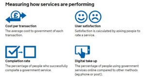
Added to this, the service manual advises that:

You must collect data for the 4 mandatory key performance indicators (KPIs), but you’ll also need your own KPIs to fully understand whether your service is working for users and communicate its performance to your organisation.

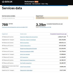
Up until this week we were collecting the data for the mandatory KPIs but they have been  somewhat buried in very large excel spreadsheets or in different locations.  For example our satisfaction data lives on a surveymonkey dashboard. Of course, spreadsheets have their place, but to get more of our colleagues in the service taking an interest in our KPI data we need to present it in a way they can understand more intuitively. Again, not wanting to reinvent the wheel, we turned to the GDS to see what they were doing. The service dashboard they publish online has two headline KPI figures followed below with a list of the departments which you can click into to see KPIs at a department level.

Achieving a new KPI dashboard

As a general rule, we prefer to use open source and openly available tools to do our work, and this means not being locked into any single product. This also allows us to be more modular in our approach to data, giving us the ability to switch tools or upgrade various elements without affecting the whole system. When it comes to analysing data across platforms, the challenge is how to get the data from the point of data capture to the analysis and presentation tech – and when to automate vs doing manual data manipulations. Having spent the last year shifting away from using Excel as a data store and moving our main KPIs to an online database, we now have a system which can integrate with Google Sheets in various ways to extract and aggregate the raw data into meaningful metrics. Here’s a quick summary of the various integrations involved:

Data capture from staff using online forms: Staff across the service are required to log performance data, at their desks, and on the move via tablets over wifi. Our online performance data system provides customised data entry forms for specific figures such as exhibition visits. These forms also capture metadata around the figures such as who logged the figure and any comments about it – this is useful when we come to test and inspect any anomalies. We’ve also overcome the risk of saving raw data in spreadsheets, and the bottleneck often caused when two people need to log data at the same time on the same spreadsheet.

Data capture directly from visitors: A while back we moved to online, self-completed visitor surveys using SurveyMonkey and these prompt visitors to rate their satisfaction. We wanted the daily % of satisfied feedback entries to make its way to our dashboard, and to be aggregated (both combined with data across sites and then condensed into a single representative figure). This proved subtly challenging and had the whole team scratching our heads at various points thinking about whether an average of averages actually meant something, and furthermore how this could be filtered by a date range, if at all.

Google Analytics:  Quietly ticking away in the background of all our websites.

Google sheets as a place to join and validate data: It is a piece of cake to suck up data from Google Sheets into Data Studio, provided it’s in the right format. We needed to use a few tricks to bring data into Google Sheets, however, including Zapier, Google Apps Script, and sheets Add-ons.

Zapier: gives us the power to integrate visitor satisfaction from SurveyMonkey into Google Sheets.

Google apps script: We use this to query the API on our data platform and then perform some extra calculations such as working out conversion rates of exhibition visits vs museum visits. We also really like the record macro feature which we can use to automate any calculations after bringing in the data. Technically it is possible to push or pull data into Google Sheets – we opted for a pull because this gives us control via Google Sheets rather than waiting for a scheduled push from the data server.

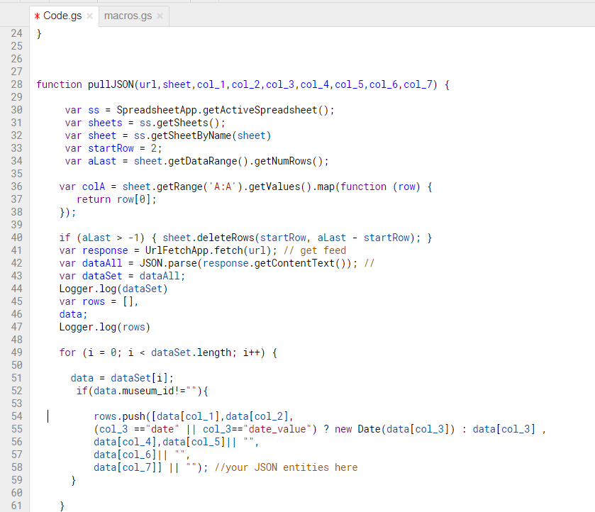
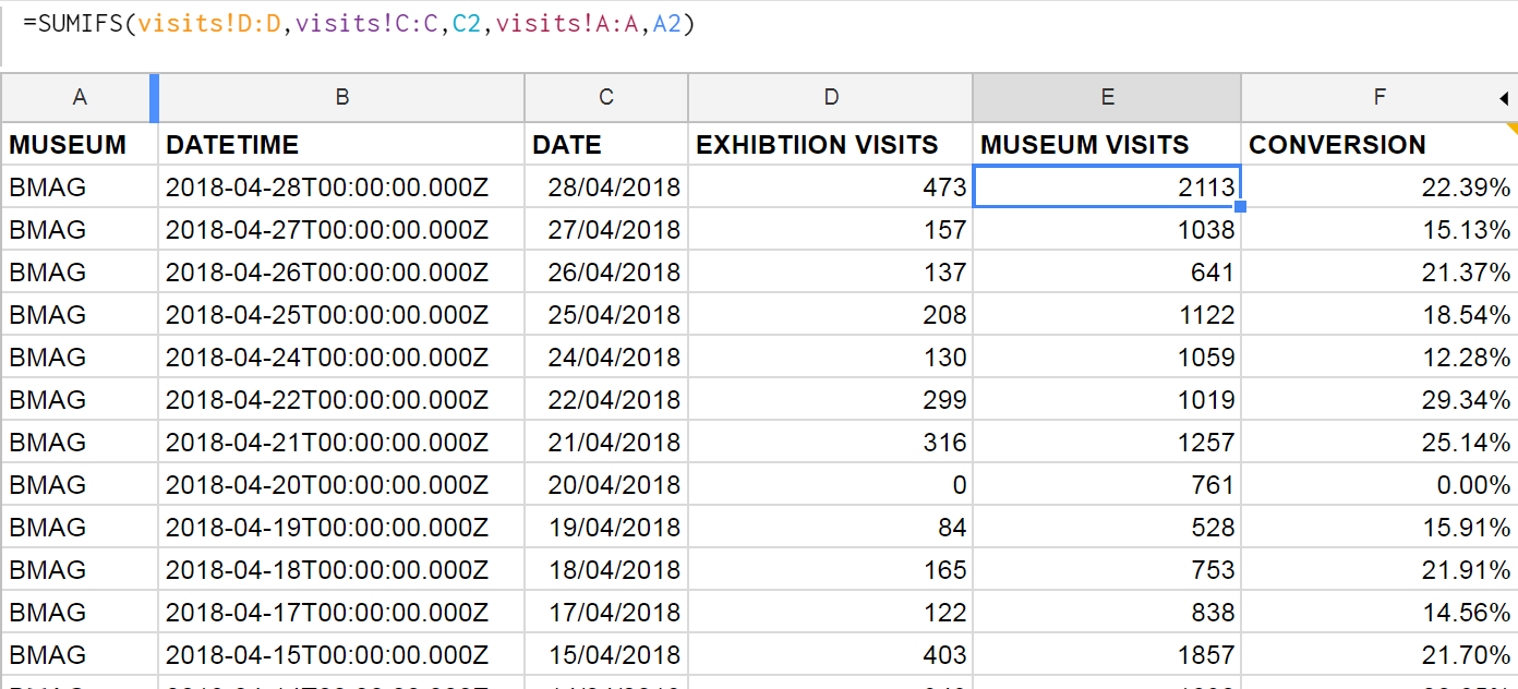
Google Sheets formulae: We can join museum visits and exhibition visits in one sheet by  using the SUMIFS function, and then use this to work out a daily conversion rate. This can then be aggregated in Data Studio to get an overall conversion rate, filtered by date.

Sheets Add-Ons: We found a nifty add-on for integrating sheets with Google Analytics. Whilst it’s fairly simple to connect Analytics to Data Studio, we wanted to combine the stats across our various websites, and so we needed a preliminary data ‘munging’ stage first.

Joining the dots…

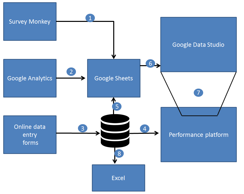
1.) Zapier pushes the satisfaction score from SurveyMonkey to Sheets.

2.) A Google Sheets Add On pulls in Google Analytics data into Sheets, combining figures across many websites in one place.

3.) Online data forms save data directly to a web database (MongoDB).

4.) The performance platform displays raw and aggregated data to staff using ChartJS.

5.) Google Apps Script pulls in performance data to Google Sheets.

6.) Gooogle Data Studio brings in data from Google Sheets,  and provides both aggregation and calculated fields.

7.) The dashboard can be embedded back into other websites including our performance platform via an iframe.

8.) Good old Excel and some VBA programming can harness data from the performance platform.

logos
Technologies involved in gathering and analysing performance data across museums.

Data Studio

We’ve been testing out Google Data Studio over the last few months to get a feel for how it might work for us. It’s definitely the cleanest way to visualise our KPIs, even if what’s going on behind the scenes isn’t quite as simple as it looks on the outside.

There are a number of integrations for Data Studio, including lots of third party ones, but so far we’ve found Google’s own Sheets and Analytics integrations cover us for everything we need. Within Data Studio you’re somewhat limited to what you can do in terms of manipulating or ‘munging’ the data (there’s been a lot of munging talk this week), and we’re finding the balance between how much we want Sheets to do and how much we want Data Studio to do.

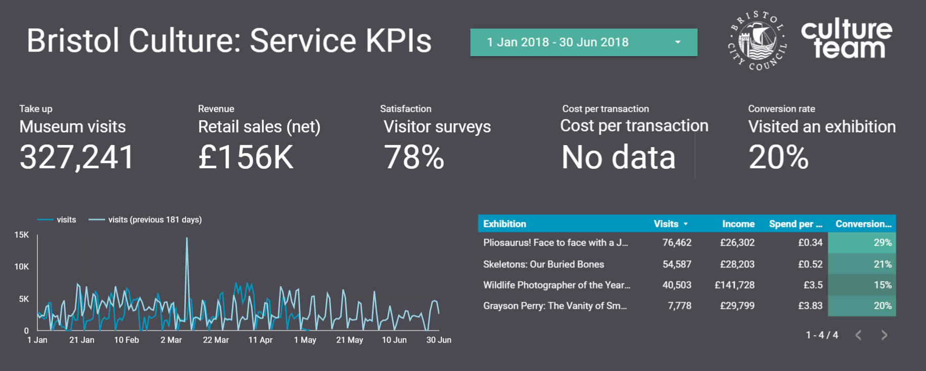
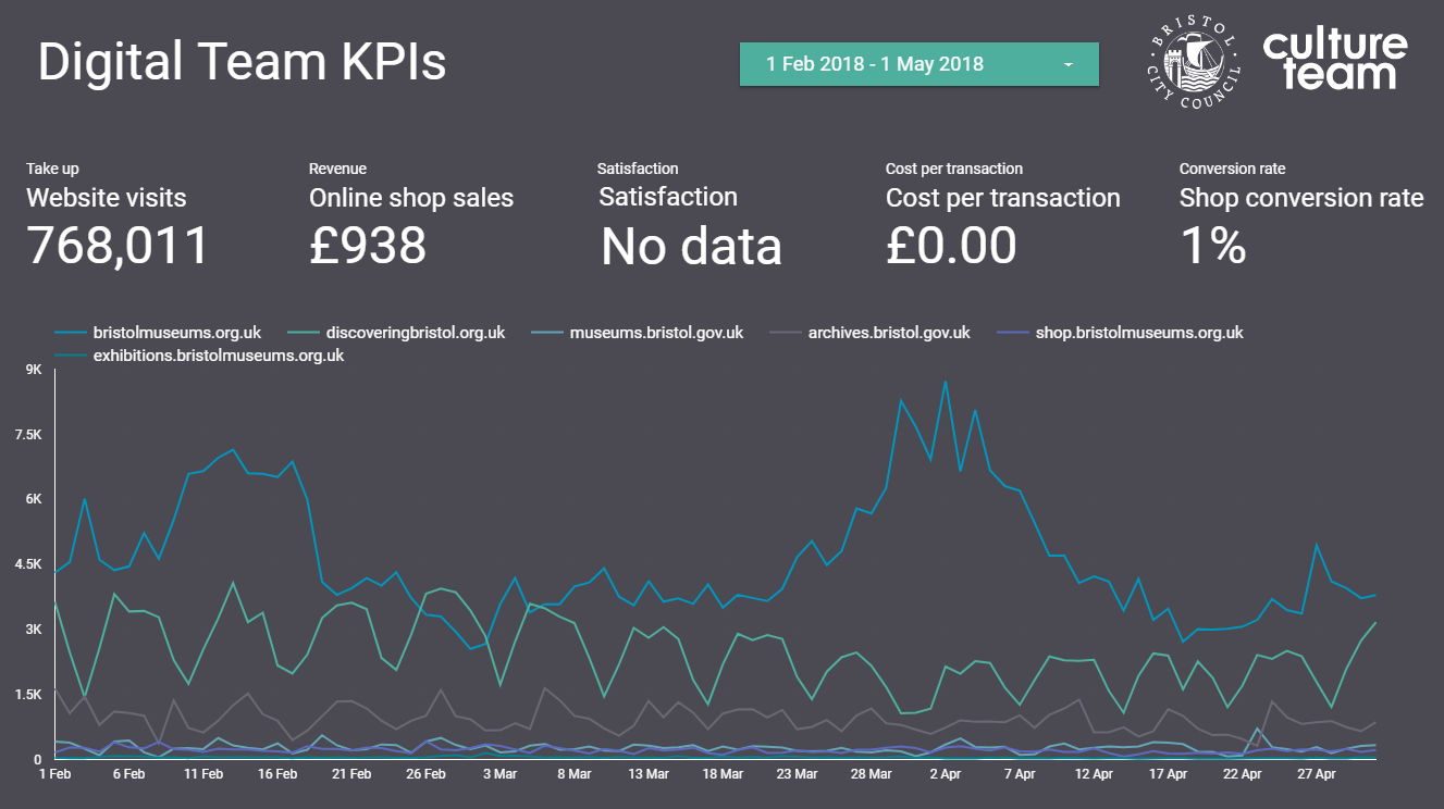
At the beginning of the sprint we set about looking at Bristol Culture’s structure and listing five KPIs each for 1.) the service as a whole; 2.) the 3 ‘departments’ (Collections, Engagement and Transformation) and 3.) each team underneath them. We then listed what the data for each of the KPIs for each team would be. Our five KPIs are:

  • Take up
  • Revenue
  • Satisfaction
  • Cost per transaction
  • Conversion rate

Each team won’t necessarily have all five KPIs but actually the data we already collect covers most of these for all teams.

Using this structure we can then create a Data Studio report for each team, department and the service as a whole. So far we’ve cracked the service-wide dashboard and have made a start on department and team-level dashboards, which *should* mean we can roll out in a more seamless way. Although those could be famous last words, couldn’t they?

Any questions, let us know.


Darren Roberts (User Researcher), Mark Pajak (Head of Digital) &  Fay Curtis (User Researcher)


Exhibitions online

We recently (softly softly) went live with Exhibitions Online.

A place to translate our in-house exhibitions for an online audience, we worked with Mike and Luke at Thirty8 Digital to create a narrative structure with scroll-through content and click-through chapters on WordPress. They built in lovely features such as object grids, timelines, slideshows, maps and quotes.

There are a few exhibitions already up, past (death: the human experience) present (Empire through the Lens) and future (What is Bristol Music?). We’ve most recently used it for our European Old Masters gallery to showcase a beautiful painting we have on loan for two years: St Luke Drawing the Virgin and Child by Dieric Bouts (I discovered the Pantone app with this one, taking the red from the gallery to use online. V satisfying). I’m currently working with the exhibition team to get our Pliosaurus! exhibition up – watch this space for some fun things with that one, which we’re hoping to use for interp in our Sea Dragons gallery at Bristol Museum & Art Gallery too.

(For the What is Bristol Music? exhibition opening in May 2018, we’re using WP plugin Gravity Forms to collate peoples’ experiences and pictures of the Bristol music scene to be featured in the physical exhibition. Chip in if you have a story to tell.)

So far, we’ve found the content and arrangement really depends on the exhibition. The idea isn’t to simply put the physical exhibition online (I say ‘simply’, as if it would be) but instead to use the format and content of the exhibition to engage with people in a different environment: albeit one where we’re competing with a thousand other things for people’s attention. Exhibitions which have been and gone have been slightly more challenging, as the content was never intended for this use and has needed some wrangling. The more we use it though the smoother the process is getting, now that we know what we need and it being on teams’ plans as something to consider.

We’re still in the early stages of reviewing analytics to see how people are using it. Initial results are heartening, though, with a few thousand visits having had minimal promotion. At the moment most people are finding it from our what’s on pages (where most of our traffic to the main website is anyway) and we’re thinking about what campaigns we can do to get it out there more.

Any feedback or thoughts, hmu → fay.curtis@bristol.gov.uk

Off-line surveys: successfully not losing data

Losing survey data is a pain – unfortunately the events team lost six events worth of survey data they collected using off-line surveys. The team used iPads (cost per iPad is c.£320) to conduct surveys on software which was sourced outside our team (I’m not sure what system it was). They used the software on the basis that it claimed to offer off-line surveys i.e. without an internet connection /wi-fi. The idea was that they data could then be uploaded once the iPad was connected to the internet. When they came to do so, however, the data was simply not there and they had lost it all.

The events team came to the digital team this year to ask if we could help them with the public surveys for the 2017 Harbour Festival. The festival is held across much of Bristol City Centre and therefore in order to conduct surveys digitally using iPads we would need to do so without having to rely on having a wifi connection.Of course, one option would be to conduct the surveys with good old pen and paper, but as a digital-first service we were happy to accept the challenge.

One of the main reasons we want to avoid paper surveys is because it is time consuming and difficult to digitise the survey results. It requires someone to sit at a computer and manually input results. Staff resources are often limited and this is a job we’d rather not have to give ourselves. Practically, paper can also be unruly, there are issues with handwriting legibility and they are easy to lose when relying on volunteers to collect them so a digital a solution is very desirable.

The challenge came down to finding the right software that I could install on the iPad and test, and that didn’t cost too much. Our usual platform for conducting surveys on iPads where we do have an internet connection is SurveyMonkey (we pay for the gold subscription £230 per year). Unfortunately, off-line surveys are not a feature available on SurveyMonkey.

These are a few Apps I tried to use but weren’t right for one reason or another:

  • Qualtrics – poor trialling options and expensive for full features £65 for one month or £435 for one year
  • iSurveys (harvestyourdata.com) – free account is limited and their main website is difficult to use and I couldn’t work out how much the full feature product was
  • SurveyPocket by QuestionPro – trial difficult to use and full feature pricing only available by contacting the company
  • The one I almost went for: QuickTap Survey & Form Builder – good pricing options from $16 per month and the trial is OK

So, after trawling the internet and the App Store for options the one we went for is an App called Feed2go (www.feed2go.com)

Quick Note: Before I speak about the virtues of Feed2go, I have to make it clear that it is currently only available on the Apple App Store; it is not available on Android devices in the Play Store (quicktap surveys app is available on Android).

I downloaded the feed2go App onto my iPad and and it was ready to go with pretty much all features available – certainly enough to get a feel of whether it was right. Most crucially on the basic/trial version you can conduct off-line surveys and test if the data is secure and can be successfully uploaded – we I did and it worked. A major advantage of the feed2go app is that to access all the app’s features (Pro) is a very reasonable subscription of £2.49 for 1 month; £4.99 for 3 months; or £12.49 for 1 year. At these costs there is virtually no risk in trying the Pro subscription.

If anyone is interested in trying the App, I would suggest going ahead and downloading and having an explore. There are just a couple of things I will highlight:

  • The user interface is nice and clean and easy to use
  • The options for question structures is OK and covers most bases but it is more limited than something like SurveyMonkey
  • Some of the navigation in the App can be a bit clunky especially when designing survey forms, but once you get used to it then it’s fine
  • Probably the most significant feature of feed2go to mention is trying to use the same survey on one device. This is not a particular strong suit of feed2go but it does work. Basically you need to download feed2go on each device you have and then share the survey between them using a cloud storage server – the best one to use in my experience is DropBox. In the App there is an export/import function to share survey forms between devices. This also means that you will need to collate all results from different devices at the end.
  • As noted above, the feed2go app needs to be downloaded on each iPad. In our case all our service iPads are registered to one email address. This means we can use the one subscription across all of our devices. This is not the case if iPads are registered to different email addresses – a subscription will need to be paid for each.

Overall, yes the experience of using the App could be improved a little. But, the main feature we wanted it for – to save the results and successfully upload them worked 100%. I think what distinguishes feed2go from the previously (unsuccessfully) used software was that it operated through a web browser which relied on a cache of temp internet files files. Feed2go is an app which stores the data securely in a folder in the same way the camera stores photos on the iPad. Finally, the FAQ on the feed2go and the email support for the App is great; the developer is really responsive.

We have now used the App to conduct surveys in the estate around Our Blaise Castle House Museum site and we are planning to replace paper exit surveys at our houses (where we don’t have wifi) with the offline App.

If you have any comments or questions about doing offlien surveys or surveys in the cultural sector please get in touch I’m happy to have a chat. darren.roberts@bristol.gov.uk

Rowan Whitehouse joins the Digital Team

Hello! My name is Rowan Whitehouse and I am currently working as a cultural support apprentice for Bristol Museums.

I have been doing six week rotations around various departments, and as part of my third, with the digital team, I’ve been asked to review some of the technology around the museum.

So, to find some!

I noticed that the distribution of technology around the museum is heavier in areas with a higher number of children. Whilst there is a lot around the ground floor, particularly the Egypt and Natural History galleries, levels definitely drop off the more steps you climb, towards the Fine and Applied Arts galleries. I think this is due, in part, to many children’s interests leaning on the dinosaur/mummy side, rather than Bristol’s history of stone pub ware. Perhaps there are also certain established ideas about what an art gallery should  be, whereas many of the historic collections lend themselves well to interactive displays.

Upstairs, the technology has a distinctly more mature focus.
I chose to look at a tablet/kiosk in the European Old Masters gallery for an example. The kiosk itself fits well into its surroundings, the slim, white design is unobtrusive – something desirable in such a traditional gallery space. The kiosk serves as an extension of the wall plaques, it has an index of the paintings in the room with information on them. I think this is a great idea as the size of wall plaques often constrain the amount of information available.

A big drawback I felt however, was that the kiosk was static and fixed in one place. I observed that as people moved around the gallery they would continually look from the painting to it’s accompanying plaque, taking in both at the same time. Though the kiosk has more information, it would need to be able to move with the user to have the advantage over the plaques. On the position of the kiosk itself, I think it would receive more use if it was positioned in the middle of the room, rather than in the corner, where it is overlooked. Signage on the wall advertised a webpage, which could be accessed on a handheld device and provided the same information as the kiosk. I felt this was a better use of the index, and could be made even easier to access via a QR code. I wonder though, if people would want to use their phones like this in a gallery, and whether ideas about the way we experience art are the ultimate obstacle. I’ll be researching how other institutions use (or don’t use) technology in their galleries.

I wanted to see how technology is being used differently with the historic collections, so I headed back downstairs to the Egypt gallery. I observed a school group using the computers at the back of the gallery, both the children and their teacher struggled with the unusual keyboard layout and rollerball mouse, unable to figure out how to search. Eventually, they came upon it by chance, and enjoyed navigating the images and learning more about the objects in the gallery. The computers also have a timeline view, showing the history of the Egyptians, and an “Explore” function, where specific subjects could be looked at.

I think the location of the units massively benefit interaction, the dedicated space with chairs really invite and encourage visitors to engage. On using the technology, I felt that the access problems could be easily fixed by some stickers highlighting the left mouse button function, and something to resolve the stiffness of the rollerball.

My favourite interactive pieces in the museum were in the Egypt gallery. I loved the screens that featured the discovery of  a body, and asked the user what they thought about the body being in a museum, and gave the user the option of viewing the body at the end of the text. I felt like this type of interaction was fantastic, and rather than just providing information, engaged the visitor directly and was a great way of broaching questions that may not usually occur to visitors.

I’m looking forward to the next six weeks, and learning more about digital engagement in museums.

With such a fantastic collection, it’s exciting finding new ways of presenting it and helping visitors interact with objects

New locker alert

Photo showing grey lockers

Adding additional lockers to our museums is a top 5 request from the public and staff alike. On Wednesday the 20th September we installed new lockers at Bristol Museum & Art Gallery and M Shed.

Until this week we only had 8 lockers at Bristol Museum & Art Gallery which is not exactly lots when you have 400,000 plus visits. At both museums the lockers have been finished in a suitable RAL colour way. We’ve introduced a £1 non-refundable fee which will initially re-pay the cost of lockers then be used to support our work. Slow money but sure money.

The main considerations for lockers are:

  • Custom brand colours
  • Coin retention lockers
  • The number of doors per locker – 2, 3 or 4 (more lockers more money but less useful if size is important)
  • installation
  • Location in the building
  • Disclaimers and cost messaging

The install didn’t quite go to plan. I asked for lockers. I got lockers. However I also needed the following which I hadn’t specified:

  • Numbered lockers – inserts so that the public can remember which locker they used
  • Numbered key fobs – the public need to know which key they have
  • Nuts and bolts – to connect each locker together and to the wall to eliminate the chance for the locker to tip over

I purposely located a bank of lockers in the corridor so that they’ll be in the sightline of visitors to the front hall. Previously the lockers were tucked away and a constant frustration for visitors. Regular readers will know one of my favourite quotes “Address the user need and the business need will be clear”.

Retail will be responsible for collecting the income with this new welcome income stream.

I was chuffed when one of our Visitor Assistants said “I’ve been here over 10 years and never thought I’d see the day we added extra lockers”.

If you remember to address the bullet points above you’ll have a smooth installation. Good luck.

Update

As of Sept 2018 we successfully recouped the costs within six months and produced a 1x return (basically doubled revenue to cost) and expect a 2x return now annually.

Transformation: Business as Usual

Transformation is made one day at a time. Ideas, mistakes, doing and refining. Ship early, ship often. There are no ribbon cutting moments just the quiet satisfaction that a tool or way things are done become normal and it’s seen as business as usual. I love this transformation.
To counteract my nervous energy on my Dublin to New York City flight I made a brief list of things we’ve introduced in the recent past.
We’ve introduced new roles including Head of Digital and user researchers. New as in never been seen in the service before. How cool is that?! We’ve pushed as many decisions out from management as possible to keep the responsibility with whomever has the direct expertise and to release the bottleneck of waiting for the four of us. Yes we can still override a preferred course of direction.
We’re getting digital tools (basecamp and trello, emu) into position as THE way we do business – freeing up meeting time and being transparent. We’re also chipping away at a culture of being a ‘cultural business’. And that’s just on the staff front. All things to be super proud of from those across the team. What I love though is how “normal” all this is now. Tools like Basecamp were seen as for the nerds like me back in 2014 in the team. Yet in 2016 I can see we now use it for project managing all exhibitions as a matter of course.

We’re cooking on gas using google drive now too as the spreadsheet sharing and linking data gets more critical eg for kpi work. Accurate information over live/ancient information.
The public are seeing some of this work through our ‘Pay What You Think’ approach to our own in-house programme. Tinkering with pricing and value.
Stroll into Bristol Museum & Art Gallery and you’re now greeted upon entry and asked if you’d like to donate without delay.
All of the above are super closely aligned to our core value of “excellence” by focusing on the needs of the user – staff or public. You may be asked on your visit about any number of our services and we use this to make our service better.
Long live business as usual.

Digital Curating Internship

We are currently uni students at UWE (University of the West of England) studying history with heritage as the first students on this programme of study. We have been given the fantastic opportunity to work with the digital department at Bristol Culture which runs the various museums and heritage sites in and around Bristol as its first digital curating internship. These fully compliment what we have been and continue to study within our degrees and will allow us to put into practical use what we have studied.

Over the course of the next eight weeks will be working alongside various different departments, collections and projects, offering us a unique insight into the heritage industry.

What does digital curating mean to us?

For us digital curation is the future of 21st century museology the implementation and development of which allows for four significant benefits:

• Democratisation of information reduces barriers to entry.
• Increases the potential use of collections.
• Stimulates further research.
• Widens community engagement to ever greater and diverse audiences.

As fantastic as these systems can be there is still room for further advancement. We have already learnt in our short time here that a few issues include inconsistencies across departments, collection backlog, dirty data also the lack of secure data sharing detailed information between institutions. Despite these hurdles the drive to expand and improve digital curation continues with great hope for what can be achieved in this field.

Expectations for the role:

Through this role we aim to:

• Engage and critique existing cataloguing methods and SPECTRUM standard archival systems such as EMu.
• To develop strategies for increasing engagement with both collections and institutions.
• Develop the necessary skills and experience to pursue a career within the heritage industry.
• Work closely and network with a variety of different heritage professionals within the South West.

We both look forward to expanding both our knowledge and experience, as well as eagerly anticipating what this internship has in store for the next eight week’s .

A special welcome for every visitor at Bristol Museum & Art Gallery

Photo showing our new welcome area with the public at the desk

Image credit: Oliver Merchant

Post by Valerie Harland

If you have been at Bristol Museum & Art Gallery within the last week, you might have noticed that our street-level entrance lobby is now a much more welcoming place for our visitors.

Staff at a new Welcome Desk now greet everyone as they enter the museum. Visitors are asked if they’ve been to the museum before, if they’ve come for a general look around or for an exhibition, talk or particular gallery or artefact.

Welcome Desk staff state that there’s no general admission fee and that donations are welcome, adding any highlights or their own personal favourites from what’s on display.

The visitor map has been improved to more graphically show the layout of the museum and share some of the highlights in the galleries. Finally, visitors are asked if they would like to make a donation today to Bristol Museums Development Trust (the independent registered charity that raises funds for Bristol Museums and Archives).

To explain why we are asking for donations, the editorial on the reverse of the visitor map explains that behind the scenes curators, conservators, documentation professionals and a host of other specialist staff are working to care for the collections, create new displays and encourage people of all ages and interests to discover more.

Illustrated examples of how the £5 suggested donation could help are also provided in the visitor map, for example to conserve an artefact, examine minerals more closely, or conserve a painting.  The visitor map also outlines Bristol Museums’ sources of funds: this is approximately 40% from Bristol City Council, 30% from Arts Council England, and the remaining 30% coming from our shops, cafes, event hires, Friends groups, and fundraising from a variety of sources including visitors.

It is anticipated the new Welcome Desk will give passers-by more of an idea of what happens inside this Edwardian building, resulting in more people crossing the threshold. It should also significantly increase the donation per head (currently 7p per head at Bristol Museum & Art Gallery), thus bringing in much needed funds that will enable us to do more with our collections and thus improve the visitor experience.

The Welcome Desk is being trialled for four months, until the end of October. If you have any comments about the Welcome Desk project, please contact Valerie Harland at valerie.harland@bristol.gov.uk

Digital Object Labels

At Bristol Museums we use EMu to manage digital interpretation, and have several galleries with touchscreen kiosks displaying object narratives. We haven’t yet settled on a single technology, framework or data model as each new project gives us opportunities to test out new ideas, based on what our audiences want and on our previous learning. The refurbishment of our European Old Masters Gallery has given us the opportunity to extend the printed interpretation into digital.

(C) John Seaman, Bristol Culture

The classic look of the gallery means label space is kept to a minimum, and this had reduced the amount of printed interpretation available on the physical labels. Digital gives our curators the opportunity to expand on the depth of interpretation by writing more detailed descriptions of paintings. Our challenge was to come up with a solution that provided in-gallery mobile digital interpretation that was easy to access and fast to load, and that made sense in context.

Taking a user-focused approach, we were keen to provide appropriate technology to the sorts of visitors to the gallery. Our audience research shows that mobile technology is a standard anong these visitors, as explained by Darren Roberts, our user researcher.

Our Audience segmentation shows that three of the Core Audience Segments for Rembrandt – City Sophisticates, Career Climbers, and Students – are all over 20% more likely than average visitors to use their mobile phone to access educational web content or apps.  All three groups are also over 20% more likely than average to agree with the statement ‘I couldn’t live without the internet on my mobile’. These three segments account for over a third of the general audience for the museum.

Ranked in order of segments that are both most likely to have an interest in Antiques and Fine Art and use their mobile phone to access free educational content or apps:

  1. Student Life

  2. Lavish Lifestyles

  3. City Sophisticates

  4. Career Climbers

  5. Executive Wealth

The top three are over 40% more likely than average visitors to engage in both these activities. All five are expected to be part of the core audience for the Rembrandt exhibition.

Picture2

With this in mind, we set about analysing the printed labels – looking at where data could be brought in from our collections management system (EMu) automatically to minimise effort in writing content. As it turns out we already had most of this data (artist name, birth date, death date etc.) and so the main curatorial effort could be focused on text wiring for the labels, while we designed the template to bring the data together.

Picture3

Thanks to some preliminary experiments, we already had a working framework to use – we are using AngularJS on the client side for rapid prototyping, templating, routing  and deployment.

Our next challenge was to optimise performance and maximise up-time. Having been inspired by the linked open data movement, we opted for having the data sit in structured JSON files that could be reused multiple times by various apps without querying the database directly. This had the double effect of reliability and speed. We did a similar thing with multimedia, running a regular content refresh cycle and packing everything up for the app to use, with images saved at sizes for thumbnail and detail views.

The finished template was as follows – we opted for a minimalist design for east of reading, and with responsive elements the pages work across multiple devices.

Mobile object label

The process of selecting source fields and mapping them to the template has inevitably thrown up areas where our database use could be improved, and where before we had data across many fields, now we have laid out better guidelines for object cataloguing that should ease this issue – for the app to work we needed set fields to extract information about the painting and artists.

We also had to deal with inconsistencies in terminology, for example the various ways dates could be written – on printed labels these variations are permitted, but we need to define the semantic patterns in order for this to work in digital. Now we have a workflow for improving the way we catalogue our objects as a result of this process.

Where some terms were abbreviated on the labels e.g “b” and”d”  for birth and death – we expanded these on the digital labels as space was not an issue and we also felt this was easier for users to read and understand – digital allows us to implement some of our user focused principles without disrupting the printed gallery interpretation.

Call to action

Through in-gallery user testing we found that whilst some features were obvious to us, visitors were not always getting to the bits we wanted them to see – we therefore added a call to action to make it clear what was available…

“Find out more about the objects in this gallery”

Something we are interested in finding out is how users navigate to their chosen painting. User stories and personas are one method we could use to get a better understanding of this. To facilitate various user journeys, we provide different routes to each digital label, either by searching by painting name, filtering on the artist’s name, or through browsing through the list view.

list view

Technical details:

The routing mechanism of AngularJS gave us a simple way to navigate through from the list view to the record view by altering the # parameter as follows:

List view: museums.bristol.gov.uk/labels

Record view: museums.bristol.gov.uk/labels/#/id/14135/narcissus

We also included some libraries for smooth page loading to improve the user experience. At this stage we don’t know whether the digital labels have a use outside the gallery, but in case the do we wanted the pictures to be zoomable, and there was a code library that allows this. N.B. this is not yet deep zoomable, but we are on the road to achieving that.

Data stuff

We want to be able to reuse our structured data on paintings and artists and their info and dates whenever new technology comes along, and so our data layer exists independently of the application, and it also sits outside our database on a  publicly accessible endpoint. If you want to use any of it, in JSON form you can take a look here:

We store lists of objects in separate index.json files here:

museums.bristol.gov.uk/labels/data

And for details info about an object you can load up records by their id here:

museums.bristol.gov.uk/labels/id

Structures and paths may change as we develop the system so apologies if these are not accessible at any point. We change bits in order to improve issues with loading time and reliability, but we aim to resolve this to a standard approach to our data layer with time.

We are also figuring out what structure out object (json) records need to contain in order to maximise their use outside of our collection management system. Where dates and places exist in several source fields, we can prioritise these on export to choose which dates are most suitable, and similarly for places.

We construct a standard object schema in JSON as a result of a scheduled content refresh script which queries the IMu api, prioritises which fields to include the and saves as a JSON…

json object

Next steps

We have implemented this in one gallery so far, and for one object type. We are now looking to roll this out to other galleries and look forward to similar challenges with different types of objects.

We are also extending the design of the prototype to bring in timelines and mapping functionality. These bring an interactive element to the experience and also provide new ways of visualising objects in time and space.

We included the TimelineJS3 library into our framework, and hooked it up to the same data powering the object labels. This provides a comparison of artists’ lives with each other, and with the paintings they produced.

We need to tweak the css a little, but out of the box it works well, thanks to the kind people at Knightlab.

Interactive artist timeline

take a look at our alpha for the digital timeline here

Remarks

The project has made us rethink some of our cataloging standards – we are aligning our internal data capture and export to be better equipped to make use of new web tools for public engagement.

We have decoupled the tasks of writing label text, and reusing object data and applying narrative metadata. We also have a process that would allow new layers of interpretation to be written and published to the same application architecture, and we can present a simplified data entry process to staff for this label writing process.

Picture2

Although we haven’t solved the problem of how to improve uptake of the application in-gallery, we’ll be ready when someone does. If its ibeacons that do it – and we think it might be, we can direct users to a single object label using a unique url to our digital label.

For now though it is just a trusty old url to point people to the page where they then navigate further, but we’d love to remove this barrier at some point.


Bristol Museum Egypt Exhibition Web-App

Hi, I’m Dhruv, and I’m a second year Computer Scientist at the University of Bristol. Along with 5 other team members, as part of our Software Product Engineering module, we are creating an interactive web-app for the Egypt Exhibition at the Bristol Museum.

The purpose of this web-app is to allow visitors to the museum to browse the exhibition whilst viewing more information about each of the exhibits on their phones, instead of the currently implemented kiosks. The following is a light technical overview of how it works.

The web-app is built on a full javascript stack involving Node.js and Express on the back-end and AngularJS on the front-end. Using frameworks based around the same language made it even easier for all members of our team to get involved with all parts of the application, as these skills easily transfer. Our system builds the website based on data exported from EMu, meaning that any updates to exhibit contents are easily displayed – be that tweaks to artefact data, or entire cabinet changes. We make this happen by designing templates for the specific types of page that exist, and use AngularJS to dynamically inject the appropriate content when the page is requested.

We decided to create a solution in this way as we felt it allowed a closer interaction with the content, along with dealing with the issue of multiple people using the kiosk at the same time. It also allows for user’s current accessibility settings (such as larger text for those with visual impairments) to be carried over.

The web-app is still in development, but some screenshots of the current implementation can be seen below.

We’ve been carrying out some user testing, and have had quite a bit of good feedback. Thanks to anyone who took the time to fill out our feedback forms!

Overall, the project has been thoroughly interesting, as it’s allowed me to expand my technical skills, but also through seeing bits of what makes Bristol Museum work smoothly.