Monthly Archives: March 2015

4.2 Trying out the Hidden Museum Game by Emma

Notes from Emma, our marketing apprentice who had the following to say after trying the app for the first time:

Before you start the game

select from some options what you want (player number, ages, time etc)

  • If already (from the last game) on the “highlighted option” I want – I don’t know if it had been selected for me. Maybe something to indicate it, e.g Change colour? Sound? Vibrate like movement
  • I selected “1  player”. Then it says who want to go first? – Obviously me. Silly irrelevant question. Unless you are playing against the computer (you’re not) which at this point isn’t obvious
  • Pick “badge” – ? Is that term unusual? …Usually ‘character, player’. Also your ‘badge’, character choice doesn’t appear later on … to the user -could seem irrelevant then…
  • A bit slow to scroll through. And it has to be in the centre of the screen to be selected (even though you can see the edges of the previous and next badge.) (Perhaps two { O } lines, brackets to suggest where it need to be placed to be selected)
  • Say “how long” ‘not long’ is as different people have different ideas, interpretations of how long ‘not long’ is. (Be clear ‘not long – 10-20mins’ so people know what they are getting and how much of the game they can roughly do.) I’m not sure people would want to commit to one hour. Would the second option be something like ‘40mins- one hour’

Playing the game

  • Exciting and fun – I’m not going to lie. It really is. I would play it again (I did) too
  • Reminded me of an Easter egg hunt…
  • Info – short, and interesting enough
  • I DO NOT like the count down on the map (and not necessarily enough time) I feel under pressure. Not in a good way
  • Made me view things in gallery/section that I wouldn’t normally, perhaps to be attracted to
  • Nice being led
  • Too much running around! Okish if you are on your own, can’t imagine that working in a big group (e.g family of 4) as you might get distracted as you get from A-B …(should be able to pick where you want to play the game e.g what floor/section).
  • I personally wouldn’t want to/cba to find/ask a member of staff something.
  • If you don’t find the object, you still have to take a picture of it…
  • from our visitor assistant –Colours not on brand?! Doesn’t appear very Bristol Museum & Art Gallery like
  • The right amount of looking at a screen vs. looking around you
  • Like the interaction – taking a picture.

4.2 Alex and Fay test the app

We (Alex – volunteer co-ordinator  and Fay – User researcher) spent a lovely half an hour wandering round the museum with the app, discovering some things that we hadn’t discovered before – we thought it was very fun and simple to use.

We got a little confused at first as it asked how many players there were and took our ages – we thought this meant we might be playing against each other (and got ready for a bit of competition!). The only game that did ask us to play together was in the geology gallery, where it asked us to find something broken. We were a bit confused by this, what with it mostly being natural objects like rocks and fossils. We later realised that there was a broken bone that we could have chosen but this did require some creative thinking! We also weren’t too sure what the numbers next to the game themes were – were these our scores? We worked out they were the amount of games that we had completed. Should they be reset each time someone new starts playing?

At one point we were sent along to the Curiosity gallery, where we were asked to find an object – a broken pot – which we couldn’t find anywhere! Turns out it was in the under 7s area (where you have to take your shoes off). We wondered why it might take us into there being two adults… By this point we’d run out of time and the app assumed we had found it. At the end of the countdown there was nowhere to say that we hadn’t found the object and I ended up having to take a picture of something random to move it along.

We really loved the things we unlocked for completing challenges, but they didn’t seem to be relevant to the areas that we were in. The first one we did gave us some lovely info about the RWA after we’d taken a picture of the ichthyosaur, and one in the geology gallery told us about objects we assumed must be in the Egypt gallery – we thought it might be nice to have been given snippets of info about objects in the galleries we were in, so we could go and have a look straight away before moving on to the next game.

We really enjoyed moving round the museum with the map and loved how it alerted you about where you were – that worked really well.

Supporting evidence for milestone 4.2 – informal user testing

4.2 Testing the Hidden Museum app by Mark Pajak

I’m Mark Pajak, a documentation officer for the Bristol Culture service. I have just tested the hidden museum app before starting work today. This is my first experience with the app so its all new and I have no preconceptions to cloud my first impressions of it.

Design

A simple and colourful ‘oversized’ design was very easy to navigate with big buttons.

Usability

I didn’t read any instructions except for those written inside each button, so following the steps the app wanted me to take was straightforward. In some cases real life got in the way of my game play, such as an impromptu meeting, but I can’t fault the app for not knowing the museum was closed before 10 so the upper gallery was locked – or can I??

Fun

Yes, as a VERY regular museum visitor I am fairly locked into a routine so anything out of the ordinary is novel, and there are still many galleries I rarely visit – so a random object hunt was fun, and cut through the usual formalities of gallery interpretation & object arrangement to surprise me. not just with an object, but with new information about something I would normally not stop to look at.

Bugs

There was a lag on the scrolling when picking an avatar, other than that I didn’t detect anything the app looked like it wasn’t supposed to be doing.

Other stuff

It took a while to realise the app could tell which direction I was pointing in, though with hindsight my iPhone can do that so that’s just what they do,  which led me to consider how and why it might use that information,  and it gave a certain ‘big brother’ feeling, but doesn’t everything these days? Also I have a slight aversion to taking photos with an ipad, but that’s just me :).

Features

I could imagine someone wanting to chose a different object just because they arent fussed about climbing many stairs, but I guess that’s where kids come in – the challenge of winning the game is probably enough to get feet moving.

Overall

Simple, quick, attractive and fun – which is impressive and means there are some clever things going on ‘behind the scenes’, or at least that’s my preconception.

Supporting evidence for milestone 4.2 – informal user testing


4.2 Testing by a Budding Volunteer

Today I tested the iBeacons Hidden Museums app for the first time. I enjoyed the sense of exploration and involvement it brought. I had to use the map of the museum to guide me to my destination. The app let out a satisfying “ping” when I reached my destination, and I found there to be no problems with the iBeacons. I was then tasked to find an object after I had been given a short amount of time to memorise it; encouraging me look through all the works on display as I searched for the elusive object. Upon finding the object I had the opportunity to take a picture of it, a feature I enjoyed as it would serve as a personal memory of the object.

I thoroughly enjoyed my time with the Hidden Museums app, and did not come across any glitches. An idea for improvement could be to, on the navigation page, have separate boxes which set out which floor and which section so the user can clearly see where they must go.

Joel Grimmer, secondary school student

Supporting evidence for milestone 4.2 – informal user testing

Developing a Prototype Digital Signage Application

Capture


We are soon to upgrade digital signage across various museum sites, and my role has been to develop the various software mechanisms to gather and display the data for our prototypes. This is a brief post about how our prototype currently works. As a bit of background our legacy signage is based on flash which, although pretty and robust under certain circumstances, has several limitations making it no longer a valid option.

Use Cases

The software would be used by both museum staff wishing to publish events, and users who need to access information about the timings and locations of events. We also have other uses such as those wishing to display messages from sponsors or front of house staff.

Client Side

We chose to implement the signs in html/JavaScript as we already had a working model for doing this which could be adapted, and this would give us the most flexibility and control for future developments. I decided to use the Backbone JavaScript framework to organise the application because of the way it would allow different templates to be used for our different designs, and also because of the way the sign data could be defined and extracted from various sources before being published. This would allow us to be flexible about which systems we use to manage the data – some of these are still in specification, and so we have the option to change data sources quite easily in future. I also used the RequireJS plugin to manage the various other plugins and dependencies we may encounter during development. With this framework and application structure in place before work began it made building the application fairly straightforward and the modular design means we can troubleshoot effectively and adapt the designs easily in future.

Server Side

Because we already use the Events Module of the KE EMu Collections Management Software to manage the exhibition object and multimedia workflow, most of the data we wanted to publish to the signs already exists as event records – so we just needed a way to publish this straight from EMu. I developed a PHP API which returns a JSON list of events (title, description, dates, etc.) which can be accessed over Wi-Fi (hopefully!). To make the system more robust we also wanted the data and images to be held locally on the digital signs, so we also needed another way to send and store the data. I adapted the API to also save the events list to a file which could be stored locally on the signs to achieve this. Similarly for the multimedia this also needed to be saved locally in case of the Wi-Fi going down. To make life easier for staff we have commissioned a new tab in EMu specifically for digital signage – this brings together just the fields used to manage and display sign data, but it also means we can harness records that already exist in the system, in keeping with the ‘Create Once, Publish Everywhere’ ethos.

Additionally I also wanted to open up other options for source data to go to the signs, for staff that would not normally have access to our collections database, so I developed an API in Google application script to allow us to manage and publish data using a Google Docs spreadsheet, if needed.

Update Scripts

We needed a mechanism to transfer the application and its content over to the signs to be held locally. Our digital team were experimenting with Ubuntu for the sign OS so I built the data loader engine using Linux shell scripts. These scripts would download a zipped version of the software on power up, and unzip the files. This would also allow us to carry out upgrades to fix bugs and improve the design during testing. I decided to use a switch, contained in a settings file which could be used to control whether the whole sign application got updated, or just the images and text to be displayed. This way I can update signs individually for testing new releases. These settings would also control which mode the sign was in – so we can specify landscape vs portrait, or which museum building the sign was in so the branding could be adjusted. This settings file would have to live outside of the main application in order for us to use one app for all signs, and this process would need to be documented in the installation instructions.

So, the update scripts had logic for upgrading, or updating the sign data as well as some failsafe code in case of only a partial download or no internet connection. The various update scripts were controlled by a master script which would be set to run each time the sign was powered on, and this would also start Chrome in full screen kiosk mode with the various parameters for local file access and other bits.

Design

I used Chrome Dev tools to build the front end, working from a design supplied by our in house team. As the signs are pretty large and tall the Chrome screen emulator helped to get the proportions right. We decided not to go with a responsive design because tests had already showed problems with css media queries when connecting to digital screens, also there was not any use cases for small screens, and again our framework makes different designs easy to implement in the same app. The main issue so far with the designs is not knowing how many events records there will be on any one day, and so we don’t yet know if we will have to scroll / rotate the records, or if we will have trouble filling all the slots.  For testing though I added some code to beef up the records in case there were not enough to fill each entry. The html was fairly simple – just a table and an image, but this was getting created from the source data using Underscore, a prerequisite of Backbone. The designs also specified images to fade in and out on rotation to represent the events, but not all events would have images, so I used a separate template and Backbone collection for images – this means the system won’t crash if not all events have images, (unlike our legacy flash software).

Further Information

Here’s a link to the latest release of the software on GitHub

Next steps

To work with team digital to refine and test the installation process, and see what our users think.


Hidden museum ‘sprints 4-6’ user testing

Our project is working rapidly in a series of two week ‘sprints’ which i’ve written about previously in ‘Working in an agile manner’. I thought i’d bundle together a few of these sprints so folks can see what we have been up to and they all related to the technology phase of the project from my point of view.

User testing (informal)

user_test_5_feb_15

After our initial testing with the museum take over day it was an exciting morning on the 5th Feb for me and Gail as we were unleashed on the first properly usable ‘beta’ prototype. Laura and Jake took notes. We headed out onto the first floor balcony gallery, as shown in the above photo and fired up the app.

  1. Would the app know where we were? YES it did! After choosing our characters we were instructed by the game to head for the Egypt Gallery on the ground floor
  2. Immediately upon seeing the map I tried to press the ‘ok i got it’ button which didn’t work. I needed to press closer to the map, valuable feedback noted by Jake who said “mmmm interesting we didn’t ever do that in our testing”
  3. When we got to the gallery the app kicked back into life and told us that we’d arrived in the right location – all thanks to the ibeacon technology. We got to play our first game of trying to spot the broken object. We had one minute to dash around the gallery and locate the broken object. I found it or so i thought. It turns out we have several broken nosed head objects but in my book we won that task. I really like that the app is almost a guide but disappears during the actual task so we could enjoy the gallery.
  4. Upon completion of the game we were ready for our next challenge. Off to the Birds and Mammals gallery on the first floor using the wayfinding feature of the app which seemed to work but then drop out (noted by the ever watchful eyes of Jake and Laura). When we arrived at the gallery it was mostly under wraps due to a gallery refurbishment. Luckily our ibeacon remained safely tucked away on a high level pillar PHEW. I took the liberty of jumping over the barriers to ensure the app at least knew we’d made to the gallery. At this point it crashed for reasons i’ll leave to aardman to figure out.
  5. After the app was restarted we got sent to the second floor to play two more of the challenges.

My first thoughts are that i’m very confident that the use of sensors, particular the location aware type, are going to be critical to the service in the years to come. The ibeacon technology clearly works. Laura and Jake have just written about the details of the ibeacons themselves and the hurdles that needed to overcome.

Using the app for the first time was genuinely exciting and despite some small issues aardman have pulled magic out of the bag for the games, the visual look and the user experience.


Although it is very tempting to test the app with the public I still feel we have 1-2 major bugs that we need to stomp before handing over to the general visitor. I think if great storytelling folks like aardman can master the opportunities of this type of sensor we’re in for some transformational ways of engagement. Onwards.

This blog post acts as ‘milestone 3’ evidence Doc 3.1, 3.2 & 3.3

bristolmuseums.org.uk – phase two, milestone two

Well it seems it’s March already. This means we’re now two milestones into project website phase two.

We’ve done a chunk of work on events filtering, which you can try out here: http://www.bristolmuseums.org.uk/whats-on/ Hopefully you’ll agree it’s pretty simple and useful. Of course we did a spot of user testing for it and got lots of positive noises from people – let us know what you think of it.

broWe also worked a bit on improving how our opening times are displayed. We added the option to add ‘notes’ to particular days, which is mainly for Bristol Record Office who have a range of opening times across any given week or month. We’re really trying to make it as clear as possible when our sites are open (and of course each of the six sites have different opening times across different seasons over any given year).

Other stuff for milestone one included nicer 404 pages, WordPress upgrade and some other bits and bobs from phase one.

So, onto milestone two. During February we held three workshops – for venue hire, what’s on and learning. In these we got a load of people from all over the service together to map out who our users are and what they need from us for each. Ben over at fffunction is going to talk more about how we get from the workshops to the prototypes in a future post, but for now I’ll leave you with a couple of images to show where we are with our venue hire section. At the moment we’re testing the prototype and putting together some visual designs for it. I’m sure it won’t be long until it’s live, and in the meantime we’re starting to think about how we show our learning offer and enabling users to book workshops online.

visual
Visual designs for venue hire
prototype
Venue hire prototype


iBeacons – our experience in the Hidden Museum app

This post is a longer-than-normal summary of our experience using iBeacons in the Hidden Museum project – intended to document a few pointers for anyone considering iBeacons for their own indoor navigation system. Caution…. this does veer more toward the technical underbelly of the project, rather than the user-facing experience… which is covered in a separate post.

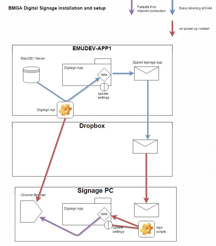
To give this all a bit more context, our basic setup is this: 1) A whole load of iBeacons placed around all three floors of the museum, 2) a device which uses their signals to calculate where it is in the museum, which 3) also uses its own compass to know which way it’s pointing. With these three tools our users can navigate a generated tour of the museum, getting lead from room to room, floor to floor, with an app that reacts when they reach each destination on the tour.

Spoiler alert… the system works!

The beginning

From the outset our fundamental technical goal was to accurately guide a single device on a physical journey around the museum, and have it react when it reaches multiple, flexible locations.

iBeacons?

iBeacons emit a signal that can be picked up by a mobile device, and the strength of that signal tells the device a rough distance between it and the iBeacon. With a few assumptions, this suggests that the technology allows a mobile device to pinpoint it’s position within a known indoor space – the two most obvious methods being triangulation-style positioning and hotspot check-in systems.

We opted for the triangulation method – as in theory if it was successful we would be able to apply to the system to any space, and cater for all sorts of navigation methods…. Particularly when used in conjunction with the device compass.

Brands

If you’ve started looking into procuring iBeacons you’ll know there are loads of suppliers to pick from, and it’s not easy to see the difference (in many cases there isn’t much). After assessing a range of brands including BlueSense, Glimworm and the beautifully presented Esitmote, we opted for Kontakt… primarily as they have easily replaceable batteries, easily configurable, are the right price, supply in volume (we needed a lot), and are visually discrete. Here’s a list of them:

Supplier URL Volume pricing Price per 100 (ex VAT + Shipping)
Kontakt http://kontakt.io/product/beacon/  Yes  ~$2200 (need to contact for discount)
BlueSense Networks http://bluesensenetworks.com/product/bluebar-beacon/  Yes  £1499
Glimworm beacons http://glimwormbeacons.com/buy/20-x-packages-of-4-glimworm-ibeacons-white-gloss-finish/  Yes  €1980
 Sensorberg http://www.sensorberg.com/en/  No  €89 per 3
 Sticknfind https://www.sticknfind.com/indoornavigation.aspx  No  $389 per 20
 Estimote http://estimote.com  No  $99 per 3
 Gelo http://www.getgelo.com/beacons/  No  $175 per 5

Placement and security

The triangulation method requires a large number of iBeacons throughout the museum building in precise locations – effectively creating a 3D grid of signals. These need to be out of reach and ideally invisible to both the public and staff, as otherwise they might be accidentally moved, tampered-with or even taken… any of which will cause serious navigation bugs in our software. This meant that colourful and attractive iBeacons such as Estimote were out of the picture for this project.

Software choices

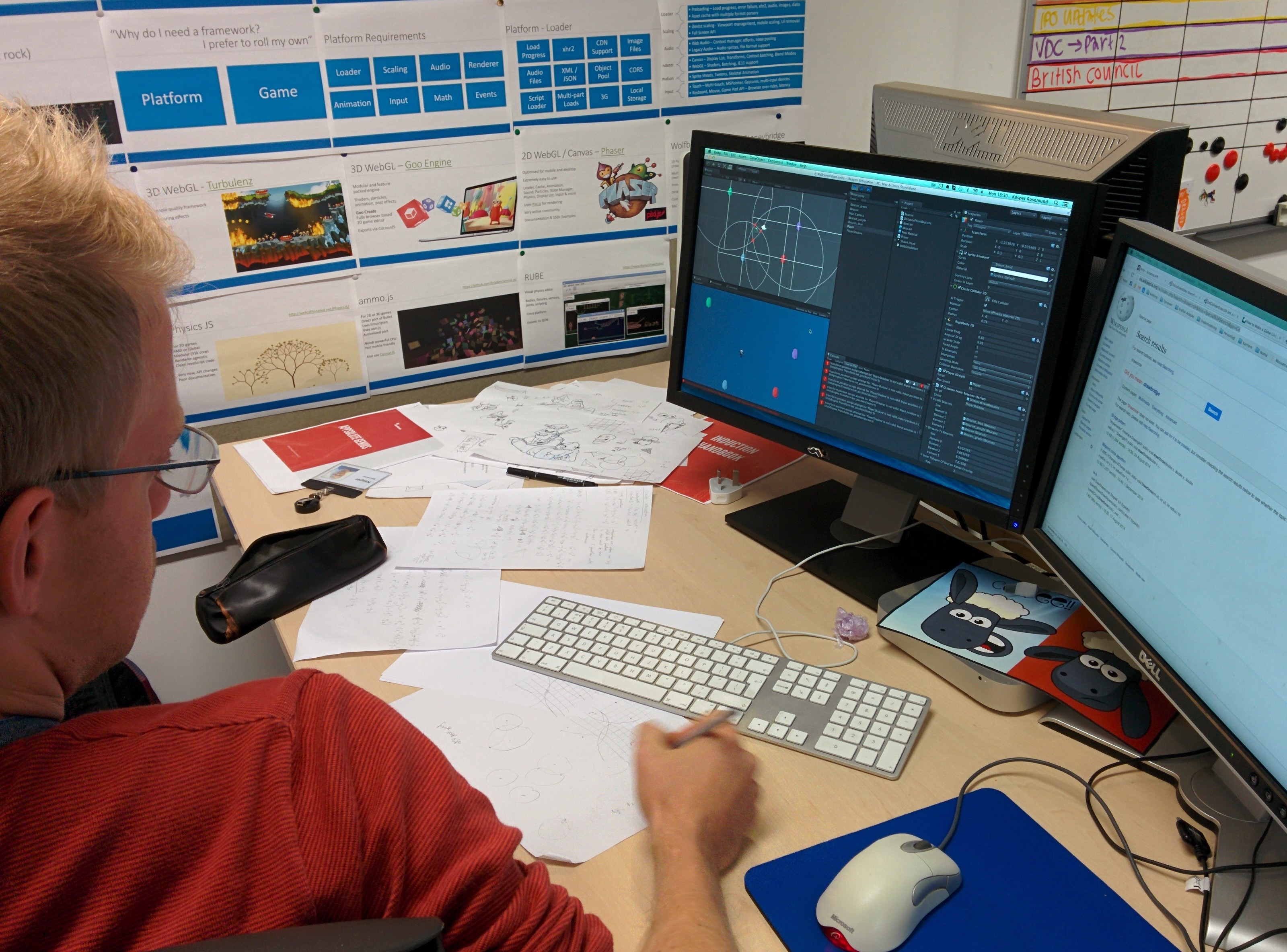
We decided to implement the navigation system in Unity 3D. Although it’s primarily a game engine, it is where our core mobile experience lies, it satisfies the cross-platform requirements of real world implementations, it is popular and has super-low barrier to entry with developers, and has very little reliance on proprietary tech.

Triangulation method in Unity

Triangulation mathsSo… how best to implement triangulation in Unity? We take the perceived distance from all ‘visible’ iBeacons, and from that we work out the precise position of the device. After a few sprints of getting neck deep in advanced mathematics, we opted to use Unity’s built-in physics engine to do the heavy lifting for us… using Spring Joints from each iBeacon to automagically position the device on a virtual map, based on perceived distances from each iBeacon in range, allowing Unity to perform the complex maths for us.

Maths and Unity

Early internal testing
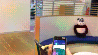
Below is a vid of an early test in the Aardman atrium – displaying the device’s perceived position and direction within a virtual 3D model of the building, as the user walks around. The bright-coloured areas on the mobile display are the two doorways. We’re not embarrassed to say that when we got this working it blew our minds a little bit.

Internal early testing

Reliability

For a triangulation system to work effortlessly the distance data it’s based on needs two things: to be accurate, and to be updated frequently.

IBeacon distance readings tend to be fairly inaccurate – with meaningful variance even in the best conditions (up to 3 metres out), and much worse in bad conditions (physical interference such as pillars or people, and electrical interference such as laptops or mobile devices). Accuracy does tend to increase the closer the iBeacons are to the device.

Frequency is also an issue. Users move around a museum space surprisingly fast… and with our system only able to read signals once a second or so it requires a lot of smoothing on the positioning data to avoid flip-outs every time an update occurs.

The compass

The compass is a tricky little system to wrangle. It is 100% reliant on the accuracy of the device’s hardware and software… which isn’t great when it comes to smart phones and tablets. Even in the best conditions digital compasses are likely to be anywhere up to 20% inaccurate (see http://www.techhive.com/article/2055380/six-iphones-tested-and-they-cant-agree-on-true-north.html) – and in bad conditions (such as an indoor space with lots of electrical interference and organic, metal or stone structures everywhere) we’ve witnessed the reading to be out by up to 90 degrees… really not ideal for leading users around a space accurately.

Three-dimensional placement

Map of Bristol Museum and Art Gallery
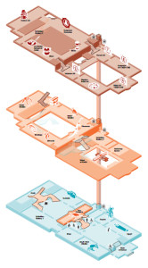
We knew that iBeacons work on distance, and so therefore the height at which we placed them would make a difference. But – perhaps naively -we didn’t expect this to cause much of an issue, so long as it was consistent. We didn’t take into consideration how powerfully the signals could penetrate through floors and ceilings… and certainly didn’t foresee issues caused by open atriums and balconies.

The Bristol museum and Art Gallery is a complicated building, with vast rooms (some without ceilings), small rooms, corridors,  stairwells, about different 6 levels over three defined floors, and even galleries overlooking other rooms as balconies.

In such a space not only is it difficult to find a consistent position in which to place the iBeacons – there are many opportunities for the device to get a bit confused about what floor it’s on…. particularly when it’s picking up signals from the floors above and below, which happen to be stronger than the closest signals from the room it’s physically in.

With a standard GPS system this would be like expecting it to tell you not just what side of the multi-storey carpark you’re in, but which level of it you’re on. And while iBeacon triangulation is vastly easier in simple environments that can be mapped in two dimensions, it is still possible in three – and we actually did it in the end.


Handling  shortcomings

So… there are a number of technical issues covered in this post, and each of them has led us to simplify and adapt the experience – even though the underlying tech is largely the same. We quickly learned to accept the huge variance in the quality, accuracy and timeliness of the data our navigation is based on, and soften the blow as much as possible so that the user’s experience isn’t affected:

  1. The inaccuracies and signal latency of iBeacons led us to free our user experience from relying on pin-point positioning – and rather round up to the user’s position to just the room they’re definitely in.
  2. The compass inaccuracies lead us to not rely on the compass to lead user around footstep by footstep – but rather to just occasionally find their bearings when stationary.
  3. The issues caused by three dimensional inaccuracies lead us to create navigation logic that only recognises movement between adjacent rooms…. So if that if the triangulation data suddenly starts suggesting the device has changed floor, it only recognises it if the user has just left an appropriate stairwell or lift area.

What’s brilliant about these solutions are how they each have significant emergent benefits to the overall user experience. Our users are not staring at the phone constantly, causing them to trip over bags and other visitors, and they’re using their brains and senses and communication to guide themselves.

All of these user experience developments and considerations will be covered in a separate post on this blog.

Summary

While iBeacons may not provide the perfect navigation system, they really aren’t a bad approach for both indoor and outdoor navigation – particularly if you go in with your eyes open to the potential issues. We achieved a slick and functional product, learning loads as we went… and hopefully this post has highlighted the issues to watch out for in your own iBeacon implementations. Thanks for reading!

This blog post acts as ‘milestone 3’ evidence Doc 3.1, 3.2 3.3, 3.4 & 3.5 (video test gif)

Using Trello as a task manager

Screen shot showing trello in action

At the museum (Bristol Culture) we use Trello, a free online task management tool to help us work together. Trello allows you to assign tasks for projects to individuals and groups of collaborators and track delivery of said tasks in a simple visual way. For example you can see our 2014-2020 Digital roadmap which is a series of ‘To-Do’ lists of projects and tasks ranging from small to multi-year, each with an assigned member of staff responsible. This particular programme of work is publicly viewable to show transparency and let potential partners see our areas of focus. Trello calls each ‘chunk’ a board. A board has one or more ‘To-Do’ lists, a status of private, shared to a group or public and members who can change the board items which are called ‘cards’.

We use the following lists across all boards as our default view:

  • Doing – what we’re actively working on for the next 1-4 weeks
  • To Do – a long list of tasks waiting to be moved to ‘doing’
  • Stalled – waiting on an action before it can be progressed e.g. changing our opening hours needs cabinet approval which takes several months so it us stalled until they make a decision and can then be moved to ‘Doing’ again
  • Done – a list of tasks that have recently been completed and sit here for the group to review together before being ‘archived’ and moved
  • Reading/Reference – a list of useful items for the group to read e.g. new policy documents

Why use trello?

Clarity of communication and speed. With over 200 staff and countless partners and collaborators keeping track of what we’re all up to is impossible through email or staff meetings. Trello is specifically made to help show ‘one to many’ what is happening, who is responsible, what an items status is and what has recently been completed . For example when the core management team (Laura, Ray, Phil and myself) make a decision that affects others we note the  date, subject  and decision outcome for all to see. Trello has a search facility making it quick to find outcomes.

We’re starting to find that trello makes lots of meetings more focused and you don’t lose track of where you are. I use it for all my team 1:1s (nothing confidential of course), key programmes and projects. I love that it works on any device making me flexible about when and where I work and it’s simple to use for all. Management team review trello on a weekly basis together using a large TV, saving paper in the process.

Check out the starter board which introduces our staff to Trello and let me know what you think of Trello.