By University of Bristol Computer Science student team: Sonny, Sergi, Thomas, Daniel and Milosz
Back in September five of us gathered round a table thinking about the prompt given to us by Bristol Museum: develop an interactive exhibit where visitors touch replicas of artefacts and related information appears, creating an interesting and fun way to learn about these objects.
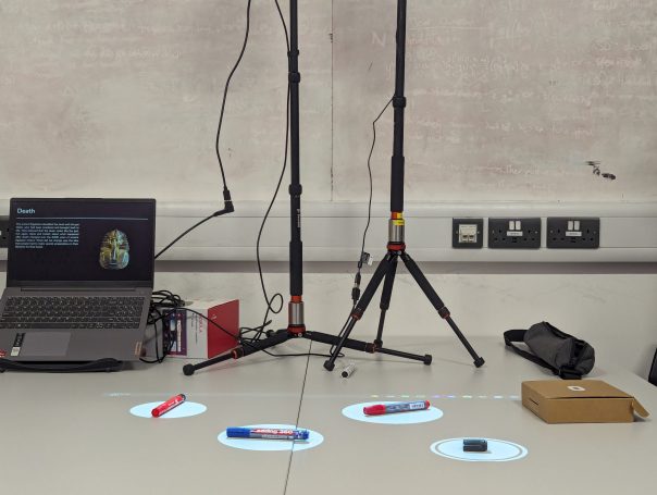
After many months and iterations, we finally came to the design you see above, an exhibit consisting hotspots over the replicas on a table. When the hotspots are touched, information about each artifact is displayed.
But how did we get here? With little idea on how to tackle such a task we split it into the three logical sections: how do people interact with the replicas? How do we display the information? How do we make it easy for museum staff to use in future exhibitions?
How do people interact with the replicas?
This was tough as we didn’t have any examples to work off – we couldn’t find anyone who’d done something similar.
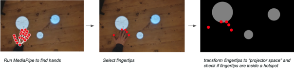
We explored many possible solutions; looking at methods such as computer vision, lasers and detecting decreases in light. Through our exploration we ultimately settled on MediaPipe; an AI-powered hand tracking model which allowed us to see how users touched the replicas.
We created hotspots in which the replicas could be placed and animations to prompt visitors to interact.
While two of us worked on this, the rest of the team was busy creating a user interface, so users could engage with the exhibition.
How do we display the information?
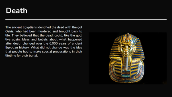
This was a simpler task; the museum had informed us that they wanted to use projectors to show this information, so we created a dynamic display with a black background and white text to make it less blocky and more appealing to the eye. After a few iterations with museum staff and user feedback we came to the structure shown. Videos, image slideshows and text can all be included.
How do we make it easy for museum staff to use in future exhibitions?
We wanted to create a easy-to-use system with equipment most museums would already have.
A projector displays hotspots and a camera detects when people touch them. The camera and projector can be calibrated with the click of a button. A second projector displays information, which changes according to how the users interact with the hotspots.
We also designed an editor allowing staff to add, remove and position the hotspots, and attach relevant information to them. We added import and export features so the design can be used on different machines.
Conclusion
Overall this was a fun project to work on. We learnt a lot about computer vision, hardware, frontend development and working as a team on a larger project. We are grateful for Bristol Museum for coming to us with such an interesting task and are looking forward to seeing this software in action.
My name is Adelina and I am a third year English Literature with Writing student at the University of the West of England. For this year`s writing module, students like me are undertaking a 36-hour long placement. The idea is that we feel prepared to find a suitable job after graduating. This is why we didn`t just simply rock up to our workplace but instead we went through a formal interview process, with our lecturers and potential employers. As nerve wrecking this as this interview was (I forgot about half of the answers I had prepared) Bristol Museum and Art Gallery agreed to take me on as a placement student.
On my first Day, Mark gave me a tour around the museum. I had visited before but didn`t realize how massive the building really was. Mark warned me that I will probably get lost in the beginning. I laughed at first, and although I hate to admit it, I did in fact get lost about three times on my first day. I even had a chance to go down to the archives, where I saw more curious things than I could have ever dreamed of. Down there was an incredible collection. From oil paintings and porcelain figurines to preserved bugs and ancient books, they had everything!
On my second day, I met Sophie who had a super fun task for me. I had the opportunity to familiarize myself with the museum`s online shop and even write a few product descriptions.
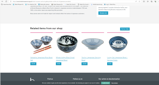
I also had the opportunity to work on the museum`s February newsletter. I was impressed on how much planning the staff must do, so that they can keep their visitors updated. Although I have created blog posts as part of my studies before, I felt proud of having contributed to this project. It was a great feeling knowing that subscribers to the Museum`s newsletter will read something that I put a lot of effort in.
Here are a few pictures of the February Newsletter:
If you would like to subscribe to Bristol Museum`s newsletter, you can do so here:
Over the course of my placement, I familiarized myself with how the museum maintains their websites. I logged into the museum`s WordPress and Shopify. I searched for related items to the websites post and added them at the bottom of the page. It was so interesting to see how important this type of marketing is within the museum`s structure.
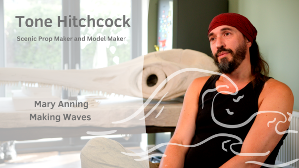
Perhaps the most challenging, yet most rewarding tasks was to create a social media plan. From 13 January until 30 April Bristol Museum and Art Gallery is displaying their “Making Waves” exhibition all about “Mary Anning and her astonishing ichthyosaur”. It was my job to promote this exhibition by creating a social media schedule for the exhibition and related events. This was particularly challenging for me as I personally don`t use social media and am not used to drafting posts. Luckly, I was giving a writing style guide which ended up being a massive help. So, if you follow Bristol Museum and Art Gallery on X (Twitter) and Instagram you may just stumble across a post that I wrote. 😊
Another fun exercise the team had planned for me was to create YouTube thumbnails, for videos about the Mary Anning exhibition that I mentioned earlier. The museum uses Canva for this. Although I had never used Canva before I felt as though I figured it out relatively quickly and enjoyed playing around with different motives and effects, to create visually appealing thumbnails. It was great to get to work on a project that was so out of my comfort zone and enjoying it.
Here is an example of a thumbnail I made.
You can watch the “Making Waves” videos on Bristol Museum`s official You Tube channel. Klick here to explore their channel and to subscribe: https://www.youtube.com/c/BristolmuseumsOrgUk
Overall, I had a wonderful time working for the Museum. It was amazing to be able to look behind the curtain of a museum so many adults and children alike visit daily. The placement gave me more confidence in my writing skills. Even though I have been living in England for a few years now, I still sometimes feel doubtful about my writing skills, since English is my second language. So, the team’s encouragement and support meant a lot to me and helped me become a more confident writer. I am grateful for this experience, and I believe that it will benefit me a lot, when taking my next step, which will be to apply for a master’s degree (fingers crossed).
Thank you so much to UWE and to Bristol Museum and Art Gallery for this opportunity. I am excited to come back again soon, only this time as a visitor. 😊
I’m Lillian Robertson, a final year undergraduate student studying Sociology at the University of Bristol. I landed this User Research Internship under a University of Bristol Q-step Internship, a sponsored scheme designed for social science students to gain experience of working with real-world data to develop their quantitative research skills. Being that I only had experience of working with data in an educational setting, I was keen to do this internship to broaden my data collection, analysis and reporting skills. Having limited knowledge about digitally assessing and presenting data, I was also excited to take on the challenge.
Getting started and Identifying the issues
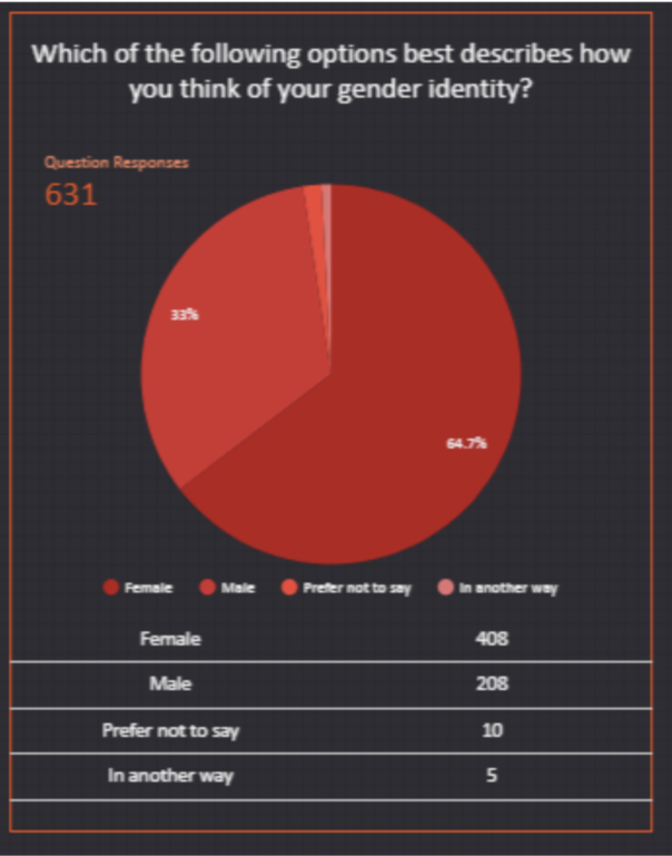
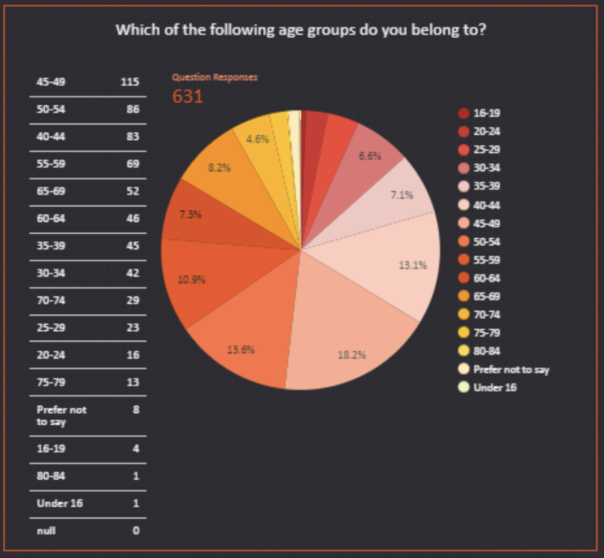
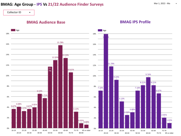
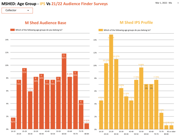
After a few set-backs and delays due to tightening covid restrictions, I began this project at the beginning of February. We laid out a 2-month timeline and started to identify issues with the current methods of visitor data collection that Bristol Museums use: emailed self-completion surveys (ESCS) and tablet self-completion surveys (TSCS). In terms of demographics, the data appeared to skewed, with visitor demographics not matching anecdotal evidence given by front-of-house (FOH) staff. Taking the Vanguard exhibition (26 June- 31 October 2021) as an example, FOH staff reported a significant proportion of visitors being younger men. But survey results didn’t reflect this, and instead showed that 64.7% of visitors were women whilst 44.9% of visitors were aged 35-54 as can be seen in the images below.
Differences in museum visits by gender are not uncommon, with women being more likely to visit general and natural history museums. But the proportion of Vanguard’s female visitors seemed particularly large, making us believe that our data collection methods may be causing sampling or non-response biases. One theory we had for the large gender difference in Vanguard visitors was that the (ESCS) are only emailed to the person who booked the museum tickets, which may be more likely to be women as a result of gendered divisions of domestic labour. With this in mind, we identified potential issues that our data collection methods may have.
Issues with the emailed self-completion survey (ESCS):
The email is only sent to the booking email address. This can be problematic as certain demographics are more likely to book tickets on behalf of a group, such as women.
Busier people may be missed out.
Some people don’t check their emails.
The email may go to spam.
The email is only in one language (English).
Misses out walk-in ticket holders entirely.
Issues with the tablet self-completion survey (TSCS):
It attracts a younger demographic.
Relies on confidence with technology which may miss out certain groups.
The positioning of the Ipads may affect who is filling the surveys out.
Coming up with a plan
To identify any sampling and non-response biases within our current data collection methods, we decided to conduct an in-person survey (IPS) at both BMAG and Mshed. This would enable more sampling controllability to make the data set as random and unbiased as possible which could then be compared to ESCS and TSCS data gathered at the same time period in order to reveal any differences and identify biases
As we were focusing on sample demographics, we only needed to collect information about people’s age, sex, ethnicity, disability status and postcode so we took this section from the current visitor survey to create a 1 minute IPS.
Collecting the data
After having a walk around the BMAG and MSHED sites I decided on specific locations for the data collection that had a consistent flow of visitors. For BMAG this was on the first floor at the dinosaur area and for MSHED it was the 1st floor main foyer area. This allowed me to catch visitors going up and down the stairs to a range of exhibitions. I also took some Covid-19 safety measures as advised by the Market Research Society’s (MRS) Post-Lockdown Covid-19 guidance regarding undertaking safe face-to-face data collection, which included precautions adhering to social distancing (including only myself touching the iPad) wearing a mask, taking a daily lateral flow test and not approaching those who looked particularly vulnerable. In terms of sampling, I used random sampling by approaching people at regular intervals depending on how busy the museums were such as every 3rd person/ group that passed by. By the end of the data collection process I had come to terms with how awkward and brutal rejections could be however the overall response rate was actually quite high. While MSHED had a response rate of 70%, BMAG had a response rate of 58% which is slightly higher than the average of 57% for IPS. A large number of people were apprehensive about the duration of the survey however agreed to take part once they were reassured it wouldn’t last more than 2 minutes. After they said yes, I read out a a few sentences about what kind of questions would be asked and how their data would be used and stored safely in order to get their informed consent. It’s also important to mention that when approaching a group, I selected one person at random by asking whose birthday was soonest. Asking the actual survey questions usually went smoothly and respondents seemed to find it easy to answer the questions, with me verbally asking the questions and then filling out their responses on an iPad. However a handful of people appeared uncomfortable or confused by the Gender and Ethnicity questions specifically, but not to any major extent. A minority of people were also uncomfortable providing their postcode, with some citing privacy and data sharing issues as a concern. Overall it was a good experience and some were even keen to share their opinions about the museum or have a chat afterwards.
What did we find?
When analysing the findings, we compared the IPS data that was collected from 01/03/22- 19/03/22 with combined ESCS and TSCS data ,collectively referred to as ‘audience finder surveys’ or ‘audience base’, from 01/03/22- 24/03/22, adding an extra 3 days to give people time to complete the ESCS.
Gender
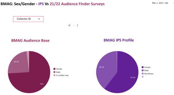
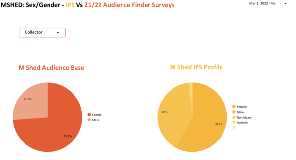
As mentioned, the over representation of women was something that we were particularly aware of from FOH accounts. Our findings indicate that this may in fact be the case. For BMAG, the IPS recorded 13.4% less women than the audience base. Similar results were found at MSHED, with the IPS showing 15.8% less female visitors.
Such gender differences suggest that ESCS and TSCS data collection methods may indeed be leading to an over representation of women. As mentioned previously, this difference could be due to women being more likely to book museum tickets, and thus receive the ESCS. Research has also found that women are more likely than men to engage with and complete E-surveys in general. It is also important to note that, for the IPS at both sites, women still make up over half of visitors. This can be explained by women generally being more likely to visit art galleries and natural histories museums then men, with the figures of 60.4% and 58.1% closely aligning with a broad survey of European museums that found 56%-58% of visitors were female.
Age
Unexpectedly, some differences in age were found. At both sites, A higher percentage of 16-34 year olds were recorded with the IPS, with other age groups showing a similar pattern to the audience base.
This may indicate that younger age groups are being underrepresented by the ESCS and TSCS and also suggests that young people may have a lower online response rate than elderly populations. However it is important to recognise how my presence as a 23 year old researcher may have affected such results, despite random sampling being consistently used. In this sense, people of my age group could have felt more inclined to complete the survey as they see themselves reflected in my position. With this in mind, it would be useful to repeat the survey with a researcher of a completely different socio-demographic to see if results differ.
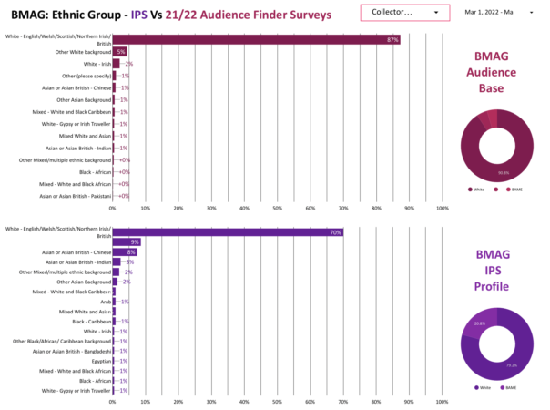
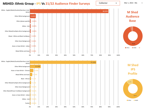
Ethnic Group
Slight differences between ethnic group responses were found, with the IPS reporting a higher percentage of people with an ‘Other white background’ and ‘Asian or Asian British- Chinese’.
Anecdotally, this may be explained by people not being confident in English or believing they weren’t eligible for the survey. Some of the people stated that their English ability was not that good, a large proportion of whom were Asian or Asian British Chinese. However, most agreed to take part when I convinced them that the survey was very short and simple. This shows that a lack of English ability may prevent certain people or groups from filling out the ESCS and TSCS, implying that surveys in additional languages may be beneficial. Additionally, those who were from an ‘Other White background’ were often tourists and a handful of people mentioned that they didn’t think they were ‘the right people’ to complete the survey because they weren’t British.
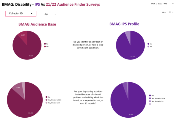
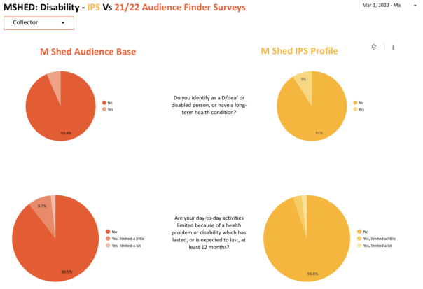
Disability
For those identifying as deaf or disabled or having a long-term health condition, very little difference was found between the audience base and the IPS. However, the second question ‘Are your day-to-day activities limited because of a health problem or disability which has lasted, or is expected to last, at least 12 months?’ did show some differences. The BMAG audience base showed that 13.4% of respondents were limited in some way as opposed to 5.6% reported by the IPS. Similarly, the MSHED audience base showed 10.4% of respondents were limited in some way in contrast to 5.1% as shown by the IPS.
This suggests that the IPS may not be appropriate for gathering data about disabilities and health conditions. Firstly, I was located by a set of stairs which may have missed out those who have to take the lift due to their disability or health condition. Secondly, people may not have been comfortable sharing their personal health information with me but would be more comfortable doing so in private using the ESCS. Thirdly, those with disabilities may need a certain environment or equipment that can only be provided at home in order to complete surveys. Finally, those with particularly evident disabilities were not approached due to covid-19 precautions.
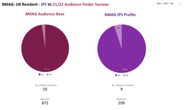
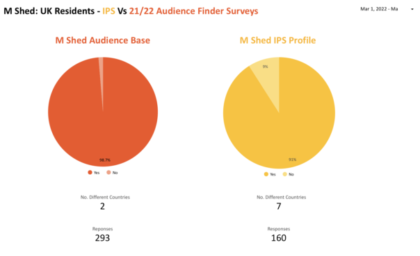
Visitor Locations
In terms of UK visitors who provided their postcode, no significant difference was found between the audience base and the IPS survey when looking at locations by UK region, region and town/area, suggesting that the ESCS’s and TSCS’s are effective at collecting such information. However when looking at the percentage of non-UK residents there is a significant difference in the responses. For BMAG, the Audience base reported 2.3% of visitors being non-UK residents while the IPS showed this to be 5.1%. Similarly, the audience finder survey at MSHED reported 1.3% of visitors being non-UK residents while the IPS suggested this to be 9%. As I mentioned above, this may be due to tourists not feeling like their English ability was good enough to complete the survey or that they weren’t eligible to complete the survey because they weren’t British.
What do we reccomend?
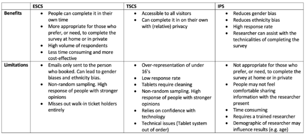
This project allowed us to see the importance of using multiple data collection methods to collect visitor data and reduce overall bias. It also revealed the benefits and limitations of individual data collection methods :
ESCS: emailed self-completion surveys. TSCS: tablet self-completion surveys. IPS: in person survey.
The key take away from this research is it’s clearly valuable and important to continue doing this research. It appears that our framework for the data collection review worked particularly well being that the IPS had a high response rate and indicated some limitations and benefits of using ESCS and TSCS. It is important to emphasise that future studies should stick to a random sampling method to reduce any bias of IPS. With a bit of confidence and “dedication to the process” the random sampling method of approaching people by intervals worked well alongside selecting someone in a group based on whose birthday was coming up next. In the future, the framework could be expanded into a larger study using volunteer researchers (Watch this space). This would mean that a larger data set could be gathered and multiple locations around the sites could be covered. Ideally, such volunteers would differ in terms of their age, gender and ethnicity in order to reduce any bias that may be caused by the researchers presence. Research could also be extended to the other sites.
Special Thanks to Bristol Museums and the University of Bristol for organising this internship and to Nikita Marryat and Mark Pajak for their support and guidance.
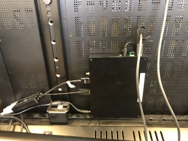
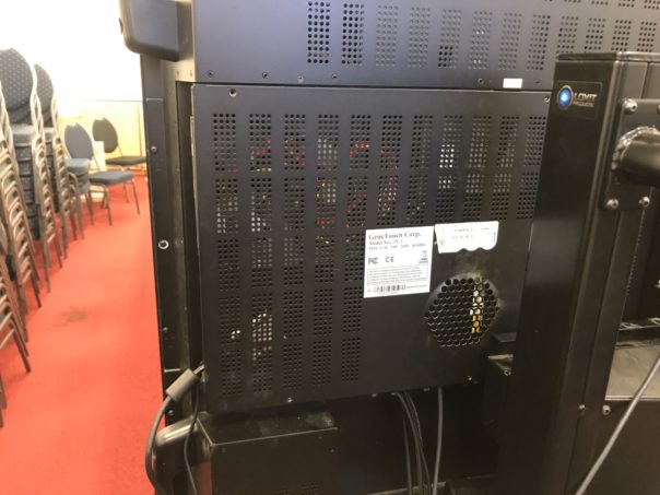
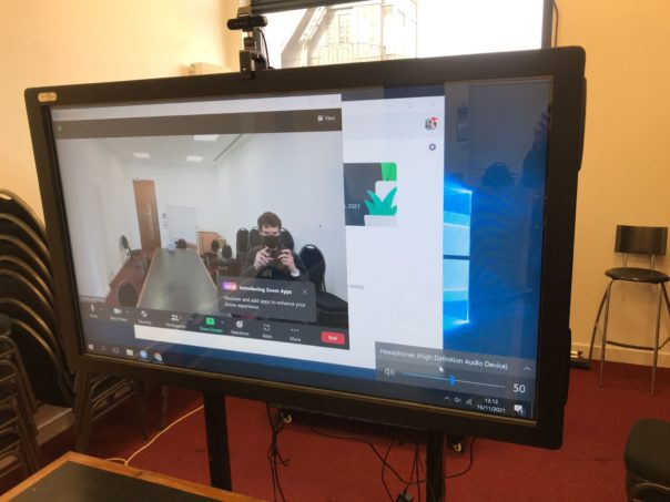
We have a large touchscreen/TV in one of our staff meeting rooms at M Shed, it has lately mainly been used an extra display for laptops as the built in PC is awkward to use and runs at a snail’s pace.
The screen is a discontinued GenTouch – CleverLCD Dual Touch Plus. We installed windows 10 on the screen’s PC, following which it became even more sluggish and a new contender for slowest machine in the building award.
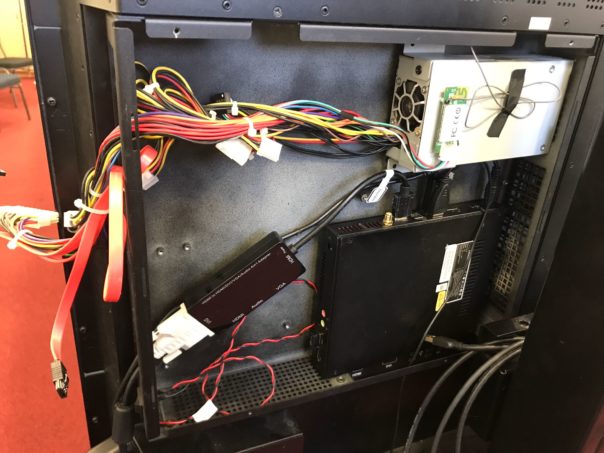
We already had a fast Windows 10 mini PC so the idea was to Frankenstein it into the screen and the idea actually worked.
Original innards.Impossible to remove screw, somehow did it.The new PC with everything connected.Old power supply would not come out but was removed with brute force.
We also set it up with a 4k quality Logitech Brio webcam and daisy chained USB microphones which can be placed at each end and in the middle of the large meeting table.
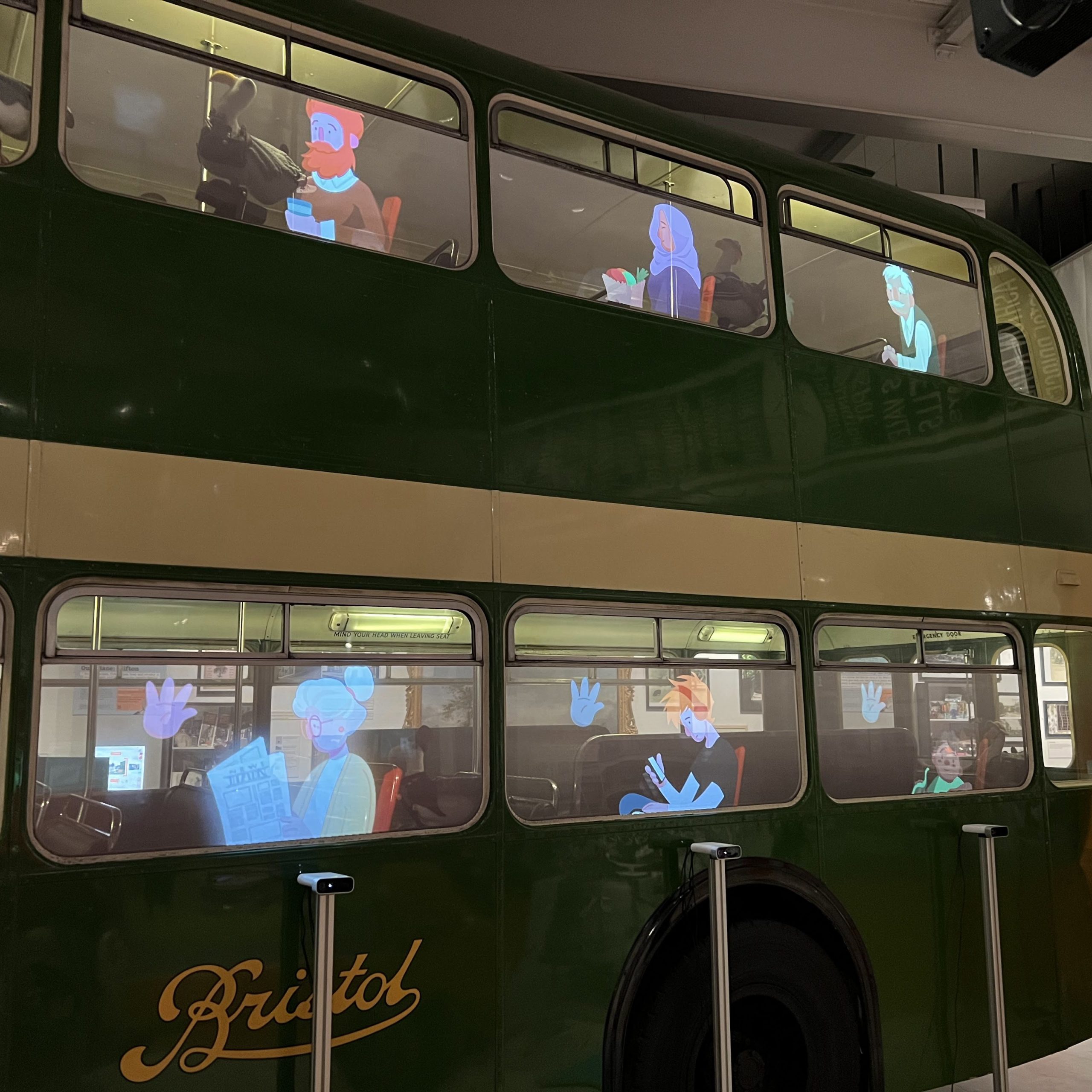
So quite a few things have happened since my last blog post here… Notably on our end, the Mshed Bus Interactive!
Over the covid period using part of our grant from the Art’s Council’s Culture Recovery Fund we decided to make our iconic Lodekka Bus an interactive installation aimed at sending kids round the museum to find objects in our collection.
The goal was to create a new way of revitalising Mshed with covid safe interactivity, specifically using the Lodekka Bus. The bus is a significant part of our collection and was accessible on both floors before covid, however due to the pandemic it currently remains closed for a period of nearly 2 years as of typing.
How it works
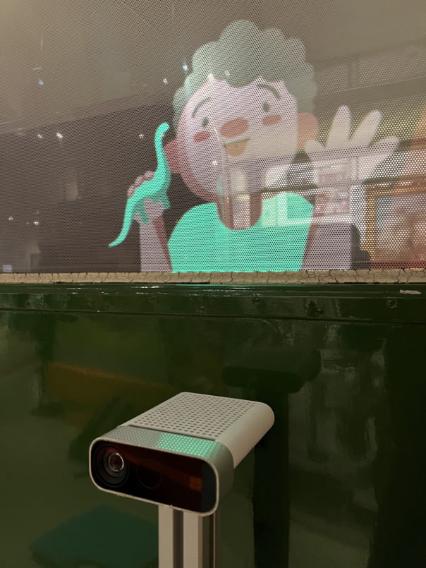
We wanted to add to the bus and give it some life back in these times and do this in a way that if it is to be opened again, would not restrict access, but add to the experience. Therefore a project was commissioned to project interactive characters in the windows. These characters (specifically from the bottom 3 windows of the bus’s left side) can be waved at and will respond to this with a story about an object in our collection.
The interactive as shown below projects onto 9 of the windows on the entrance side of the bus, and has a conductor character on the TV next to the Lodekka, signposting people to the interactive. Each of the 3 interactive windows has a hand icon that fills up based on how close it is to being activated by waving.
This video shows the functionality of the interactive windows.
How it works (The Nerd Version)
The system uses 3 Azure Kinects, each hooked up to their own computer, equipped with an 8 core i7 processor and RTX Graphics card. The 3 PC’s are hooked up to 4 projectors (one machine handling two projectors), this gives each machine one Azure Kinect hooked up to one of the 3 interactive windows on the bottom floor of the bus. All the PC’s run the same Touchdesigner project and talk to each other in order to coordinate what characters are doing in the bus windows depending on which sensor is triggered.
The characters are premade animations with each video circling back to the same start and end frame in order for videos to change over seamlessly, each projector covers 2 windows so 2 characters per projector. The bus windows are covered in Contravision which enables you to see the image whilst also being able to see inside the bus and outside the bus from the inside.
Touchdesigner also allows us to projection map the videos to the windows making them work perfectly in situ. The wave detection is able to tell when the hand is both raised and moving and a threshold is set for the amount of said motion. Visual feedback is given in a hand icon which shows the level the threshold is currently at. Once the threshold is passed the sensor has detected a wave and will change the video content, the character will then tell you about an object in the museum. As the system works on changing videos over the characters can be changed over with new characters whenever we want them created.
Research/Procurement
I was given the task of researching the technical side as a whole to make sure this will work, most notably being able to get the system to recognise waving as a trigger for content and being able to make this work with what hardware is available and find a developer who could pull this off.
This was a leviathan of a project to pull off in the timeframe and we managed to make use of some fantastic developments in interactive technology to achieve this. Most notably Azure Kinect sensors and Touchdesigner, which is a real time visual development platform that allows you to create interactive installations with less code and is visual programming which allows for quicker development.
It’s a software package I’ve been interested in for a while as it allows you to mock up interactives using sensors at a much quicker pace than coding them, as most bits of code you would need to join up use of different devices and multimedia are built into the software. It’s also not restrictive in that you can still use Python within Touchdesigner to add functionality where there is no native way of achieving what you want.
The timeframe to get this project on the go was set at the peak of covid and was restrictive for numerous reasons, notably electronic supply chains suffering, no ability to do testing of sensors on more than one person and restricted access to site affecting testing and brainstorming of the project concept and logistics.
In particular this made researching if a robust enough sensor for detecting a wave was readily available to us with a developer who can work with it and hardware powerful enough to run the detection software. After getting hold of sensors we decided that the most robust option was going to be to use Azure Kinects, which have solid skeletal tracking, which is what we use to detect waving.
Due to how niche this project was, finding a developer that was able to pull this off was difficult. Freelancers were definitely the option as few companies are willing to take this on without doing the entire project (content as well as hardware), let alone not charging an astronomical fee for the project (10s if not 100s of thousands of pounds). Probably the hardest turn around i’ve done thus far here getting all this to fit together and work.
We also had issues with procuring computers with powerful enough Graphics Cards to run the Azure Kinect sensors (a key reminder that order by request does not guarantee you that product at the end, even after payment.) Thankfully we had a computer delivered before install week, months after putting in the order. It all pulled together in the end and we got a fantastic developer Louis d’Aboville, he’s done numerous projects with Touchdesigner and has done a fantastic job in this project.
Development/Installation
Once we had the project green lit and the purchases made, the software development began from Louis, which with his use of Touchdesigner has proven to give us a changeable, upgradable and robust system that achieved this complex project. Following development of the software being finished, we began the install process of the hardware in July, where the bulk of the install work was done. Alongside this in July the content development was given to Kilogramme, who did a stellar job working with the constraints of the content needed in order for it to work with the system. Particularly with making content the right lengths to make triggering the interactive quick whilst keeping continuity throughout by using the same start and end frames, all whilst making the animation look convincing.
Because of how the pandemic was at this time planning out a timeline for this that would fit in with other obligations of staff was nigh impossible, so getting the install date nailed down took awhile and remobilsation work of getting our sites reopened and fully running had to take precedent as well as exhibitions such as Vanguard Street Art and Bristol Photo Festival also draining our capacity. So I would again like to thank both Louis and Kilogramme for the work done with an ever changing set of dates for key work to be completed.
And as of October 2021 we launched the interactive to the public!
Where we plan to go from here?
We don’t plan to stop after the initial launch. As the system was designed with flexibility we wish to use analytics integrated by the developer to figure out how to improve the system over time. Over time we can figure out how to optimise the gesture recognition by walking the line between robustness and sensitivity to the various types of human waving. We can also use signage in the interactive area to drop visual cues on how to best interact with the system. We can also add themes to the content in festive periods such as Christmas with snow, halloween with pumpkins, easter with eggs, etc. On top of this there is still more we could do with the system over time.
I believe this system shows the capability of Touchdesigner being used in museums. The ability for it to cover most types of interactives that would be made in museums, whilst being a piece of development software that i think most technicians could pick up themselves over time. It has numerous uses apart from using sensors, cameras and video content. It can manipulate content, projection map and do real time 3d content, all of these elements can be linked in to each other in one project, in realtime. A good video showing the use of this in museums can be seen here.
I have been learning the software myself and have been able to pull off some basic interactivity using the Azure Kinect and other sensors and in time I aim to be able to build on this knowledge and apply it in the museum where and when possible, to pioneer new interactivity on our sites.
A Special Thanks to Bristol Museums Development Trust and Arts Council England for making this possible.
I have been working on the development of the Bristol Museums partner page with Google Arts & Culture for close to two years, and in October it finally went live!
Some background info about my involvement
I started working on this as a trainee on the Museum Futures programme in January 2020, this was actually one of the first projects that I participated on. Originally designed as a partnership with South West Museum Development , the idea behind it was that we would develop a page for Bristol Museums and then bring this (and the process guides) to smaller museums as a way to support getting their collections online. However, it was mutually decided that this process was more convoluted than anyone first assumed, and that didn’t end up happening.
As of April 2021, I have continued to work on this in my current role as Digital Collections Content Coordinator – a position funded by the Art Fund – as part of a larger project to make our collections accessible online. Thanks Art Fund!
This project has not necessarily gone to plan. We originally aimed to launch at some point in summer 2020. We were then offered to be a part of the Google Arts & Culture Black History Month 2020 campaign if we were ready to launch by that October. While we first worked towards meeting the deadline, we ultimately decided against going ahead with this plan as we had to rush, and we felt that these stories deserved a much longer preparation time than we could give them at that stage. Also, we felt that we didn’t need to be a part of the campaign in order to tell these stories.
What is Google Arts & Culture?
Google Arts & Culture is still fairly new and unknown territory, and there seem to be a number of (understandable) misconceptions about what its purpose is. Is it social media? Is it an alternative to Collections Online? Is it a blog? Can we signpost to events and the shop?
No, sort of but not really, no and no.
This doesn’t really sound appealing, does it?
The best comparison we can make is to a Collections Online service, but less extensive. And it’s shared by lots of other organisations. And also other organisations can use our images. (Yikes! But bear with me.)
It is described as an online platform through which the public can view high resolution images of objects in museums and galleries. This is accurate, does what it says on the tin.
You might know Google Arts & Culture from the Art Selfies trend (which I would recommend checking out if you’re not easily offended, as the comparisons are usually NOT KIND) or the chance to zoom in reeeeeally close to Rembrandt’s The Night Watch. These are two of the platform’s jazzy features that haven’t really been seen anywhere before, at least not in the same way.
Why do we want to use it?
They use incredibly sophisticated software to automatically attach these functions to uploaded content, which is good for us because it means we don’t have to do anything special to get them to work for our objects. By using the highest quality TIFFs that we have for the objects we’ve selected, we can zoom in to brushstroke level on these works and use attention grabbing features like an interactive timeline.
I mentioned before that other people can use our images. This sounds like a big no-no, but bear with me (again).
When creating an exhibition or a story you can use content that you’ve previously uploaded, but you also have the opportunity to use images shared by other organisations. This is often used if an org is creating a story about a specific subject and they don’t have enough content/images to contextualise, they can use images that have been uploaded to the platform previously. As all images already have clear rights acknowledgements and redirect to the partner page they belong to, this does not breach anything nasty.
The benefit of this is that the reach one image could potentially have is boundless, and thus, the reach of our page also has the potential to be boundless.
What do we do if they kill it?
Well, it wouldn’t be ideal. We wouldn’t lose much content, and we won’t lose any data as this all came from our CMS anyway. We don’t rely on this to attract the bulk of our audiences and we’ve approached it as a bit of an experiment. It would be a shame to lose it, but it’s so new that I honestly can’t say how much of an impact that it would have, so I suppose we’ll just have to wait and see.
What has the process been to make it a thing here?
LONG. This process has been full of learning curves and a lot of troubleshooting. There is much to be said for data consistency and quality at internal database level when working on projects such as this. Arguably, one of the longest processes is assessing groups of content to ensure that what you’re including meets data requirements. But it has been fun to experiment and uncover a process that is now…somewhat…streamlined – which looks a bit like this:
Find cool things on the database
Export cool things using a self-formatting report that you’ve spent weeks developing in Visual Basic (groan)
Find images of cool things and group those
Export images of cool things using another self-formatting report that you’ve spent weeks developing in Visual Basic (more groaning)
Stitch together image metadata and object metadata
Add in descriptions and dimensions data manually because of data quality issues and duplicates that you have to assess on a case by case basis
Upload fully formatted and cleaned dataset to a Google Drive as a Google Sheet
Add in rows from new dataset into the Google Sheet that you’ve been provided with, because instead of uploading individual CSVs (which it says you can do but this option does not work) you have to use one spreadsheet and refresh it every time you make additions from the Cultural Institute (Google A&C back end)
Upload images to Google Bucket
Refresh spreadsheet from the Cultural Institute
Fix all of the errors that it comes up with because it’s a buggy system
Refresh again
Repeat steps 11 and 12 as needed
So…not exactly streamlined but in fairness, I have ironed out all of the kinks that I am capable of ironing out. The systems designed by Google are more archaic in practice than I was anticipating (sorry Google, no shade) and the small yet very irritating tech issues were real roadblocks at times. And yet, we persevere.
There will always be a level of manual work involved in this process, as there should be when it comes to choosing images and reviewing content, but I think that this does highlight areas where we could do with giving our database some TLC – as if that’s an easy and quick solution that doesn’t require time, money and other resources…
We aren’t sure what the future of the Bristol Museums partner page looks like just yet, especially with a few projects in the works that might help us bridge some of the gap that Google Arts & Culture is helping to fill. At the very least, I’ve learned a fair bit about data movement and adaptability.
Do have a look! This was a labour of love and stubbornness. Maybe let us know what you think?
This work was made possible by a Respond and Reimagine grant from The Art Fund
I’m George, a new member of the team on a year fixed term contract, coming from a background of website UX and other IT technical experience. My former role had a high focus on web standards, accessibility and a lot of ownership over what with publish but following guidance. I have taken a big curiosity over how we meet user needs with our digital and online web content and why. One of the easiest ways we really know what our users want is by measuring our data, and analysing its successes.
I was very grateful to have an opportunity when I joined the team, to be a part of Culture24‘s Let’s Get Real project (Supported by Arts Council England). And was gladly thrown into a positive working community of other museums and professionals alike who assisted me and complimented my existing knowledge. In this blog i’ll cover some of the things I aimed to achieve throughout its time, how I achieved it and now how it is being used in our daily activities.
The project and my experiments led to a discovery of what data is important to our organisation and also paved the way of thinking of how can we use this data to consistently read and improve on our digital output.
To begin, I created a dashboard using Google Data studio to measure all our web stats and also experiments, at first I wasn’t too sure of it being easy to read at a glance, so I kept making improvements on my first version and getting feedback and testing from business and my team.
Web stats dashboard: Screenshot of the current version of our data dashboard
Now with a way to measure my experiments, I started my first idea with to add another static header button for newsletter sign ups (and measure its effectiveness of converting site users to newsletter sign ups).
Website header CTA buttons:Addition of newsletter option, which is 0 cost to the user sign up and then getnotified of everything we do – events, shop products and venue reopening times.
During this experiment I felt I could do more, I felt the need to have something more tailored to the user and what page they were viewing and looked at using page targeted pop ups for my second experiment.
Building a dashboard measure success
Before and during experimenting we needed to ensure we could visualise the data of our results. We could of course use analytics, but we found this was not time efficient and had many different routes to find our information. The use and development of one google dashboard allowed us to build and expand upon needs of the organisation through data driven decisions and evidence.
From the whole of one domain and it’s page views, where users come from before coming onto the site (referrals), a timeline graph of noticeable hits and a map to show what different regions, countries and cities are viewing what pages the most and for how long – the use of a bespoke designed dashboard would accomplish this. And it shouldn’t need you to be a analytics genius.
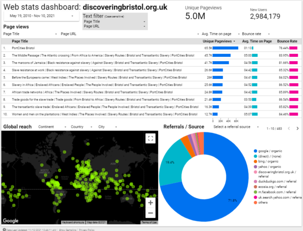
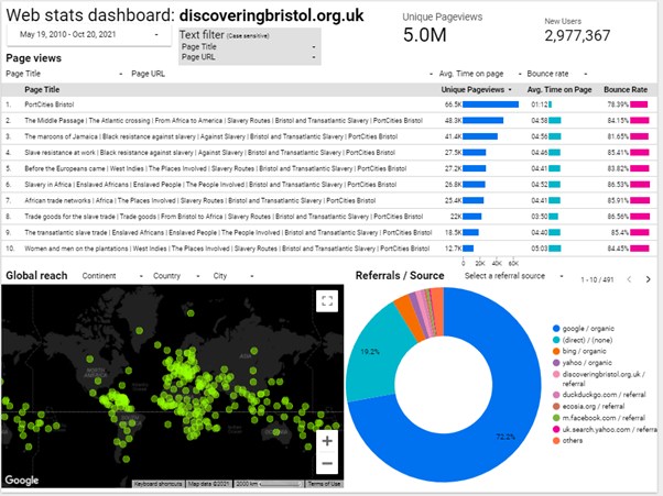
I tried several different designs initially but tried to keep in simple, user friendly and at a glance. Once the design elements and graphs were in place, it was easy enough to create more of these and filter to specific organisation need. One notable website I added has exceptionally interesting and notable data for our organisation: discoveringbristol.org.uk.
Noting the below dashboard, it has users across the world, a great average reading time and approx. 5million page views. However we feel it could use an update to reflect more modern times and tech.
Web stats dashboard: 5million hits and worldwide users on discoveringbristol.org.uk
But what more can we do with this data? There is a clear need by the pageviews to provide more historical content not just to the local or national viewers of our site – a worldwide web audience.
Understanding our users and what they want
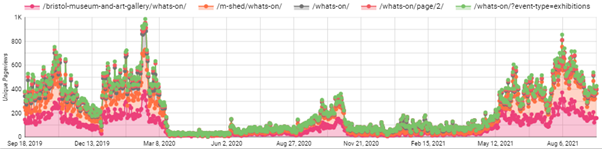
The timeline graph below shows the most viewed events web pages since September 2019. Do note the almost flatline number of page views from March 2020 – when COVID lockdown begun.
Timeline graph of pageviews: A noticeable impact due to covid on our events pages
As a result of our venues closing we could predict that visitor donations, online ticket sales, in venue shop sales and visitors who relied on our noticeboards or promotions using banners would decrease.
And an opposite effect is there has been more of a demand to have a stronger web presence, offer online events and exhibitions, keeping our audiences up to date with what we’re doing etc.
It’s this thinking which gave me the idea as part of Let’s Get Real to experiment with trying to convert users to donations, shop sales or newsletter sign ups as this could help the impact that COVID has had on our organisation.
Experiments
Experiment one: Adding ‘Newsletter’ button alongside 2 other header buttons
Problem: Newsletter underperforms as an ‘outbound event click’ in Google Analytics compared to Shop/Donate buttons Solution: Add extra button alongside static buttons within website header Expected outcome: To increase newsletter clicks and gain bigger mailing list for future promotions Considerations: May decrease other 2 buttons clicks as 3 options Result: Newsletter clicks are performing better than donations clicks
Summary:
We had 2 CTA buttons for Shop and Donate. I suggested to add a ‘Newsletter’ button link as shown:
Header buttons: Shop/Donate/Newsletter – We needed to offer a 0 cost option to our users
We implemented the google tag manager tracking of all these event clicks from Jul 2nd. At the same time, we added the button for Newsletter to our live site as shown above. The first two buttons require a cost – buying or donating money. I felt we could be more inclusive.
For other users of certain demographics, for example those who are younger, disadvantaged, lower incomes, the very least we could offer them is a way to be notified by our work via email newsletter. This should offer just that – a way to interact and keep involved with us.
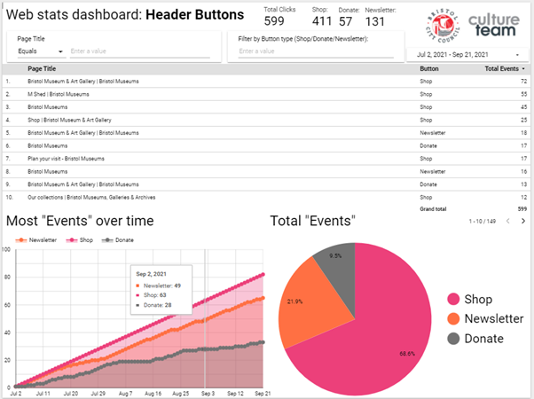
Web stats dashboard: Header Buttons: Shop/Donate/Newsletter – Area and Pie (page) chart
The above screenshot showed us our users prefer to go to our shop, then click our newsletter link and then lastly donate. The table shows what pages had the most clicks to which buttons.
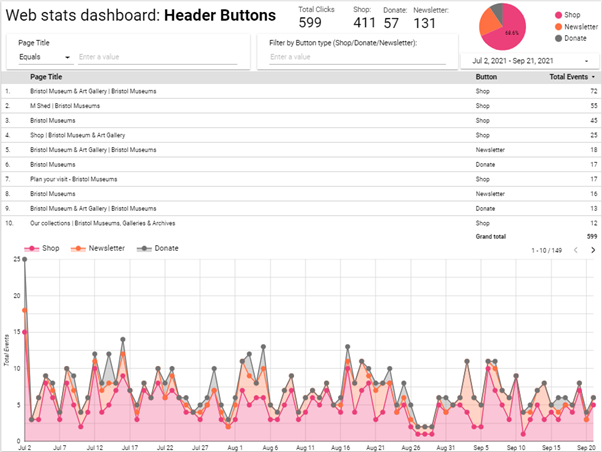
Here is our second page of the same report, with different data charts to help visualise the results:
Web stats dashboard: Header Buttons: Shop/Donate/Newsletter – table and timeline chart
Conclusion:
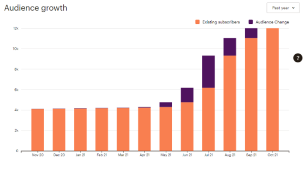
We have seen a major increase in newsletter sign ups since I joined in March and made these changes:
Mailchimp newsletter:Audience growth 30-11-20 to 30-11-21
Given the year of lockdown and restrictions to visit public venues, combined with data such as large page views of our venue opening times before announcements to drop restrictions, sending our users direct updates to their mailbox seemed like a better way to notify attendees.
I feel this was better than have them navigate to our site to check updates as they have been frequently changing and potentially delayed or disrupted – potentially out of date.
As these buttons are within the header area, the first things seen before reading content, and are present across all pages of the site. The opportunity to sign up is given to the user to click these whenever, regardless of the content they are viewing.
Once we added the button, we have found an increase of clicks to the newsletter sign up, where this could be a user chooses after reading the page to intentionally sign up to keep notified and updated of the museums via email newsletter.
This is a positive safeguard to prevent them missing out on more information and general relevant news which could decide or impact their attend the museum in the future. As this was a static button this gave me the idea for my next experiment: page targeted pop ups.
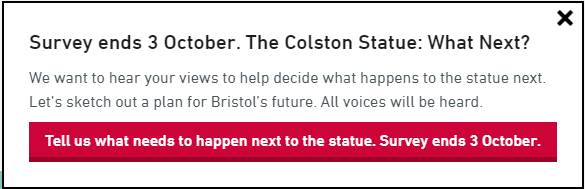
Experiment two: Page targeted pop ups for The Colston WHN exhibition/survey
Problem: Inability/lack of control to target users to a specific goal campaign or CTA that interactively prompts them during their reading – static buttons already in place for our more generic targets Solution: Find and install flexible page pop ups tool and launch with testing alongside relevant and suitable campaign/topic. In this case Colston Exhibition and Black History web pages Expected outcome: Users see a pop up relating to page content topic and will click on the pop up as its relevant to their interest. Considerations: ‘pop ups’ generally considered an annoyance/disruptive/negative impact Result: Effective – content that readers have chosen to view get suggested to take an action. This was successful as the target pages had content relevant to the suggested action in the popup
Page targeted popups: CTA prompt used for TCS: What Next survey, exhibition and campaign
Summary:
We needed a way to drive existing readers of our Black History content to the Colston statue survey. I researched different ways to prompt users and looked at a plugin called Boxzilla pop ups. It was obvious that users reading our Black History content would actually take the survey and also offer good, valuable feedback – if they were suggested to.
But how would these users who land on our History pages know about the Colston survey or exhibition if they were just on the article/story they had chosen to read? A box that prompts them during their reading, with a well phrased call-to-action that appears halfway through their reading.
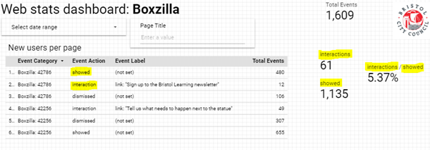
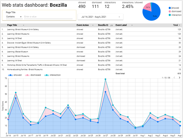
We also needed to measure this which is what the plugin we added could offer us. This tied in with the google dashboard, where we see how many were shown, interacted and dismissed.
Popup dashboard: Measuring success on showed/interaction/dismissed data
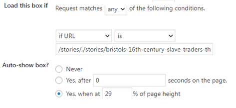
First we needed a list of pages we needed to target, we then set the box pop up to be seen on all of those page URLs when the user scrolls above 55%. By default the box type is on the bottom right of the screen. We can then set the expiry of the pop up if necessary, which is useful for if it is running beside a campaign – for example this could be for a donations campaign or a shop sale.
Popup settings: Where and how we can set the popup prompts
These parameters are all pretty self-explanatory and offer the option to be more present to the users viewing experience if necessary, however for the sake of less intrusion to the user and a bad experience it typically seems better to have a ‘less is more’ approach as it may seem intrusive.
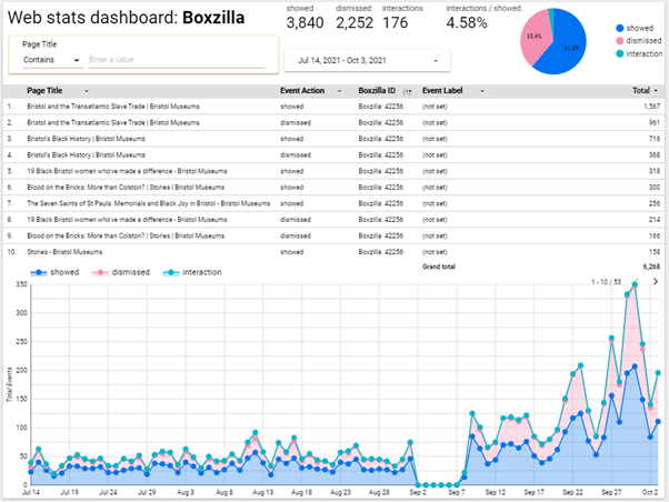
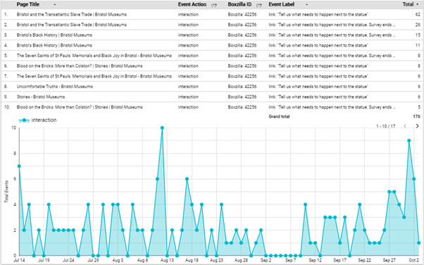
Popup dashboard: Timeline total of actions taken on the popup for Colston survey campaign
Conclusion
Generally speaking, as long as the pop up call-to-action is directly relevant to the page content itself then it’s more likely that the user will not ignore or close the prompt. The longer the exhibition went on, the more popups increased too.
The last part of the campaign we saw a massive increase which is likely linked to general pubic awareness of the survey campaign, alongside the organisations other comms and other promotions plans to do with the survey. The ‘last chance’ message was likely more encouraging too.
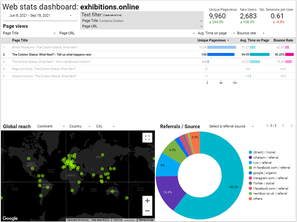
Popup dashboard: Total interactions on the Colston Survey, July 14 to Oct 2Survey page data: Pageviews and referral data
In comparison to the more general, static newsletter button CTA which are at the top of the page and then scrolled past (and likely missed). A popup that prompts for something like newsletter specifically is more likely to be ignored as it may be intrusive due to no direct relevance to their reading content and they have already seen it as a static button. Also, popups do not return unless the page is refreshed.
Popup dashboard: Total actions taken on the popup of Newsletter – non-specific campaign
I think it can be useful to have a pop up newsletter but if the same users are looking at them repeatedly, it could be intrusive and possibly an annoyance – I am in belief with more testing it can be set to not show popups to those already signed up to their newsletter (via mailchimp newsletter integration).
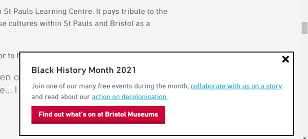
Popup: Used for Black History Month to drive users to events/feedback and our decol statement
For now, ultimately, alongside other campaigns ongoing within the organisation this has great potential to assist those by keeping users already on our website directed to other parts and to convert readers into actions.
If you didn’t know already, Bristol Museum & Art Gallery is home to a permanent gallery exploring the history of Egypt. This gallery hosts information belonging to the objects on touchscreen enabled kiosks. When they were installed this was the height of in-gallery audience interaction.
As we re-opened in September 2020 after lockdown, the use of touchscreens had obviously been axed. The problem was that they actually hosted most of the information in that gallery, so it was necessary to find an alternative.
The fabulous in-house Digital Assistant team were able to develop a plugin site using WordPress from scratch, and we were able to collate the original content and shove it onto this new platform. Pages were designed by kiosk, and were available via NFC and QR code access points that were printed on stickers and stuck onto the disabled kiosk screens. Long story short – and this is very much a long and important story cut short and not explained very well – an entirely digital alternative was created and the problem was solved.
This was a huge achievement, but not really sustainable if in future we encounter a similar conundrum and don’t have the required time/resources to complete it – which is what we encountered with the Bristol Photo Festival temporary exhibitions.
We suddenly needed to provide digital labels that could be accessed in the gallery containing biographies for each artist/photographer. Unfortunately, we had less than half the time and resources as we did with the Egypt gallery. Also, this is for a temporary exhibition rather than a permanent display. Naturally, these are very different circumstances.
Enter: Exhibitions Online.
We have a dedicated site that runs on WordPress that we do indeed use for Exhibitions Online They run on preset templates that we can tinker with to an extent, there’s not a whole lot of creative freedom but it does the job it was designed for.
We’ve used this site in a gallery setting once before; the online exhibition for Pliosaurus was available as an interactive a few years ago.
After doing some more tinkering myself, I came to the conclusion that we could take the templates out of their original context and create something that would work for these new digital labels in a fraction of the time, and without having to build or buy something new. Win/win.
By creating individual pages but without linking them to each other or to a parent page (like a landing page) we could have a number of individual pages (65 to be precise) that are technically hosted on a website that doesn’t really exist, from an audience perspective.
By doing this we could assign a QR code to each page that could be printed on a label and installed in the gallery. These pages aren’t available anywhere else (unless you look really, really hard for them) and are intended for solely mobile use while visiting the exhibitions. It turned out to be a really simple solution to something that was originally a bit daunting.
The other fundamental thing that we needed was a bunch of QR codes and a way of keeping on top of them. Jack Evans, Digital Assistant, developed a system that would both generate and also give us more flexibility and control over the now abundant number of QR codes that we use in our galleries – but he can explain this better than I:
“We realised that the demand for QR codes in the gallery was going to increase and be in place for at least a year if not permanently. We know that QR codes can be generated for free, but we knew we needed a system where QR codes could be modified after printing.
I could not come across a sustainable cost-effective system and we were opposed to basing a permanent fixture of our galleries on a system we don’t have full control over. Therefore, I created a system based on python scripting and a bit of javascript that allows us to create QR Codes that can have their destination changed after printing and uses google analytics to see how in demand particular content and the system as a whole is.”
This has been a helpful tool not only for this project, but also with the other projects where we have needed to implement QR codes since. The ability to both assess use and amend links after printing gives us a whole new range of possibilities when it comes to improving audience in-gallery experience.
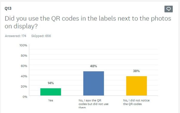
This gallery opened alongside the rest of the museum on the 18th of May, so we’ve had a fair amount of time to collate data that tells us how our audience have been using these digital labels and what their experience has been. This data has informed us that our audiences…have barely used them. Oh.
Out of the 174 people who have answered the question “Did you use the QR codes in the labels next to the photos on display?” on our ongoing Audience Finder Survey, only 14% (equating to 25 people) said yes (as of writing).
Not exactly the result that we were hoping for. Although, not sure how much of a surprise this is. Back in 2018 our User Researcher Fay posted a blog about how we use QR codes which points out that QR codes are only really used when facilitated. This more recent evidences shows that they still aren’t really being used without facilitation, even in a post-Covid (but-still-in-Covid?) world, overrun with them! Hmm…
Bonus round!
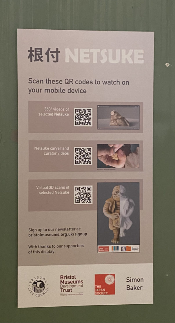
Another instance of using this platform for a QR code triggered in-gallery experience is the additional content that we provided as part of the Netsuke: Miniature masterpieces from Japan exhibition. Netsuke are small and very intricately carved figures, originally used as toggles for pouches so that they could be attached to clothing. In collaboration with the Centre for Fine Print Research, UWE Bristol we were able to showcase two of the netsuke as 3D models, hosted on Sketchfab and embedded into the Online Exhibition.
In the before times, wanted to have 3D printed models as a sort of handling collection so that our visitors, and especially our younger visitors, could further explore the objects on display – which obviously couldn’t happen in a Covid familiar world. Instead, we made the page that features the 3D models available in-gallery via QR code.
One of the 3D models available via the Online Exhibition and in the gallery.
This work was made possible thanks to support from the Art Fund
I am a MA student studying Museum Cultures at Birkbeck University,(London). I have an academic interest in Black History and telling the stories of underrepresented groups and communities. A part of the course requires me to undertake a work placement (remotely) in which there was an opportunity to be a Digital Intern for Bristol Museums.
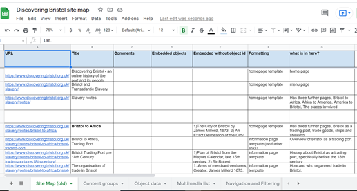
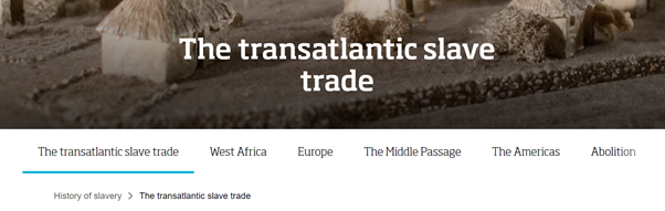
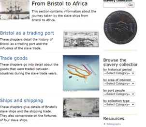
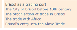
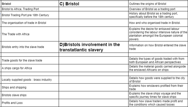
The main focus of my work placement has been finding ways to update the content of the Discovering Bristol website. The first thing I did was to conduct an audit of the site using Google Sheets, to create summaries of the pages in the Slavery Routes section of the website. This first section of the site is approximately 85 pages of content. I also made note of the embedded images on the site to check for image quality and copyright.
What have I found?
The text: content-heavy, repetitive and outdated language.
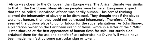
It does not explicitly state that this was the views of Europeans at the time and not the narrators. More importantly, it treats Africans as passive victims rather than highlighting the explicit intention to capture and enslave Africans based on a growing racialised system of labour.
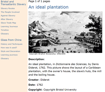
The images- lack of historical context
Why is it problematic?
Images such as this are part of a British art historical style known as the tropical picturesque. The image presents an idealised version of plantation life. It also implies the enslaved accepted their position and diminishes the need for abolition if the brutality of plantation life is concealed.
My approach to updating content
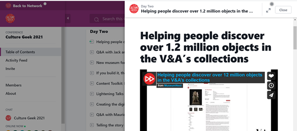
I have watched the V&A talk on the online platform Culture Geek to find out how they maximise their user experience, focussing on the ‘Explore their Collections’ function. The main findings were :
They changed their approach because in 2009, when it was first created, they realised it was too self-contained and not connected enough to the main V&A website.
They used interaction modes ‘Understand’, ‘Explore’, ‘Develop’ and ‘Research’ to understand how different users have different user needs. The user modes ‘Explore’ and ‘Develop’ were seen as priorities because of Covid-19
What did they change?
They added a ‘You may also like’, function, recommending similar objects. Reasons behind this:
They wanted to connect ‘objects with objects’
E-commerce influence- recommended products function
Influence of BLM- heightened awareness of offensive language- ‘Content warning’ filters were added to their search engine
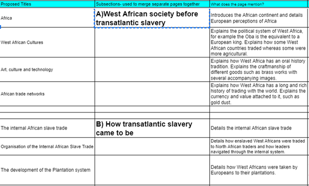
I have also looked into Liverpool Museums who have created online stories that have a similar structure in terms of the places and events mentioned. I think it is possible to streamline content in this way compared to the existing site.
Format of the old site
Old site consisted of clicking a series of pages which linked in a chronological order however, it often repeated the information mentioned which meant it was difficult to navigate quickly.
New site- would be using long form scrolling like this WordPress, which should provide easier navigation. But it would need an awareness of the order of information. The structure would also reduce excess content.
When Colston was toppled on the 7th of June 2020, the Bristol Museum website received a record number of pageviews. In contrast to the lower engagement during prior months of the pandemic, this was pretty striking. Understandably, not many people were checking the museum Opening Times or What’s On pages as museum doors were closed in March 2020 because of coronavirus. However, the digital museum was still ‘open’ – the museum websites are packed with content from Online Collections, Stories, Blog posts and now online events.
My User Research Internship with Bristol Culture was born from a need to analyse how people were engaging with the museum websites throughout the pandemic. Having recently finished my Geography degree at the University of Bristol, where I wrote my dissertation on the inclusivity of gender-neutral toilets in university and art spaces in Bristol, the timing of this internship was perfect. I have always wanted to work in the culture and creative industry, so I was keen to lead this research project.
Google analytics breaks down the user journey into Acquisition, Behaviour and Conversion. I was interested in understanding more about how people found the Museum’s web pages. Acquisition seemed a good place to start the research. Where were audiences coming from: Organic searches? Social Media? Newsletters? This varied across different sections of the website – have a look here.
It was difficult to look at Acquisition alone without making assumptions or querying the Behaviours of these users. How long were they spending on these pages and were there any themes linking the content they were accessing? Next, I explored the Behaviour data collected by Google Analytics.
Although users flooded to the website to explore Bristol’s Black British History and involvement in the Transatlantic Slave Trade, a deeper investigation suggested that as Blogs (as opposed to Stories), this content is popular throughout the year.
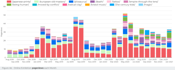
Online exhibitions showed Japanese exhibits were very popular, but users were dropping off before entering one of the three exhibits. Further testing of the online exhibition platform is needed to analyse the significance of the order the exhibits appear on the homepage. For example, a revolving showreel could be useful here.
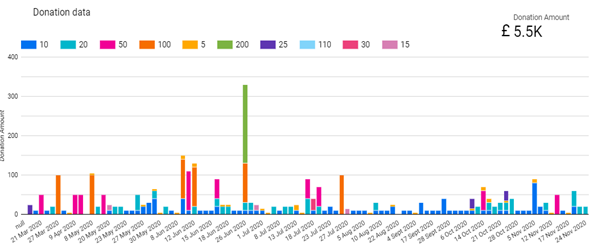
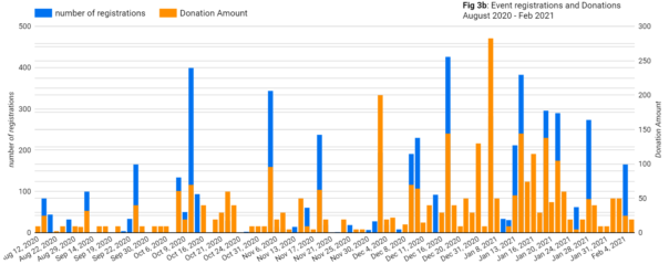
The final stage of my research journey focussed on the relationship between online events and individual donations made. There was another spike in June 2020 with the donations data – this could be related to Colston, online events or a combination, as there were 8 online events in the final 2 weeks of June, some of which sold out. January 2021 was another record high month for donations.
Withstanding everything the pandemic has thrown at the Arts, Bristol Museums have delivered a hugely ambitious online programme of week-long festivals, workshops, lectures and events. In total, there have been 120 events in the past 12 months. A highlight of mine was the panel discussion on the history of gender segregation in sport during the LGBTQ+ History month, because the voices of trans athletes are so often ignored. This blended data suggests that there is a relationship between online event dates and donations.
Leaving Bristol Culture will be sad as I feel like I’ve only just scratched the surface with user research and the possibilities of Google Data Studio. As with much of coding, I had a love-hate relationship with Google Data Studio as it was often challenging to communicate how I wanted to display data using this tool.
I am coming away from the internship with a constant curiosity about the data collected by all other websites I visit and how my user journey is informing their analytics. From my short 3 months at Bristol Museums (working from home 2 days a week), I’ve improved my quantitative data manipulation and analysis skills, learnt the importance of feedback forms, and how to engage a range of audiences with the museum collections and events, during a pandemic.