In order to help us plan how we reopen our museums we
created an online public survey which we have publicised via our social media
channels, our website, community networks, and e-newsletter.
Our reopening will be phased and will begin with Bristol
Museum and Art Gallery (BMAG) and M Shed. A date for reopening has not yet been
confirmed.
The following is a summary of 10 key findings from the
public survey:
Findings are based on feedback between 22/05 – 10/06 from c.360
responses
There is demand for our sites to reopen. 75% of respondents say they will visit; 59% told us BMAG or M Shed are in their top 3 indoor public spaces to visit once the lockdown is lifted.
There is higher demand from respondents for BMAG to reopen than M Shed (67% vs. 33%)
Levels of trust in the museums to provide a safe visit are very high. The average trust rating is 4.5 out of 5.
84% of respondents told us they would like to visit for between 30 minutes and 2 hours.
33% of respondents told us they are likely to visit with children under 16
The top four reasons for visiting the museums following the lockdown would be 1) to see a temporary exhibition 22%; 2) To get out of the house 17%; 3) To go somewhere familiar 16%; and 4) To learn something 16%.
Respondents are generally happy to see additional restrictions and measures put in place: 85% are happy to pre-book free tickets; 71% would like to see ‘child free’ time slots; and 72% would like to see time slots for ‘over 70s and vulnerable adults’.
The main change that would put off visitors is the closing of our current temporary exhibitions Wildlife Photgrapher of the Year (M Shed) and Do You Believe Magic? (BMAG) – 36% told us they would be put off visiting by this change.
The primary suggestions for increasing safety during visits are: increased hygiene, limits on numbers, social distancing, and increased staff visibility.
Acorn Analysis (segmentation) of respondents shows there is a slightly lower than typical representation of Audiences form disadvantaged background – 13% compared to 21% average across physical sites.(Actions are in place or planned to address this.)
The survey will remain open till at least the end of June 2020. So far the responses have been really useful in telling us what our audiences need from us to reopen our sites in a safe and welcoming way.
There are various versions of a common saying that ‘if you don’t measure it you can’t manage it’. See Zak Mensah’s (Head of Transformation at Bristol Culture) tweet below. As we’ll explain below we’re doing a good job of collecting a significant amount of Key Performance Indicator data; however, there remain areas of our service that don’t have KPIs and are not being ‘inspected’ (which usually means they’re not being celebrated). This blog is about our recent sprint to improve how we do KPI data collection and reporting.
The most public face of Bristol Culture is the five museums we run (including Bristol Museum & Art Gallery and M Shed), but the service is much more than its museums. Our teams include, among others; the arts and events team (who are responsible the annual Harbour Festival as well as the Cultural Investment Programme which funds over 100 local arts and cultural organisations in Bristol); Bristol Archives; the Modern Records Office; Bristol Film Office and the Bristol Regional Environmental Recording Centre who are responsible for wildlife and geological data for the region.
Like most organisations we have KPIs and other performance data that we need to collect every year in order to meet funding requirements e.g. the ACE NPO Annual Return. We also collect lots of performance data which goes beyond this, but we don’t necessarily have a joined up picture of how each team is performing and how we are performing as a whole service.
Why KPIs?
The first thing to say is that they’re not a cynical tool to catch out teams for poor performance. The operative word in KPI is ‘indicator’; the data should be a litmus test of overall performance. The second thing is that KPIs should not be viewed in a vacuum. They make sense only in a given context; typically comparing KPIs month by month, quarter by quarter, etc. to track growth or to look for patterns over time such as busy periods.
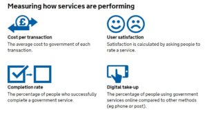
A great resource we’ve been using for a few years is the Service Manual produced by the Government Digital Service (GDS) https://www.gov.uk/service-manual. They provide really focused advice on performance data. Under the heading ‘what to measure’, the service manual specifies four mandatory metrics to understand how a service is performing:
cost per transaction– how much it costs … each time someone completes the task your service provides
user satisfaction– what percentage of users are satisfied with their experience of using your service
completion rate– what percentage of transactions users successfully complete
digital take-up– what percentage of users choose … digital services to complete their task
Added to this, the service manual advises that:
You must collect data for the 4 mandatory key performance indicators (KPIs), but you’ll also need your own KPIs to fully understand whether your service is working for users and communicate its performance to your organisation.
Up until this week we were collecting the data for the mandatory KPIs but they have been somewhat buried in very large excel spreadsheets or in different locations. For example our satisfaction data lives on a surveymonkey dashboard. Of course, spreadsheets have their place, but to get more of our colleagues in the service taking an interest in our KPI data we need to present it in a way they can understand more intuitively. Again, not wanting to reinvent the wheel, we turned to the GDS to see what they were doing. The service dashboard they publish online has two headline KPI figures followed below with a list of the departments which you can click into to see KPIs at a department level.
Achieving a new KPI dashboard
As a general rule, we prefer to use open source and openly available tools to do our work, and this means not being locked into any single product. This also allows us to be more modular in our approach to data, giving us the ability to switch tools or upgrade various elements without affecting the whole system. When it comes to analysing data across platforms, the challenge is how to get the data from the point of data capture to the analysis and presentation tech – and when to automate vs doing manual data manipulations. Having spent the last year shifting away from using Excel as a data store and moving our main KPIs to an online database, we now have a system which can integrate with Google Sheets in various ways to extract and aggregate the raw data into meaningful metrics. Here’s a quick summary of the various integrations involved:
Data capture from staff using online forms: Staff across the service are required to log performance data, at their desks, and on the move via tablets over wifi. Our online performance data system provides customised data entry forms for specific figures such as exhibition visits. These forms also capture metadata around the figures such as who logged the figure and any comments about it – this is useful when we come to test and inspect any anomalies. We’ve also overcome the risk of saving raw data in spreadsheets, and the bottleneck often caused when two people need to log data at the same time on the same spreadsheet.
Data capture directly from visitors: A while back we moved to online, self-completed visitor surveys using SurveyMonkey and these prompt visitors to rate their satisfaction. We wanted the daily % of satisfied feedback entries to make its way to our dashboard, and to be aggregated (both combined with data across sites and then condensed into a single representative figure). This proved subtly challenging and had the whole team scratching our heads at various points thinking about whether an average of averages actually meant something, and furthermore how this could be filtered by a date range, if at all.
Google Analytics: Quietly ticking away in the background of all our websites.
Google sheets as a place to join and validate data: It is a piece of cake to suck up data from Google Sheets into Data Studio, provided it’s in the right format. We needed to use a few tricks to bring data into Google Sheets, however, including Zapier, Google Apps Script, and sheets Add-ons.
Zapier: gives us the power to integrate visitor satisfaction from SurveyMonkey into Google Sheets.
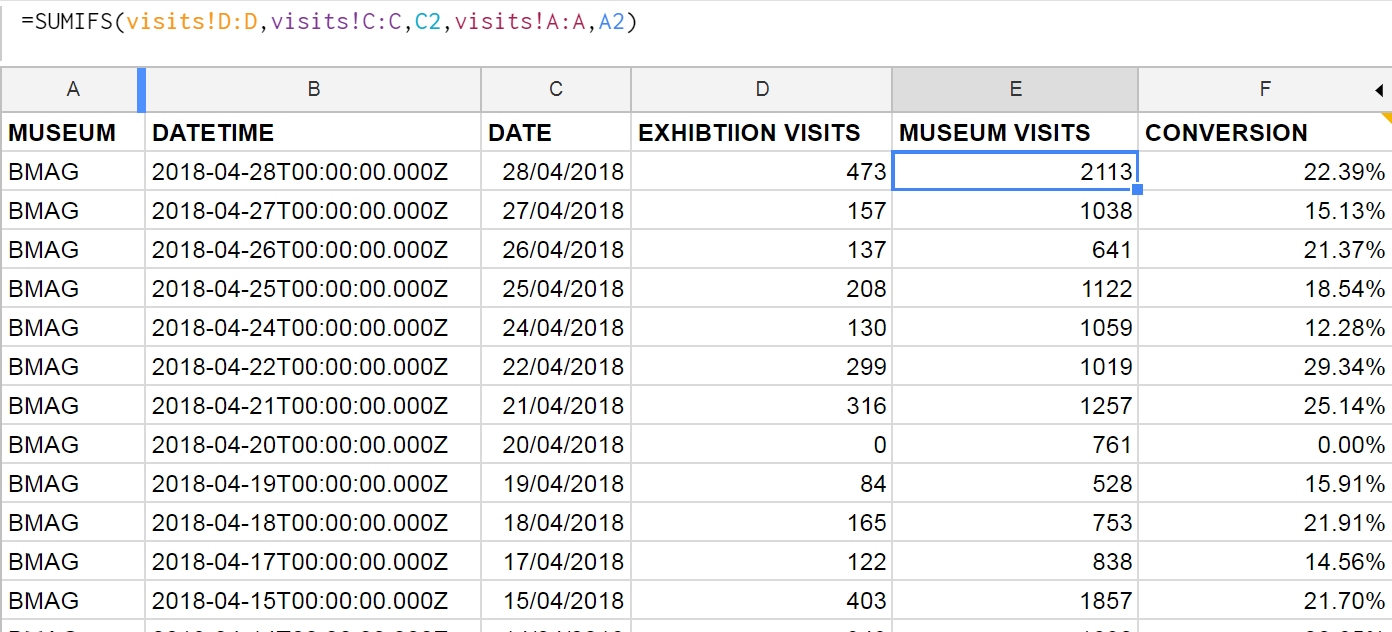
Google apps script: We use this to query the API on our data platform and then perform some extra calculations such as working out conversion rates of exhibition visits vs museum visits. We also really like the record macro feature which we can use to automate any calculations after bringing in the data. Technically it is possible to push or pull data into Google Sheets – we opted for a pull because this gives us control via Google Sheets rather than waiting for a scheduled push from the data server.
Google Sheets formulae: We can join museum visits and exhibition visits in one sheet by using the SUMIFS function, and then use this to work out a daily conversion rate. This can then be aggregated in Data Studio to get an overall conversion rate, filtered by date.
Sheets Add-Ons: We found a nifty add-on for integrating sheets with Google Analytics. Whilst it’s fairly simple to connect Analytics to Data Studio, we wanted to combine the stats across our various websites, and so we needed a preliminary data ‘munging’ stage first.
Joining the dots…
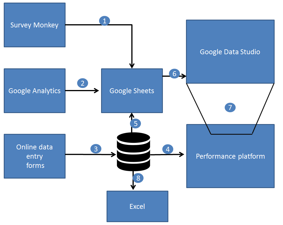
1.) Zapier pushes the satisfaction score from SurveyMonkey to Sheets.
2.) A Google Sheets Add On pulls in Google Analytics data into Sheets, combining figures across many websites in one place.
3.) Online data forms save data directly to a web database (MongoDB).
4.) The performance platform displays raw and aggregated data to staff using ChartJS.
5.) Google Apps Script pulls in performance data to Google Sheets.
6.) Gooogle Data Studio brings in data from Google Sheets, and provides both aggregation and calculated fields.
7.) The dashboard can be embedded back into other websites including our performance platform via an iframe.
8.) Good old Excel and some VBA programming can harness data from the performance platform.
Technologies involved in gathering and analysing performance data across museums.
Data Studio
We’ve been testing out Google Data Studio over the last few months to get a feel for how it might work for us. It’s definitely the cleanest way to visualise our KPIs, even if what’s going on behind the scenes isn’t quite as simple as it looks on the outside.
There are a number of integrations for Data Studio, including lots of third party ones, but so far we’ve found Google’s own Sheets and Analytics integrations cover us for everything we need. Within Data Studio you’re somewhat limited to what you can do in terms of manipulating or ‘munging’ the data (there’s been a lot of munging talk this week), and we’re finding the balance between how much we want Sheets to do and how much we want Data Studio to do.
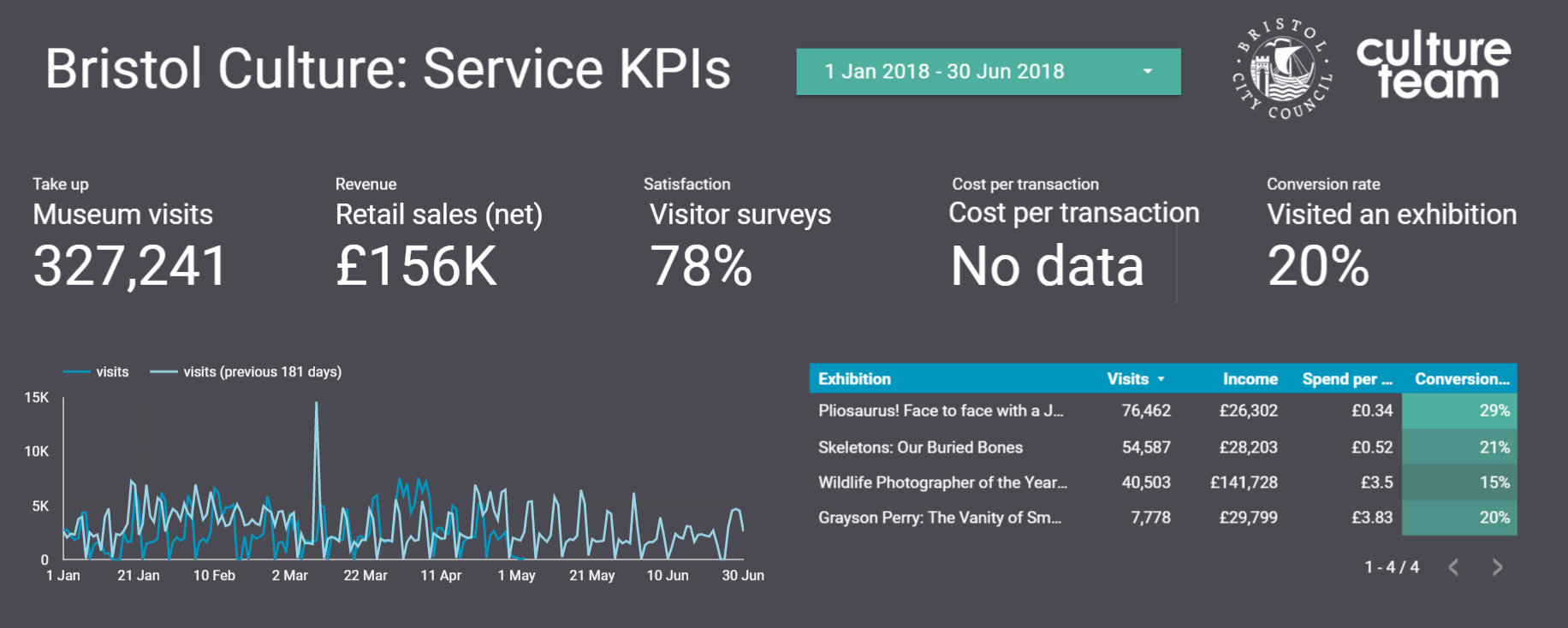
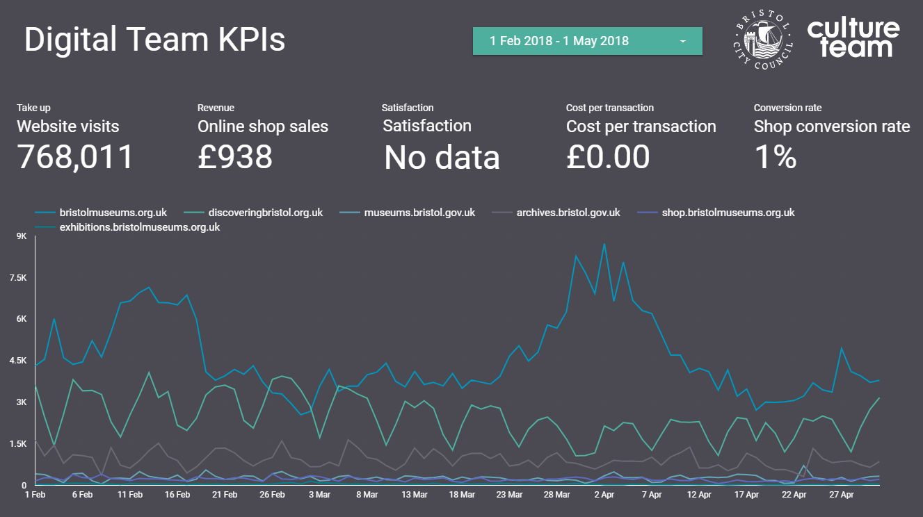
At the beginning of the sprint we set about looking at Bristol Culture’s structure and listing five KPIs each for 1.) the service as a whole; 2.) the 3 ‘departments’ (Collections, Engagement and Transformation) and 3.) each team underneath them. We then listed what the data for each of the KPIs for each team would be. Our five KPIs are:
Take up
Revenue
Satisfaction
Cost per transaction
Conversion rate
Each team won’t necessarily have all five KPIs but actually the data we already collect covers most of these for all teams.
Using this structure we can then create a Data Studio report for each team, department and the service as a whole. So far we’ve cracked the service-wide dashboard and have made a start on department and team-level dashboards, which *should* mean we can roll out in a more seamless way. Although those could be famous last words, couldn’t they?
Any questions, let us know.
Darren Roberts (User Researcher), Mark Pajak (Head of Digital) & Fay Curtis (User Researcher)
Losing survey data is a pain – unfortunately the events team lost six events worth of survey data they collected using off-line surveys. The team used iPads (cost per iPad is c.£320) to conduct surveys on software which was sourced outside our team (I’m not sure what system it was). They used the software on the basis that it claimed to offer off-line surveys i.e. without an internet connection /wi-fi. The idea was that they data could then be uploaded once the iPad was connected to the internet. When they came to do so, however, the data was simply not there and they had lost it all.
The events team came to the digital team this year to ask if we could help them with the public surveys for the 2017 Harbour Festival. The festival is held across much of Bristol City Centre and therefore in order to conduct surveys digitally using iPads we would need to do so without having to rely on having a wifi connection.Of course, one option would be to conduct the surveys with good old pen and paper, but as a digital-first service we were happy to accept the challenge.
One of the main reasons we want to avoid paper surveys is because it is time consuming and difficult to digitise the survey results. It requires someone to sit at a computer and manually input results. Staff resources are often limited and this is a job we’d rather not have to give ourselves. Practically, paper can also be unruly, there are issues with handwriting legibility and they are easy to lose when relying on volunteers to collect them so a digital a solution is very desirable.
The challenge came down to finding the right software that I could install on the iPad and test, and that didn’t cost too much. Our usual platform for conducting surveys on iPads where we do have an internet connection is SurveyMonkey (we pay for the gold subscription £230 per year). Unfortunately, off-line surveys are not a feature available on SurveyMonkey.
These are a few Apps I tried to use but weren’t right for one reason or another:
Qualtrics – poor trialling options and expensive for full features £65 for one month or £435 for one year
iSurveys (harvestyourdata.com) – free account is limited and their main website is difficult to use and I couldn’t work out how much the full feature product was
SurveyPocket by QuestionPro – trial difficult to use and full feature pricing only available by contacting the company
The one I almost went for: QuickTap Survey & Form Builder – good pricing options from $16 per month and the trial is OK
So, after trawling the internet and the App Store for options the one we went for is an App called Feed2go (www.feed2go.com)
Quick Note: Before I speak about the virtues of Feed2go, I have to make it clear that it is currently only available on the Apple App Store; it is not available on Android devices in the Play Store (quicktap surveys app is available on Android).
I downloaded the feed2go App onto my iPad and and it was ready to go with pretty much all features available – certainly enough to get a feel of whether it was right. Most crucially on the basic/trial version you can conduct off-line surveys and test if the data is secure and can be successfully uploaded – we I did and it worked. A major advantage of the feed2go app is that to access all the app’s features (Pro) is a very reasonable subscription of £2.49 for 1 month; £4.99 for 3 months; or £12.49 for 1 year. At these costs there is virtually no risk in trying the Pro subscription.
If anyone is interested in trying the App, I would suggest going ahead and downloading and having an explore. There are just a couple of things I will highlight:
The user interface is nice and clean and easy to use
The options for question structures is OK and covers most bases but it is more limited than something like SurveyMonkey
Some of the navigation in the App can be a bit clunky especially when designing survey forms, but once you get used to it then it’s fine
Probably the most significant feature of feed2go to mention is trying to use the same survey on one device. This is not a particular strong suit of feed2go but it does work. Basically you need to download feed2go on each device you have and then share the survey between them using a cloud storage server – the best one to use in my experience is DropBox. In the App there is an export/import function to share survey forms between devices. This also means that you will need to collate all results from different devices at the end.
As noted above, the feed2go app needs to be downloaded on each iPad. In our case all our service iPads are registered to one email address. This means we can use the one subscription across all of our devices. This is not the case if iPads are registered to different email addresses – a subscription will need to be paid for each.
Overall, yes the experience of using the App could be improved a little. But, the main feature we wanted it for – to save the results and successfully upload them worked 100%. I think what distinguishes feed2go from the previously (unsuccessfully) used software was that it operated through a web browser which relied on a cache of temp internet files files. Feed2go is an app which stores the data securely in a folder in the same way the camera stores photos on the iPad. Finally, the FAQ on the feed2go and the email support for the App is great; the developer is really responsive.
We have now used the App to conduct surveys in the estate around Our Blaise Castle House Museum site and we are planning to replace paper exit surveys at our houses (where we don’t have wifi) with the offline App.
If you have any comments or questions about doing offlien surveys or surveys in the cultural sector please get in touch I’m happy to have a chat. darren.roberts@bristol.gov.uk
Here at the M Shed in Bristol, we have amazing views of the harbor from our lovely events suit. Here we hold all sorts of events from large annual AGMs for corporations’, to weddings and some really great community events.
We have a fully automated integrated audio visual system. With AMX and Creston control systems, you can walk around the function rooms holding a smart, touch screen control panel and control just about everything! You can power up the projectors, lower the screens, open and shut the blinds, control volumes, select what to display from Sky TV, Blu-ray players and laptops, you can even change the lighting to any colour scheme you want.
It’s all pretty smart. Pretty smart apart from the dreaded Video Graphics Array as the main interface, more commonly referred to as the VGA connector! For all this advanced technology, presenters still have to connect their devices with a cable.
The VGA standard was invented in 1987 by IBM, and its dreaded 15 pin D Sub connector still to this day refuses to go away.
Until now…
There’s something amiss when a presenter asks to use their nice, brand new iPad to run their presentation and you then have to use a lighting port to VGA adapter connected to 10 meter VGA cable. These VGA connectors were designed for permanent installation and so when they are swapped between laptop and other devices several times a day, the 15 tiny pins take a battering and it only takes one bent pin for the screen to go pink, blue or stop all together.
Here comes the ingenious solution to take advantage of the wireless / Wi-Fi capabilities that are now standard for all devices.
The idea and solution comes in the form of finding a combination of ready available, off the shelf technology combined in such a way it allows the transmission of a device’s screen to appear on our projection system, without any wires. We needed this to be augmented into our current system without affecting its current capabilities. It is already a great intergraded AV system, it’s just needs to be brought into the future without losing its ability to use the old VGA system. It may be old but it works so well as a last resort and backup.
Apple products long ago ditched the VGA system in favour of min-display ports or “lighting ports”. A quick trip to any Apple store and an assistant will enthusiastically show how with a flick of the devices, a display can be “thrown” to another screen. It’s called Air Play and is Apple’s secure version of Wi-Fi streaming.
Google, with their ever innovative developments, have developed a technology called Chrome Cast to the same effect, which is also based on Wi-Fi streaming.
With delegates at our events bringing Apple products, PCs and android devices, we needed an all in one system; so purchased these products to enable this streaming. I ordered an Apple TV and a Chrome Cast device which both work by connecting to a Wi-Fi network and looking for compatible devices. Both of these provide a solution for all devices. Chrome Cast is much cheaper than Apple TV and can support Apple products too, but the ease of use and reliability of Apple on Apple products seemed worth the extra investment. I calculated the cost of replacement VGA cables and at the current rate we replace them, these new items would pay for themselves in just three years!
The main issue I faced in integrating these was how to patch them into a fully automated, closed AV system without affecting its capabilities. In essence, how to “retrofit” an Apple TV and Chrome Cast and get the systems to talk over M Shed’s Wi-Fi – a public network, effectively part of the councils IT network and heavily locked down.
To solve the first issue, I had to literally climb into the AV racking system to find a suitable part that interfaced with an HDMI connector (both Chrome Cast and Apple TV use HDMI). I chose our SKY TV box and unplugged its HDMI cable. Onto this cable I place a HDMI switcher, which allows 4 inputs to connect as one. The switcher is the sort of device you would buy if your TV at home only has one HDMI port and you had multiple devices you wanted to connect: a DVD player, games console and a Freeview box. I then connected the Sky box to the switcher along with the Apple TV and Chrome Cast unit. Then after finding power outlets, whilst still inside the AV systems rack, I carefully slid the switcher unit so its control switch faced out the front of the rack. A few cables ties and some Velcro later and the hardware was installed, all that was left to do was to climb out and check it all worked.
Going back to the Creston AV touch panel, I selected Sky TV and sure enough it appeared on the projections screen as it should. Then by using the controls on the switcher unit I was able to toggle between Sky, Apple TV and Chrome Cast.
It then occurred to me that both the Apple and Chrome devices use the HDMI to output their audio too. However the HDMI feeds to the projector which only projects the image, so audio would be lost. Climbing back into the AV rack, I noticed that the Sky box was using analog RCA connectors to output its audio to integrated ceiling speaker system. Fortunately the switcher also had 3.5mm TRS output (headphone socket), so by setting the Sky box to output audio through its HMDI it meant that all three devices were now feeding the audio and visual signal to the switcher. Then by using the RCA connector from the Sky box with the TRS adapter, all three devices were now feeding to the ceiling speaker system. I climbed back out of the rack and started to create a new, independent Wi-Fi network for devices to communicate.
The new Wi-Fi network was actually the simpler part.
I purchased an ASUS RT-AC3200 Tri-Band Giga-Bit Wi-Fi router. This router is enormous with six aerials and looks like the Batmobile. I figured that it would have to be reliable and be able to cope with large amount of data traffic, so I got the most powerful but cost effective router I could find.
The idea behind the router was to have all the devices (Apple TV, Chrome Cast and whichever device is streaming) all on the same network, a network I could manage. Once on the same network, it was a matter of connecting. The Apple system was really straight forward- you join the same Wi-Fi network as the Apple TV (I named the network “presentations”) then chose the Airplay option on the device and as easy as that the screen is mirrored on the projector. The Chrome set up was a little more involved. With an android device, you have to install an app called Chrome Cast. Once installed it’s quite straight forward to pair with the Chrome Cast receiver and then the screen can be mirrored on the projector. With a Windows PC laptop, I had to install the latest version of Chrome. This then comes with the option to cast either just the browser tab you’re using or the whole desktop -this works well but compared to the Apple TV there is a slight lag. In some instances you would have to install the Chrome Cast extension for Chrome.
I also connected the Wi-Fi router to our open Wi-Fi system with a RJ45 cable. This then allowed people on the Presentation Wi-Fi to still be able to access the net.
We are still trialing the system before we start to officially offer it as part of a package, but so far so good. It has been received very positively from users. We’ve had people walking around with iPads – controlling their presentation and not being tied to the lectern with an old pc. We’ve even had the best man at a wedding wirelessly control the music playlist from his iPhone at the top table! PCs are still being used at the lectern as normal but without the need to trail VGA cable everywhere. The only thing left to work out is wireless power… I suppose batteries will have to do for now.
Here at M Shed Bristol, we have some great working exhibits from the bygone era of Bristol Harbour’s industrial past: steam engines, steam boats, steam cranes and more. But the most recognisable and iconic are the four great towering electric cranes standing over 120 feet above the old docks.
As the Industrial Museum was being transformed into the present day M Shed Museum two of the cranes would strike up conversations with each other, entertaining and informing passers-by of what they could look forward to seeing inside the new museum. However due to renovations and movement of the
cranes they fell silent again…
A few years later, due to popular demand I was tasked with bringing the cranes back to life!
To get these cranes talking was going to require rebuilding the whole audio and lighting system and recording new scripts. We were fortunate enough to have Alex Rankin, from our M Shed team, lend his penning abilities for the new scripts and Jacqui and Heather to voice the new crane characters.
To record the dialogue, we arranged to meet in a nice quite corner of the L Shed store room. It’s a vast store, full of so many objects that there isn’t enough space to have them on permanent display. With both Jacqui and Heather sat at opposite ends of a table, I set up a pair of good quality condenser microphones. Each plugged into their own separate channel on my external sound card, an Akai EIE 4 channel usb sound card with great preamps and phantom powered for the mics. This in turn was hooked up to my MacBook and copy of Logic Pro. I recorded through each script a few times and was able to compile a seamless recording from the various takes. Once finished, I hard panned each channel left and right so that when each voice played back each would have its own speaker, left or right – crane 1 or crane 2.
To start building the new AV system, I searched around the vast L-Shed stores and work rooms to find what was left of the old system. I then decided what could be re used and what new equipment would be needed. I had been informed, by our volunteer team for the working exhibits, that everything had been removed from the cranes themselves; this meant starting from scratch.
The cranes themselves would need a loud speaker system for the voices and the crane cabs would need different coloured lights to flash in time with the talking as this helps to animate the cranes. That part was relatively easy. It meant scaling the cranes and bolting speakers to their underside and mounting lamps inside the cabs. I’ll be honest, I was helped by the Volunteer team and a huge mobile diesel powered cherry picker!
The hard part was how to feed the power and audio cables to the cranes. After some investigation it turned out that below the surface of the dockside was a network of underground pipes which lead to the base of each crane to feed their power. The great volunteer team once again worked miracles and fed over 600 combined meters of audio and lighting cables for me. This all led back to the clean room in their ground floor workshop. With all the cabling done I just needed to build a lighting control and audio playback system.
My design solution, using what kit I could find and a few new bits, was to use a solid state compact flash media player, graphic equaliser, audio mixing desk and power amplifier for the audio. To have the light flash in time with the dialogue, I used a two light controller with a light to sound module, similar to what a DJ might use to have their disco lights flash to the music!
By having the audio go through the mixing desk, I was able to take an audio feed for each channel and direct them to lighting controllers. By recording the two voices in stereo, with each voice on its own left or right channel, it meant i only needed one media player and could easily control each channel on the sound desk. The graphic equaliser allowed me to tweak the speakers to acoustically fit their environment.
I looked at randomising the audio or having it triggered by people walking past, but with the amount of people who pass outside M Shed the cranes would be chatting away, non-stop all day! I decided to create a long audio file of about 3 hours with the different recorded scripts and random intervals of silence. These ranged from 5 minutes to 20 minutes, so it always comes as a surprise when they start talking to each other.
The results are really effective. It is always fun to see people being caught by surprise as the cranes light up and start a conversation and to see them stop and listen in on what they have to say.
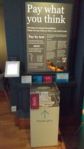
In 2013 Bristol Museum & Art Gallery (BMAG) ran its first Pay What You Think pricing model at the temporary exhibition; Taylor Wessing: Photographic Portrait Prize. The principle is very simple – visitors enter the exhibition for free and pay the amount they feel the exhibition was worth by putting money in a box at the end of their visit. It was a success and visitors responded well to it. But, there was one sticking point; because we were only accepting cash payments our visitors were telling us that they were either not paying or paying less because they didn’t have cash on them.
“A quality experience, thank you M Shed for providing it! Ps. I only have a little cash with me, but would like to have paid £5…”
“Some of the portraits were very moving… P.s. I gave less than £5 – all the cash I had.”
This got us thinking about alternative ways of collecting payments from visitors for our next Pay What You Think temporary exhibition – death: the human experience (24 October 2015—13 March 2016). Card payments were deemed unfeasible as the Pay What You Think system is not staffed in the same way as standard ticketing – so card payments cannot be taken securely. The next thing that came to mind was payment by text message. Taking payment by text is relatively common nowadays – it can often be seen in things like charity appeals and car parks. Anyone who has used a text to pay system before will know that it is a very simple way of making a payment as it generally doesn’t require sign-up or registration. Instead, the user simply sends a text message containing a specific word to a specific number and a set amount of money is paid (I’ll explain in more detail below).
With a month to go before the opening of death: the human experience at BMAG I set about to organise a text to pay system for the exhibition. Here I run through a step-by-step guide to text to pay. Nb. there’s a bit of a catch at the end with collecting payments – the phone companies (3, EE, Vodafone etc.) will probably want to take a slice of your earnings…
Text to pay: a step-by-step guide
Searching for a Premium SMS service provider
The very first steps in setting up the text to pay were trickier than I expected. This is because I didn’t know the proper name for ‘text to pay’. Naturally, I went to google and searched for ‘text to pay provider’ (+ various versions of those words). I found a few websites, but it wasn’t immediately obvious which service I was looking for and who could provide it. I called a couple of companies who offered similar texting services but not exactly what I was looking for. Eventually, I learnt that what I wanted was called a ‘Premium SMS’ service provider. You will have much more luck searching for Premium SMS than ‘text to pay’.
So, once I had found this out I found a couple of companies that provided the s
ervice and requested quotes from them both. I got quotes from the companies Oxygen8 and txtNation (I’m sure there are many more options out there). The better quote was given by Oxygen8 – so I went with them.
Compliance and regulation
One of the things that struck me was the amount of regulation and compliance there is involved in Premium SMS. This is actually quite unsurprising as Premiuim SMS is used when you pay for app downloads and in things like TV competitions and voting on programmes like the X Factor. Premium SMS services are regulated by an independent regulatory body called PhonepayPlus – their Code of Practice is regulated by Ofcom.
Before you can setup and run a Premium SMS service you have to register with PhonepayPlus and ensure compliance with their code of practice. All the information you will need on how to do this can be found here on their website. It is pretty straightforward; it requires some form-filling and a payment of an annual registration fee of £155 +VAT. Once you have done this you will be assigned a PhonePayPlus registration number. Ours is ORG837-51289-03976.
Setting up ‘keywords’ and ‘shortcodes’
There are two key elements of a Premium SMS system – the Keyword and the Shortcode.
It’s very simple, to make a payment the user sends a prescribed keyword (e.g. PAY5) to a shortcode (a five digit number; e.g. 63333).
The keyword is a word that the user can send in order to make a payment. In the case of our exhibition we have five different keyword options – death1, death2, death3, death5, and death10 – each of which allows for a different level of payment. When a user sends an SMS containing one of these keywords to the shortcode 63333 a payment will be made to the value of the number included in the text; e.g. text death5 and the user will be charged £5. (The payment is either taken from the remaining credit of users with pay as you go phones or it will be added to the bill of users on phone contracts).
The keywords and shortcodes are also the bit that you have to pay your provider (in our case Oxygen8) to setup. There is a charge to setup the shortcode and then a monthly fee for that shortcode – the provider is effectively renting it on your behalf. Then there is a charge to setup each keyword. In total, to setup and run the Premium SMS for the five month duration of the exhibition it cost us approx. £320.
Displaying and advertising your Premium SMS service
As you might expect there is a bit of compliance to get through when advertising a Premium SMS service. Basically, you have to make it as clear to the user as possible that if they text one of the keywords to the number then they will be charged, and what they are being charged for. Sounds simple, but it took a few emails back and forth with our provider to get this right. The accompanying text also needs to include contact details and your PhonepayPlus registration number. (Your provider should help you with this).
Collecting Payments (here’s the catch)
I’m sorry to leave this till last but there is a catch to all of this. If, as we are, you are collecting payments using a Premium SMS service for anything other than a registered charity then the payments you receive from your visitors/customers will be subject to a levy from the phone companies (see here if you’re a charity). In other words, if one of our visitors texts to pay £5 then we will not see the whole £5, the phone company (3, EE, Vodafone etc.) will take a slice of the payment. How much they take depends on the initial value and on the phone company – but typically they take around 25%.
Our visitors to death: the human experience are responding to the text to pay service we’re offering. We know this because we can follow payments on Oxygen’s very handy online dashboard. The individual payments reach us as a single payment from our provider at the end of the exhibition (we had the option of monthly payments).
Next steps
The Premium SMS service has one final advantage – you gain access to the mobile phone contact details of your visitors. Bristol museum will not be doing any kind of follow-up messaging using our text to pay user details – this is explained to visitors in the advertising material. Other organisations may choose to use mobile phone contact details as part of their marketing.
To some extent, the Premium SMS service we’re running for death is a bit of an experiment both to make our exhibitions as user-friendly as possible and to explore different options for income generation. It’s difficult to judge the success until the exhibition has finished – but we already thinking about using Premium SMS for our one-off events and talks.
If you have any questions or comments and would like to get in touch with me directly, my email is – darren.roberts@bristol.gov.uk
One of the focus areas for improvement at Bristol Museum & Art Gallery (BMAG) and M Shed is our retail offer. Over the past year Zak Mensah (Head of Transformation) and Helen Lewis (Retail Manager), with input from Peter Holloway (retail consultant) and myself (User Researcher), have implemented a number of big and small changes in order increase income generation in our shops but to also make them more appealing, relevant, and exciting parts of the museums.
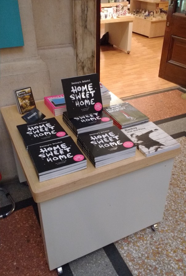
This post is about a small but seemingly effective change we have recently made within the shop at BMAG. It follows the Phase One refurbishment of the shop in October 2015. The shop refurb included the purchase of seven new nesting tables; one of which we have designated to display products outside the entrance of the shop. Here I look at what impact this small change has had.
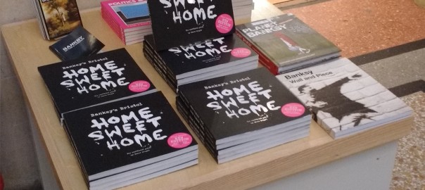
We began using the shop-front display table on the 11th December 2015, and we have been surprised with the positive impact it has had on sales. The display is dedicated entirely to a range of books about Banksy – the world renowned Bristol-born graffiti artist. We know from sales data that the Banksy books are an important product within the BMAG shop. To date in 2015-16 the book Banksy’s Bristol: Home Sweet Home by Steve Wright is our fourth most popular product, and overall it is the most popular book that we sell. If you’re interested, it is now also available through our online shop.
Following the general retail rule of putting the most popular items forefront and centre of the shop, Helen displayed the Banksy books on the shop-front display table. In total we stock four books dedicated to the work of Banksy:
Banksy’s Bristol: Home Sweet Home – £14.00
Banksy: Myths and Legends – £5.95
Banksy: Wall and Piece – £14.99
Planet Banksy – 12.49
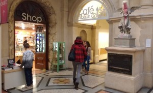
It wasn’t until the table was in place that we realised how much of a natural fit the Banksy book display was. Directly outside the shop is BMAG’s very own piece of original artwork by Banksy – Paint Pot Angel. The iconic piece was given to the museum by Banksy following the hugely successful exhibition/takeover of Banksy’s artwork in the museum in 2009 – Banksy versus Bristol Museum. The display table is in the eye-line of the Paint Pot Angel and it’s the perfect moment to capture visitor’s interest in Banksy, and ultimately to generate sales of Banksy related products.
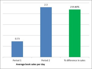
What’s been the impact on sales?
Between 2nd May 2015 and the 30th December 2015 we have sold a total of 205 Banksy books at BMAG. (Our retail sales records for this year excludes April, it begins in May 2015 as this is when we moved to Shopify).
Period One – without shop-front display table
Prior to the 11th December (223 days) 163 books were sold
Average of 0.73 books sold per day
Period Two– with shop-front display table
From 11-30th December (excluding 25/26th Dec) (18 days) 42 books were sold
Average of 2.3 books sold per day
In the period we have displayed the Banksy books on the shop-front table, there has been an increase in sales of 219.8%
To some extent these figures may be inflated by the Christmas sales, but there are other notably busy periods within the period between May and December so it is likely that this increase in sales cannot be attributed to Christmas alone.
The lessons of this small change it seems is that it can be good to experiment with change in museum retail, especially if you use the available evidence you have to inform those changes. The Banksy books are also a great example of the need to provide visitors with products that are relevant to their experience of the museum – they respond well to them.
On a regular basis I will see visitors come into the museum, go straight to Banksy’s Paint Pot Angel, take a photo of it and leave. There are only nine pieces of Banksy’s artwork remaining in Bristol, two of which are displayed in our collections – the Paint Pot Angel at BMAG and the Grim Reaper at M Shed. The two that we display are the only ones displayed in-doors and so we have a great opportunity to provide the Banksy books and other merchandise that fans of Banksy want. As I noted above, we already knew that our Banksy products were popular; even before the shop-front display of the books, the Banksy products were already in our top-ten most popular products. So the big lesson is that when looking to increase income generation it is a good to start with popular items and ask whether they could do better still.
It is only in the recent history of Bristol Museums, Galleries & Archives that we have been charging an entry fee for some of the temporary exhibitions – the first paid exhibition ‘Eye for Fashion’ took place in early 2012.
In the intervening time a number of approaches to pricing have been tried and tested including, for example, a ‘pay what you think’ model for the Photographic Portrait Prize in 2013. We are currently planning a similar model – ‘Pay what you can’ – for the Death exhibition (24 October 2015—13 March 2016). Over the past few years we have also been collecting data on pricing in the exhibition surveys via questions about ‘value for money’ – responses to which vary according to the exhibition in question. Despite having some data related to pricing, further research on pricing is needed. As such I undertook a short two week exploratory research project looking into temporary exhibition pricing and I discuss some of the findings here.
The research involved four days of survey collection whilst the Hogarth exhibition was on in Bristol Museum & Art Gallery (early July 2015). The survey consisted of nine questions focused on the pricing of temporary exhibitions (see below). A total of 39 surveys were completed by a random sample of museum visitors. The key questions to highlight are three and four. These questions ask about firstly the price point of an exhibition that directly appeals to the visitor, and secondly about promotions that would help to incentivise exhibitions which have less direct appeal. The aim is to understand how pricing and promotion relate to different kinds of exhibitions.
Have you been to or intend to go to the Hogarth exhibit? Y/N
Did you come to the museum specifically to see the Hogarth exhibit? Y/N
Thinking about an exhibition that appeals to you, which statement do you most agree with?
I am unlikely to pay for a temporary exhibition
£5 is too high, but would pay a lower entrance fee
£5 is reasonable and would be prepared to pay it
I would not be put off if the price was higher
If you were unsure about paying to enter an exhibition, would any of the following promotions make you more likely to buy a ticket?
Pay once and return as many times as you wish
A discounted annual pass for temporary exhibits
Discount in the Museum Cafe and Shop
Discount for visits during quiet periods e.g. weekday mornings
Free tea or coffee with adult ticket
2 for 1
Family tickets
50% off promotion
None
Other (please specify)
If we had a ticketing promotion how would you like to hear about it?
Have you previously paid to visit a temporary exhibit in this museum or M-Shed? Y/N
Have you previously paid to visit a temporary exhibit in other museums and art galleries? Y/N
Have you bought anything in the shop or cafe on your visit? Y/N
Do you understand why there is a charge for this exhibition and where the money raised from ticket fees goes? Y/N
In line with the previous visitor feedback on ‘value for money’, the results from the survey suggest that paid entry is not necessarily a barrier to visitors, nor is the current price point of £5. Moreover, the results potentially suggest that a higher price point would not always negatively affect the decision to pay for a temporary exhibition. Below I highlight two key findings and then suggest some further questions that may need addressing with further research.
Finding One
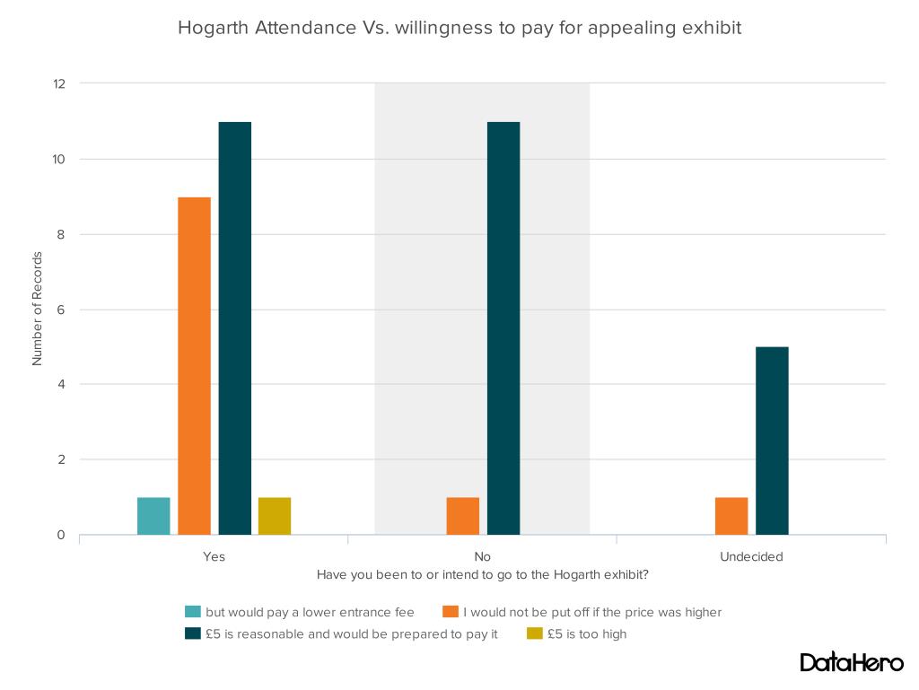
The graph below shows combined data from the Q.1 Have you been to or intend to go to the Hogarth exhibit? and Q.3. ‘Thinking about an exhibition that appeals to you, which statement do you most agree with?’. It shows the following:
The majority (69%) of all respondents who had and had not been into Hogarth agree with the statement ‘£5 is reasonable and would be prepared to pay it’.
Of the 22 users who had been to Hogarth, 41% agreed with the statement ‘I would not be put off if the price was higher’. A potential insight that the audience who are visiting Hogarth (60% over 55) would not be put off by higher ticket prices.
Only a small minority (2.5%) of all respondents agreed with the statements ‘I am unlikely to pay for a temporary exhibition’ or ‘£5 is too high, but would pay a lower entrance fee’.
Wider Insight: There may be a need to re-assess the fixed price structure of £5/£4 con/Free U16s across all paid temporary exhibitions in order to maximise the different offers of each one. We know that different exhibitions appeal to different audiences and therefore further research may be needed on how prices points are perceived by key target audiences for each exhibition.
Finding Two
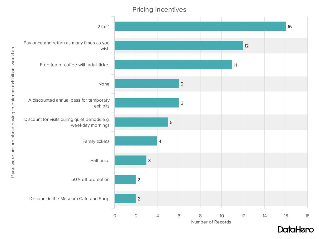
The graph below shows data for Q.4 – ‘If you were unsure about paying to enter an exhibition, would any of the following promotions make you more likely to buy a ticket?’ It shows the following:
85% of users selected at least one pricing incentive option which would make them more likely to buy a ticket for an exhibit they were unsure about. 15% selected the ‘none’ option, meaning they would not be convinced by a pricing incentive to buy a ticket for an exhibit they were unsure about.
The most popular discount pricing options were ‘2 for 1’ (41%) and ‘Free tea or coffee with an adult ticket’ (28%). This result is perhaps unsurprising, however, pricing discounts would need further research.
The ticketing schemes we presented were also popular. The option of ‘pay once and return as many times as you wish’ was selected by 31% of users and the Discounted Annual pass was selected by 15%.
Of those who said they had paid for exhibition in Bristol Museum and Art Gallery or M-Shed previously (Q.6), 28% selected an annual pass. This may indicate a stronger desire for an annual pass from already returning visitors.
Wider Insight: The data in this graph is indicative of openness among users to re-consider exhibits that they are unsure about given the right pricing incentive or promotion. This needs further investigation, including experimenting with pricing incentives.
Emerging questions and issues
As hoped at the outset of this short piece of research, a number of questions and issues emerged which need further investigation. The first one concerns what place temporary exhibitions have in the overall experience of a museum visit, for example, ‘are visitors using multiple offers in the museum: the permanent exhibitions, the temporary exhibitions (paid and free), the shop, and the café?’ Related to this, there is a need to better understand how temporary exhibitions relate to other paid-for elements in the museum. For example, ‘if the café is currently doing well, should we use its success as a means to increase visitor spend in the shop and in temporary exhibits (i.e. use the café as a direct marketing opportunity)?’
Perhaps the widest reaching insight, which would require further research, is that arguably the primary barrier to entry to any given exhibition remains a perceived lack of interest in a given exhibition. Previous research from the Hidden Museum project, however, revealed that a perceived lack of interest among visitors is often founded on assumptions and bias, but that this can be resolved given the right tools and approach.
Finally, it is part of my task as the new user researcher (audience development) to design and facilitate research which can address these questions and feed the findings back into decisions about how we shape the temporary exhibition offers that we have across Bristol Museums, Galleries & Archives.
If you have any questions about the digital or audience development research we do at Bristol Museums, Galleries & Archives feel free to get in touch with me darren.roberts@bristol.gov.uk
We have reached the half way point in the user testing phase of the research which began on the 11th April and will run till the 3rd May. I just thought I would provide a quick snapshot of how things are shaping up in the museum. To begin, some numbers; so far we have been in the museum on seven individual days and during that time 39 groups have taken part (=5-6 per day). In total, 125 individuals have taken part in using the app. I have interviewed the majority of the groups.
Issues on the ground
We have had a few logistical and technical issues along the way, so I will highlight three of these before I summarise some of the key parts of the research so far. Bad news first…
Issue 1 — The first significant problem we have encountered was on Sunday 12th April. Frances and I had to close down testing because the top floor of the museum was closed. This was due to a staff absence. When we found out the museum was partly closed-off, we quickly realised that the app will not function as there is no option to ‘skip’ a room if the app sends you there. The upshot is simply that it is important to check with the museum staff that the museum is operating normally.
Issue 2 — On Sunday 18th, we came across our first significant technical problem. When I attempted to open the app, a notification popped up saying that the Beta testing period had expired. Fortunately, my quick thinking volunteer came up with a temporary solution (manually changing the date on the iPad). I contacted Laura and she put Mark on the case to fix this which he did. However, this issue remains in play; the app needs to be ‘reset’ each month – something to keep in mind if we do any further user testing after the 3rd May (e.g. on the 10th June for our festival of education session).
Issue 3 — The third problem is an ongoing one which seemed to peak on Sunday 18th – the app/ibeacons occasionally not locating effectively. On the vast majority of occasions, the app is locating the user and it finds them and they get the ‘ping’ when they enter them room that they have been directed to. However, on occasion this doesn’t happen. On Sunday 18th it just so happened that this problem was experienced by three groups who all then returned the iPad because they couldn’t continue with the app (despite multiple attempts by users to be located by walking around and waving the iPad etc.). This sparked us to have a troubleshooting session in the museum on Monday 20th April…
Troubleshooting session in the Museum – 20th April 2015
Aardman Team Troubleshooting in the Museum
Initially the general thinking was that the depleting battery life of the iBeacons was causing the performance of the app to become unreliable. However, the troubleshooting session with the Aardman technical team (Mark, Nate, and another colleague), revealed that the batteries were minimally depleted with most showing around 90% power remaining. Good news! Most of the iBeacons were installed around October so they are faring well after around six months – this is a big positive in terms of reducing the level of resources required for ongoing maintenance (should they need it).
The sort of bad news, however, is that the troubleshooting session couldn’t specifically identify why the app is intermittently and seemingly randomly not locating users. We generally acknowledge that it can be temperamental at times, and in essence we have simply to work with it being that way. Nate reminded me that one solution for users is to click the ‘open map’ button if it is not locating them and this should give it a kick to find the user – I am now telling users this when I set them up on the app. I think the reality, for the time being at least, is that the app does require a degree of patience from users. Having said that, to reiterate, the app is working almost perfectly a lot more often than not and technical problems are rarely reported back to me in user feedback.
General news from the user testing
Hidden Museum Desk
One of the bigger changes we have made since the pilot research was to move the Hidden Museum desk to the main foyer – a good move. You can also see from the photo that we also have our Hidden Museum banner in place. It is fair to say that this has very much improved our general look and visibility and has also increased interest. Relatedly, we have changed recruitment tactics to include on-the-day recruitment, which means we are now inviting visitors from within the museum on the take part. This decision was taken partly because people were asking to take part and we felt like it was defeating the point if we said no, and because it feels like there is only so much that can be done through twitter and online registration. I would say that the combination of the two recruitment methods (online and on-the-day) is favourable. To note, users that we do recruit on-the-day are still required to provide ID and to fill-out the consent form in order to take part.
Feedback from users
User testers getting going in the museum foyer
Feedback from users has generally been very positive. It is difficult to summarise the feedback in this short space but I will note a couple of things. Where most users agree is on the question of ‘is there a place for the integration of digital technology like the app into the museum experience?’ – the answer has been a resounding ‘yes’, and users have been very clear that they think the concept of the app is great and should be given support.
Secondly, and this is good news, the app appears to be fulfilling its most basic objective – getting visitors to parts of the museum they don’t usually go to. The response on this has been virtually unanimous; the app is taking visitors to the less visited parts of the museum, and for the most part they are finding the experience of going to those parts of the museum interesting and valuable.
With regards to the more critical comments, they are certainly there but they are quite varied so they are difficult to capture at this stage. I will highlight one, and that is the issue of ‘pace’ – quite simply users are not so keen on how fast they end up going around the museum when using the app. When children are part of a group this issue is especially pronounced as they are often leading the group and responding primarily to the app and the instruction to move on. Initial ideas to overcome this include the option to ‘have another challenge’ in the room, or, perhaps an instruction to ‘explore the room before moving on’. Of course, these issues require fleshing out before they can be addressed.
This blog is about my thoughts on joining the Hidden Museum project and the partnership with Aardman and Bristol Museum and Art Gallery. I use my experience of going to the museum and meeting some of the team for the first time (early April). I also use this as an opportunity to unpack a bit about the research we will be doing on the project during April and May (see also milestone 4.4 for further info about the research design).
To begin; some context … I have just begun a research assistant role on the Hidden Museum project. I will be based at the University of Bristol within the Graduate School of Education and will be working with Dr. Frances Giampapa. The second bit of context is that the research we are conducting is focused on questions about how the Hidden Museum game app affects the nature of interaction, learning, and engagement among museum users (I will unpack this below).
Before I go on to explore some of the research themes, the first thing to say (and I think it is worth saying) is that I am excited to know the museum it will be my research location for the next couple of months – it’s a fascinating place. Secondly, it was real a pleasure to meet some of the Hidden Museum team (Gail, Laura, Jake, Amy, and Al). When speaking with you, what quickly came to mind from a research perspective was the need to include and, to some extent, start with your ideas and understandings of the key research themes such as ‘digital technologies’, ‘museum cultures’, and ‘engagement’. (The following week I got the chance to interview Laura and Jake from Aardman and Gail from the Museum about this). Third, I thoroughly enjoyed my experience of using/testing the Hidden Museum app.
Testing the app and the research themes
Generally speaking, what social scientists like Frances and I do is use qualitative and/or quantitative data to build up a ‘narrative’ about a topic (e.g. a place, or community, or set of practices) which we then analyse within a particular framework. Here the aim will be to develop a narrative about the three intersecting themes of digital technologies, museums, and learning/engagement. We will collect qualitative data through observation and short interviews and analyse it using ideas from education studies literatures. It is on this platform that more ‘layers’ can be added. For example, in the team meeting, we began discussing the possibility of incorporating questions about socio-economic diversity. This prompted ideas about potentially inviting particular groups from more deprived areas of the city to use the Hidden Museum app. In turn, it was suggested that this could form the basis of a small case study within the research.
The observation part of my research began to take shape from my first visit to the museum both because I got the chance to go around the museum and get to know the space, but I also got a chance to use the Hidden Museum game app – Frances, Amy, and I (all first-time users) played the Hidden Museum game in a team of three. Despite some initial technical hitches, which were speedily and impressively resolved, the game successfully revealed a hidden museum as it directed and delivered us to different parts of the building. For me and Frances, the question we are interested is, in what ways did the Hidden Museum game app shape or change how we engaged as visitors to the museum? To me it seems that one of the keys to answering this question is unpacking what we mean by ‘engagement’ and by thinking about the multipleways that weengage. That is, to think of engagement as a combination of different forms of engagement. So, for example, on one occasion the game asked a member of the group to find out a fact about the item and then to quiz the other group members on the item. In response to the app a form ‘social’ engagement occurred as our group interacted and collaborated in the quiz. A ‘creative’ engagement occurred as one member of the group had to construct a meaningful question on the spot about a museum object. And a new ‘emotional’ engagement occurred as one group member slightly panics to come up with a question and the other team members wait with a degree of anticipation and playfulness.
Additionally, it is not always about the increase of engagement, for example, engagement with digital technology, especially the iPad and the game itself, fluctuates. This is something the team were discussing at the meeting, especially the idea that the app is designed to discourage the users from over-engaging with the game or the iPad in order that they could engage more fully in other ways with the space of the museum, with their group, and with exhibitions and items in the museum.
I hope this ramble has gone a little way in providing an insight into some of my initial thoughts as a researcher on the project and how we develop our side of things. I look forward to learning about how people will use the Hidden Museum game app in Bristol Museum and Art Gallery.


 Added to this, the service manual advises that:


 It’s all pretty smart. Pretty smart apart from the dreaded Video Graphics Array as the main interface, more commonly referred to as the VGA connector! For all this advanced technology, presenters still have to connect their devices with a cable.
 Apple products long ago ditched the VGA system in favour of min-display ports or “lighting ports”. A quick trip to any Apple store and an assistant will enthusiastically show how with a flick of the devices, a display can be “thrown” to another screen. It’s called Air Play and is Apple’s secure version of Wi-Fi streaming.


 purchased an ASUS RT-AC3200 Tri-Band Giga-Bit Wi-Fi router. This router is enormous with six aerials and looks like the Batmobile. I figured that it would have to be reliable and be able to cope with large amount of data traffic, so I got the most powerful but cost effective router I could find.

 e, we arranged to meet in a nice quite corner of the L Shed store room. It’s a vast store, full of so many objects that there isn’t enough space to have them on permanent display. With both Jacqui and Heather sat at opposite ends of a table, I set up a pair of good quality condenser microphones. Each plugged into their own separate channel on my external sound card, an Akai EIE 4 channel usb sound card with great preamps and phantom powered for the mics. This in turn was hooked up to my MacBook and copy of Logic Pro. I recorded through each script a few times and was able to compile a seamless recording from the various takes. Once finished, I hard panned each channel left and right so that when each voice played back each would have its own speaker, left or right – crane 1 or crane 2.

 seen in things like charity appeals and car parks. Anyone who has used a text to pay system before will know that it is a very simple way of making a payment as it generally doesn’t require sign-up or registration. Instead, the user simply sends a text message containing a specific word to a specific number and a set amount of money is paid (I’ll explain in more detail below).
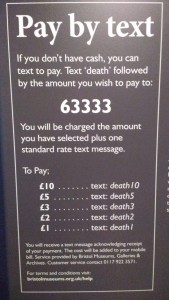
 he period we have displayed the Banksy books on the shop-front table, there has been an increase in sales of 219.8%