You can read lots about how the project came about by reading the various blog posts on here with the tag “hidden museum“.
The reason we haven’t made a big splash about the launch comes down to one word BATTERIES. As the app has taken so long to get into the app store we are yet to get the chance to run around the building and check all the battery levels of the ibeacons. Thus the app is available but living by its moniker and being hidden from general view for a few days. If you do get a chance to play the game please do let me know what you thought by leaving a comment, tweeting @bristolmuseum or email.
On to the next projects to ship, CRM and alpha visitor giving.
Thanks to all the good folks who made the project a reality on our team, aardman and The University of Bristol. Finally to The Digital R&D Fund for supporting us, challenging us and helping us make a little dent in the world.
Last week we began our pilot testing: it’s time for all the hard work we’ve done to be prodded and poked by people who have never heard of the project and who have no personal investment in its success. This is a somewhat daunting proposition since we clearly want visitors to love what we have created but for us also to be able learn from our testers as ‘critical friends’ and trust they will highlight any mistakes!
My role
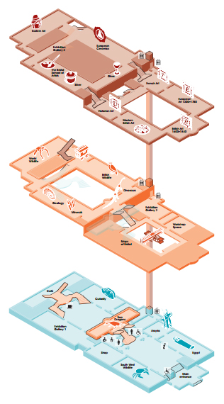
“Most visitors need a real helping hand to get around a building created over several floors and split levels.”
As an experienced museum curator I am used to telling stories (interpretation) using a variety of different tools – these might include 3D real objects, images, AV, IT, graphic text, physical and mechanical inter-actives. I like to think that in creating the Hidden Museum we will be adding to the varied menu of possibilities we provide which enable our visitors to engage with our collections, with the space (museum) and especially with each other. My role has been to help inform the user journey from a museum perspective and to learn more about how we might better approach visitor engagement utilising new technology. It has also been my task to liaise with project partners who have no direct knowledge of the collections or experience of delivering ‘museum style’ interpretation, public visiting habits, desires, wants and needs, or of the intricacies of an Edwardian building. Clearly it has been just as important for me to be guided by them and the fresh perspectives they bring since we want this app to be innovative in its approach rather than just a digital version of things we already do – its been a good to have our assumptions challenged by each other and to learn new skills from each other too!
Content
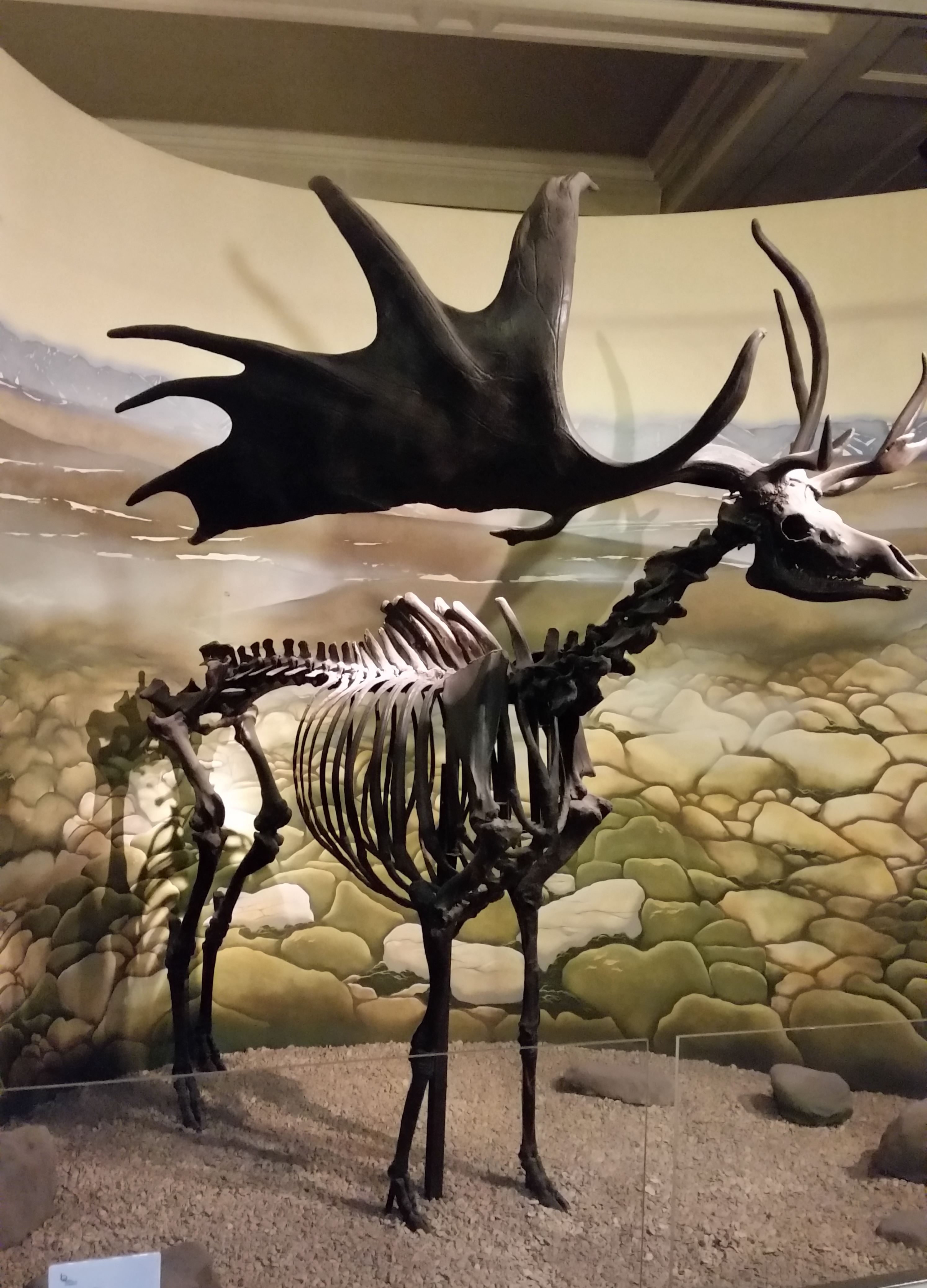
Who knew we didn’t have an image of one of our largest specimens?
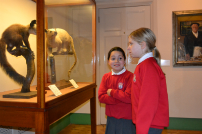
I have mainly been responsible for the collation and creation of the museum ‘assets’ we needed in order to be able to populate the app with content. Having worked on the delivery of a number of software based AV/IT inter-actives at M Shed I knew that this would always take longer than anticipated and true to form it did! We are fortunate to have a sophisticated collections management system (CMS)that contains high quality images of objects, so some of those we required could be sourced this way: others proved more elusive and I often found myself running up and down the stairs to various galleries to take just the right shot or to check a detail.
The biggest question we needed to resolve was how objects would be linked together across galleries and how playful we could be with this . We began by looking at some pre-existing paper-based trails used on museum activity days but after preliminary user testing we realised these were too prescriptive and we needed a much more interesting, dynamic and perhaps more random way of linking objects together. We used our CMS to create a digital data set of all the items on display with images attached to their records and then began to interrogate this by randomly selected keywords: the latter produced more playful connections, for example, the word ‘fish’ linked live specimens in tanks in one gallery with oil paintings in another. Although this method started to lead us in the right direction we didn’t manage to refine our thinking until after we’d analysed the feedback report from our ‘Kid In Museums’ testing day.
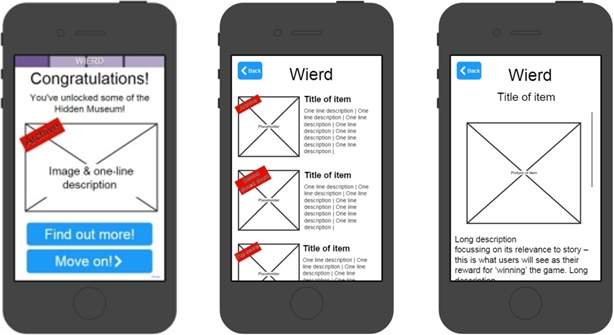
“Wireframe images within templates helped to keep content consistent”
Themes began to emerge that could be interpreted in a really flexible way based on words such as ‘weird’ or ‘oops’, but these weren’t words that generally appeared in our databases and so we had to resort to pounding the galleries to create lists of possibilities. In order to achieve a consistent approach, and for easier referencing whilst uploading content, we agreed that we would work to two templates: one that set out game content and the other museum ‘secrets’. The latter act as the ‘rewards’ given to players after they complete each game in a tour. These are designed to be exclusive to the Hidden Museum experience and so needed to be more revelatory or anecdotal than anything that can be found on a museum label. Interesting discussions took place between the partners as to what words should or shouldn’t be used to describe each theme. The word ‘weird’ became ‘extraordinary’ since it was felt the former could have been easily misconstrued in a negative or insulting way , whilst ‘oops’ became ‘broken’ because that more adequately reflected the objects represented within the theme.
Journey
This is not the end of the road as far as my role is concerned since we will almost certainly need to refine the content based on our user testing and research. At the beginning of the project were were working in ‘sprints’ – the first round of these involved all project partners but then each one of us played different roles and had differing degrees of responsibility for its delivery over time. The technical and museum teams have now passed the baton well and truly to the research team who will be gathering data ready to feed back to us all – can’t wait to see and hear the results!
Early on in our production we discussed levels of accessibility required for this app.
As a company, Aardman feel very connected to accessible digital products – we have created some highly accessible products in the past, the most accessible of which had to be the Something Special games which include a range of settings for users of all cognitive and physical abilities. We are well versed in the creation of accessible apps as well so we felt well prepared to advise as to suitable levels of accessibility for this product. And in one of our most recent mobile games CBBC’s Escargot Escape Artistes, as well as using only the most simple of gestures to play the game, players can choose to play it using their voice alone – without any physical input.
Since this is a research project and full accessibility can become a project all in itself, we decided that our goal would be to be ‘as inclusive as possible’ within the constraints of time and budget.
As a result, we decided that if we were going to target a single device for this research phase, that we should target iOS devices since these are known that these have the best accessibility features as standard. As a result we decided to deploy to a test base of iPad Air 2’s for this research testing.
We also ensured that all text was a minimum height on screen and that colours used in the designs were compliant with the general colour blindness guidelines for web design.
In terms of the app’s design, at first when we were leading users around the museum, care was taken to establish whether the user was able to use stairs or not. As the game design has moved away from a ‘led’ tour into more of a general guide we have not had to establish this but have always offered users routes via stairs or lifts in the map view of the app to ensure that all abilities are catered for in that way.
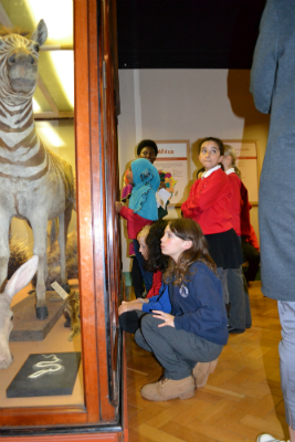
On Friday 21st November, the Hidden Museum team were lucky enough to have the opportunity to be a part of a Kids in Museums take over day. Kids in Museums are an independent charity dedicated to making museums open and welcoming to all families, in particular those who haven’t visited before.
This was a great opportunity for us to test our app in production with real users, over 30 kids and 6 adults who had never seen the app before! A real coup for us as developers – a chance to get some real insight into how our app might be received on completion.
However we were conscious that we did not want to take advantage of the day and it’s main aim of making museums more open to kids and families. So we took great care to plan the day with the education coordinators at the museum, Naif and Karen, to ensure that we were providing a fun experience for the kids, as well as testing elements of our app. As there were adults supervising the kids we also tested all elements with the supervising adults to get an impression of a family group’s opinion of each element (rather than kids opinions only) – very important as our app is aimed at a mixed-age group.
Naif and Karen suggested that we warmed them up with a ‘fingertips explorers’ activity – where the kids felt an artifact blindfold, and had to describe it to their friends – their friend’s guessing what it could be. (A fun game which the kids really enjoyed and we have used as an influence for one of our games as a result!)
We decided that after the fingertips explorers warm up the kids would be ready for app testing!
As the app was not yet complete, we decided to test elements of the app broken down, rather than the experience as a whole. We decided to break our testing down into 4 elements:
This decision was reached mainly through necessity since the app was not complete. However, we found that it really worked for us, and allowed us to get some really in depth insight into our app. This was for two reasons – firstly it allowed us to break the group of children down into smaller more manageable groups so we were able to have real conversations with each of the children in turn – and secondly it allowed us to assess which elements of the app they struggled with the most and so exactly where we should be making our improvements.
There were lots of great testing outcomes to the day around each of the app elements outlined above – I’ll update the blog with how we tested each of the app elements (and the associated learnings) over the coming days.