From physical to digital to…?
At Bristol Culture we aim to collect, preserve and create access to our
collections for use by present and future generations. We are increasingly dealing with digital assets amongst these collections – from photographs of our objects, to scans of the historical and unique maps and plans of Bristol, to born-digital creations such as 3D scans of our Pliosaurus fossil. We are also collecting new digital creations in the form of video artwork.
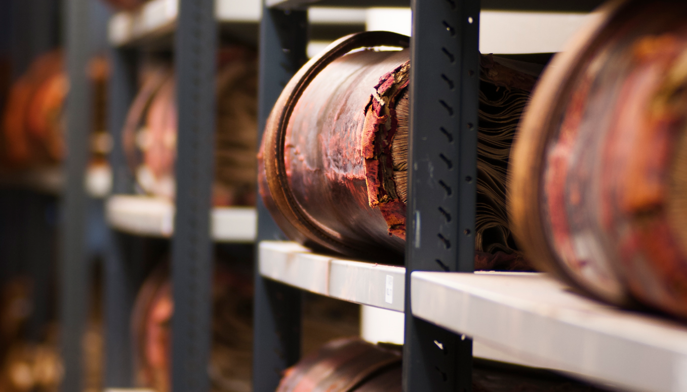
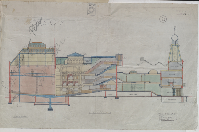
One day we won’t be able to open these books because they are too fragile – digital will be the only way we can access this unique record of Bristol’s history, so digital helps us preserve the physical and provides access. Inside are original plans of Bristols most historic and well-known buildings including the Bristol Hippodrome, which require careful unfolding and digital stitching to reproduce the image of the full drawing inside.
With new technology comes new opportunities to explore our specimens and this often means having to work with new file types and new applications to view them. 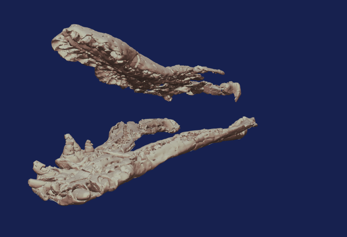
This 3D scan of our Pliosaurus jaw allows us to gain new insights into the behavior and biology of this long-extinct marine reptile.
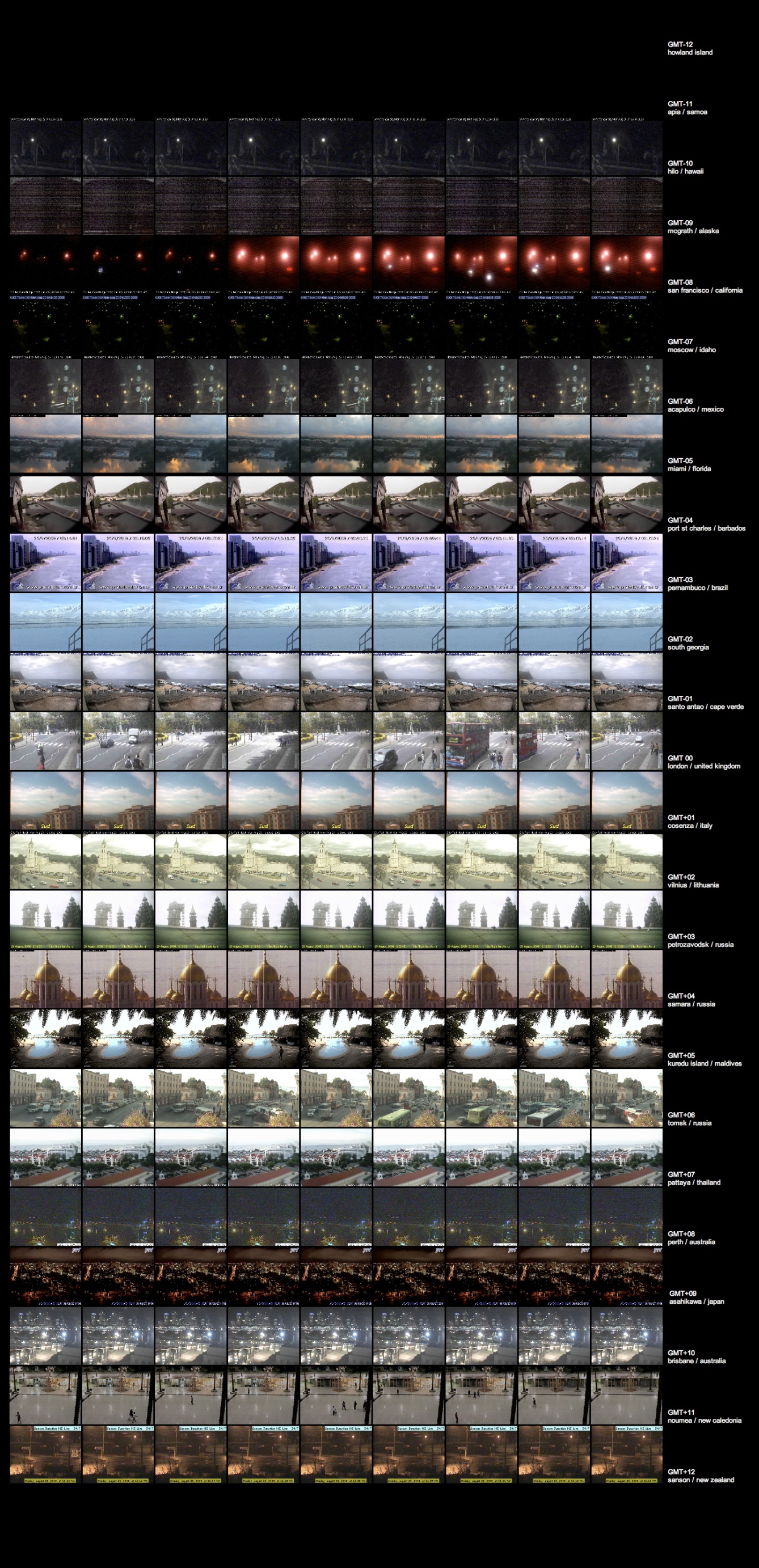
Horizon © Thompson & CraigheadThis digital collage by Thompson & Craghead features streaming images from webcams in the 25 time zones of the world. The work comes with a Mac mini and a USB drive in an archive box and can be projected or shown on a 42″ monitor. Bristol Museum is developing its artist film and video collection and now holds 22 videos by artists including Mariele Neudecker, Wood and Harrison, Ben Rivers, Walid Raad and Emily Jacir ranging from documentary to structural film, performance, web-based film and video and animation, in digital, video and analogue film formats, and accompanying installations.
What could go wrong?
So digital assets are helping us conserve our archives, explore our collections and experience new forms of art, but how do we look after those assets for future generations?
It might seem like we don’t need to worry about that now but as time goes by there is constant technological change; hardware becomes un-usable or non-existent, software changes and the very 1s and 0s that make up our digital assets can be prone to deteriorating by a process known as bitrot!. Additionally, just as is the case for physical artifacts, the information we know about them including provenance and rights can become dissociated. What’s more, the digital assets can and must multiply, move and adapt to new situations, new storage facilities and new methods of presentation. Digital preservation is the combination of procedures, technology and policy that we can use to help us prevent these risks from rendering our digital repository obsolete. We are currently in the process of upskilling staff and reviewing how we do things so that we can be sure our digital assets are safe and accessible.
Achieving standards
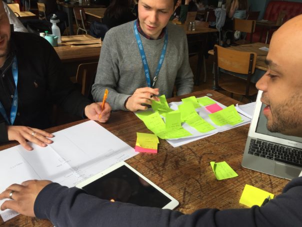
It is clear we need to develop and improve our strategy for dealing with these potential problems, and that this strategy should underline all digital activity where the result of that activity produces output which we wish to preserve and keep. To rectify this, staff at the Bristol Archives, alongside Team Digital and Collections got together to write a digital preservation policy and roadmap to ensure that preserved digital content can be located, rendered (opened) and trusted well into the future.
Our approach to digital preservation is informed by guidance from national organisations and professional bodies including The National Archives, the Archives & Records Association, the Museums Association, the Collections Trust, the Digital Preservation Coalition, the Government Digital Service and the British Library. We will aim to conform to the Open Archival Information System (OAIS) reference model for digital preservation (ISO 14721:2012). We will also measure progress against the National Digital Stewardship Alliance (NSDA) levels of digital preservation.
A safe digital repository
We use EMu for our digital asset management and collections management systems. Any multimedia uploaded to EMu is automatically given a checksum, and this is stored in the database record for that asset. What this means is that if for any reason that file should change or deteriorate (which is unlikely, but the whole point of digital preservation is to have a mechanism to detect if this should happen) the new checksum won’t match the old one and so we can identify a changed file.
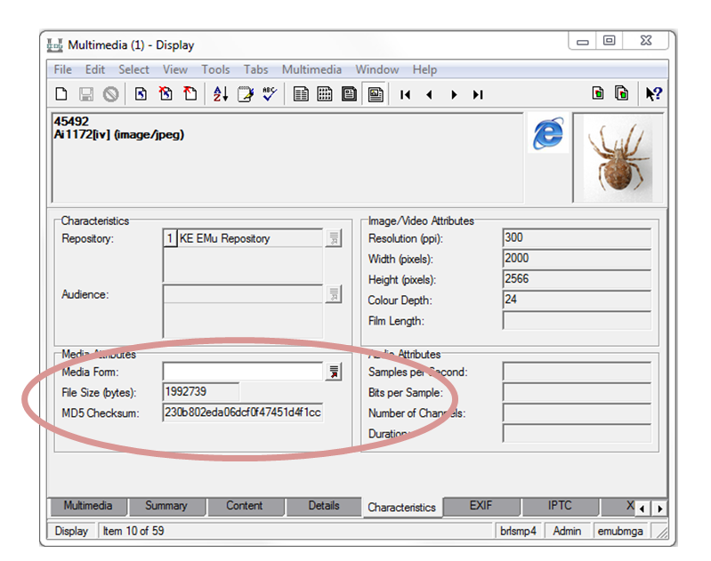
Due to the size of the repository, which is currently approaching 10Tb, it would not be practical to this manually, and so we use a scheduled script to pass through each record and generate a new checksum to compare with the original. The trick here is to make sure that the whole repo gets scanned in time for the next backup period because otherwise, any missing or degraded files would become the backup and therefore obscure the original. We also need a working relationship with our IT providers and an agreed procedure to rescue any lost files if this happens.
With all this in place, we know that what goes in can come back out in the same state -so far so good. But what we cant control is the constant change in technology for rendering files – how do we know that the files we are archiving now will be readable in the future? The answer is that we don’t unless we can migrate from out of date file types to new ones. A quick analysis of all records tagged as ‘video’ shows the following diversity of file types:
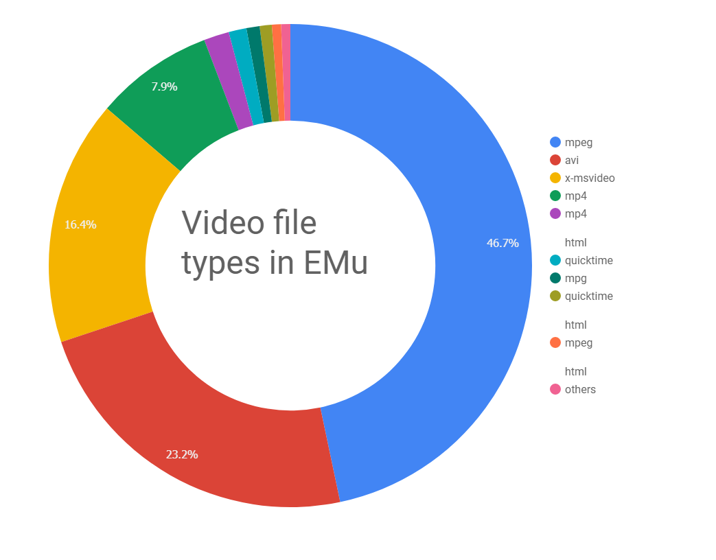
(See the stats for images and audio here). The majority are mpeg or avi, but there is a tail end of various files which may be less common and we’ll need to consider if these should remain in this format or if we need to arrange for them to be converted to a new video format.
Our plan is to make gradual improvements in our documentation and systems in line with the NDSA to achieve level 2 by 2022: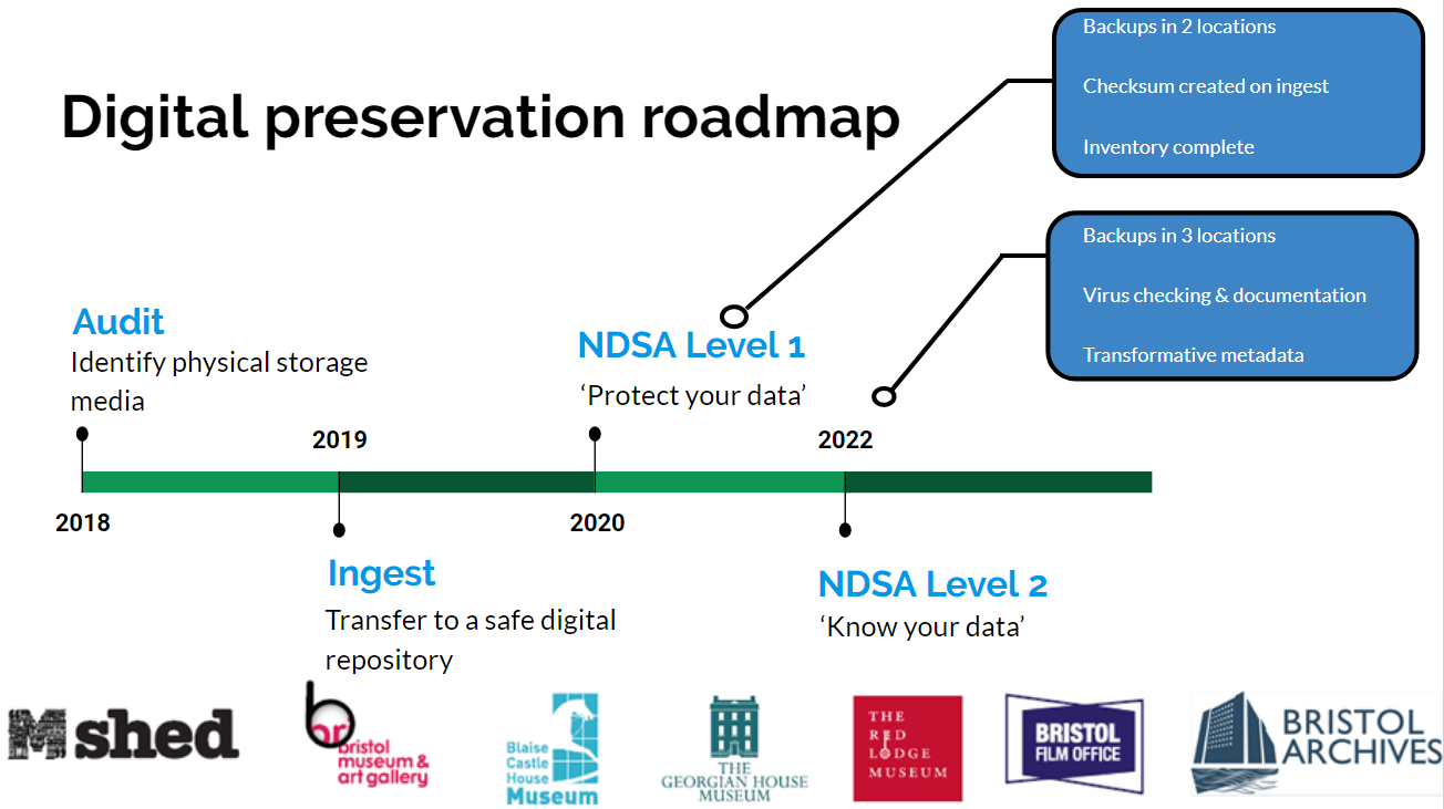
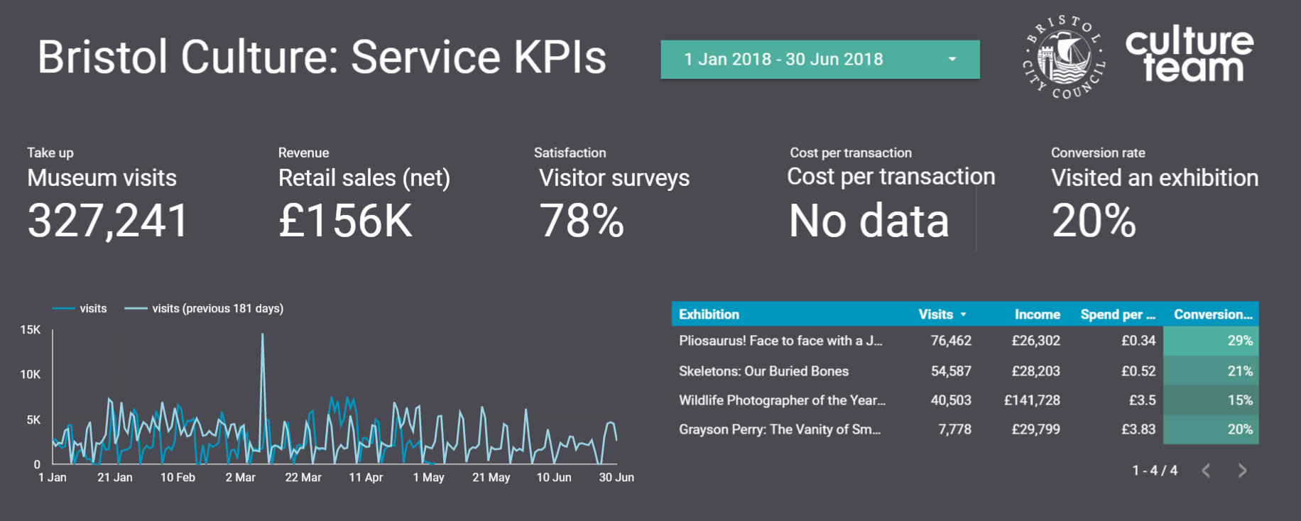
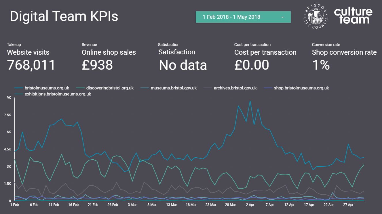
The following dashboard gives an idea of where we are currently in terms of file types and the rate of growth:
Herding digital sheep
Its all very well having digital preservation systems in place, but the staff culture and working practices must also change and integrate with them.
In theory, all digital assets should line up and enter the digital repository in an orderly and systematic manner. However, we all know that in practice things aren’t so straightforward.
Staff involved in digitisation and quality control need the freedom to be able to work with files in the applications and hardware they are used to without being hindered by rules and convoluted ingestion processes. They should to be allowed to work in a messy (to outsiders) environment, at least until the assets are finalised. Also there are many other environmental factors that affect working practices including rights issues, time pressures from exhibition development, and skills and tools available to get the job done. By layering new limitations based on digital preservation we are at risk of designing a system that wont be adopted, as illustrated in the following tweet by @steube:
Design vs User Experience Examples: Talk w/ & Listen to Users #ui #ux #userexperience #design #SXSW2016 #sxsw pic.twitter.com/TSqZiKnux0
— Fred Steube (@steube) March 12, 2016
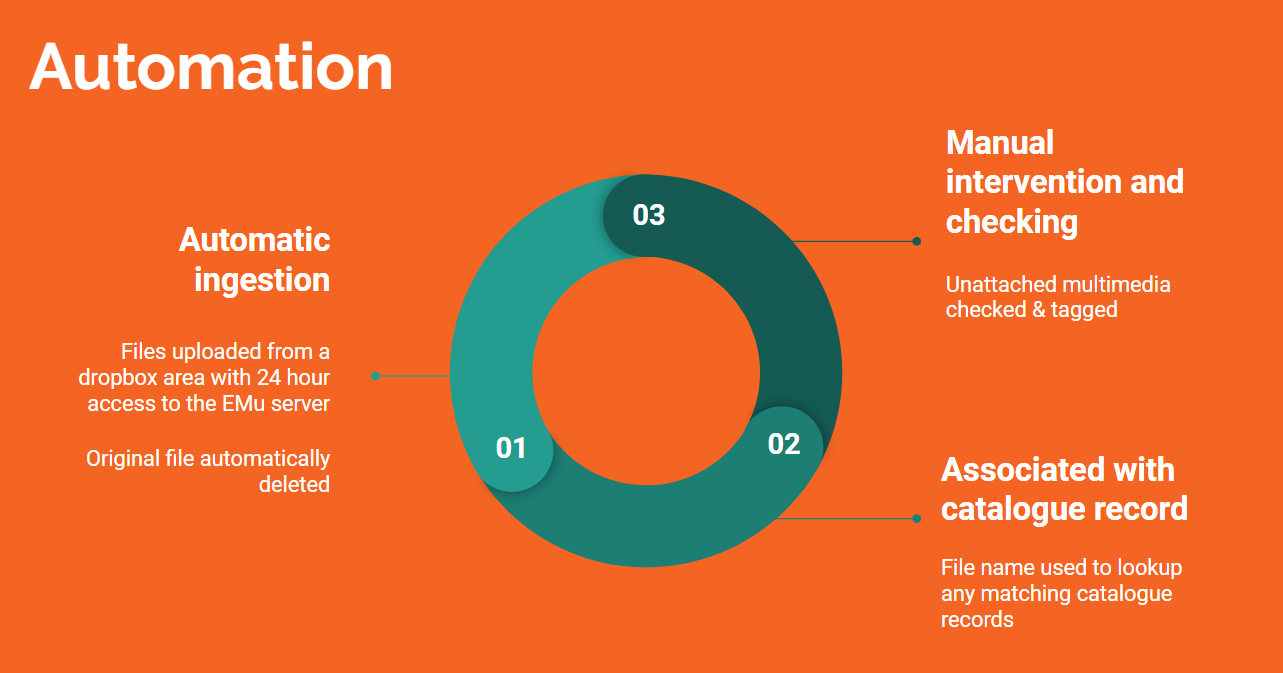
So we’ll need to think carefully about how we implement any new procedures that may increase the workload of staff. Ideally, we’ll be able to reduce the time staff take in moving files around by using designated folders for multimedia ingestion – these would be visible to the digital repository and act as “dropbox” areas which automatically get scanned and any files automatically uploaded an then deleted. For this process to work, we’ll need to name files carefully so that once uploaded they can be digitally associated with the corresponding catalogue records that are created as part of any inventory project. Having a 24 hour ingestion routine would solve many of the complaints we hear from staff about waiting for files to upload to the system.
Digital services
Providing user-friendly, online services is a principle we strive for at Bristol Culture – and access to our digital repository for researchers, commercial companies and the public is something we need to address.
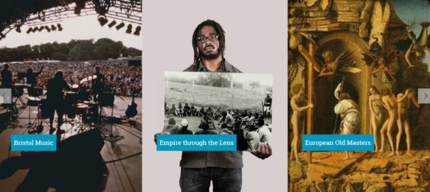
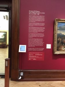
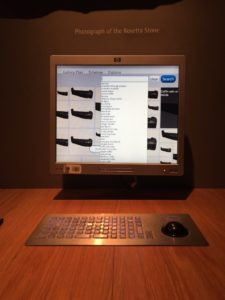
We want to be able to recreate the experience of browsing an old photo album using gallery technology. This interactive uses the Turn JS open source software to simulate page turning on a touchscreen featuring in Empire Through the Lens at Bristol Museum.
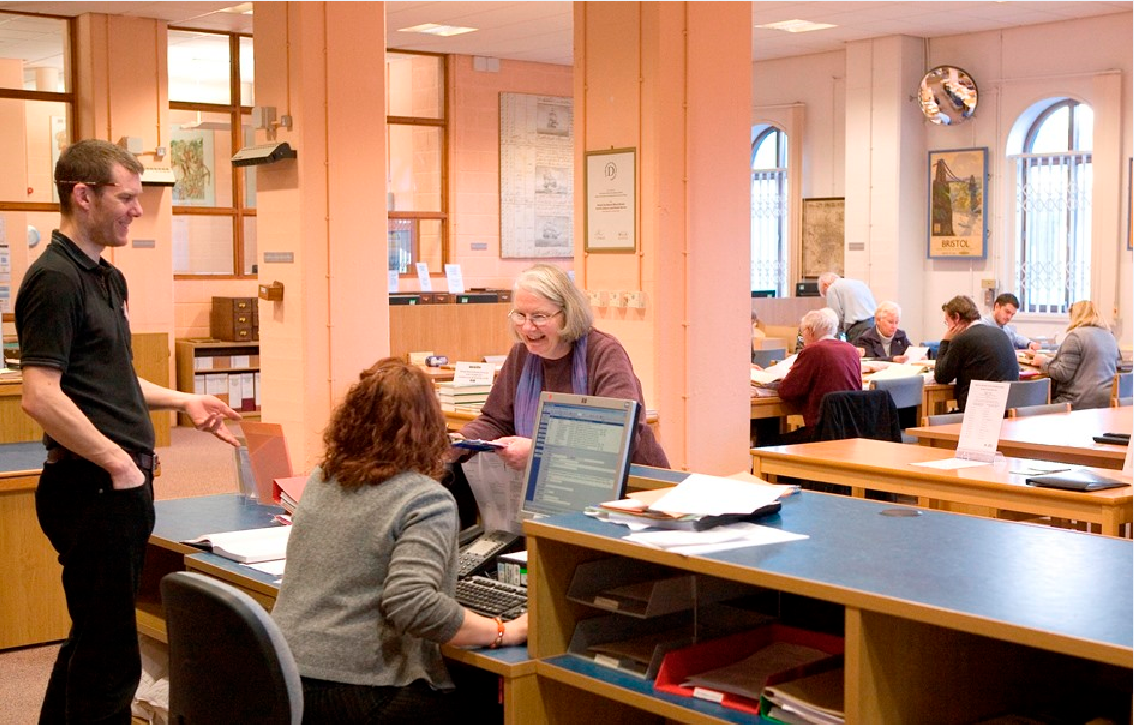
Visitors to the search room at Bristol Archives have access to the online catalogue as well as knowledgeable staff to help them access the digital material. This system relies on having structured data in the catalogue and scripts which can extract the data and multiemdia and package them up for the page turning application.
But we receive enquiries and requests from people all over the world, in some cases from different time zones which makes communication difficult. We are planning to improve the online catalogue to allow better access to the digital repository, and to link this up to systems for requesting digital replicas. There are so many potential uses and users of the material that we’ll need to undertake user research into how we should best make it available and in what form.

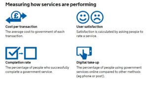 Added to this, the service manual advises that: