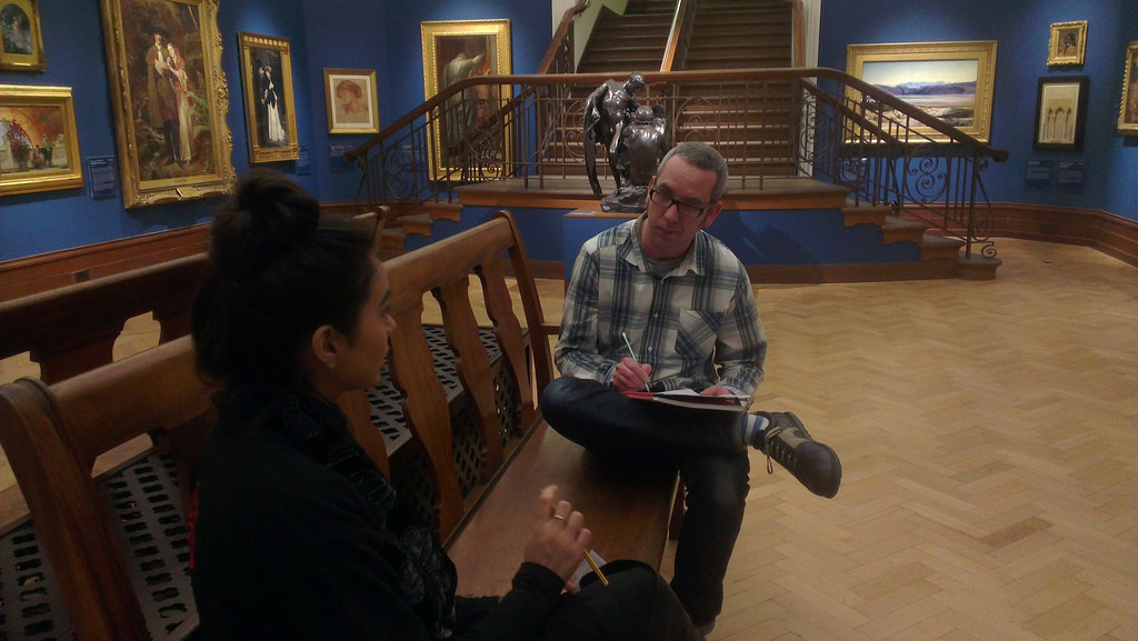
Transformation is made one day at a time. Ideas, mistakes, doing and refining. Ship early, ship often. There are no ribbon cutting moments just the quiet satisfaction that a tool or way things are done become normal and it’s seen as business as usual. I love this transformation.
To counteract my nervous energy on my Dublin to New York City flight I made a brief list of things we’ve introduced in the recent past.
We’ve introduced new roles including Head of Digital and user researchers. New as in never been seen in the service before. How cool is that?! We’ve pushed as many decisions out from management as possible to keep the responsibility with whomever has the direct expertise and to release the bottleneck of waiting for the four of us. Yes we can still override a preferred course of direction.
We’re getting digital tools (basecamp and trello, emu) into position as THE way we do business – freeing up meeting time and being transparent. We’re also chipping away at a culture of being a ‘cultural business’. And that’s just on the staff front. All things to be super proud of from those across the team. What I love though is how “normal” all this is now. Tools like Basecamp were seen as for the nerds like me back in 2014 in the team. Yet in 2016 I can see we now use it for project managing all exhibitions as a matter of course.
We’re cooking on gas using google drive now too as the spreadsheet sharing and linking data gets more critical eg for kpi work. Accurate information over live/ancient information.
The public are seeing some of this work through our ‘Pay What You Think’ approach to our own in-house programme. Tinkering with pricing and value.
Stroll into Bristol Museum & Art Gallery and you’re now greeted upon entry and asked if you’d like to donate without delay.
All of the above are super closely aligned to our core value of “excellence” by focusing on the needs of the user – staff or public. You may be asked on your visit about any number of our services and we use this to make our service better.
Long live business as usual.
The Moved by Conflict exhibition at M Shed is comprised of many different types of technology to interpret content, from projectors to speakers. We used some new technology we haven’t used in the past to deliver this content, notably the RFID tag system.
We had several briefs, but the one that stands out is: visitors need to have a personalised experience through the exhibition; the ability for visitors to have content of their choice delivered to them in the exhibition through digital means. The idea was to have stories being told through video, and we worked with Bristol Old Vic to bring a more theatrical performance to these stories. We had actors playing six fictional characters telling their stories, which would capture their lives before, throughout and the end of the First World War.
Concept
We needed a way for visitors to trigger the content when they wanted to experience it. Initially we wanted hidden video screens (projections) around the exhibition and when a visitor walked next to it the video magically appears for them. To do this we looked into iBeacons, a Bluetooth technology which can be used to trigger an activity from a specified distance to the user, for example playing a sound when someone gets within two metres of a loudspeaker. Our concept was when someone gets to within a metre of a screen the content appears and when they leave that area the content turns off. The trigger device would be a visitor’s smartphone or a small Bluetooth transmitter/tag.
Media player
After a lot of research we found that this would cost a lot of money and would take a lot of time to develop – this technology is still very new, which is why it costs quite a bit. We looked then at long-range RFID technology, but this was also outside of our budget. We decided to go for short-range RFID, so a visitor would need to pick up an RFID wrist band and scan it in a specific location, as we were still keen on the idea of the content being triggered when you get to a certain distance. To do this we’d need to use a sensor, which wouldn’t trigger the main content but would trigger an intermediate screen, such as an image with instructions on it informing you what to do with the RFID wrist band.
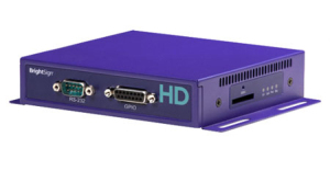
Once we had finalised the concept we started looking into the equipment that would enable us to do what we wanted. We looked at a number of options, ultimately what we went for worked very well. The content is displayed on a 24 inch screen, used in portrait orientation. There is an actor speaking to camera, with their head and shoulders in shot, giving the actor lifelike dimensions. We needed something that would play the content and to be able to accept triggers so we looked in to Raspberry Pi. For what we wanted to do there would be a lot of programming and coding, and we were also not sure if the Raspberry Pi would be instant enough on the triggering as we were informed Raspberry Pi could have a slight delay in triggering hd content. We wanted instant triggering and relatively easy setup/programming as we were limited on time, so we went down the route of a media player.
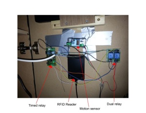
We selected a Brightsign hd1020 media player which has GPIO and allows you to connect buttons to trigger content, and also has USB input so you can connect a keyboard to it. The programming of this media player is relatively easy to do as it has graphical programming software you load on to your pc. These three elements were what we needed to make our concept work.
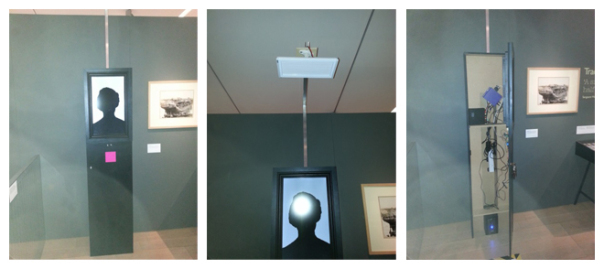
Character point (left), directional speaker (middle) and inside the character point (right)
Concept to Reality
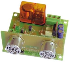
The GPIO is connected to an ultrasonic sensor, which sends out a high pitched audio noise (well above human hearing) and listens for the echo to return. The sensor allows you to increase or decrease the sensitivity, meaning you can set the distance of how far you want it to trigger. It also has a ‘stay open state’ and ‘stay closed state’ feature, so when a person is watching the content the sensor will stay in an open state (as it is still detecting an object in front of it) and once the person steps out of the sensor’s range it will switch to a closed state and the content will finish.
The USB port on the media player is used to connect a USB close range RFID reader. This reader detects the RFID wrist bands that visitors pick up. We’ve also used a directional speaker to limit sound spill in the gallery and to give the visitor a more personal experience. With all these elements combined, the way it works is;
On the screen the visitor sees a static attractor image
As the visitor gets closer to the screen, the motion sensor will detect them
This will trigger the content on the screen to change to an image with instructions asking them to scan their RFID wrist bands on the pink square (the RFID reader is directly behind the pink square)
This will trigger the content.
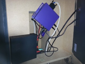
Media player and audio amplifier
If visitors read the instructions and decide they don’t want to view the content they can step away and the sensor will detect there is no one in front of it and switch to the attractor image. If a visitor decides to trigger the video content with the RFID wrist band and decides that they’d rather not watch any more, they can step away and the sensor will detect there is no one there, so the video will end and go back to the attractor image. In the exhibition we have six of these RFID interactives; we’ve named them Character Points.
Concept to Reality Issues
We quickly realised that there was an issue with the triggering. We found that the sensors were not staying in the open state; they would go into a closed state and open state repeatedly which meant the content wasn’t staying on the screen for long. To overcome this we bought a timed relay and wired it in to the sensor. The relay activates when the motion detector senses a person and holds the sensor in an open state – we set the time of this to 10 seconds. The relay gets activated even when it’s holding, meaning it will continuously reset the timer to 10 seconds as long as it’s detecting something. Now when a person steps away from the sensor’s range the content will stay on screen for 10 seconds then switch back to the attractor screen.
Internal components
Another issue we had was that some visitors decided to poke their fingers through the holes that the sensor’s microphones stick out of. These need to be visible otherwise the sensor will not work (you can see these microphones in the photo of the sensor above). The sensor would get dislodged and fall inside the character point. We tried using glue and silicone to stick these sensors to the door, but visitors still managed to push the sensor through. We found good old gaffer tape held the sensor in place and can withstand a lot of force if someone tries to push the sensor through.
Now that we have the equipment to do this kind of interactivity, we’ll be using it in other interactives. Hopefully in the future we can expand on this to make it in to a long-range RFID system.
On the 15th of May we quietly launched our new website phase one www.bristolmuseums.org.uk which was made possible with the hard work of lots of staff here and at fffunction.
I’ll be writing very soon about the weeks in the lead up to release, what happened at launch and what we have planned next.
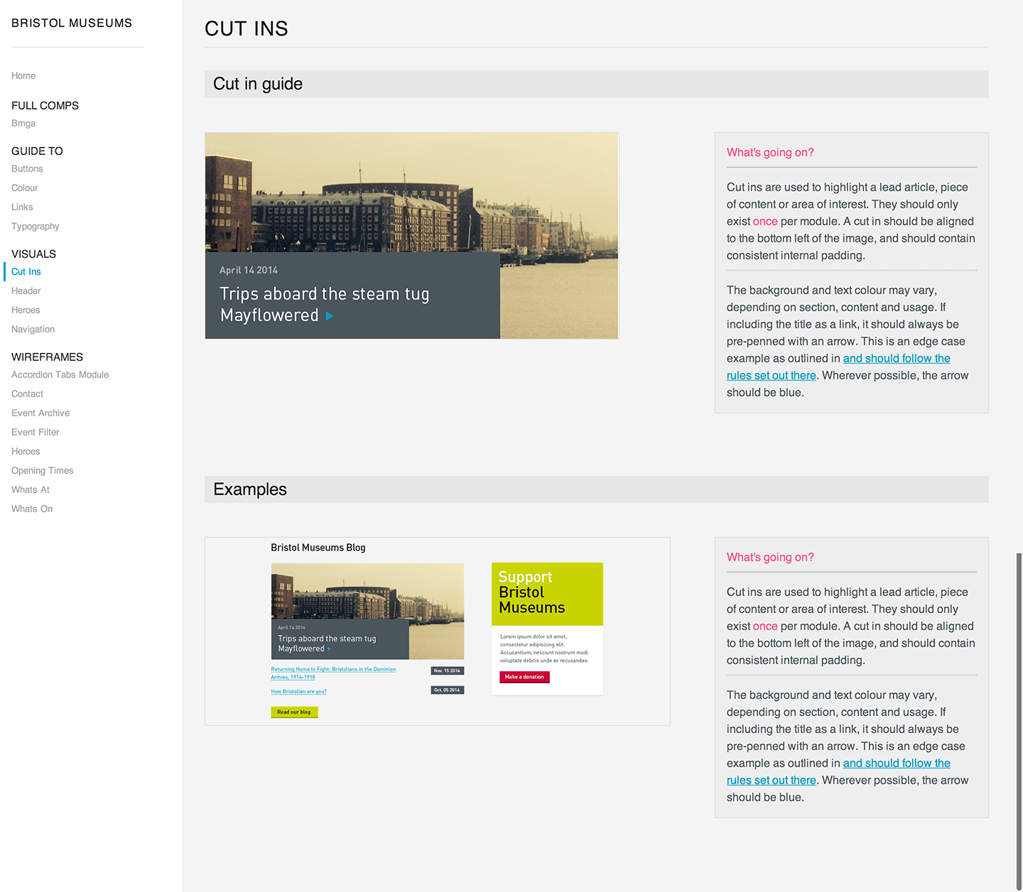
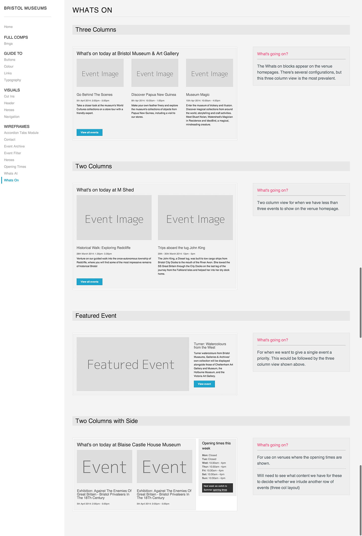
Something we’ve started in the last week or so is building out the BMAG pattern library.
Eventually this will contain all the elements that will make up the website. We’ve already got some visual design going on, some core elements such as colour and typography and also wireframes in the form of screenshots from the prototyping work we’ve completed and tested.
We’ve broken the site into modules to work with to help with the BEMs orientated approach we’ll be building the site with. We’ve found it helps to start thinking in terms of modules rather than pages as early as possible in the design process in preparation for building using using BEMs.
For each of the modules we often have several variants, or different states that we have a clear definition for. We use different images for each state, and provide an explanation as to what can happen with each module.
So you can see in the left column of the pattern library that we’ve got the following groups:
Full Comps
Show full page visual designs, currently there’s a design for the homepage that is very much a work in progress.
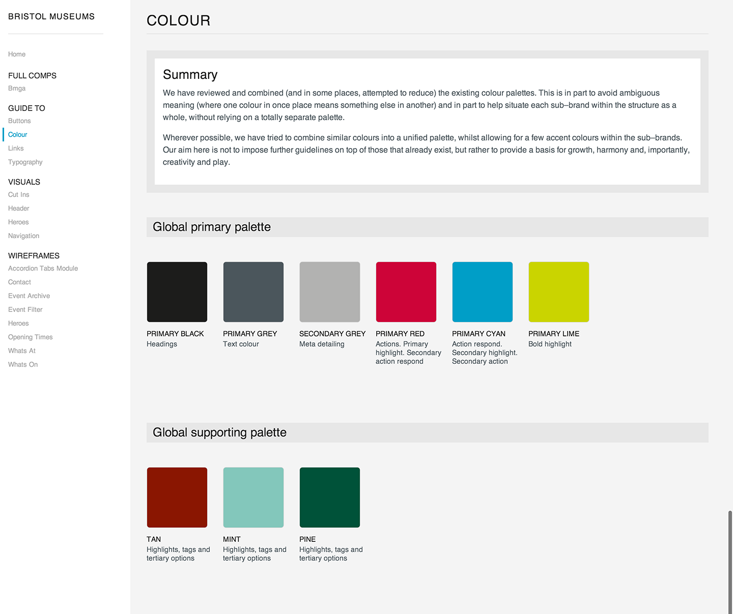
Guide To
Shows core brand elements that are defined from the various venue brands and over-arching service brand. This includes: Buttons, Colour, Links & Typography. You can see an example of the colour page below:
Visuals
As visual designs come together we’re adding them here. Again, not too much to see aside from some initial thinking on some core elements.
Wireframes
As we’ve been moving our thinking into the prototype and testing on users we’ve edited to improve the design. Once we’re happy with each module or group of elements we’re moving it into this pattern library for reference. You can see an example of the Whats On modules below:
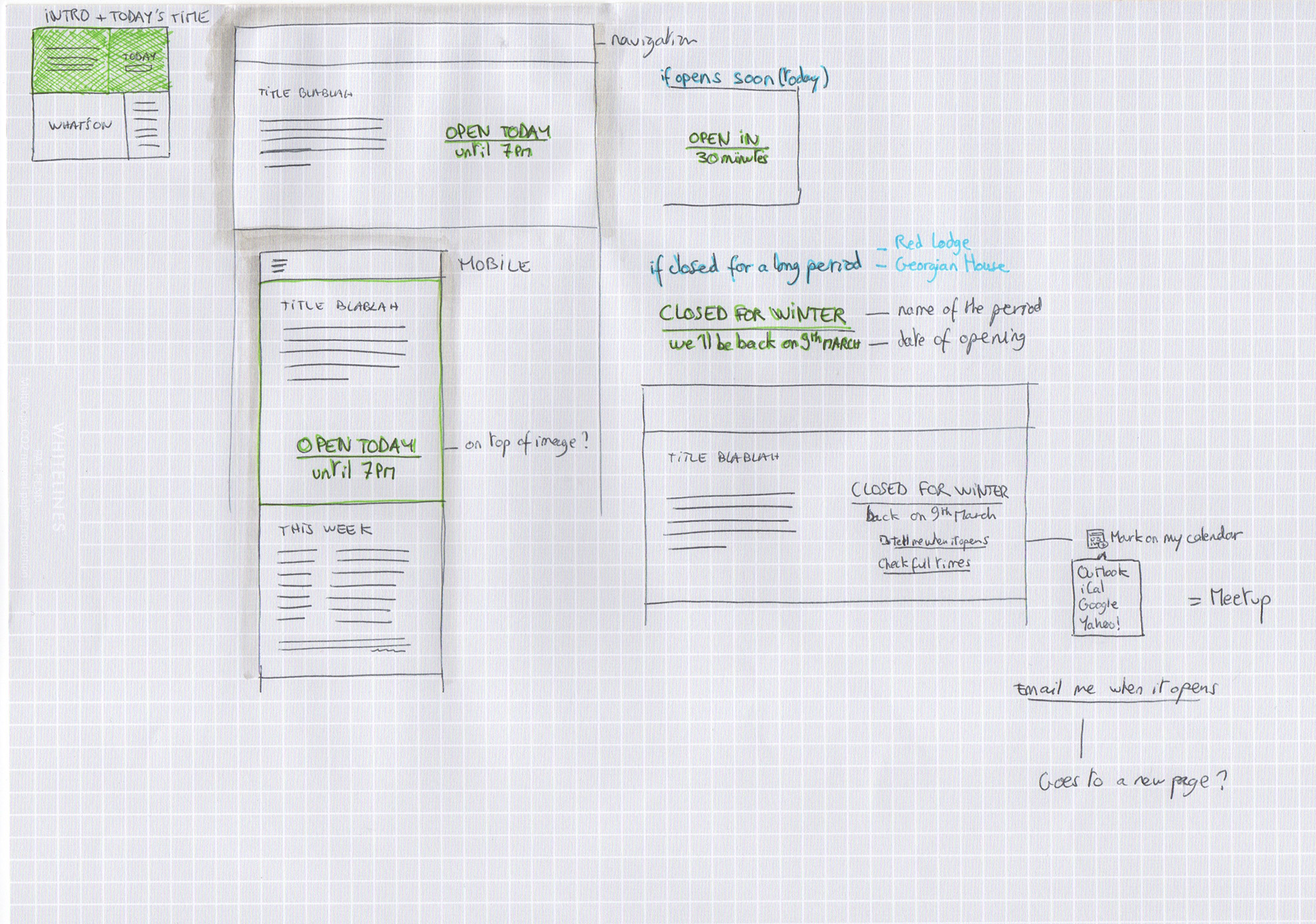
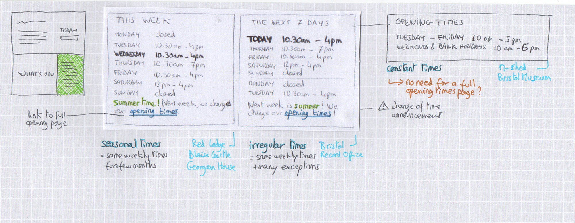
Let’s talk about the big little details that offered up some challenges.Basic information such as opening times are extremely valuable for visitors, despite being sometimes overlooked during the design process.
For our project, a common user journey would involve looking for something to do today, as the previous user research suggested. Visitors would like to know right away if the museum is open today and what activities or events are available.
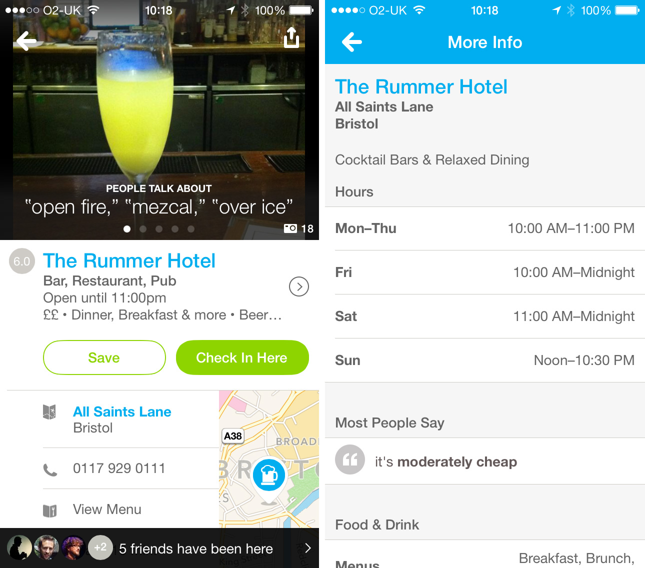
Foursquare displays a time for the current day. A simple click links to a page with the full opening times.
A simple click or tap links to a page with the full opening times. This task gets more complicated when all our venues have a different system of timetables. They would all be displayed on the homepage of each venue but vary wildly in their arrangement. Who would have thought it could be such a challenge?
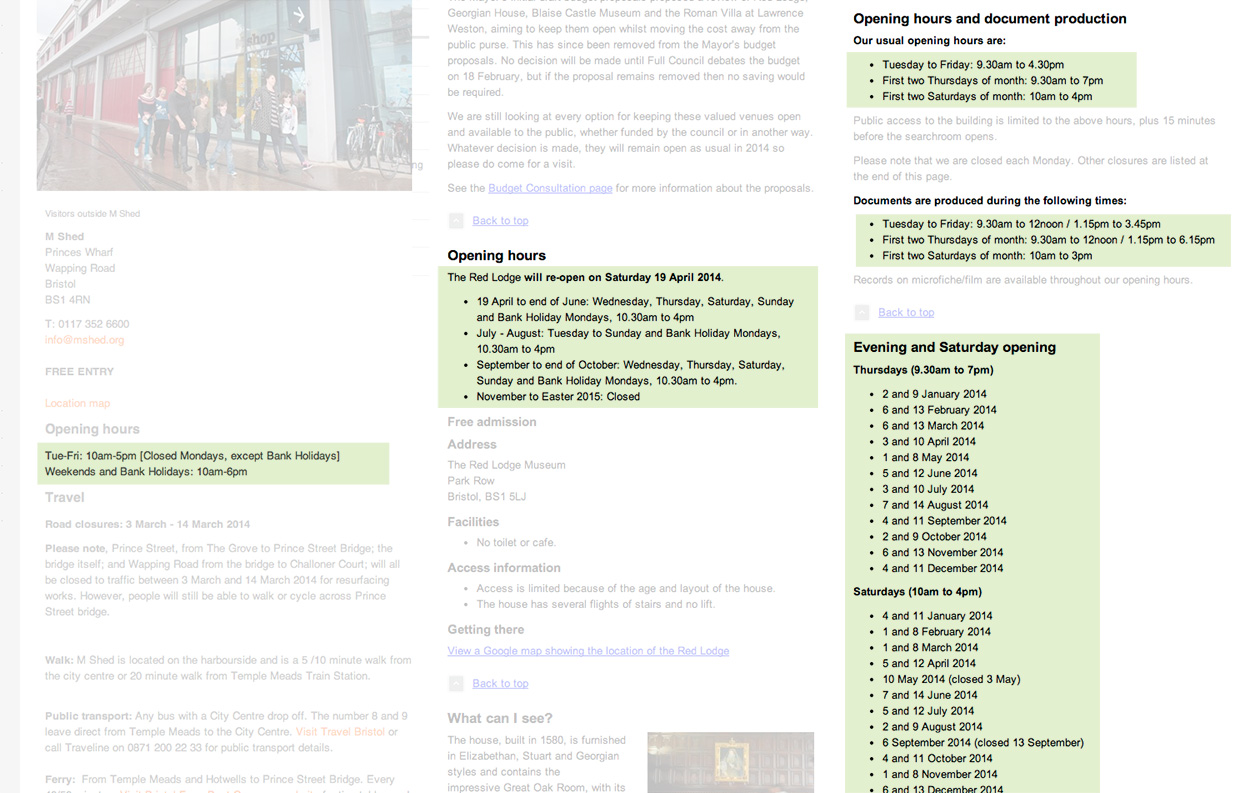
Opening times for three of the museums involved in the project.
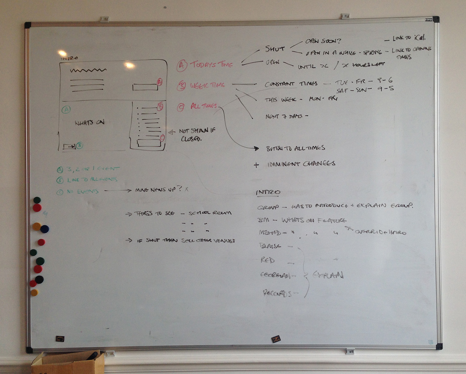
After some experimentation with the layout, we defined all of the user scenarios to solve. Some of the scenarios we found were, how do we show today’s time left before closing? How do all the modules connect together if the venue is closed for a few months? How do we deal with irregular times without displaying a list full of exceptions and difficult to digest information on the homepage?
The tree of possibilities we have to think about to develop a flexible solution.
Looking at all the scenarios started sketching out different layouts to solve each.
A few ideas to display today’s opening time for each case.Sketches about displaying a weekly opening timetable: some venues have very regular times throughout the year, other requires flexibility.
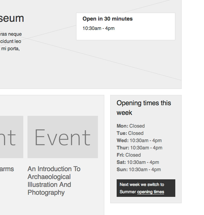
And once we’d sketched out and refined all the options we could display we moved all the ideas into a prototype.
One of the cases implemented in the prototype.
Check out the rest by clicking on each venue on http://bmga-prototype.fffixture.co. We’ll be testing this with users next week to validate our thinking and see which ideas perform best.
Something we’re massively keen on is sketching. Its the quickest way to get ideas out of my head and onto a page, and whilst I’m doing it I’m debating and justifying the decisions I make along the way. Its an incredibly good exercise for honing ideas quickly.
So today I began sketching UI ideas for the various sections of the site, having first digested the IA and User Research work we’ve completed.
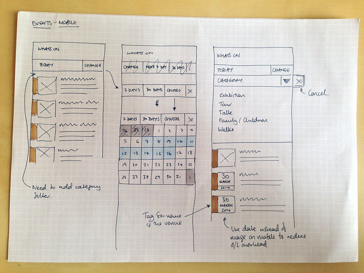
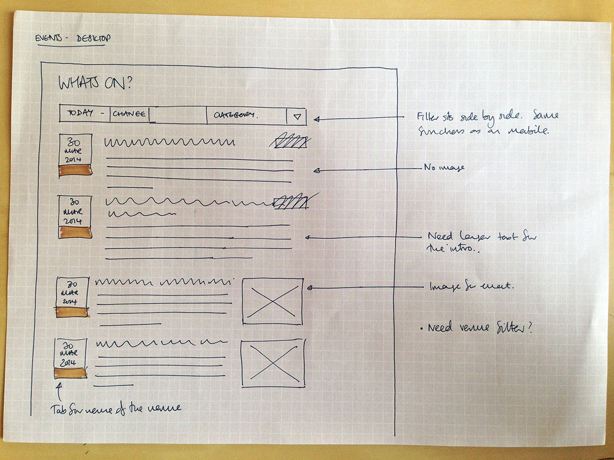
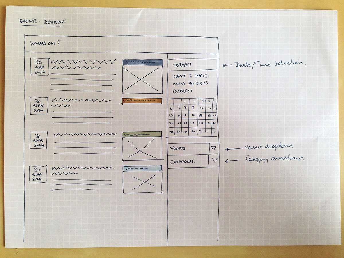
The images below show the sketching I’ve been doing whilst looking at the different display options for handling events. We need to give the user an initial snapshot of the day’s events, whilst enabling them to look at a week, a month or a custom time period. We also want to offer them the option to filter by type of event, or the venue.
So in this first image I’m looking at a mobile view, and how users can interact to view the events as they wish. There’s ideas coming out such as colour coding events by venue. I also started with thumbnail images for each event, and then thought about download overhead, and so made a note that we could use a date card device there instead.
The next step was to take the ideas to the desktop view, and see how we could configure and add to them there. So there’s two ideas on how to treat the elements from the mobile view. You can see I’m exploring the options for displaying the filter – whether in a horizontal configuration that closely resembles the mobile UI, or in a sidebar so its very visible for the user. I’ve considered whether there will be images for each event, and what to do if there is not one. And lastly, how to use the colour coded tabs to indicate the venue for each event.
All a work in progress, but worth sharing so you can see how I quickly generate, discard and progress ideas. The next step for us is to test these ideas with users, and see how they respond.
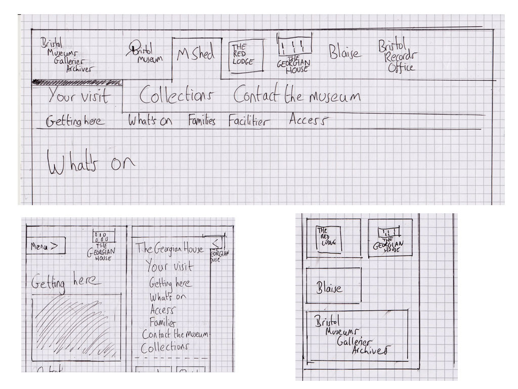
Since our initial review of user research, I’ve been busy developing information architecture and navigation ideas. We’ve worked up an initial information architecture and navigation which is geared towards getting museum visitors the information that they need but which will allow the site to expand to accommodate content for other users in later phases of the project.
Sketches for navigation for mobile and desktop views of the Bristol Museums website
We’re committed to testing our work with users throughout the project and for these early stages we’ll be using an interactive prototype built with HTML and CSS for this. Building and testing with a prototype in this way allows us to
work quickly and iteratively
experiment, keeping what works and throwing away what doesn’t
design and test across devices: everything we build must be fully responsive
quickly, easily and continuously share our designs with members of the team, stakeholders and everyone else who is interested (see the URL below)
More details of how we build our prototypes will come in a later post or, in case we forget(!), on request.
We’re working on setting up a development site to publish the prototype on Bristol Museum’s hosting but until that’s sorted, you can access it here:
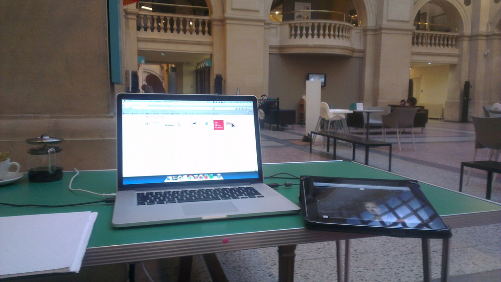
Last week we ran the first tests with members of the public. We set ourselves up with a laptop and an iPad in the cafe at Bristol Museum and Art Gallery and invited users to test the IA and navigation. Volunteers who could spare us 10 – 15 minutes were asked to complete a theoretical task by navigating the prototype whilst talking through what they were thinking and doing.
User testing at Bristol Museum with a laptop an iPad and a pot of tea
We tested with a number of individuals or couples and gained some really helpful insights into our early stage designs. We’re incorporating changes to the navigation as a response to these insights at the same time as starting to populate the prototype with features and content for further user testing.
Here at fffunction, we always work with clients to try to incorporate at least some user research into our projects. Often this will take the form of interviewing users from user segments which we’ve identified with clients (typically based on motivations and tasks) to test our assumptions and gain new insights.
When we started working with the Bristol Museums, Galleries and Archive service, we quickly discovered that the service has a strong research and evaluation team with a wealth of data at its disposal. Furthermore, the museums and cultural institutions sector in the UK has an ethos of open sharing of research amongst organisations. So given that the budget for the design and development of the new BMGA website for this financial year is tight, we made a call to limit the amount of research we did ourselves but to review relevant research which was available to us.
The main piece of research we used is the report from the second phase of a multi-phase research project from Culture24 called Let’s Get Real. Culture24 have worked with organisations throughout the UK’s cultural sector to help them define and measure success online.
Let’s Get Real 2: a research report from Culture24
In the kickoff for the project, the team’s instinct was that the website should focus on content to help visitors plan a visit to the museums in the group. Our review of the Let’s Get Real 2 research along with other research supplied by the museum from visitor surveys and some informal interviews which we conducted with visitor services staff in the service have shown us that this instinct is a good one.
Dan from fffunction conducting a user research interview at Bristol Museum
So for the first phase of the website project, we’ll focus on content which supports visitors in planning visits. We’ll be bearing other tasks and motivations in mind and these will get more attention in later phases of the project, with more user research around them very likely.
Affinity diagram – the result of considering audience and business needs
We receive over one million unique visitors to our two primary websites, the Bristol museum and Art Gallery museum section hosted on the Bristol City Council website and our own M Shed website. In addition to these two sites, we also have at least twenty other websites and online channels such as brerc, trip advisor, Bristol Record Office and multiple wikipedia entries. Combined, these sites also bring healthy traffic to parts of our service.
Despite having healthy traffic, it was clear that the websites had plenty of room for improvement, both for our audiences and our business needs. For example our internal processes mean that making changes is slow and awkward at best. We also regularly receive public feedback that we are missing key information and that its difficult to understand across the board. Our analytics, which measures web visits (what pages get visited, for how long and much much more!) suggests that current content and/or design is largely ineffective.
I had to write a business case for the first phase which included:
We are seeking to build a phased service-wide website for Bristol Museums, Galleries and Archives to address audience and business needs.
The website will cover all the museum sites and services and focus on evolving our currently unevenly distributed series of websites from a brochure website of static listings, and basic visitor information to a digital platform enabling audience focused tasks and service-wide digital engagement business focused on addressing our needs beyond our current constraints.
Our website properties have become a destination in their own right for our audience.
During 2012-2013 online we attracted:
1.1 Million unique page views (to the council section and M Shed but excludes our other sites and channels)
20,000 Twitter followers
6,500 Facebook likes
4,500 Mailing list subscribers
8% international audience
We seek to address the needs of both our existing and growing new user base by delivering digital services via the web in line with our strategic objectives. Our evaluation of our visitors through tracking, user surveys and staff feedback, identifies emerging usage trends which our current websites are failing to address to due to existing constraints.
Key performance indicators demonstrate that cost per transaction, user satisfaction, task completion rates and digital take-up must be addressed as a key business need.
The project will adhere to our 8 Digital Principles: Users at the heart, evaluation, digital services, build digital skills, experiment, partnerships, sustainability and open practices which is the start of a long-term commitment to digital delivery.
I met with a small group of recommended web agencies, mostly local, and chose fffunction. We agreed our approach should:
Be user focused
Be open not just internally but with the public too
Run the project in an agile way
Make use of the build, measure, learn feedback loop
Follow the GDS service delivery approach oulined in the Service Manual of discovery, alpha, beta and finally live
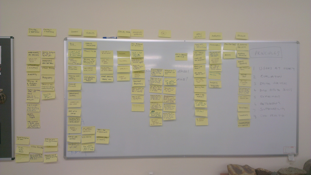
The first part of the project is called the ‘project kick-off’ and was a day with four key internal stakeholders and fffunction.
We took a look at the biggest opportunities, ideas for direction and established obvious constraints such as time, budget and resource. We produced an affinity diagram (shown in this post) and put this into a public trello for everybody to see the ideas. This formally began the project ‘discovery phase‘ which GDS describe as “A short phase, in which you start researching the needs of your service’s users, find out what you should be measuring, and explore technological or policy-related constraints. will last for 3-4 weeks and cover.
We’ll be sharing more about the project in the coming weeks.