Introduction
I’m George, a new member of the team on a year fixed term contract, coming from a background of website UX and other IT technical experience. My former role had a high focus on web standards, accessibility and a lot of ownership over what with publish but following guidance. I have taken a big curiosity over how we meet user needs with our digital and online web content and why. One of the easiest ways we really know what our users want is by measuring our data, and analysing its successes.
I was very grateful to have an opportunity when I joined the team, to be a part of Culture24‘s Let’s Get Real project (Supported by Arts Council England). And was gladly thrown into a positive working community of other museums and professionals alike who assisted me and complimented my existing knowledge. In this blog i’ll cover some of the things I aimed to achieve throughout its time, how I achieved it and now how it is being used in our daily activities.
The project and my experiments led to a discovery of what data is important to our organisation and also paved the way of thinking of how can we use this data to consistently read and improve on our digital output.
To begin, I created a dashboard using Google Data studio to measure all our web stats and also experiments, at first I wasn’t too sure of it being easy to read at a glance, so I kept making improvements on my first version and getting feedback and testing from business and my team.
Now with a way to measure my experiments, I started my first idea with to add another static header button for newsletter sign ups (and measure its effectiveness of converting site users to newsletter sign ups).

During this experiment I felt I could do more, I felt the need to have something more tailored to the user and what page they were viewing and looked at using page targeted pop ups for my second experiment.
Building a dashboard measure success
Before and during experimenting we needed to ensure we could visualise the data of our results.
We could of course use analytics, but we found this was not time efficient and had many different routes to find our information. The use and development of one google dashboard allowed us to build and expand upon needs of the organisation through data driven decisions and evidence.
From the whole of one domain and it’s page views, where users come from before coming onto the site (referrals), a timeline graph of noticeable hits and a map to show what different regions, countries and cities are viewing what pages the most and for how long – the use of a bespoke designed dashboard would accomplish this. And it shouldn’t need you to be a analytics genius.
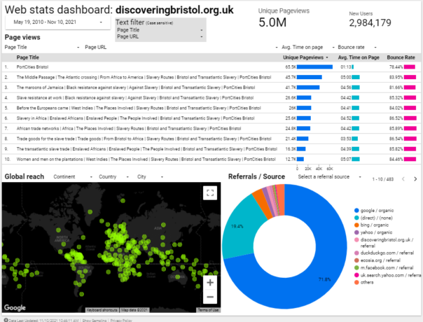
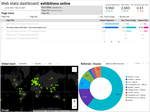
I tried several different designs initially but tried to keep in simple, user friendly and at a glance. Once the design elements and graphs were in place, it was easy enough to create more of these and filter to specific organisation need. One notable website I added has exceptionally interesting and notable data for our organisation: discoveringbristol.org.uk.
Noting the below dashboard, it has users across the world, a great average reading time and approx. 5million page views. However we feel it could use an update to reflect more modern times and tech.
But what more can we do with this data? There is a clear need by the pageviews to provide more historical content not just to the local or national viewers of our site – a worldwide web audience.
Understanding our users and what they want
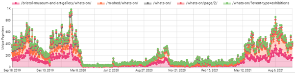
The timeline graph below shows the most viewed events web pages since September 2019.
Do note the almost flatline number of page views from March 2020 – when COVID lockdown begun.
As a result of our venues closing we could predict that visitor donations, online ticket sales, in venue shop sales and visitors who relied on our noticeboards or promotions using banners would decrease.
And an opposite effect is there has been more of a demand to have a stronger web presence, offer online events and exhibitions, keeping our audiences up to date with what we’re doing etc.
It’s this thinking which gave me the idea as part of Let’s Get Real to experiment with trying to convert users to donations, shop sales or newsletter sign ups as this could help the impact that COVID has had on our organisation.
Experiments
Experiment one: Adding ‘Newsletter’ button alongside 2 other header buttons
Problem: Newsletter underperforms as an ‘outbound event click’ in Google Analytics compared to Shop/Donate buttons
Solution: Add extra button alongside static buttons within website header
Expected outcome: To increase newsletter clicks and gain bigger mailing list for future promotions
Considerations: May decrease other 2 buttons clicks as 3 options
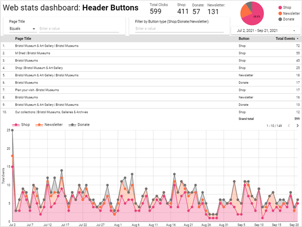
Result: Newsletter clicks are performing better than donations clicks
Summary:
We had 2 CTA buttons for Shop and Donate. I suggested to add a ‘Newsletter’ button link as shown:

We implemented the google tag manager tracking of all these event clicks from Jul 2nd.
At the same time, we added the button for Newsletter to our live site as shown above.
The first two buttons require a cost – buying or donating money. I felt we could be more inclusive.
For other users of certain demographics, for example those who are younger, disadvantaged, lower incomes, the very least we could offer them is a way to be notified by our work via email newsletter. This should offer just that – a way to interact and keep involved with us.
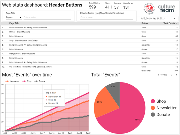
The above screenshot showed us our users prefer to go to our shop, then click our newsletter link and then lastly donate. The table shows what pages had the most clicks to which buttons.
Here is our second page of the same report, with different data charts to help visualise the results:
Conclusion:
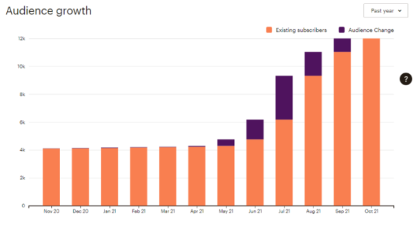
We have seen a major increase in newsletter sign ups since I joined in March and made these changes:
Given the year of lockdown and restrictions to visit public venues, combined with data such as large page views of our venue opening times before announcements to drop restrictions, sending our users direct updates to their mailbox seemed like a better way to notify attendees.
I feel this was better than have them navigate to our site to check updates as they have been frequently changing and potentially delayed or disrupted – potentially out of date.
As these buttons are within the header area, the first things seen before reading content, and are present across all pages of the site. The opportunity to sign up is given to the user to click these whenever, regardless of the content they are viewing.
Once we added the button, we have found an increase of clicks to the newsletter sign up, where this could be a user chooses after reading the page to intentionally sign up to keep notified and updated of the museums via email newsletter.
This is a positive safeguard to prevent them missing out on more information and general relevant news which could decide or impact their attend the museum in the future.
As this was a static button this gave me the idea for my next experiment: page targeted pop ups.
Experiment two: Page targeted pop ups for The Colston WHN exhibition/survey
Problem: Inability/lack of control to target users to a specific goal campaign or CTA that interactively prompts them during their reading – static buttons already in place for our more generic targets
Solution: Find and install flexible page pop ups tool and launch with testing alongside relevant and suitable campaign/topic. In this case Colston Exhibition and Black History web pages
Expected outcome: Users see a pop up relating to page content topic and will click on the pop up as its relevant to their interest.
Considerations: ‘pop ups’ generally considered an annoyance/disruptive/negative impact
Result: Effective – content that readers have chosen to view get suggested to take an action.
This was successful as the target pages had content relevant to the suggested action in the popup
Summary:
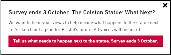
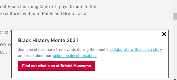
We needed a way to drive existing readers of our Black History content to the Colston statue survey.
I researched different ways to prompt users and looked at a plugin called Boxzilla pop ups.
It was obvious that users reading our Black History content would actually take the survey and also offer good, valuable feedback – if they were suggested to.
But how would these users who land on our History pages know about the Colston survey or exhibition if they were just on the article/story they had chosen to read? A box that prompts them during their reading, with a well phrased call-to-action that appears halfway through their reading.
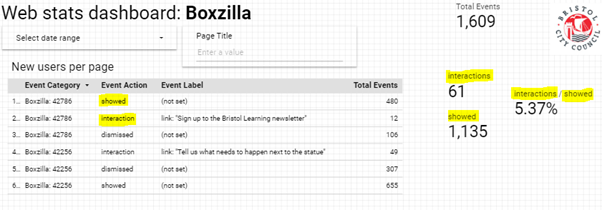
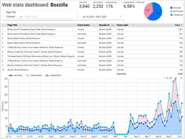
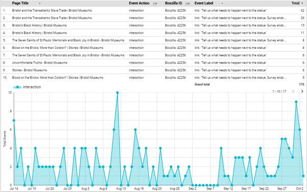
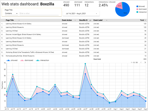
We also needed to measure this which is what the plugin we added could offer us. This tied in with the google dashboard, where we see how many were shown, interacted and dismissed.
First we needed a list of pages we needed to target, we then set the box pop up to be seen on all of those page URLs when the user scrolls above 55%. By default the box type is on the bottom right of the screen. We can then set the expiry of the pop up if necessary, which is useful for if it is running beside a campaign – for example this could be for a donations campaign or a shop sale.
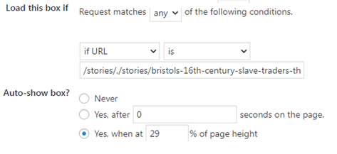
These parameters are all pretty self-explanatory and offer the option to be more present to the users viewing experience if necessary, however for the sake of less intrusion to the user and a bad experience it typically seems better to have a ‘less is more’ approach as it may seem intrusive.
Conclusion
Generally speaking, as long as the pop up call-to-action is directly relevant to the page content itself then it’s more likely that the user will not ignore or close the prompt. The longer the exhibition went on, the more popups increased too.
The last part of the campaign we saw a massive increase which is likely linked to general pubic awareness of the survey campaign, alongside the organisations other comms and other promotions plans to do with the survey. The ‘last chance’ message was likely more encouraging too.
In comparison to the more general, static newsletter button CTA which are at the top of the page and then scrolled past (and likely missed). A popup that prompts for something like newsletter specifically is more likely to be ignored as it may be intrusive due to no direct relevance to their reading content and they have already seen it as a static button. Also, popups do not return unless the page is refreshed.
I think it can be useful to have a pop up newsletter but if the same users are looking at them repeatedly, it could be intrusive and possibly an annoyance – I am in belief with more testing it can be set to not show popups to those already signed up to their newsletter (via mailchimp newsletter integration).
For now, ultimately, alongside other campaigns ongoing within the organisation this has great potential to assist those by keeping users already on our website directed to other parts and to convert readers into actions.