By University of Bristol Computer Science student team: Sonny, Sergi, Thomas, Daniel and Milosz
Back in September five of us gathered round a table thinking about the prompt given to us by Bristol Museum: develop an interactive exhibit where visitors touch replicas of artefacts and related information appears, creating an interesting and fun way to learn about these objects.
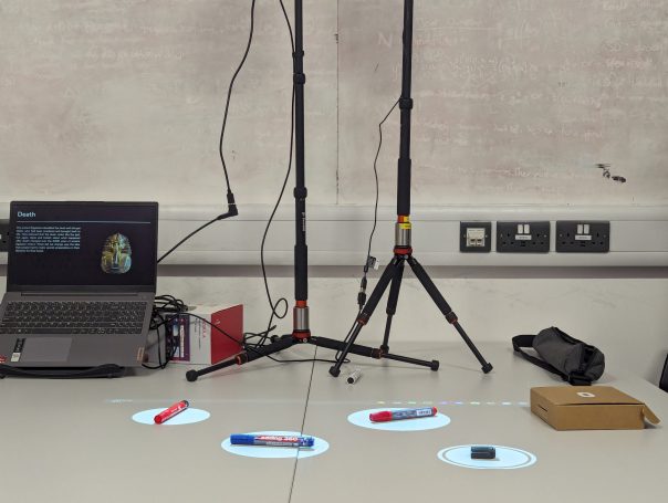
After many months and iterations, we finally came to the design you see above, an exhibit consisting hotspots over the replicas on a table. When the hotspots are touched, information about each artifact is displayed.
But how did we get here? With little idea on how to tackle such a task we split it into the three logical sections: how do people interact with the replicas? How do we display the information? How do we make it easy for museum staff to use in future exhibitions?
How do people interact with the replicas?
This was tough as we didn’t have any examples to work off – we couldn’t find anyone who’d done something similar.
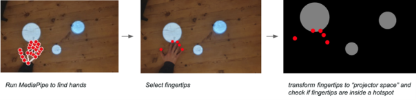
We explored many possible solutions; looking at methods such as computer vision, lasers and detecting decreases in light. Through our exploration we ultimately settled on MediaPipe; an AI-powered hand tracking model which allowed us to see how users touched the replicas.
We created hotspots in which the replicas could be placed and animations to prompt visitors to interact.
While two of us worked on this, the rest of the team was busy creating a user interface, so users could engage with the exhibition.
How do we display the information?
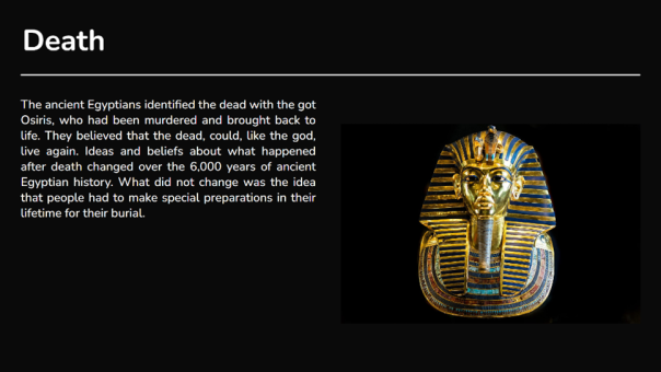
This was a simpler task; the museum had informed us that they wanted to use projectors to show this information, so we created a dynamic display with a black background and white text to make it less blocky and more appealing to the eye. After a few iterations with museum staff and user feedback we came to the structure shown. Videos, image slideshows and text can all be included.
How do we make it easy for museum staff to use in future exhibitions?
We wanted to create a easy-to-use system with equipment most museums would already have.
A projector displays hotspots and a camera detects when people touch them. The camera and projector can be calibrated with the click of a button. A second projector displays information, which changes according to how the users interact with the hotspots.
We also designed an editor allowing staff to add, remove and position the hotspots, and attach relevant information to them. We added import and export features so the design can be used on different machines.
Conclusion
Overall this was a fun project to work on. We learnt a lot about computer vision, hardware, frontend development and working as a team on a larger project. We are grateful for Bristol Museum for coming to us with such an interesting task and are looking forward to seeing this software in action.
In July 2022 at M Shed, we launched our exhibition ‘Think Global: Act Bristol’. It’s an exhibition that informs the public on Climate Change as a global issue, whilst showing how Bristol can and how Bristol is acting to fight climate change. An important topic that reaches through various aspects of society, including nature.
This Interactive was thought up to be displayed in the ‘Nature’ section of this exhibition. Its purpose? To allow the public to accession our collection of Lepidoptera. This is done by entering the data shown in the photographs of our Lepidoptera, these Lepidoptera are photographed with their original handwritten accession data in shot. This data input is done through a web form on a computer setup in gallery, which is accompanied by an interactive projection wall.
The interactive wall element is to give people a fun interactive experience in gallery by moving the Lepidoptera with their movement in front of the wall. As well as this, the wall plays animations after an accession entry has been submitted and the animation is based on the data entered by a member of the public. There are 3 animations that can be displayed, one for each classification of our Lepidoptera: butterflies, moths and extinct species.
How it Works
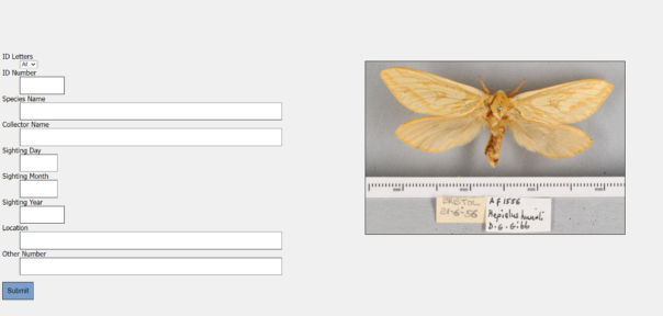
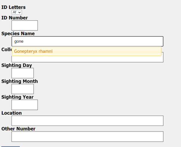
The interactive has a keyboard, mouse, screen, projector and camera. These are used to carry out the two functions of the interactive, accession data entry and the interactive wall. The form function is there to enable people to transcribe accession data from photos of our Lepidoptera with their paper accession data. An example of one of these images is shown below.
an image of an ‘Celastrina argiolus’ with it’s accession data.
The form has the necessary fields with validation measures where necessary to ensure that the data entered is of use. The fields are as follows:
ID Letters
ID Number
Species Name
Collectors Name
Sighting Day
Sighting Month
Sighting Year
Location
Other Number
Data entry page with data entry points listed and a photo for transcription
All of these fields have validation that restricts what data can be entered and some of them (Species Name, Collectors Name, Location) have an autocorrect feature. This kicks in after 4 correct characters in a row that correspond exactly to one of the possible entries for that field. This helps the public get the spelling correct and speeds up the process of entering in data. Having the autocorrect come up after 4 correct characters also deters spam data entries, at the member of the public can only submit an entry if it passes all 4 required validation points.
Screenshot of a data entry point showing an autofill suggestion for a species that could be entered.
Once the data is entered correctly and submit is pressed a loading screen will appear, this loading screen will stay on until an animation corresponding with the type of Lepidoptera is shown on the interactive wall.
This interactive wall uses an ultra short throw projector to front project Lepidoptera onto a wall in gallery. The nature of this projector means that it is hard for people to cast shadows on the wall as the projector is mounted very close to the wall. As we were not able to rear project, this is the next best setup for this projection that also achieves an image over 3 and a half metres wide, which gives a good area for interaction.
There is a Kinect Azure mounted away from the wall which gets a depth image of everything in shot. This depth image is used to detect motion in front of the wall which in turn is used to affect butterflies in the area around where the motion is made. More Lepidoptera build up on the projection every time an entry is made in a day.
How it Works: The Nerd Version
The interactive runs on two systems with one system referencing the other. The data entry system is a Python Flask Server, which runs on Apache and can be run on a Windows PC or a Linux server. Though the server version I am yet to run in gallery due to some compatibility improvements and an inability to sort terms and conditions for this exhibition as of typing.
The server serves the client the data entry form with a randomly chosen image for transcription alongside it, the data inputed for each entry is saved to a timestamped json file. This file contains all the data fields as well as the filename for the image, meaning that all the data can be linked and sorted through afterwards in order to upload to our database. The server also updates a file that shows the latest species that has been entered, this is used by the Interactive Wall’s system to trigger animations.
The interactive wall runs on a Touchdesigner project that I created that uses a Kinect Azure to see people and know where to apply movement to the Lepidoptera in the projection. Touchdesigner is a real time visual development platform that allows you to create interactive installations, it’s a node based programming environment that allows interactives like this to be created in good time. Touchdesigner uses a particle system(particleGPU) that uses 3 videos, one for butterflies, moths and extinct species. These videos are then put on 2d planes that move and rotate in 3d space, these are the ‘particles’. These particles are affected by optical flow, which is generated by Touchdesigner analysing motion in the depth image, areas in which it believes there are motion are then used on the particleGPU video to move the particles in the affected areas.
2d Planes without Lepidoptera2d planes with Lepidoptera
For the entry animations that play when an entry is made by the public there are 3 videos that play, again one for butterflies, moths and extinct species. Touchdesigner overlays these videos onto the particleGPU output when the Flask Server signals it’s had a new entry, Touchdesigner will then check which animation should be played to make sure it corresponds with the relevant Lepidoptera. This process works however it is not instantaneous and It’s one of the elements of this interactive I wish to improve for future use.
What’s next?
As of typing, the exhibition is yet to finish, I am hoping to add some improvements to the interactive before it’s derigged as having it in gallery would be a good test bench to make solid changes. These changes include:
Reworked css to improve compatibility on smartphones
Have the linux version up and running on our server so the public can enter data on their devices
Decrease the latency between both systems by taking a different approach for their communication
Add analytics to the Touchdesigner project so we can gather data
As of typing we have over 1500 entries from the public, which should enable us to have hundreds of these Lepidoptera catalogued, which is fantastic news for us! I think this interactive has big potential for other museums and I’m hoping that I can provide versions of this to other sites in future.
Currently it’s planned that this interactive will be returning in a permanent installation, so I plan to add these additional changes for this. I will post a second blog on labs once I’ve done some upgrades and analysed the data we have gathered from this exhibition.
Special thanks to Bristol Museums Development Trust and the ‘Think Global: Act Bristol’ exhibition for making this all possible.
If you didn’t know already, Bristol Museum & Art Gallery is home to a permanent gallery exploring the history of Egypt. This gallery hosts information belonging to the objects on touchscreen enabled kiosks. When they were installed this was the height of in-gallery audience interaction.
As we re-opened in September 2020 after lockdown, the use of touchscreens had obviously been axed. The problem was that they actually hosted most of the information in that gallery, so it was necessary to find an alternative.
The fabulous in-house Digital Assistant team were able to develop a plugin site using WordPress from scratch, and we were able to collate the original content and shove it onto this new platform. Pages were designed by kiosk, and were available via NFC and QR code access points that were printed on stickers and stuck onto the disabled kiosk screens. Long story short – and this is very much a long and important story cut short and not explained very well – an entirely digital alternative was created and the problem was solved.
This was a huge achievement, but not really sustainable if in future we encounter a similar conundrum and don’t have the required time/resources to complete it – which is what we encountered with the Bristol Photo Festival temporary exhibitions.
We suddenly needed to provide digital labels that could be accessed in the gallery containing biographies for each artist/photographer. Unfortunately, we had less than half the time and resources as we did with the Egypt gallery. Also, this is for a temporary exhibition rather than a permanent display. Naturally, these are very different circumstances.
Enter: Exhibitions Online.
We have a dedicated site that runs on WordPress that we do indeed use for Exhibitions Online They run on preset templates that we can tinker with to an extent, there’s not a whole lot of creative freedom but it does the job it was designed for.
We’ve used this site in a gallery setting once before; the online exhibition for Pliosaurus was available as an interactive a few years ago.
After doing some more tinkering myself, I came to the conclusion that we could take the templates out of their original context and create something that would work for these new digital labels in a fraction of the time, and without having to build or buy something new. Win/win.
By creating individual pages but without linking them to each other or to a parent page (like a landing page) we could have a number of individual pages (65 to be precise) that are technically hosted on a website that doesn’t really exist, from an audience perspective.
By doing this we could assign a QR code to each page that could be printed on a label and installed in the gallery. These pages aren’t available anywhere else (unless you look really, really hard for them) and are intended for solely mobile use while visiting the exhibitions. It turned out to be a really simple solution to something that was originally a bit daunting.
The other fundamental thing that we needed was a bunch of QR codes and a way of keeping on top of them. Jack Evans, Digital Assistant, developed a system that would both generate and also give us more flexibility and control over the now abundant number of QR codes that we use in our galleries – but he can explain this better than I:
“We realised that the demand for QR codes in the gallery was going to increase and be in place for at least a year if not permanently. We know that QR codes can be generated for free, but we knew we needed a system where QR codes could be modified after printing.
I could not come across a sustainable cost-effective system and we were opposed to basing a permanent fixture of our galleries on a system we don’t have full control over. Therefore, I created a system based on python scripting and a bit of javascript that allows us to create QR Codes that can have their destination changed after printing and uses google analytics to see how in demand particular content and the system as a whole is.”
This has been a helpful tool not only for this project, but also with the other projects where we have needed to implement QR codes since. The ability to both assess use and amend links after printing gives us a whole new range of possibilities when it comes to improving audience in-gallery experience.
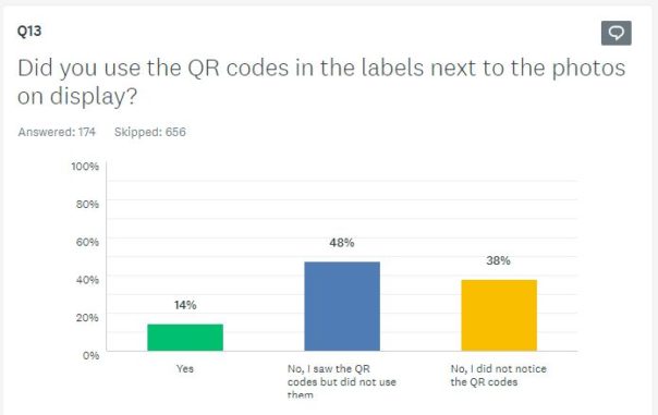
This gallery opened alongside the rest of the museum on the 18th of May, so we’ve had a fair amount of time to collate data that tells us how our audience have been using these digital labels and what their experience has been. This data has informed us that our audiences…have barely used them. Oh.
Out of the 174 people who have answered the question “Did you use the QR codes in the labels next to the photos on display?” on our ongoing Audience Finder Survey, only 14% (equating to 25 people) said yes (as of writing).
Not exactly the result that we were hoping for. Although, not sure how much of a surprise this is. Back in 2018 our User Researcher Fay posted a blog about how we use QR codes which points out that QR codes are only really used when facilitated. This more recent evidences shows that they still aren’t really being used without facilitation, even in a post-Covid (but-still-in-Covid?) world, overrun with them! Hmm…
Bonus round!
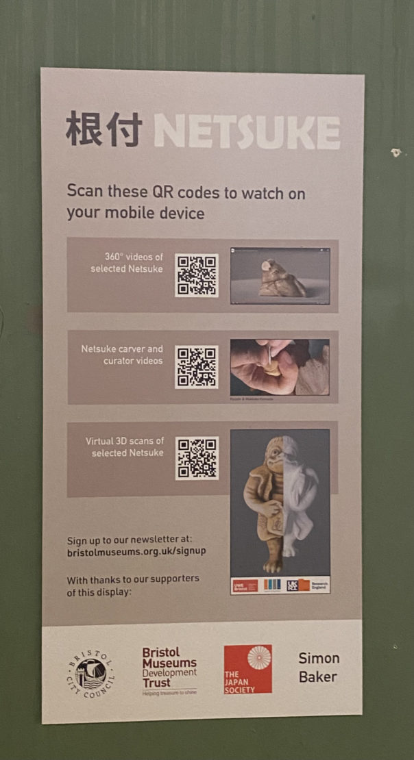
Another instance of using this platform for a QR code triggered in-gallery experience is the additional content that we provided as part of the Netsuke: Miniature masterpieces from Japan exhibition. Netsuke are small and very intricately carved figures, originally used as toggles for pouches so that they could be attached to clothing. In collaboration with the Centre for Fine Print Research, UWE Bristol we were able to showcase two of the netsuke as 3D models, hosted on Sketchfab and embedded into the Online Exhibition.
In the before times, wanted to have 3D printed models as a sort of handling collection so that our visitors, and especially our younger visitors, could further explore the objects on display – which obviously couldn’t happen in a Covid familiar world. Instead, we made the page that features the 3D models available in-gallery via QR code.
One of the 3D models available via the Online Exhibition and in the gallery.
This work was made possible thanks to support from the Art Fund
Our temporary exhibitions have around a 20% conversion rate on average. While we feel this is good (temporary exhibitions are either paid entry or ‘pay what you think’, bringing in much-needed income), flip that around and it means that around 80% of people are visiting what we call our ‘permanent galleries’ – spaces that change much less often than exhibitions. With a million visitors every year across all of our sites (but concentrated at M Shed and Bristol Museum & Art Gallery), that’s a lot of people.
A lot of our time as a digital team is taken up with temporary exhibitions at M Shed and Bristol Museum. Especially so for Zahid, our Content Designer, who looks after all of our AV and whose time is taken up with installs, derigs and AV support.
But what about all of the digital interpretation in our permanent galleries? Focusing on the two main museums mentioned above, we’ve got a wide range of interp such as info screens, QR codes triggering content, audio guides and kiosks. A lot of this is legacy stuff which we don’t actively update, either in terms of content or software/hardware. Other bits are newer – things we’ve been testing out or one-off installs.
So, how do we know what’s working? How do we know what we should be replacing digital interp with when it’s come to the end of its life – *IF* we should replace it at all? How do we know where we should focus our limited time (and money) for optimal visitor experience?
We’ve just started some discovery phases to collate all of our evidence and to gather more. We want a bigger picture of what’s successful and what isn’t. We need to be clear on how we can be as accessible as possible. We want to know what tech is worth investing in (in terms of money and time) and what isn’t. This is an important phase of work for us which will inform how we do digital interpretation in the future – backed up by user research.
Discovery phases
We’ve set out a number of six week stints from August 2018 to January 2019 to gather data, starting with an audit of what we have, analytics and what evidence or data we collect.
We’ll then move onto looking at specific galleries– the Egypt Gallery at Bristol Museum and most of the galleries at M Shed which have a lot of kiosks with legacy content. (The M Shed kiosks probably need a separate post in themselves. They were installed for when the museum opened in 2011, and since then technology and user behaviours have changed drastically. There’s a lot we could reflect on around design intentions vs reality vs content…)
We’ll also be gathering evidence on any audio content across all of our sites, looking at using ourexhibitions online as interp within galleries and working on the Smartify app as part of the 5G testing at M Shed.
We’re using this trello board to manage the project, if you want to follow what we’re doing.
Auditing our digital interpretation
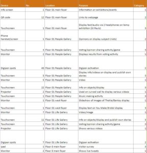
First off, we simply needed to know what we have in the galleries. Our apprentice Rowan kindly went around and scoured the galleries, listing every single thing she could find – from QR codes to interactive games.
We then categorised everything, coming up with the below categories. This has really helped to give an overview of what we’re working with.
Key
Level of interaction
Examples
User control
1
Passive
Auto play / looping video, static digital label, info screens
User has no control
2
Initiate
QR code / URL to extra content, audio guide
User triggers content, mostly on own or separate device
3
Active
Games and puzzles, timeline
User has complete control. Device in gallery
We then went through and listed what analytics we currently gather for each item or what action we need to take to set them up. Some things, such as info screens are ‘passive’ so we wouldn’t gather usage data for. Other things such as games built with Flash andDiscoveryPENs (accessible devices for audio tours), don’t have in-built analytics so we’ll need to ask our front of house teams to gather evidence and feedback from users. We’ll also be doing a load of observations in the galleries.
Now that people have devices in their pockets more powerful than a lot of the legacy digital interpretation in our galleries, should we be moving towards a focus on creating content for use on ‘BYO devices’ instead of installing tech on-site which will inevitably be out of date in a few short years? Is this a more accessible way of doing digital interpretation?
Let us know what you think or if you have any evidence you’re happy to share with us. I’d be really interested to hear back from museums (or any visitor attractions really) of varying sizes. We’ll keep you updated with what we find out.
Any other museum digital people getting an influx of requests for QR codes to put in galleries recently? No? IS IT JUST US?!
After thinking that QR codes had died a death a few years ago, over the last few months we’ve had people from lots of different teams ask for QR codes to trigger content in galleries, for a variety of uses such as:
Sending people to additional content to what’s in an exhibition, to be used while in the gallery e.g. an audio guide
Showing the same content that’s in the exhibition but ‘just in case’ people want to look at it on their phones
Sending people to content that is referenced in exhibitions/galleries that needs a screen but doesn’t have an interactive e.g. a map on Know Your Place
After an attempt to fend them off we realised that we didn’t really have any evidence that people don’t use them. At least nothing recent or since the introduction of automatic QR code scanning with iOS 11 last year (thanks for that, Apple). So, we thought we’d test it out, making sure we’re tracking everything and also always providing a short URL for people to type into browsers as an alternative.
In most cases, it’s as expected and people just aren’t using them. They’re also not using the URL alternatives either, though, which maybe suggests that people don’t really want to have to go on their phones to look at content and are happy with reading the interpretation in the gallery. Controversial, I know. (Or maybe we need to provide more appealing content.)
However, then we come to our recent Grayson Perry exhibition at Bristol Museum & Art Gallery, which had audio content which was ‘extra’ to what was in the exhibition. We provided headphones but visitors used their own devices. A key difference with this one though was that our front of house team facilitated use of the QR codes, encouraging visitors to use them and showing them what to do. As such, the six audio files (there was one with each tapestry on display) had 5,520 listens altogether over the course of the exhibition (March – June), over 900 each on average.
Whilst it’s great that they were used – it threw us a bit – the flip side of this is that it was only in an instance where it’s being facilitated. I’m not partuclarly keen on using something that we’re having to teach visitors how to use and where we’re trying to change users’ behaviours.
There’s also some more here around the crossover between online and gallery content (should we be using one thing for both, are they different user cases that need to be separate) which we’re talking about and testing more and more at the moment, but that’s one for another post.
We’d be really interested to hear your thoughts on triggered content. Do people even know what QR codes are? Are ‘just because we can and they’re no/low cost’ reasons enough to use them? How do you do triggered content? Is this unique to medium-sized museums or are the big and smaller guys grappling with this too? Or is it really just us?!
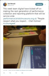
There are various versions of a common saying that ‘if you don’t measure it you can’t manage it’. See Zak Mensah’s (Head of Transformation at Bristol Culture) tweet below. As we’ll explain below we’re doing a good job of collecting a significant amount of Key Performance Indicator data; however, there remain areas of our service that don’t have KPIs and are not being ‘inspected’ (which usually means they’re not being celebrated). This blog is about our recent sprint to improve how we do KPI data collection and reporting.
The most public face of Bristol Culture is the five museums we run (including Bristol Museum & Art Gallery and M Shed), but the service is much more than its museums. Our teams include, among others; the arts and events team (who are responsible the annual Harbour Festival as well as the Cultural Investment Programme which funds over 100 local arts and cultural organisations in Bristol); Bristol Archives; the Modern Records Office; Bristol Film Office and the Bristol Regional Environmental Recording Centre who are responsible for wildlife and geological data for the region.
Like most organisations we have KPIs and other performance data that we need to collect every year in order to meet funding requirements e.g. the ACE NPO Annual Return. We also collect lots of performance data which goes beyond this, but we don’t necessarily have a joined up picture of how each team is performing and how we are performing as a whole service.
Why KPIs?
The first thing to say is that they’re not a cynical tool to catch out teams for poor performance. The operative word in KPI is ‘indicator’; the data should be a litmus test of overall performance. The second thing is that KPIs should not be viewed in a vacuum. They make sense only in a given context; typically comparing KPIs month by month, quarter by quarter, etc. to track growth or to look for patterns over time such as busy periods.
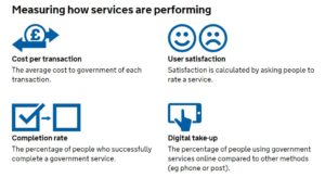
A great resource we’ve been using for a few years is the Service Manual produced by the Government Digital Service (GDS) https://www.gov.uk/service-manual. They provide really focused advice on performance data. Under the heading ‘what to measure’, the service manual specifies four mandatory metrics to understand how a service is performing:
cost per transaction– how much it costs … each time someone completes the task your service provides
user satisfaction– what percentage of users are satisfied with their experience of using your service
completion rate– what percentage of transactions users successfully complete
digital take-up– what percentage of users choose … digital services to complete their task
Added to this, the service manual advises that:
You must collect data for the 4 mandatory key performance indicators (KPIs), but you’ll also need your own KPIs to fully understand whether your service is working for users and communicate its performance to your organisation.
Up until this week we were collecting the data for the mandatory KPIs but they have been somewhat buried in very large excel spreadsheets or in different locations. For example our satisfaction data lives on a surveymonkey dashboard. Of course, spreadsheets have their place, but to get more of our colleagues in the service taking an interest in our KPI data we need to present it in a way they can understand more intuitively. Again, not wanting to reinvent the wheel, we turned to the GDS to see what they were doing. The service dashboard they publish online has two headline KPI figures followed below with a list of the departments which you can click into to see KPIs at a department level.
Achieving a new KPI dashboard
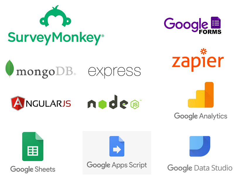
As a general rule, we prefer to use open source and openly available tools to do our work, and this means not being locked into any single product. This also allows us to be more modular in our approach to data, giving us the ability to switch tools or upgrade various elements without affecting the whole system. When it comes to analysing data across platforms, the challenge is how to get the data from the point of data capture to the analysis and presentation tech – and when to automate vs doing manual data manipulations. Having spent the last year shifting away from using Excel as a data store and moving our main KPIs to an online database, we now have a system which can integrate with Google Sheets in various ways to extract and aggregate the raw data into meaningful metrics. Here’s a quick summary of the various integrations involved:
Data capture from staff using online forms: Staff across the service are required to log performance data, at their desks, and on the move via tablets over wifi. Our online performance data system provides customised data entry forms for specific figures such as exhibition visits. These forms also capture metadata around the figures such as who logged the figure and any comments about it – this is useful when we come to test and inspect any anomalies. We’ve also overcome the risk of saving raw data in spreadsheets, and the bottleneck often caused when two people need to log data at the same time on the same spreadsheet.
Data capture directly from visitors: A while back we moved to online, self-completed visitor surveys using SurveyMonkey and these prompt visitors to rate their satisfaction. We wanted the daily % of satisfied feedback entries to make its way to our dashboard, and to be aggregated (both combined with data across sites and then condensed into a single representative figure). This proved subtly challenging and had the whole team scratching our heads at various points thinking about whether an average of averages actually meant something, and furthermore how this could be filtered by a date range, if at all.
Google Analytics: Quietly ticking away in the background of all our websites.
Google sheets as a place to join and validate data: It is a piece of cake to suck up data from Google Sheets into Data Studio, provided it’s in the right format. We needed to use a few tricks to bring data into Google Sheets, however, including Zapier, Google Apps Script, and sheets Add-ons.
Zapier: gives us the power to integrate visitor satisfaction from SurveyMonkey into Google Sheets.
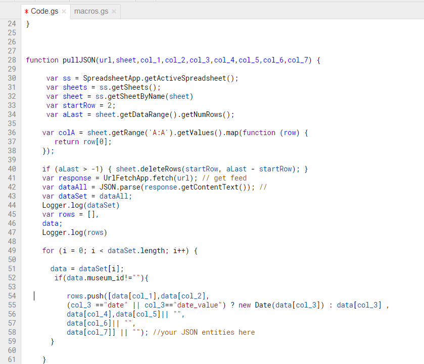
Google apps script: We use this to query the API on our data platform and then perform some extra calculations such as working out conversion rates of exhibition visits vs museum visits. We also really like the record macro feature which we can use to automate any calculations after bringing in the data. Technically it is possible to push or pull data into Google Sheets – we opted for a pull because this gives us control via Google Sheets rather than waiting for a scheduled push from the data server.
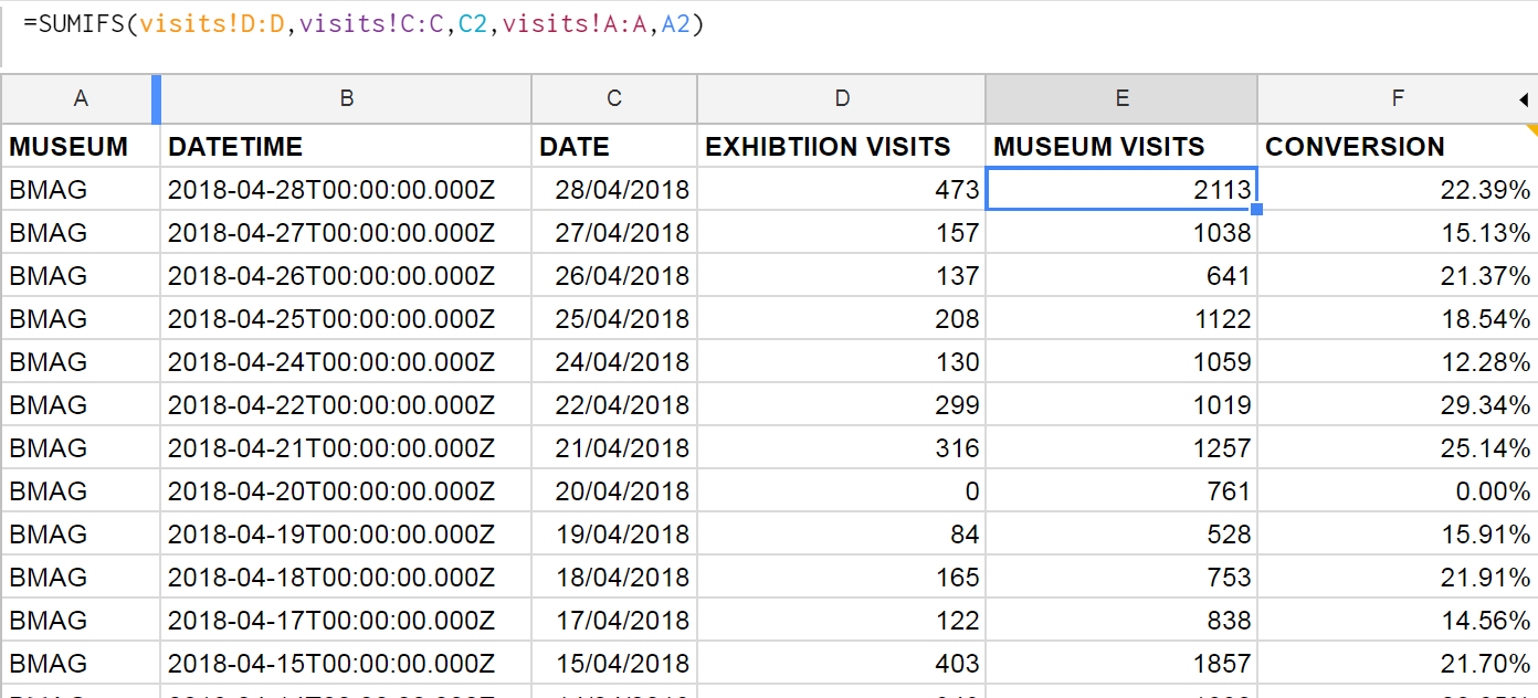
Google Sheets formulae: We can join museum visits and exhibition visits in one sheet by using the SUMIFS function, and then use this to work out a daily conversion rate. This can then be aggregated in Data Studio to get an overall conversion rate, filtered by date.
Sheets Add-Ons: We found a nifty add-on for integrating sheets with Google Analytics. Whilst it’s fairly simple to connect Analytics to Data Studio, we wanted to combine the stats across our various websites, and so we needed a preliminary data ‘munging’ stage first.
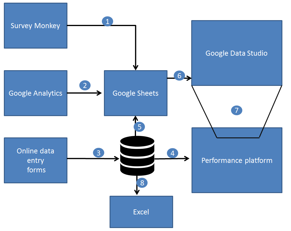
Joining the dots…
1.) Zapier pushes the satisfaction score from SurveyMonkey to Sheets.
2.) A Google Sheets Add On pulls in Google Analytics data into Sheets, combining figures across many websites in one place.
3.) Online data forms save data directly to a web database (MongoDB).
4.) The performance platform displays raw and aggregated data to staff using ChartJS.
5.) Google Apps Script pulls in performance data to Google Sheets.
6.) Gooogle Data Studio brings in data from Google Sheets, and provides both aggregation and calculated fields.
7.) The dashboard can be embedded back into other websites including our performance platform via an iframe.
8.) Good old Excel and some VBA programming can harness data from the performance platform.
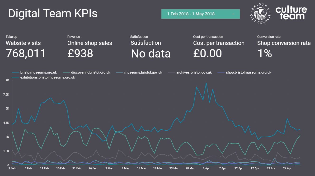
Technologies involved in gathering and analysing performance data across museums.
Data Studio
We’ve been testing out Google Data Studio over the last few months to get a feel for how it might work for us. It’s definitely the cleanest way to visualise our KPIs, even if what’s going on behind the scenes isn’t quite as simple as it looks on the outside.
There are a number of integrations for Data Studio, including lots of third party ones, but so far we’ve found Google’s own Sheets and Analytics integrations cover us for everything we need. Within Data Studio you’re somewhat limited to what you can do in terms of manipulating or ‘munging’ the data (there’s been a lot of munging talk this week), and we’re finding the balance between how much we want Sheets to do and how much we want Data Studio to do.
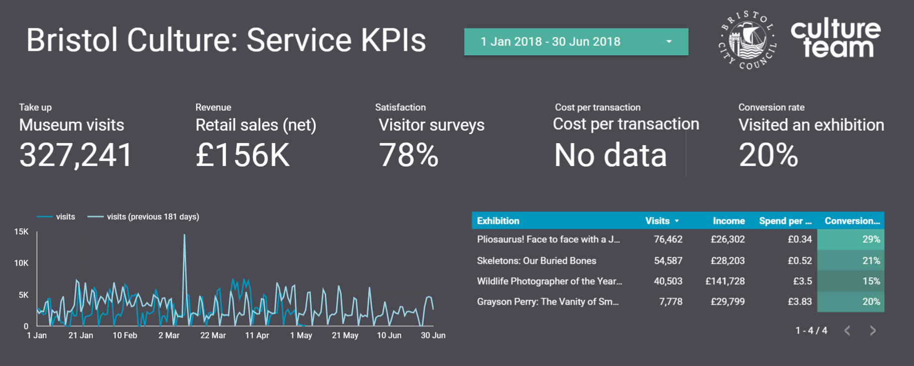
At the beginning of the sprint we set about looking at Bristol Culture’s structure and listing five KPIs each for 1.) the service as a whole; 2.) the 3 ‘departments’ (Collections, Engagement and Transformation) and 3.) each team underneath them. We then listed what the data for each of the KPIs for each team would be. Our five KPIs are:
Take up
Revenue
Satisfaction
Cost per transaction
Conversion rate
Each team won’t necessarily have all five KPIs but actually the data we already collect covers most of these for all teams.
Using this structure we can then create a Data Studio report for each team, department and the service as a whole. So far we’ve cracked the service-wide dashboard and have made a start on department and team-level dashboards, which *should* mean we can roll out in a more seamless way. Although those could be famous last words, couldn’t they?
Any questions, let us know.
Darren Roberts (User Researcher), Mark Pajak (Head of Digital) & Fay Curtis (User Researcher)
developing a digital timeline for scheduling exhibitions
BACKGROUND
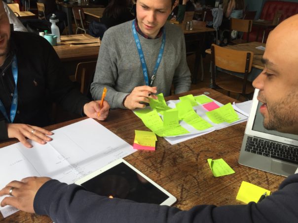
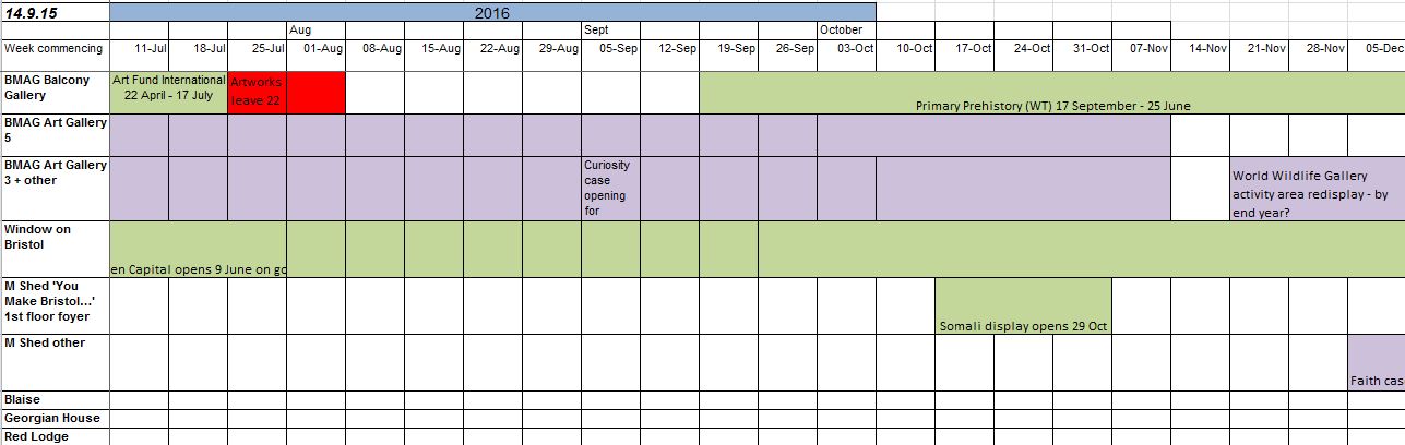
Having a visual representation of upcoming exhibitions, works, and major events is important in the exhibition planning process. Rather than relying on spotting dates that clash using lists of data, having a horizontal timeline spread out visually allows for faster cross-checking and helps collaboratively decide on how to plan for exhibition installs and derigs.
Until recently we had a system that used excel to plan out this timeline, by merging cells and coloring horizontally it was possible to manually construct a timeline. Apart from the pure joy that comes from printing anything from Excel, there were a number of limitations of this method.
When dates changed the whole thing needed to be rejigged
Everyone who received a printed copy at meetings stuck that to the wall and so date changes were hard to communicate.
We need to see the timeline over different scales – short term and long term, so this means using 2 separate excel tabs for each, hence duplication of effort.
We were unable to apply any permissions
The data was not interoperable with other systems
TIMELINE SOFTWARE (vis.js)
Thanks to Almende B.V. there is an open source timeline code library available at visjs.org/docs/timeline so this offers a neat solution to the manual task of having to recast the timeline using some creative Excel skills each time. We already have a database of Exhibition dates following our digital signage project and so this was the perfect opportunity to reuse this data, which should be the most up to date version of planned events as it is what we display to the public internally in our venues.
IMPLEMENTATION
The digital timeline was implemented using MEAN stack technology and combines data feeds from a variety of sources. In addition to bringing in data for agreed exhibitions, we wanted a flexible way to add installations, derigs, and other notes and so a new database on the node server combines these dates with exhibitions data. We can assign permissions to different user groups using some open source authentication libraries and this means we can now release the timeline for staff not involved in exhibitions, but also let various teams add and edit their own specific timeline data.
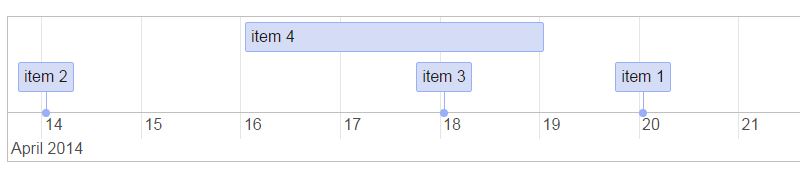
The great thing about vis is the ease of manipulation of the timeline, users are able to zoom in and out, and backward and forwards in time using with mouse, arrow or touch/pinch gestures.
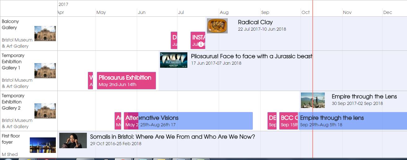
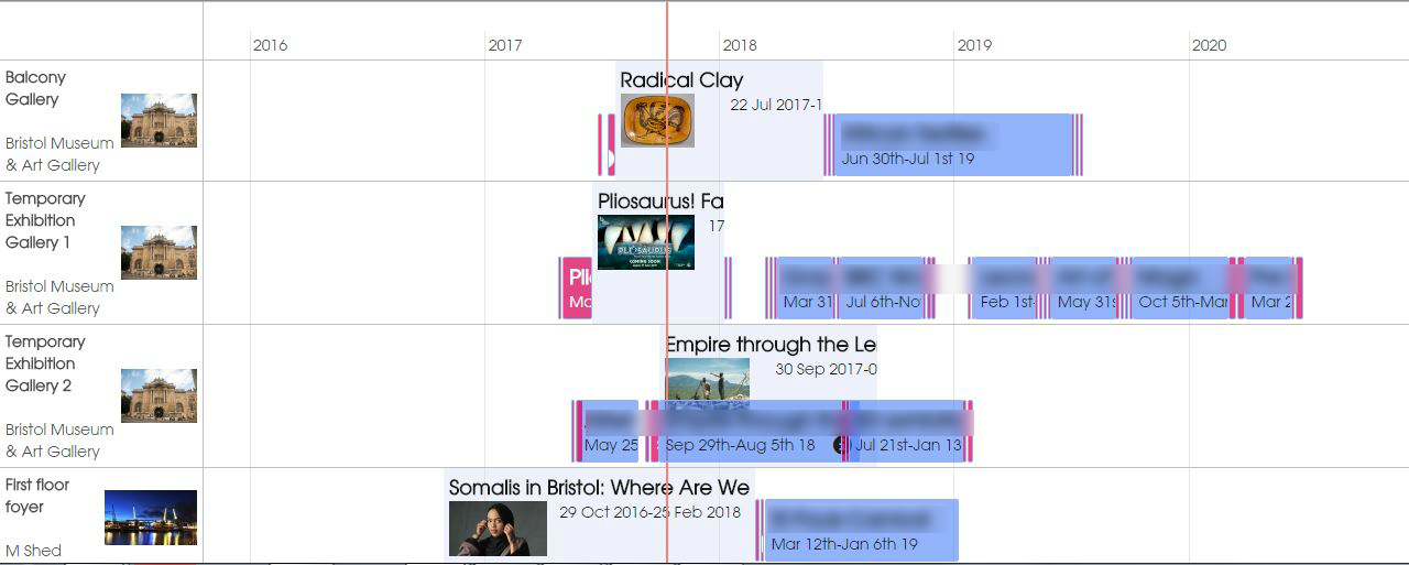
Zoomed out view for the bigger picture
Zoomed in for the detail…
EMU INTEGRATION
The management of information surrounding object conservation, loans and movements is fundamental to successful exhibition development and installation. As such we maintain a record of exhibition dates in EMu, our collections management software. The EMu events module is used to record when exhibitions take place and also the object list where curators select and deselect objects for exhibition. Using the EMU API we are able to extract a structured list of Exhibitions information for publishing to the digital timeline.
HOW OUR TIMELINE WORKS
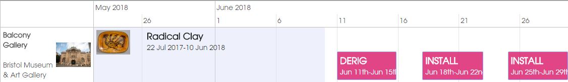
Each gallery or public space has its own horizontal track where exhibitions are published as blocks. These are grouped into our 5 museums and archives buildings and can be selected/deselected from the timeline to cross reference each. Once logged in a user is able ot manually add new blocks to the timeline and these are pre-set to “install”, “derig” and “provisional date”. Once a block is added our exhibitions team are able to add notes that are accessible on clicking the block. It is also possible to reorder and adjust dates by clicking and dragging.
IMPACT
The timeline now means everyone has access to an up to date picture of upcoming exhibitons installations to no one is out of date. The timeline is on a public platform and is mobile accessible so staff can access it on the move, in galleries or at home. Less time is spent on creative Excel manipulation and more work on spotting errors. It has also made scheduling meetings more dynamic, allowing better cross referencing and moving to different positions in time. An unexpected effect is that we are spotting more uses for the solution and are currently investigating the use of it for booking rooms and resources. There are some really neat things we can do such as import a data feed from the timeline back into our MS Outlook calendars (“oooooh!”). The addition of thumbnail pictures used to advertise exhibitions has been a favorite feature among staff and really helps give an instant impression of current events, since it reinforces the exhibition branding which people are already familiar with.
ISSUES
It is far from perfect! Several iterations were needed to develop the drag and drop feature fo adding events. Also, we are reaching diminishing returns in terms of performance – with more and more data available to plot, the web app is performing slowly and could do with further optimisation to improve speed. Also due to our IT infrastructure, many staff use Internet Explorer and whilst the timeline works OK, many features are broken on this browser without changes to compatibility and caching settings on IE.
WHAT’S NEXT
Hopefully optimisation will improve performance and then it is full steam ahead with developing our resource booking system using the same framework.
Hello! My name is Rowan Whitehouse and I am currently working as a cultural support apprentice for Bristol Museums.
I have been doing six week rotations around various departments, and as part of my third, with the digital team, I’ve been asked to review some of the technology around the museum.
So, to find some!
I noticed that the distribution of technology around the museum is heavier in areas with a higher number of children. Whilst there is a lot around the ground floor, particularly the Egypt and Natural History galleries, levels definitely drop off the more steps you climb, towards the Fine and Applied Arts galleries. I think this is due, in part, to many children’s interests leaning on the dinosaur/mummy side, rather than Bristol’s history of stone pub ware. Perhaps there are also certain established ideas about what an art gallery should be, whereas many of the historic collections lend themselves well to interactive displays.
Upstairs, the technology has a distinctly more mature focus.
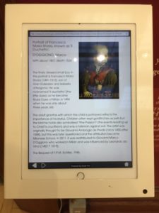
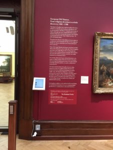
I chose to look at a tablet/kiosk in the European Old Masters gallery for an example. The kiosk itself fits well into its surroundings, the slim, white design is unobtrusive – something desirable in such a traditional gallery space. The kiosk serves as an extension of the wall plaques, it has an index of the paintings in the room with information on them. I think this is a great idea as the size of wall plaques often constrain the amount of information available.
A big drawback I felt however, was that the kiosk was static and fixed in one place. I observed that as people moved around the gallery they would continually look from the painting to it’s accompanying plaque, taking in both at the same time. Though the kiosk has more information, it would need to be able to move with the user to have the advantage over the plaques. On the position of the kiosk itself, I think it would receive more use if it was positioned in the middle of the room, rather than in the corner, where it is overlooked. Signage on the wall advertised a webpage, which could be accessed on a handheld device and provided the same information as the kiosk. I felt this was a better use of the index, and could be made even easier to access via a QR code. I wonder though, if people would want to use their phones like this in a gallery, and whether ideas about the way we experience art are the ultimate obstacle. I’ll be researching how other institutions use (or don’t use) technology in their galleries.
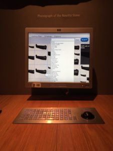
I wanted to see how technology is being used differently with the historic collections, so I headed back downstairs to the Egypt gallery. I observed a school group using the computers at the back of the gallery, both the children and their teacher struggled with the unusual keyboard layout and rollerball mouse, unable to figure out how to search. Eventually, they came upon it by chance, and enjoyed navigating the images and learning more about the objects in the gallery. The computers also have a timeline view, showing the history of the Egyptians, and an “Explore” function, where specific subjects could be looked at.
I think the location of the units massively benefit interaction, the dedicated space with chairs really invite and encourage visitors to engage. On using the technology, I felt that the access problems could be easily fixed by some stickers highlighting the left mouse button function, and something to resolve the stiffness of the rollerball.
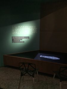
My favourite interactive pieces in the museum were in the Egypt gallery. I loved the screens that featured the discovery of a body, and asked the user what they thought about the body being in a museum, and gave the user the option of viewing the body at the end of the text. I felt like this type of interaction was fantastic, and rather than just providing information, engaged the visitor directly and was a great way of broaching questions that may not usually occur to visitors.
I’m looking forward to the next six weeks, and learning more about digital engagement in museums.
With such a fantastic collection, it’s exciting finding new ways of presenting it and helping visitors interact with objects


 But what about all of the digital interpretation in our permanent galleries? Focusing on the two main museums mentioned above, we’ve got a wide range of interp such as info screens,
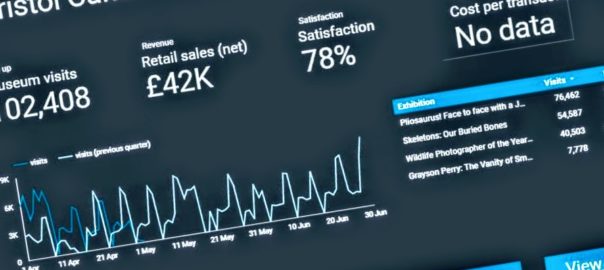
 Added to this, the service manual advises that: