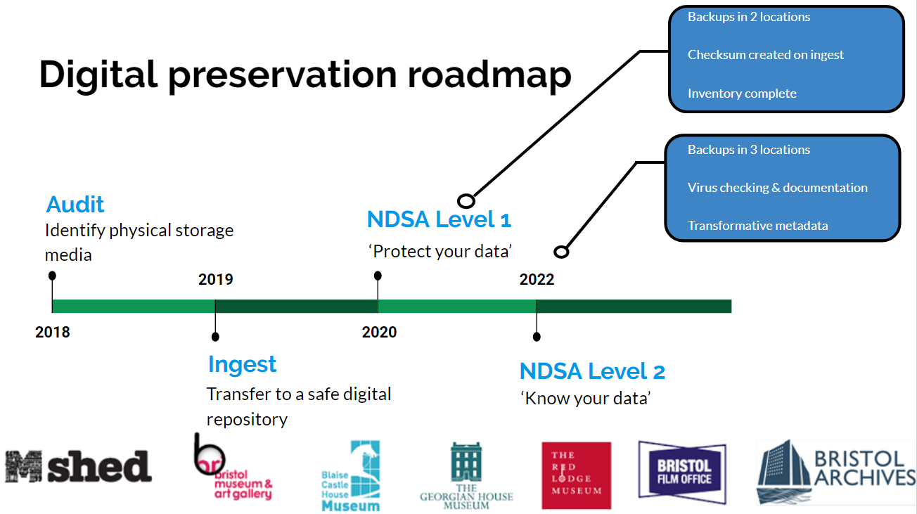
Background
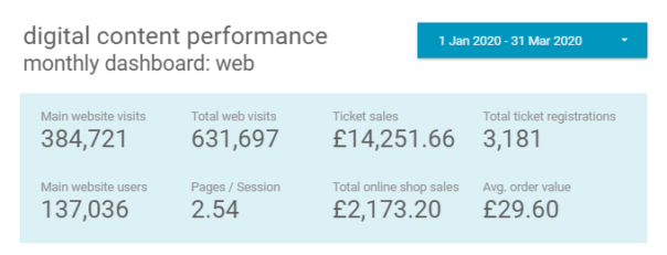
Bristol Culture receives an average of 2.5 million yearly visits to its websites (not including social media). Additionally, we have different demographics specific to each social media channel, which reflect the nature of the content and how users interact with the platform features offered.
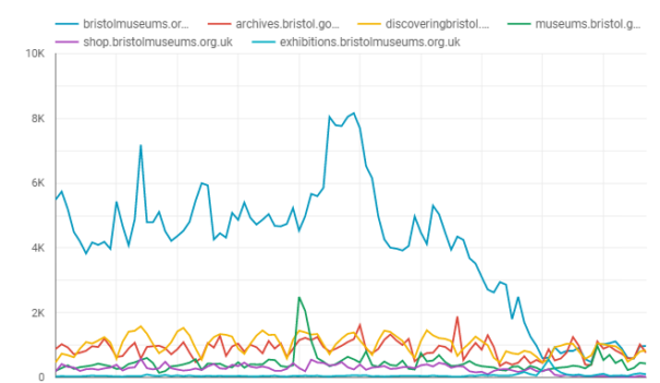
Since March 13th visits to the bristolmuseums.org.uk have fallen off sharply from a baseline of 4000/day to under 1000/day as of 6th April. This unprecedented change in website visitors is a reflection of a large scale change in user behaviour which we need to understand, presumably – due to people no longer searching to find out about visiting the museum in person, due to enforced social distancing measures. It remains to be seen how patterns of online behaviour will change in the coming weeks, however, it appears we have a new baseline which more closely matches our other websites that are more about museum objects and subject matter than physical exhibitions and events.
You can explore this graph interactively using the following link:
https://datastudio.google.com/reporting/196MwOHX1WOhtwDQbx62qP0ntT7sLO9mb
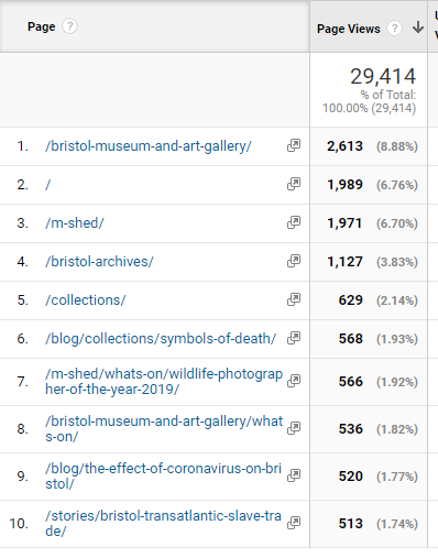
Before CV struck
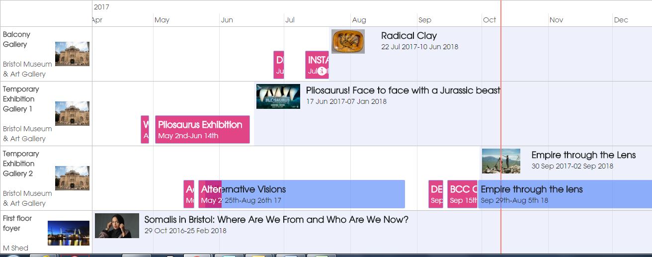
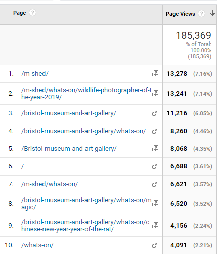
The top 10 most visited pages in January on bristolmuseums.org.uk feature our venue homepages, specific exhibitions and our events listings
During Lockdown
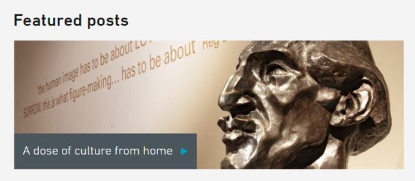
From March-April we are seeing visits to our blog pages, our online stories and our collections pages feature in the top 10 most visited.
Digital Content Strategy
Internally, we have been developing a digital content strategy to help us develop and publish content in a more systematic way. The effect of CV-19 has meant we have had to fast track this process to deal with a large demand for publishing new online content. The challenge we are faced with is how to remain true to our longer-term digital aims, whilst tackling the expectations to do more digitally. In practice, we have had to rapidly transform to a new way of working with colleagues, collaborating remotely, and develop a new fast track system of developing and signing off digital content. This has required the team to work in different ways both internally, distributing tasks between us, but also externally across departments so that our content development workflow is more transparent.
Pre-quarantine online audiences
Online we follow our social media principles: https://www.labs.bristolmuseums.org.uk/social-media-principles/
A key principle of our audience development plan is to understand and improve relationships with our audiences (physical and digital). This involves avoiding the idea that everything is for ‘everyone’. Instead of recognising that different activities suit different audiences. We seek to use data from a range of sources (rather than assumptions) to underpin decisions about how to meet the needs and wants of our audiences.
Quarantine online audiences
Since the implementation of strict quarantine measures by the Government on Tuesday 24th March – audiences’ needs have changed.
- Families at home with school-age children (4 – 18) who are now home-schooling during term-time.
- Retired people with access to computers/smart-phones who may be isolated and exploring online content for the first time.
- People of all ages in high-risk groups advised not to leave their homes for at least the next 12 weeks.
- People quarantining who may be lonely/anxious/angry/bored/curious or looking for opportunities to self-educate.
- Possible new international audiences under quarantine restrictions.
See this list created anonymously by digital/museum folk: https://docs.google.com/document/d/1MwE3OsljV8noouDopXJ2B3MFXZZvrVSZR8jSrDomf5M/edit
What should our online offer provide?
Whilst our plummeting online visitors overall tells us one story – we now have data to tell us there is a baseline of people who are visiting our web pages regularly and this audience needs consideration. Potentially a new audience with new needs but also a core group of digitally engaged visitors who are seeking content in one form or another.
Some things we need to be thinking about when it comes to our digital content:
- What audiences are we trying to reach and what platforms are they using?
- What reach are we aiming for and what are other museums doing – we don’t necessarily want to publish content that is already out there. What’s our USP?
- What can we realistically do, and do well with limited resources?
- What format will any resources take and where will they ‘live’?
- What’s our content schedule – will we be able to keep producing this stuff if we’ve grown an audience for it once we’re open again? When will we review this content and retire if/when it’s out of date?
- We need to be thinking about doing things well (or not doing them at all – social media platforms have ways of working out what good content is, and will penalise us if we keep posting things that get low engagement. A vicious cycle)
- We want to engage with a relevant conversation, rather than simply broadcast or repurpose what we have (though in practice we may only have resource to repurpose content)
Submitting ideas/requests for digital content during Quarantine period
We are already familiar with using trello to manage business processes so we quickly created a new board for content suggestions. This trello-ised what had been developing organically for some time, but mainly in the minds of digital and marketing teams.
Content development Process in trello
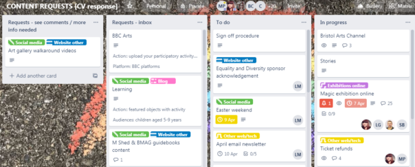
STEP 1: An idea for a new piece of digital output is suggested, written up and emailed to the digital team, and then added to the Digital Content Requests Trello.
STEP2: The suggestion is then broken down / augmented with the following information (detailed below), and added as fields to the trello card
STEP 3: This list of suggestions is circulated amongst staff on the sign off panel, for comments.
STEP 4: The card is either progressed into the To Do List, or moved back to “more info needed / see comments” list.
The following information is required in order to move a digital content suggestion forward:
Description: Top level description about what the proposal is
Content: What form does the content take? Do we already have the digital assets required or do we need to develop or repurpose and create new content? What guidelines are available around the formats needed?
Resource: What staff are required to develop the content, who has access to upload and publish it?
Audiences: Which online audiences is this for and what is their user need?
Primary platform: Where will the content live, and for how long?
Amplification: How will it be shared?
Success: What is the desired impact / behaviour / outcome?
Opportunities
Experimentation
New and emerging content types: The lockdown period could be an opportunity to try a range of different approaches without worrying too much about their place in the long term strategy.
Online events programme
Now we can only do digital-or-nothing, we need to look at opportunities for live streaming events. Where there is no audience – how do we build enough digital audiences to know and be interested in this if we did go down that route. Related to above – online family/ adult workshops, a lot of this is happening now, are they working, how long will people be interested?
Collaborating with Bristol Cultural organisations
With other cultural organisations in Bristol facing similar situations, we’ll be looking to collaborate on exploring:
- What is the online cultural landscape of Bristol?
- Collaborative cultural response to Corona
- A curated, city wide approach
- Working with digital producers on user research questions
- Similar to the Culture ‘Flash Sale’
- Scheduled content in May
Arts Council England business plan
Those projects are at risk of not being able to be delivered – can digital offer a way to do these in a different way?
Service / Museum topical issues
How can we create an online audience to move forward our decolonisation and climate change discussions?
Family digital engagement
We’ll be working with the public programming team to develop content for a family audience
Examples of museum services with online content responding well to quarantine situation
a) they have a clear message about the Corona virus situation
b) they have adjusted their landing pages to point visitors to online content.
- British Museum https://www.britishmuseum.org/closure Up front message from Director about situation, message of valuing audiences, website not that polished, does it matter?
- Tate Gallery https://www.tate.org.uk/ No clear upfront message but 4 highlighted options can be enjoyed from home/may be useful for parents too
- Rijksmuseum, Amsterdam https://www.rijksmuseum.nl/en Good simple landing message ‘Rijksmuseum from home. Always open online’. 360 degree virtual tours of most popular galleries, ability to zoom in on individual paintings (although not labels).
- The Louvre https://www.louvre.fr/en scrolling landing pages link to digital content
- Birmingham Museums https://www.birminghammuseums.org.uk/ Closure message (although could be more up front), virtual tours, collections search and NHS cup sales foregrounded
- Leeds Museums https://museumsandgalleries.leeds.gov.uk/leeds-city-museum/ Very simple, signposting to following updates via social media.
- Glasgow Museums https://www.glasgowlife.org.uk/museums explaining work going on behind the scenes “we are working hard to create online versions of the activities and programmes 75% of Glaswegians enjoy and rely on.”
Examples of museums with good online content generally
Recent Guardian article by Adrian Searle lists museums for digital visits https://www.theguardian.com/artanddesign/2020/mar/25/the-best-online-art-galleries-adrian-searle
- The Prado, Madrid https://www.museodelprado.es/en/the-collection Google search brings up Collections page first. Explore individual paintings or interactive timeline
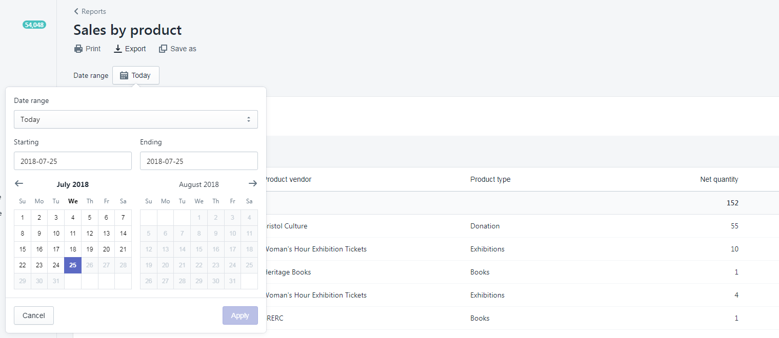
Fundraising
The Development Team typically manages around £12,800 in donations per month through ‘individual giving’ which goes to our charity, Bristol Museums Development Trust. This is from a variety of income streams including donation boxes, contactless kiosks, Welcome Desks and donations on exhibition tickets. Closure of our venues means this valuable income stream is lost. To mitigate this, we need to integrate fundraising ‘asks’ into our online offers. For example, when we promote our online exhibitions, ask for a donation and link back to our online donation page.
The Development Team will work with the Digital and Marketing teams to understand plans and opportunities for digital content and scope out where and how to place fundraising messages across our platforms. We will work together to weave fundraising messages into the promotion of our online offers, across social media, as well as embed ‘asks’ within our website.
Next Steps:
Clearly, there will be long-lasting effects from the pandemic and they’ll sweep through our statistics and data dashboards for some time. However – working collaboratively across teams, responding to change and using data to improve online services are our digital raison d’etre – we’ll
use the opportunity as a new channel for 2020 onwards instead of just a temporary fix .