By University of Bristol Computer Science student team: Sonny, Sergi, Thomas, Daniel and Milosz
Back in September five of us gathered round a table thinking about the prompt given to us by Bristol Museum: develop an interactive exhibit where visitors touch replicas of artefacts and related information appears, creating an interesting and fun way to learn about these objects.
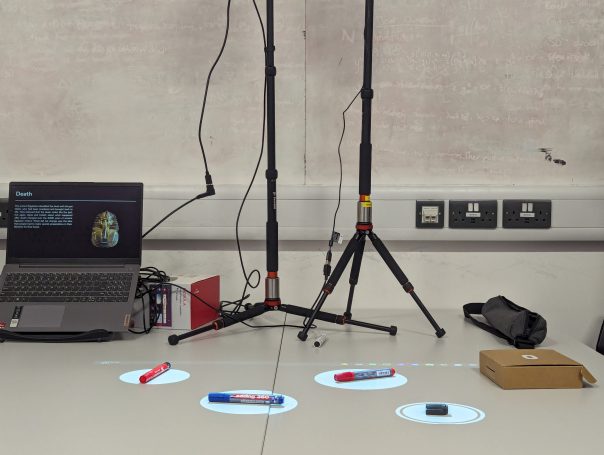
After many months and iterations, we finally came to the design you see above, an exhibit consisting hotspots over the replicas on a table. When the hotspots are touched, information about each artifact is displayed.
But how did we get here? With little idea on how to tackle such a task we split it into the three logical sections: how do people interact with the replicas? How do we display the information? How do we make it easy for museum staff to use in future exhibitions?
How do people interact with the replicas?
This was tough as we didn’t have any examples to work off – we couldn’t find anyone who’d done something similar.
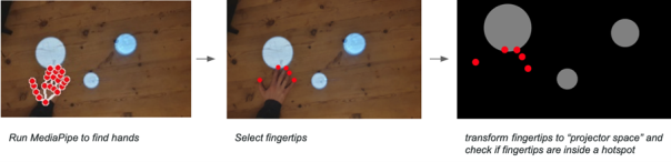
We explored many possible solutions; looking at methods such as computer vision, lasers and detecting decreases in light. Through our exploration we ultimately settled on MediaPipe; an AI-powered hand tracking model which allowed us to see how users touched the replicas.
We created hotspots in which the replicas could be placed and animations to prompt visitors to interact.
While two of us worked on this, the rest of the team was busy creating a user interface, so users could engage with the exhibition.
How do we display the information?
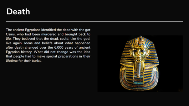
This was a simpler task; the museum had informed us that they wanted to use projectors to show this information, so we created a dynamic display with a black background and white text to make it less blocky and more appealing to the eye. After a few iterations with museum staff and user feedback we came to the structure shown. Videos, image slideshows and text can all be included.
How do we make it easy for museum staff to use in future exhibitions?
We wanted to create a easy-to-use system with equipment most museums would already have.
A projector displays hotspots and a camera detects when people touch them. The camera and projector can be calibrated with the click of a button. A second projector displays information, which changes according to how the users interact with the hotspots.
We also designed an editor allowing staff to add, remove and position the hotspots, and attach relevant information to them. We added import and export features so the design can be used on different machines.
Conclusion
Overall this was a fun project to work on. We learnt a lot about computer vision, hardware, frontend development and working as a team on a larger project. We are grateful for Bristol Museum for coming to us with such an interesting task and are looking forward to seeing this software in action.
I’m Lillian Robertson, a final year undergraduate student studying Sociology at the University of Bristol. I landed this User Research Internship under a University of Bristol Q-step Internship, a sponsored scheme designed for social science students to gain experience of working with real-world data to develop their quantitative research skills. Being that I only had experience of working with data in an educational setting, I was keen to do this internship to broaden my data collection, analysis and reporting skills. Having limited knowledge about digitally assessing and presenting data, I was also excited to take on the challenge.
Getting started and Identifying the issues
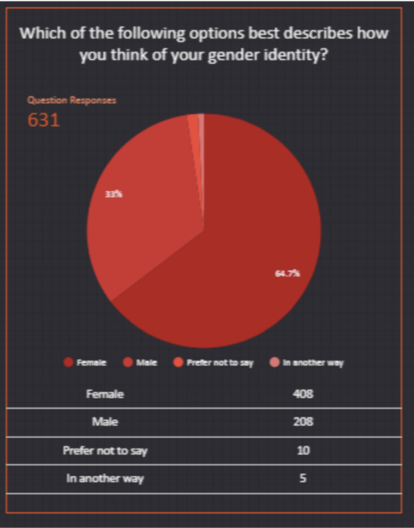
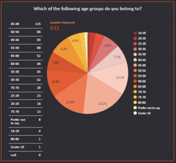
After a few set-backs and delays due to tightening covid restrictions, I began this project at the beginning of February. We laid out a 2-month timeline and started to identify issues with the current methods of visitor data collection that Bristol Museums use: emailed self-completion surveys (ESCS) and tablet self-completion surveys (TSCS). In terms of demographics, the data appeared to skewed, with visitor demographics not matching anecdotal evidence given by front-of-house (FOH) staff. Taking the Vanguard exhibition (26 June- 31 October 2021) as an example, FOH staff reported a significant proportion of visitors being younger men. But survey results didn’t reflect this, and instead showed that 64.7% of visitors were women whilst 44.9% of visitors were aged 35-54 as can be seen in the images below.
Differences in museum visits by gender are not uncommon, with women being more likely to visit general and natural history museums. But the proportion of Vanguard’s female visitors seemed particularly large, making us believe that our data collection methods may be causing sampling or non-response biases. One theory we had for the large gender difference in Vanguard visitors was that the (ESCS) are only emailed to the person who booked the museum tickets, which may be more likely to be women as a result of gendered divisions of domestic labour. With this in mind, we identified potential issues that our data collection methods may have.
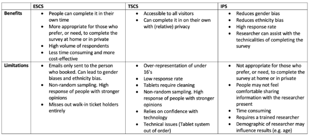
Issues with the emailed self-completion survey (ESCS):
The email is only sent to the booking email address. This can be problematic as certain demographics are more likely to book tickets on behalf of a group, such as women.
Busier people may be missed out.
Some people don’t check their emails.
The email may go to spam.
The email is only in one language (English).
Misses out walk-in ticket holders entirely.
Issues with the tablet self-completion survey (TSCS):
It attracts a younger demographic.
Relies on confidence with technology which may miss out certain groups.
The positioning of the Ipads may affect who is filling the surveys out.
Coming up with a plan
To identify any sampling and non-response biases within our current data collection methods, we decided to conduct an in-person survey (IPS) at both BMAG and Mshed. This would enable more sampling controllability to make the data set as random and unbiased as possible which could then be compared to ESCS and TSCS data gathered at the same time period in order to reveal any differences and identify biases
As we were focusing on sample demographics, we only needed to collect information about people’s age, sex, ethnicity, disability status and postcode so we took this section from the current visitor survey to create a 1 minute IPS.
Collecting the data
After having a walk around the BMAG and MSHED sites I decided on specific locations for the data collection that had a consistent flow of visitors. For BMAG this was on the first floor at the dinosaur area and for MSHED it was the 1st floor main foyer area. This allowed me to catch visitors going up and down the stairs to a range of exhibitions. I also took some Covid-19 safety measures as advised by the Market Research Society’s (MRS) Post-Lockdown Covid-19 guidance regarding undertaking safe face-to-face data collection, which included precautions adhering to social distancing (including only myself touching the iPad) wearing a mask, taking a daily lateral flow test and not approaching those who looked particularly vulnerable. In terms of sampling, I used random sampling by approaching people at regular intervals depending on how busy the museums were such as every 3rd person/ group that passed by. By the end of the data collection process I had come to terms with how awkward and brutal rejections could be however the overall response rate was actually quite high. While MSHED had a response rate of 70%, BMAG had a response rate of 58% which is slightly higher than the average of 57% for IPS. A large number of people were apprehensive about the duration of the survey however agreed to take part once they were reassured it wouldn’t last more than 2 minutes. After they said yes, I read out a a few sentences about what kind of questions would be asked and how their data would be used and stored safely in order to get their informed consent. It’s also important to mention that when approaching a group, I selected one person at random by asking whose birthday was soonest. Asking the actual survey questions usually went smoothly and respondents seemed to find it easy to answer the questions, with me verbally asking the questions and then filling out their responses on an iPad. However a handful of people appeared uncomfortable or confused by the Gender and Ethnicity questions specifically, but not to any major extent. A minority of people were also uncomfortable providing their postcode, with some citing privacy and data sharing issues as a concern. Overall it was a good experience and some were even keen to share their opinions about the museum or have a chat afterwards.
What did we find?
When analysing the findings, we compared the IPS data that was collected from 01/03/22- 19/03/22 with combined ESCS and TSCS data ,collectively referred to as ‘audience finder surveys’ or ‘audience base’, from 01/03/22- 24/03/22, adding an extra 3 days to give people time to complete the ESCS.
Gender
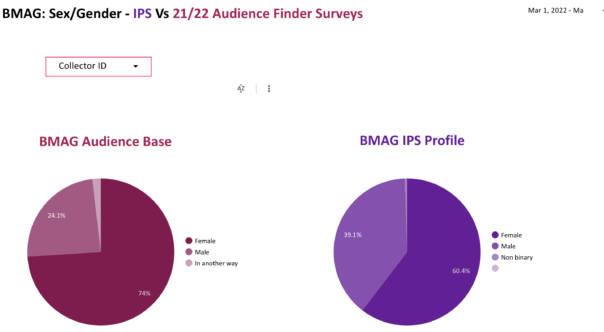
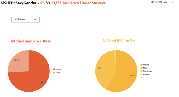
As mentioned, the over representation of women was something that we were particularly aware of from FOH accounts. Our findings indicate that this may in fact be the case. For BMAG, the IPS recorded 13.4% less women than the audience base. Similar results were found at MSHED, with the IPS showing 15.8% less female visitors.
Such gender differences suggest that ESCS and TSCS data collection methods may indeed be leading to an over representation of women. As mentioned previously, this difference could be due to women being more likely to book museum tickets, and thus receive the ESCS. Research has also found that women are more likely than men to engage with and complete E-surveys in general. It is also important to note that, for the IPS at both sites, women still make up over half of visitors. This can be explained by women generally being more likely to visit art galleries and natural histories museums then men, with the figures of 60.4% and 58.1% closely aligning with a broad survey of European museums that found 56%-58% of visitors were female.
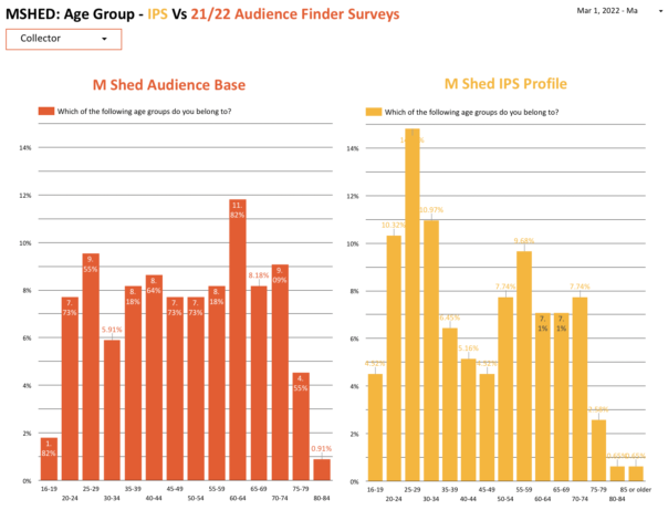
Age
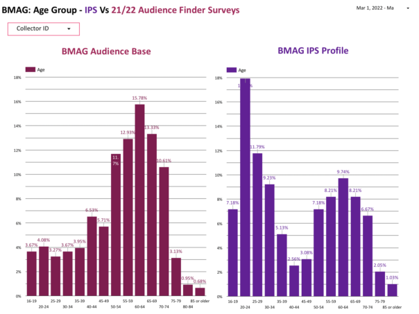
Unexpectedly, some differences in age were found. At both sites, A higher percentage of 16-34 year olds were recorded with the IPS, with other age groups showing a similar pattern to the audience base.
This may indicate that younger age groups are being underrepresented by the ESCS and TSCS and also suggests that young people may have a lower online response rate than elderly populations. However it is important to recognise how my presence as a 23 year old researcher may have affected such results, despite random sampling being consistently used. In this sense, people of my age group could have felt more inclined to complete the survey as they see themselves reflected in my position. With this in mind, it would be useful to repeat the survey with a researcher of a completely different socio-demographic to see if results differ.
Ethnic Group
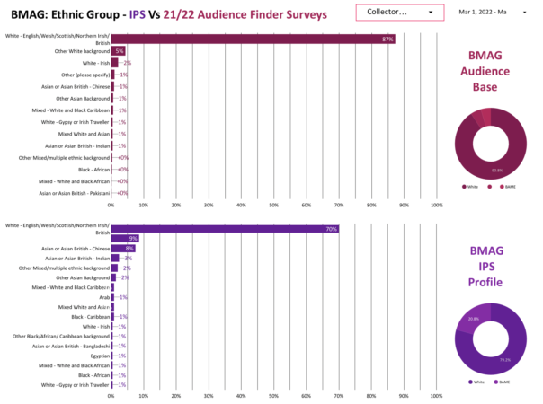
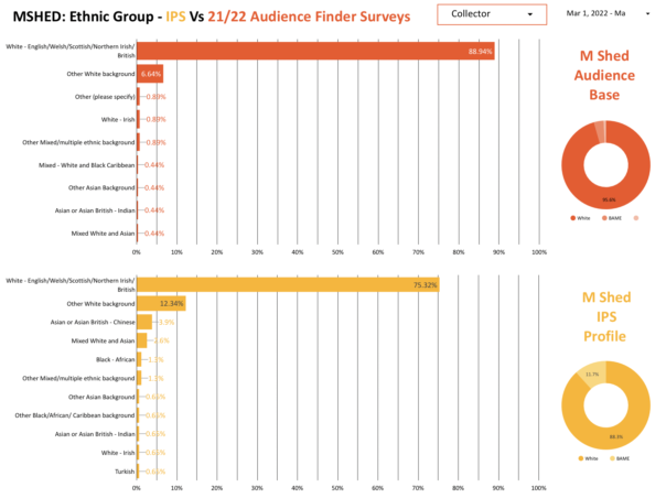
Slight differences between ethnic group responses were found, with the IPS reporting a higher percentage of people with an ‘Other white background’ and ‘Asian or Asian British- Chinese’.
Anecdotally, this may be explained by people not being confident in English or believing they weren’t eligible for the survey. Some of the people stated that their English ability was not that good, a large proportion of whom were Asian or Asian British Chinese. However, most agreed to take part when I convinced them that the survey was very short and simple. This shows that a lack of English ability may prevent certain people or groups from filling out the ESCS and TSCS, implying that surveys in additional languages may be beneficial. Additionally, those who were from an ‘Other White background’ were often tourists and a handful of people mentioned that they didn’t think they were ‘the right people’ to complete the survey because they weren’t British.
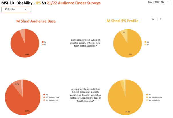
Disability
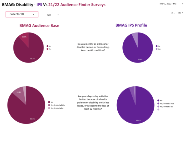
For those identifying as deaf or disabled or having a long-term health condition, very little difference was found between the audience base and the IPS. However, the second question ‘Are your day-to-day activities limited because of a health problem or disability which has lasted, or is expected to last, at least 12 months?’ did show some differences. The BMAG audience base showed that 13.4% of respondents were limited in some way as opposed to 5.6% reported by the IPS. Similarly, the MSHED audience base showed 10.4% of respondents were limited in some way in contrast to 5.1% as shown by the IPS.
This suggests that the IPS may not be appropriate for gathering data about disabilities and health conditions. Firstly, I was located by a set of stairs which may have missed out those who have to take the lift due to their disability or health condition. Secondly, people may not have been comfortable sharing their personal health information with me but would be more comfortable doing so in private using the ESCS. Thirdly, those with disabilities may need a certain environment or equipment that can only be provided at home in order to complete surveys. Finally, those with particularly evident disabilities were not approached due to covid-19 precautions.
Visitor Locations
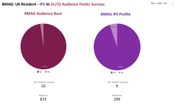
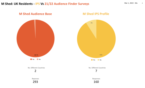
In terms of UK visitors who provided their postcode, no significant difference was found between the audience base and the IPS survey when looking at locations by UK region, region and town/area, suggesting that the ESCS’s and TSCS’s are effective at collecting such information. However when looking at the percentage of non-UK residents there is a significant difference in the responses. For BMAG, the Audience base reported 2.3% of visitors being non-UK residents while the IPS showed this to be 5.1%. Similarly, the audience finder survey at MSHED reported 1.3% of visitors being non-UK residents while the IPS suggested this to be 9%. As I mentioned above, this may be due to tourists not feeling like their English ability was good enough to complete the survey or that they weren’t eligible to complete the survey because they weren’t British.
What do we reccomend?
This project allowed us to see the importance of using multiple data collection methods to collect visitor data and reduce overall bias. It also revealed the benefits and limitations of individual data collection methods :
ESCS: emailed self-completion surveys. TSCS: tablet self-completion surveys. IPS: in person survey.
The key take away from this research is it’s clearly valuable and important to continue doing this research. It appears that our framework for the data collection review worked particularly well being that the IPS had a high response rate and indicated some limitations and benefits of using ESCS and TSCS. It is important to emphasise that future studies should stick to a random sampling method to reduce any bias of IPS. With a bit of confidence and “dedication to the process” the random sampling method of approaching people by intervals worked well alongside selecting someone in a group based on whose birthday was coming up next. In the future, the framework could be expanded into a larger study using volunteer researchers (Watch this space). This would mean that a larger data set could be gathered and multiple locations around the sites could be covered. Ideally, such volunteers would differ in terms of their age, gender and ethnicity in order to reduce any bias that may be caused by the researchers presence. Research could also be extended to the other sites.
Special Thanks to Bristol Museums and the University of Bristol for organising this internship and to Nikita Marryat and Mark Pajak for their support and guidance.
I’m George, a new member of the team on a year fixed term contract, coming from a background of website UX and other IT technical experience. My former role had a high focus on web standards, accessibility and a lot of ownership over what with publish but following guidance. I have taken a big curiosity over how we meet user needs with our digital and online web content and why. One of the easiest ways we really know what our users want is by measuring our data, and analysing its successes.
I was very grateful to have an opportunity when I joined the team, to be a part of Culture24‘s Let’s Get Real project (Supported by Arts Council England). And was gladly thrown into a positive working community of other museums and professionals alike who assisted me and complimented my existing knowledge. In this blog i’ll cover some of the things I aimed to achieve throughout its time, how I achieved it and now how it is being used in our daily activities.
The project and my experiments led to a discovery of what data is important to our organisation and also paved the way of thinking of how can we use this data to consistently read and improve on our digital output.
To begin, I created a dashboard using Google Data studio to measure all our web stats and also experiments, at first I wasn’t too sure of it being easy to read at a glance, so I kept making improvements on my first version and getting feedback and testing from business and my team.
Web stats dashboard: Screenshot of the current version of our data dashboard
Now with a way to measure my experiments, I started my first idea with to add another static header button for newsletter sign ups (and measure its effectiveness of converting site users to newsletter sign ups).
Website header CTA buttons:Addition of newsletter option, which is 0 cost to the user sign up and then getnotified of everything we do – events, shop products and venue reopening times.
During this experiment I felt I could do more, I felt the need to have something more tailored to the user and what page they were viewing and looked at using page targeted pop ups for my second experiment.
Building a dashboard measure success
Before and during experimenting we needed to ensure we could visualise the data of our results. We could of course use analytics, but we found this was not time efficient and had many different routes to find our information. The use and development of one google dashboard allowed us to build and expand upon needs of the organisation through data driven decisions and evidence.
From the whole of one domain and it’s page views, where users come from before coming onto the site (referrals), a timeline graph of noticeable hits and a map to show what different regions, countries and cities are viewing what pages the most and for how long – the use of a bespoke designed dashboard would accomplish this. And it shouldn’t need you to be a analytics genius.
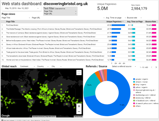
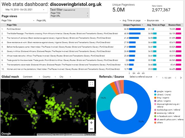
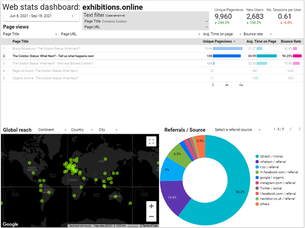
I tried several different designs initially but tried to keep in simple, user friendly and at a glance. Once the design elements and graphs were in place, it was easy enough to create more of these and filter to specific organisation need. One notable website I added has exceptionally interesting and notable data for our organisation: discoveringbristol.org.uk.
Noting the below dashboard, it has users across the world, a great average reading time and approx. 5million page views. However we feel it could use an update to reflect more modern times and tech.
Web stats dashboard: 5million hits and worldwide users on discoveringbristol.org.uk
But what more can we do with this data? There is a clear need by the pageviews to provide more historical content not just to the local or national viewers of our site – a worldwide web audience.
Understanding our users and what they want
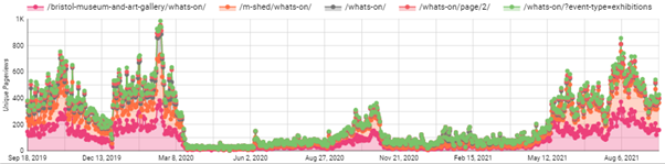
The timeline graph below shows the most viewed events web pages since September 2019. Do note the almost flatline number of page views from March 2020 – when COVID lockdown begun.
Timeline graph of pageviews: A noticeable impact due to covid on our events pages
As a result of our venues closing we could predict that visitor donations, online ticket sales, in venue shop sales and visitors who relied on our noticeboards or promotions using banners would decrease.
And an opposite effect is there has been more of a demand to have a stronger web presence, offer online events and exhibitions, keeping our audiences up to date with what we’re doing etc.
It’s this thinking which gave me the idea as part of Let’s Get Real to experiment with trying to convert users to donations, shop sales or newsletter sign ups as this could help the impact that COVID has had on our organisation.
Experiments
Experiment one: Adding ‘Newsletter’ button alongside 2 other header buttons
Problem: Newsletter underperforms as an ‘outbound event click’ in Google Analytics compared to Shop/Donate buttons Solution: Add extra button alongside static buttons within website header Expected outcome: To increase newsletter clicks and gain bigger mailing list for future promotions Considerations: May decrease other 2 buttons clicks as 3 options Result: Newsletter clicks are performing better than donations clicks
Summary:
We had 2 CTA buttons for Shop and Donate. I suggested to add a ‘Newsletter’ button link as shown:
Header buttons: Shop/Donate/Newsletter – We needed to offer a 0 cost option to our users
We implemented the google tag manager tracking of all these event clicks from Jul 2nd. At the same time, we added the button for Newsletter to our live site as shown above. The first two buttons require a cost – buying or donating money. I felt we could be more inclusive.
For other users of certain demographics, for example those who are younger, disadvantaged, lower incomes, the very least we could offer them is a way to be notified by our work via email newsletter. This should offer just that – a way to interact and keep involved with us.
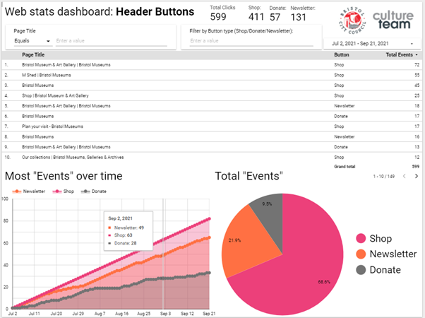
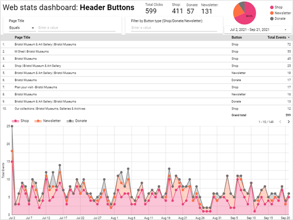
Web stats dashboard: Header Buttons: Shop/Donate/Newsletter – Area and Pie (page) chart
The above screenshot showed us our users prefer to go to our shop, then click our newsletter link and then lastly donate. The table shows what pages had the most clicks to which buttons.
Here is our second page of the same report, with different data charts to help visualise the results:
Web stats dashboard: Header Buttons: Shop/Donate/Newsletter – table and timeline chart
Conclusion:
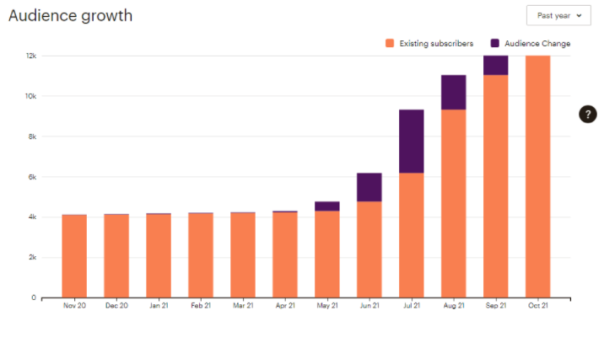
We have seen a major increase in newsletter sign ups since I joined in March and made these changes:
Mailchimp newsletter:Audience growth 30-11-20 to 30-11-21
Given the year of lockdown and restrictions to visit public venues, combined with data such as large page views of our venue opening times before announcements to drop restrictions, sending our users direct updates to their mailbox seemed like a better way to notify attendees.
I feel this was better than have them navigate to our site to check updates as they have been frequently changing and potentially delayed or disrupted – potentially out of date.
As these buttons are within the header area, the first things seen before reading content, and are present across all pages of the site. The opportunity to sign up is given to the user to click these whenever, regardless of the content they are viewing.
Once we added the button, we have found an increase of clicks to the newsletter sign up, where this could be a user chooses after reading the page to intentionally sign up to keep notified and updated of the museums via email newsletter.
This is a positive safeguard to prevent them missing out on more information and general relevant news which could decide or impact their attend the museum in the future. As this was a static button this gave me the idea for my next experiment: page targeted pop ups.
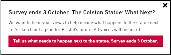
Experiment two: Page targeted pop ups for The Colston WHN exhibition/survey
Problem: Inability/lack of control to target users to a specific goal campaign or CTA that interactively prompts them during their reading – static buttons already in place for our more generic targets Solution: Find and install flexible page pop ups tool and launch with testing alongside relevant and suitable campaign/topic. In this case Colston Exhibition and Black History web pages Expected outcome: Users see a pop up relating to page content topic and will click on the pop up as its relevant to their interest. Considerations: ‘pop ups’ generally considered an annoyance/disruptive/negative impact Result: Effective – content that readers have chosen to view get suggested to take an action. This was successful as the target pages had content relevant to the suggested action in the popup
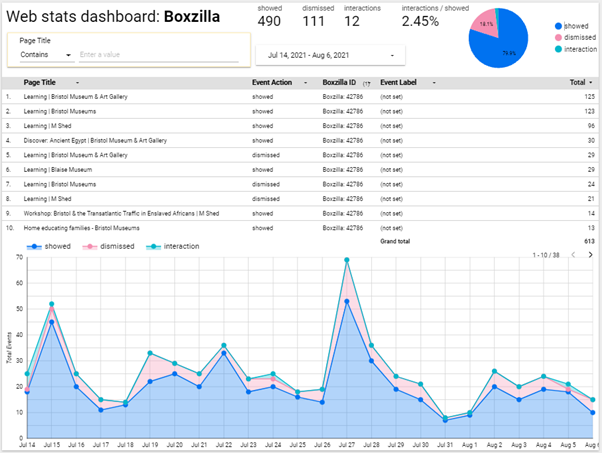
Page targeted popups: CTA prompt used for TCS: What Next survey, exhibition and campaign
Summary:
We needed a way to drive existing readers of our Black History content to the Colston statue survey. I researched different ways to prompt users and looked at a plugin called Boxzilla pop ups. It was obvious that users reading our Black History content would actually take the survey and also offer good, valuable feedback – if they were suggested to.
But how would these users who land on our History pages know about the Colston survey or exhibition if they were just on the article/story they had chosen to read? A box that prompts them during their reading, with a well phrased call-to-action that appears halfway through their reading.
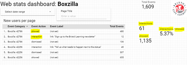
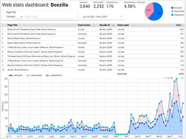
We also needed to measure this which is what the plugin we added could offer us. This tied in with the google dashboard, where we see how many were shown, interacted and dismissed.
Popup dashboard: Measuring success on showed/interaction/dismissed data
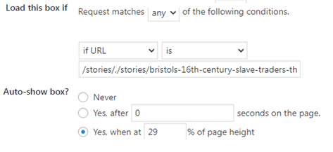
First we needed a list of pages we needed to target, we then set the box pop up to be seen on all of those page URLs when the user scrolls above 55%. By default the box type is on the bottom right of the screen. We can then set the expiry of the pop up if necessary, which is useful for if it is running beside a campaign – for example this could be for a donations campaign or a shop sale.
Popup settings: Where and how we can set the popup prompts
These parameters are all pretty self-explanatory and offer the option to be more present to the users viewing experience if necessary, however for the sake of less intrusion to the user and a bad experience it typically seems better to have a ‘less is more’ approach as it may seem intrusive.
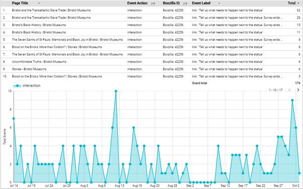
Popup dashboard: Timeline total of actions taken on the popup for Colston survey campaign
Conclusion
Generally speaking, as long as the pop up call-to-action is directly relevant to the page content itself then it’s more likely that the user will not ignore or close the prompt. The longer the exhibition went on, the more popups increased too.
The last part of the campaign we saw a massive increase which is likely linked to general pubic awareness of the survey campaign, alongside the organisations other comms and other promotions plans to do with the survey. The ‘last chance’ message was likely more encouraging too.
Popup dashboard: Total interactions on the Colston Survey, July 14 to Oct 2Survey page data: Pageviews and referral data
In comparison to the more general, static newsletter button CTA which are at the top of the page and then scrolled past (and likely missed). A popup that prompts for something like newsletter specifically is more likely to be ignored as it may be intrusive due to no direct relevance to their reading content and they have already seen it as a static button. Also, popups do not return unless the page is refreshed.
Popup dashboard: Total actions taken on the popup of Newsletter – non-specific campaign
I think it can be useful to have a pop up newsletter but if the same users are looking at them repeatedly, it could be intrusive and possibly an annoyance – I am in belief with more testing it can be set to not show popups to those already signed up to their newsletter (via mailchimp newsletter integration).
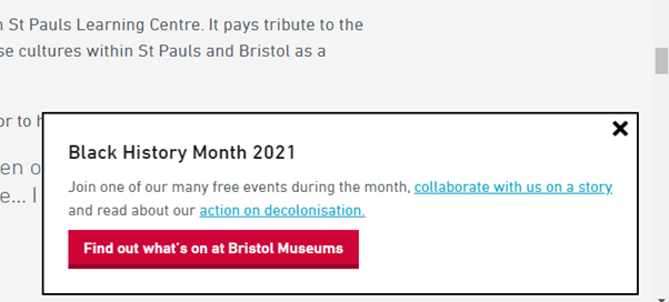
Popup: Used for Black History Month to drive users to events/feedback and our decol statement
For now, ultimately, alongside other campaigns ongoing within the organisation this has great potential to assist those by keeping users already on our website directed to other parts and to convert readers into actions.
Hi! My name is Cameron Hill and I am currently working as a Digital Apprentice as part of
Cameron Hill
the Bristol City Council Culture Team, where I’ll mainly be based at Bristol Museum and helping out with all things digital.
Previously to joining Bristol City Council, I studied Creative Media at SGS College for two years as well as at school for GCSE. A huge interest of mine is social media. Whilst at college I worked with a friend who was a fashion student who sold her creations to create more of a brand for herself. After she came up with the name, I created an Instagram page for the brand and started creating various types of content. Using Instagram stories was a great way to interact with followers. Using different features such as Q&A and polls, it was easy to see what the customers like. Something else we did with stories was showing the ‘behind the scenes’. For example: from picking the fabric, making the item itself and packing the item to be shipped.
As I am writing this it is my first day and so far it has been a lot to take in. One of my first tasks was to upload an image to a folder linked to the various screens around the museum.
Digital signage not working
Although technology can be temperamental, the first issue we came across was unexpected….
Using my iPhone, I was asked to take an image to upload into the folder but without me realising the phone camera had ‘live photos’ turned on meaning all pictures taken would create small video clips. After waiting for five minutes or so and the image not appearing we realised that the image was taken in High-Efficiency Image File Format (HEIC). Not knowing what HEIC was I did what anyone in the twenty-first century would do and took to Google.
After a little research, I came across an article in a technology magazine, The Verge stating that this format that Apple has added to iOS 11 would be a problem for PC users. From reading various articles online it is clear that a lot of people have struggled
when trying to upload their files to PCs and not being able to view and edit it. I am really looking forward to my future working here as part of the Digital Team.